Category Archives: Charles Dow

Deconstructing Mike Wirth Claims 2/N @derek_brower

In our previous piece dated October 14, 2022, we’ve covered the first paragraph of commentary from Chevron CEO Mike Wirth found in the Financial Times dated October 12, 2022.  In this piece, we cover the second paragraph of the same article written by Derek Brower.

The second paragraph states:

“Mike Wirth, Chevron’s chief executive, said a premature effort to transition from fossil fuels had resulted in ‘unintended consequences’, including energy supply insecurity from crisis-hit Europe to California.”

They say that a good way to gauge the relative progress of history is to see what they said 100 years prior and see how much progress has been made.  Looking back at what was said in September 1922, we get a glimpse into a world that we currently take for granted.

In an article titled “One Hundred Years From Now” by Brewster S. Beach, it is proposed that power will be transmitted by radio waves and a grid network of power stations throughout the country.

image

If we shorten our lens from 100 years ago to approximately fifty, we find some accurate but curious takes on the future of energy.  In this piece found in Barron’s dated June 18, 1973, we find that solar energy was accurately represented as impractical at the time.  We consider it a win for solar that it was mentioned at all.

image

If we look at the history of energy sources in the United States from 1850-2040 (detailed image found on twitter), as published in the 2009 Exxon Annual Report, we can see that the transitionary trend from oil started in the 1970s & 1980s as natural gas and oil peaked when nuclear and “modern” renewables came online in full force.

Image

This brings us back Mr. Wirth’s claim that “…a premature effort to transition from fossil fuels had resulted in ‘unintended consequences’…”.

It is difficult to believe that the progression from a primarily coal, natural gas, oil dependent economy has prematurely transitioned to alternative energy sources. In fact, as we’ve stated in the past, the delayed move from an oil based economy to “renewables” is due to the fact that the “peak oil” theory continues to be proven illusory, so far.

image

Whether alternative energy sources come to dominate the fossil fuel standbys, with over 100 years of transitioning from theory to practice, we cannot suddenly proclaim that we have rushed into this with “unintended consequences” that have not been examined ad infinitum.

see also:

Deconstructing Mike Wirth Claims 1/N @derek_brower

On October 12, 2022, Chevron CEO Mike Wirth was featured in a Financial Times article titled “Chevron Chief Blames Western Governments for Energy Crunch.”  In this piece, we attempt to deconstruct the many ways that the claims by Wirth are inaccurate.

image

To embark on a discussion of this nature, it is important to understand our take on the topic of oil companies and the government’s role in economic affairs.

In the past, we have bought and sold energy companies as part of our investment portfolios.  Our track record has been a mixed bag of modest successes and failures.  In terms of our macro analysis, we’ve had more luck in analyzing market trends.  One aspect that we’ve been consistent with is a non-narrative approach to the energy sector.  This means that we do not emphasize the glowing prospects or the dire nature of the industry.  Instead, we focus on the price action and the historical precedent and not much else.

As outlined in many twitter postings, we are for as little government involvement as possible.  We believe that price will, as it always has, dictate the needed direction for markets.  However, we’re cognizant of the fact that “government happens” and therefore are accepting of the role that government plays on many economic issues.

Anyone who has stumbled across our twitter feed @NewLowObserver in the last two years will notice that our strongest claims are against government involvement with markets and that solid economic analysis and conclusions begins with data from exceptional precedent.  With this in mind, we will go back in time to help draw upon what we believe is a more accurate view of the government and oil industry’s role in the current environment.

Our Thoughts on the Oil Sector

It has been our contention that if you want to know all about a business or industry, you only need to look at the stock index or the stock price and you can infer enough to make some reasonable assumptions for now and the not too distant future.  In the following examples, we highlight what we’d like to always accomplish when assessing markets. Basically, these are exceptions but they are what we strive for when examining any industry or market.

2012: Chesapeake Energy

We didn’t know much about Chesapeake Energy other than they were in the shale fracking business and the CEO was very popular in the industry.  On April 26, 2012, we wrote a short piece on Chesapeake Energy outlining the prospects.

We opened with the line, “While it appears that Chesapeake Energy  (CHK) has seen all the punishment that could possibly lay ahead, we’re concerned that the previous technical pattern in the period from 1993 to 1999 is about to repeat” and warned that “If CHK falls significantly below the $4.94 level, then the stock has a high likelihood of going all the way $0.67.”

What you should notice is that we did not talk about industry trends, emerging headwinds, possible decline in earnings, proven/probable reserves, life of wells, age of rigs, etc. We only focused on the stock price. Chesapeake filed bankruptcy in 2020.

image

2015: NYSE Arca Oil and Gas Stock Index

In September 7, 2015, we reviewed the price structure of the NYSE Arca Oil and Gas Stock Index and concluded “...we hazard to guess what would happen globally to the oil market in order to decline to such a low point.

Again, we didn’t assess the market based on the political climate, global warming regulations, growth/decline of global demand.  Instead, we simply looked at the price and gave our opinion.  In March 2020, the price of oil dropped to negative levels in the near term contracts.

image

2020: SPDR S&P Oil & Gas Exploration & Production ETF

Finally, in April 2020, we highlighted the need to consider $XOP after it was clear that that prices in the oil sector had gone too low.

image

image

The point of the historical look at our work is to emphasize that our goal is price and not narrative. We don’t care about the political arguments of either side of the aisle as they don’t rely on evidence that can be substantiated.  This absence of evidence then relies heavily on narrative which, if well crafted, can be effectively used regardless of the reality.

In this vein, we have hammered away at the narrative of those who claim oil is running out and therefore we are obligated to craft policies that don't consider the frictional costs for bridges to nowhere. With this in mind, we hope you’ll indulge us with a rebuttal to the remarks made by Mr. Wirth.

“Western Governments Have Made a Global Oil and Gas Crunch Worse”

“Western governments have made a global oil and gas crunch worse by ‘doubling down’ on climate policies that will make energy markets “more volatile, more unpredictable, more chaotic”, the head of US supermajor Chevron has warned.”

There are several narratives based on the above claims that require full examination in this critical opening paragraph.  Without going too far back in time, we shall demonstrate how the opposite of Mr. Wirth’s claim is the reality.

If we look at the trajectory of oil prices since the 2008 peak, the trend has been down.

image

Most notable in the decline of the price of oil is the price of almost every other commodity from 2011 as highlighted in the Invesco DB Commodity Index Tracking Fund.

image

If the claim is that oil is the largest component of the commodity index then look at the 2011 peaks experienced by gold, silver, copper, platinum, natural gas, heating oil, corn, soybean oil, cotton #2, orange juice, etc.

If climate policies favoring alternative energy pushed down the use, consumption, or investment in fossil fuels then why is the laundry list of other commodities struggling under the same weight of the 2011 peak?

Let’s invert the question and ask, is it possible that government’s “doubling down” in support of the oil industry caused the price of oil to go negative in 2020? How could this be?

image

From 2016 to 2018, Federal land sales for drilling oil and gas increased at an exceptional rate while the overall trend of all commodities was in decline, a mistake that pushed the industry to glut conditions.  Can we not say that government has been very supportive of the oil & gas industry and the consequences of such support has actually been more disastrous than the push for the “renewables.” [Don’t get us started on renewables]

We couldn’t help but notice that Chevron is experiencing a surge in the stock price to new highs after getting through oil prices going negative, presumably due to the government’s eager intervention that helped defy the declining trend of the market from 2011.

image

From the price history, the trajectory of Chevron shares seem to be a continuation of a trend that has been in place since the 1974 lows.  It appears that the bonuses that will be given out to Wirth in the coming year will be well earned.   However, we cannot accept the claim that Chevron has suffered at the hands of the government when the market says everything appears on a trend that has been in place since 1974, a period when government policy has strongly favored the oil industry.

see also:

Stock Market and Inflation Risk

A reader of our Dow 130k article has raised an important question about the risks that the stock market faces when confronted with the prospect of rising interest rates.  The reader says, in part:

“…they say that interest rates are mean reverting and based on where we are today (historically low) I would think that the betting man would bet that it can only go up from here.  If that is the case, I can't see a bull market in the coming years.

“What if the scenario is that we have permanent low inflation (Secular stagnation). Productivity improvements through outsourcing and technology innovation may explain this paradigm shift.”

We don’t have much to go by other than the historical record.  In this case, the historical record says the following:

  • Interest rates will go up
  • Inflation is broadly bullish for the stock market
  • the period of “low inflation” is behind us

In this article, we will examine, from a historical perspective, whether this is a new era where all of our claims are false or history will repeat.

Continue reading

Gold Stock Indicator: October 9, 2013

Although gold and gold stocks declined, the Gold Stock Indicator (GSI) increased above the level from yesterday.  we’re currently sitting slightly above the “stage 4 buy” level which is based on the 2008 low.

image

Our use of the 2008 low as a reference point is based on Charles H. Dow’s assessment of the best time to consider an investment:

“The point of importance for those who deal in industrial stocks is whether the capitalization of the companies into which they propose to buy is moderate or excessive, when compared with the aggregate earnings of the various concerns forming the combination in a period of depression. It is probable that consolidated companies will be able to earn as much in the next period of low prices as the companies forming the combine were able to earn in the last one; hence the very foundation of investments in industrials should be knowledge of what these companies earned, say in 1893 to 1896, making, perhaps, reasonable allowances for economies under consolidation. Where the earnings so shown would have provided dividends for industrials now active, the fact must be regarded as a very strong point in favor of those stocks.[1]”

The consideration of investments “in periods of depression,” “periods of low prices,” and “economies under consolidation” with the reference to 1893 and 1896 are all consistent with extremes in the investment cycle.  This definitely is the case for gold and more especially gold stocks.  Dow is telling us that investment considerations need to look back to the prior extreme lows for the best approximation for where investments will likely go to the downside in the current cycle and when those investments could be considered the best values. Naturally, in the next decline from a gold stock peak, we will need to use the 2013 low as the worst case scenario of downside risk.

The following are the dates and levels of gold and gold stocks (XAU) that were at or lower than the current level in the GSI.

Date Gold XAU
10/27/2008 $730.50 65.72
6/24/2013 $1,286.75 87.33
6/25/2013 $1,279.00 87.22
6/26/2013 $1,236.25 82.35
6/27/2013 $1,232.75 84.35
7/8/2013 $1,235.25 84.98
7/9/2013 $1,255.50 85.99
7/10/2013 $1,256.00 85.71
10/8/2013 $1,329.50 88.94
10/9/2013 $1,304.00 88.79

June 26, 2013 was the lowest point ever reached in the GSI since 1983.  While we’re not there yet, we expect that gold and gold stocks should bring us to the former low with some margin for error on the downside.

Citation:

  1. Dow, Charles. H. Review and Outlook. Wall Street Journal. April 27, 1899.

Gold: 50% Principle

From a Dow Theory perspective, downside targets rely heavily on the concept of the 50% principle. Although mistakenly attributed to E. George Schaefer by Richard Russell, the 50% principle is derived from Charles H. Dow’s “great law of action and reaction.” Dow describes the “law” in the following manner:

The market is always responsive to the great law of action and reaction. The longer the swing one way the longer it will be the other. One of the best general rules in speculation is the theory that reaction in an advance or a decline will be at least one-half of the primary movement [50% principle].

The fact that the law is working through short ranges and long ones at the same time makes it impossible to tell with certainty what any particular swing may do; but for practical purposes, it is not infrequently wise to believe that when a stock has risen 10 points, and as a result of one or two short swings [double tops] does not go above the high point, but rather recedes from it, that it will gradually work off 4 or 5 points.[1]”

In another excerpt from Dow’s work, on the topic of the 50% principle, Dow says:

It often happens that the secondary movement in a market amounts to 3/8 to ½ of the primary movement.[2]”

Again, Dow emphasis the concept of the 50% principle:

Whoever will study our averages, as given in the Journal for years past, will see how uniformly periods of advance have been followed by periods of decline, amounting in a large proportion of cases to from one-third to one-half of the rise. [3]”

Finally, George Bishop, one of the greatest authors on the topic of Charles H. Dow, concludes:

The law of action and reaction applies to both the general market and to individual stocks. This law states that the reaction to an advance or decline will approximate half the original movement.[4]”

Dow Theory 50% Principle for Gold

Dow Theory downside targets for the price of gold, based on the peak of $1,895 and the initial  low of $252.80 based on the closing price, is charted below (July 20, 1999 and September 5, 2011, respectively):

image


Citations:

  • [1] Dow, Charles H. Wall Street Journal. October 19, 1900.
  • [1] Bishop, George. Charles H. Dow and the Dow Theory. Appleton-Century-Crofts. New York. 1960. page 119.
  • [1] Sether, Laura. Dow Theory Unplugged. W&A Publishing. 2009. page 112.
  • [2] Dow, Charles H. Wall Street Journal. January 22, 1901.
  • [2] Bishop, George. Charles H. Dow and the Dow Theory. Appleton-Century-Crofts. New York. 1960. page 120.
  • [2] Sether, Laura. Dow Theory Unplugged. W&A Publishing. 2009. page 117.
  • [3] Dow, Charles H. Wall Street Journal. January 30, 1901
  • [3] Bishop, George. Charles H. Dow and the Dow Theory. Appleton-Century-Crofts. New York. 1960. page 120.
  • [3] Sether, Laura. Dow Theory Unplugged. W&A Publishing. 2009. page 199.
  • [4] Bishop, George. Charles H. Dow and the Dow Theory. Appleton-Century-Crofts. New York. 1960. page 231.

Incorrect Interpretations of Market Peaks

In a MarketWatch article titled “7 Ways to Spot a Market Top” (found here), it is suggested that there are key ways to tell whether or not we are at a top in U.S. stock markets.  First, we’re going to selectively choose (cherry pick) the points that we can refute or demonstrate weaknesses.  Second, we’re going show how, even at a stock market peak, abandoning new investment opportunities can potentially be a mistake.

Starting with the first of the “7 Ways to Spot a Market Top” is the claim that:

While the U.S. stock market is trading at record highs, three blue-chip Chinese companies -- Petro China (PTR), China Mobile (CHL) and Yanzhou Coal are trading near 52-week lows, points out Brad Lamensdorf, chief investment officer of the Lamensdorf Market Timing Report. All three stocks peaked in January [2013]and have been skidding ever since. Given the key role China plays in the global economy, ‘this looks like a bad sign for US stocks,’ Lamensdorf said.

While it cuts us deep to suggest that a 52-low implies proof that a top in the market is at hand (don’t forget our vested interest on this topic), there are clear weaknesses in this argument.  First and foremost, look at the chart for the respective stocks.

image

For PetroChina (PTR) the stock peaked in April 2011.  Since then, the stock has been unable to exceed the prior peak.  A technical analyst would have immediately recognized this and would not make the basis of their analysis the 2013 peak because it is lower than the 2011 top.

image

In the case of China Mobile (CHL), the stock peaked in August 2012.

image

In the instance of Yanzhou Coal (YZC), the stock peaked in May of 2011.  If what Mr. Lamensdorf says is true, U.S. stocks should have shown more signs of weakness before the most recent declines.  Based on the information that we’ve provided, the first of 7 ways to spot a market top is very weak at best.

The second of 7 ways to spot a market top reflects on the performance of the Spanish stock market indexes.  Unfortunately, there is no PROOF that, based on the movement of the three indexes, that we’ve seen the top in the U.S. stock market.  Instead, it only reflects on what has happened in Spain.  In addition, the time span that is used is narrow at best.  What is a better alternative to indicate a possible top in the market?  First and foremost, Dow Theory could have been a better guide for consideration of when and if we were at a market top in advance of the actual peaks.  As an example, the Spanish IBEX 35 Index, is shown below from 2006 to the present.

image

From the peak of the IBEX 35 Index in 2007, the decline was down to the March 2009 low near 6,936.90.  The increase of the IBEX 35 Index could have been expected to increase at least half of the prior decline before giving clear indications of a change in direction in the market.  According to Dow Theory the best case scenario would be for the market to retrace 50% of the previous decline.

Our own example of a real-time application of Dow Theory projections in advance of a market top is our April 3, 2009 posting titled “Bear Market Rally Targets” (found here), when the Dow was at 8,017.59.  At that time, we said that the Dow Jones Industrials Average had an upside target of 10,360.02 based on the Dow Theory 50% principle.  Dow Theory clearly outlines how to interpret market direction based on the stock market movement after the retracement of the 50% principle.  Therefore, it would have been clear that the decline was in the cards and not helped by the European Financial crisis.

In our considered opinion, calling the top is easy after the fact, however the tools were in place to allow for understanding the potential upside limits beforehand.  Additionally, there is no proof that the Spanish markets have topped out, based on such a short time frame (June 2012 to June 2013).   In fact, according to the precepts of Dow Theory, the marginal top of January 2013 could not be considered to be “in” until the IBEX 35 declines below the 2012 low.

The third of 7 ways to spot a market top is based on the FTSE Europe relative strength index.  The indicator only shows the last year of movement.  The problem with this is that we don’t have a “relative” view on which to test the accuracy of this indication.  Although not the exact index and without the exact measure of time for which the indicator is at (a considerable weakness to leave out such information because we cannot independently test what should be widely available), we’ve outlined the Vanguard FTSE Europe ETF (VGK) with a relative strength indicator on a 28-period trailing interval.

image

As can be seen above, the RSI has not necessarily give a clear indication of where the top in the market is when reviewed over a period from 2006 to the present.  As an example, in 2012, the two RSI peaks resulted in higher market levels afterwards.  Likewise, the RSI low of 2010 resulted in an even lower level for the Vanguard ETF in 2012.  Worse still, the early 2008 low in the RSI was much lower than the early 2009 RSI low.  However, the 2009 low in price was a staggering –58% lower than the early 2008 price for the Vanguard ETF.

Again, without the source of the RSI provided and the exact index that was used over a substantial period of time to verify the quality of the indicator, it would be difficult to suggest that the information provided was enough to prove that we could use the information to identify a market top, or bottom.

The fourth of the 7 ways to spot a market top refers to the Schiller P/E or CAPE ratio valuation of global equity markets.  Again, this view only reflects the current point in time.  It leaves out the perspective of other times in history, relative to when the S&P 500 Index was at respective peaks and troughs in history, compared to the same countries.  However, we do have a good source to help see how this may not be the top, according to CAPE valuations.

image

The chart above is the Shiller P/E or CAPE ratio from GuruFocus.com (found here).  According to the chart, it would appear that on a historical basis, the U.S. stock market should trade back to the mean P/E level of 16.5 after trading to the historical peak level of 22.9.  However, there are two serious problems with this perspective.  First, it ignores the fact that at nearly 50% of the times that the S&P has been at the same level in the past, the market continued much higher than the current level in 1929 and 2000.  In the case of the year 2000, the market doubled the P/E level that we are currently at.  The second problem is that the S&P 500 index didn’t exist before 1957.  Therefore, anything before 1957 is based on a theoretical P/E ratio that is not even “real.”  In fact, everything prior to 1957 is based on the belief that an imaginary S&P 500 would have replicated the performance of the Dow Jones Industrial Average).  We’ve already pointed out the deceptiveness of P/E ratios and how they can be astronomical at market bottoms and miniscule at market tops in our article titled “P-E Ratios: Lessons from Confliction Indications” (found here).

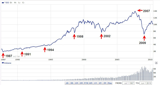
In the fifth of the 7 ways to spot a market top, the article refers to the S&P 500 activity from 1996 to the present.  Yes, it is true that the S&P 500 has failed to exceed the prior peaks of 2000 and 2007 by a wide margin.  However, choosing the S&P 500 strictly fits the argument.  Additionally, it seems to be the point of the author that prior peaks are a indication of a market top.  However, if the Dow Jones Industrial Average were applied to the same period of time then it could be argued that you cannot pick a market top based on prior peaks.

image

In each instance of a peak for the Dow, the index went higher, as opposed to the S&P 500.  Furthermore, If we looked at the Nasdaq Composite Index, then we could say, based on the flawed logic of prior peaks being the top in the market, that we’re a long way from the top in the stock market, as seen in the chart below.

image

The sixth of 7 ways to spot a market top relates to the 50-moving average of the S&P 500 Index.  According to the article, Mark Luschini, chief investment strategist at Janney Montgomery Scott says:

“'As a matter of fact, with the S&P 500’s recent pullback to 1,600, it actually suggests an interim bottom,’ says Luschini. The index has bounced around and off of the 50-day moving average of 1,615, ‘so for the time being, that’s pretty good support for the market,’ he adds.”

Suffice to say, this wasn’t actually a way to spot a market top.  We’re not sure why this was included.

Finally, the seventh of the 7 ways to spot a market top discusses the price of oil but it doesn’t relate this back to the stock market as the previous 6 points attempted, somewhat.  Despite this fact, we have to point out the comment made by the analyst about the price of oil.  The article states:

“As crude gets more expensive, OPEC members have an incentive to ramp up production. But in such times, [Tim] Evans doesn’t view the higher prices as bullish.”

Unfortunately, in the chart that is included with Mr. Evans commentary, we can see that the price of oil increased from January 2007 and peaked June 2008 and collapsed to the April 2009 low.  Coincidentally, the stock market had a similar movement over the exact period of time. As Charles H. Dow, co-founder of the Wall Street Journal, said:

For the past 25 years the commodity market and the stock market have moved almost exactly together. The index number representing many commodities rose from 88 in 1878 to 120 in 1881. It dropped back to 90 in 1885, rose to 95 in 1891, dropped back to 73 in 1896, and recovered to 90 in 1900. Furthermore, index numbers kept in Europe and applied to quite different commodities had almost exactly the same movement in the same time. It is not necessary to say to anyone familiar with the course of the stock market that this has been exactly the course of stocks in the same period ( source: Dow, Charles. Review and Outlook. Wall Street Journal.February 21, 1901.)”

With this in mind, it is possible to suggest that because oil is relatively far from the peak, there may still be some upside left.  After all, in the period from 2007 to the present, whenever oil rose, so too did the stock market.  Why should we expect anything different going forward? Especially when the price for oil hasn’t exceed the 2008 peak.

Our next point is regarding the abandonment of investments if and when you “know” that the stock market has peaked.  In our posting titled “Complete 2008 Transaction Summary” (found here), we show every position that we took in 2008, the length of time that we held each position and the gain or loss for each position.  It is important to note that although the stock market was in the process of collapsing, we were able to make long only positions based on stocks from our U.S. Dividend Watch List and end the year with gains of +14% as opposed to Dow Industrials and S&P 500 declines of -38% and greater.

Another source for inspiration of investing in stocks at stock market peaks can be derived from the work of Jeremy Siegel’s article titled “Nifty Fifty Revisited” (PDF here).  In the article by Siegel, the highest P/E stocks (at a market peak; 1972) for that era were selected to determine their performance over a long-term basis (1972 to 1995). If, as a long-term investor, you’re interested in beating inflation by a wide margin, then avoiding new purchases at the peak in the market, because you think we’re at a peak, isn’t as rational as it would seem.  It might make sense if you have a well established system (that is profitable, of course) in place.  However, the work of Siegel suggests that for long-term investors, avoiding new purchases at market peak could be a costly trade off.

In our personal experience, a la 2008, we can’t suggest that our performance will be replicated again.  However, what we can claim is that, aside from dumb luck, abandoning investment opportunities because the market has peaked or is falling could be just as mistaken as calling market tops, and bottoms, based on spurious notions that are unsubstantiated.

Dow Theory: The Beginning of a Cyclical and Secular Bull Market?

The world of Dow Theory was abuzz after the Dow Jones Industrial Average and the Dow Jones Transportation Average charged to all-time highs on March 5, 2013 (found here).  At the time, the Dow Jones Industrial Average had finally capitulated to the inexorable forces that had long since propelled the Dow Jones Transportation Average above the 2011 all-time high.  The confirmation of a Dow Theory bull market came when the Dow Jones Industrial Average finally exceeded the all-time high of 14,164 set in October 2007.

The action of the Dow Industrials and Transports has been so compelling that Dow Theorist Richard Russell acquiesced to the strength of the market on March 11, 2013 by saying the following:

“Yes, I know that this market is uncorrected during its long rise from the 2009 low, and I know that there are risks in buying an uncorrected advance that is becoming uncomfortably long in the tooth, but my suggestion is that my subscribers should take a chance (after all, Columbus took a chance) and take a position in the DIAs.”

In the same posting, Russell later punctuates the point by saying:

“I really believe that subscribers should take a flyer on this market. After all, after weeks of flirting with a new high in the Industrial Average, the Dow finally confirmed the previous record high of the Transportation Average. With the Industrials and the Transports both in record high territory, I think being in the market is justified under Dow Theory.”

By all indications, this Dow Theory bull market indication is the real deal, especially when it is endorsed by Russell’s 55 years of experience on the topic.  The implications of this signal are significant for one very important reason, this time we’ve achieved a secular bull market indication (learn about cyclical and secular trends).

Throughout stock market history, cyclical primary bull markets tend to last 2-4 years.  These bull markets require rapt attention to the nuances and vagaries of changes in the trend.  The last indication of a cyclical primary bull market was on July 23, 2009, when the Dow Industrials traded at 9,069.29.  Based on our interpretation of Dow Theory, we received a cyclical primary bear market indication on August 2, 2011 when the Dow Jones Industrial Average was at 11,866.62.

Secular bull markets, on the other hand, require very little attention and have typically lasted between 15 and 18 years.  Secular bull markets are the proverbial sweet spot of investing with the trend, where “buy-and-hold” is the rule. The two most prominent secular bull markets resulted in the Dow Jones Industrial Average increasing by 10-fold or more. From 1942 to 1966, the Dow rose from 100 to 1000 and in the period from 1982 to 2000, the Dow went from 1,000 to 11,722. If the current implications are correct, we could be on the cusp of a run to Dow 100,000.

Volume: The Lone Holdout

The three major components of Dow Theory are the Industrials, Transports and trading volume.  As described above, the Industrials and Transports have achieved the required all-time highs at (or near) the same time which would indicated that we are in a new cyclical AND secular bull market.  However, volume has been the holdout in the current move higher.

In the seminal book on Dow Theory titled The Stock Market Barometer, written by William Peter Hamilton, it says the following about trading volume, “It is worth while to note here that the volume of trading is always larger in a bull market than in a bear market. It expands as prices go up and contracts as they decline.

The average trading volume for the Industrials and Transports has been in a declining trend (contracting) since the 2009 low, as seen in the charts below.

image

image

In order for Dow Theory to have relevance, increasing volume needs to accompany the rise of the stock market to ensure that there is sufficient participation and interest.  Unfortunately, average trading volume, as indicated in the above charts for the respective indexes, has been trending lower since 2009.  This suggests that we could only be in an extended  cyclical bull market, within a secular bear market, rather than at the beginning of a cyclical and secular bull market.  The key to understanding trading volume and its interpretation are found in the table below.

volume price interpretation
decrease decrease positive
decrease increase negative
increase decrease negative
increase increase positive

In the days before volume was tabulated for the individual Dow indexes, the New York Stock Exchange trading volume was the proxy for the market trend in conjunction with the Industrials and Transports.  Below is the  200-day average trading volume of the NYSE since 2001.

image

What is evident is the dramatic rise and peak of average trading volume during the decline of the stock market from the peak in 2007 to the bottom in 2009.  However, once the market started taking off, the trading volume uncharacteristically plunged.  To emphasis the point, below we have included the charts for the cyclical bull markets from 2001-2007 and 2009 to the present.

image

In the chart from 2001, we can see that NYSE average trading volume hit a peak in 2002 and then flat-lined for a couple of years until 2005.   However, as the strength in the stock market grew, the trading volume accelerated to new highs.  This was the hallmark of a true bull market run, rising prices and rising volume.

image

In the chart from 2008, the average trading volume for the NYSE has had a declining trend throughout the whole bull market run from 2009 to the present.  As indicated in the table above, declining volume with increasing prices should be interpreted as a negative.  After volume has been in a declining trend for so long, the only alternative is for a dramatic increase.

When the increase in volume arrives, the question then becomes, will there be a dramatic increase or decrease in stock market price?  Will the general public’s lack of participation be the catalyst that charges the market to move higher?  This situation has to be resolved at some point.

To round out our thoughts on the potential secular bull market signal that we recently received, we thought we would compare it to the last secular bull market change in trend.  In the period from 1966 to 1982, the Dow Industrials never traded significantly above 1,000.  However, that all ended in late 1982 when the stock market broke above 1,000 and never looked back.

Below is a chart of the Industrials, Transports and NYSE trading volume from March 1982 to November 1982:

image

The most important information to be gleaned from this chart is the fact that all three of the essential indicators for Dow Theory were confirming each other at a critical point in time.  They all achieved clear bull market indications by rising in unison.  The current divergence between the Dow indexes with the NYSE trading volume suggests that we will be witness to the greatest transition in the history of the stock market.

The above examination of trading volume, based on a what we believe to be reliable sources, has us concerned that a new secular bull market is not really what we’re witness to.

As William Peter Hamilton has said in The Stock Market Barometer:

“The professional speculator is no more superfluous than the pressure gauge of the steam-heating plant in your cellar. Wall Street is the great financial power house of the country, and it is indispensably necessary to know when the steam pressure is becoming more than the boilers can stand.”

The pressure in the market is building and we may be watching the beginning of the most spectacular stock market blow-off ever.  Just before an even more astonishing decline.

Dow Theory Update

We may be on the cusp of a Dow Theory cyclical and secular bull market signal.  However, where the rubber hits the road when it comes to Dow Theory is discretion and confirmation.  Discretion is needed for the purpose of avoiding frequent and erroneous calls. Confirmation is needed to ensure the quality of the analysis. We’re hoping that the chart below clarifies what investors need to know about the recent stock market activity.

Continue reading

Our Primary Concern: Retaining Profits

We have frequently claimed that our goal was never to have trading strategy while dealing with dividend paying stocks.  In fact, the whole purpose of mining the field of dividend stocks is to increase the odds that we can compound our investment income.
However, a recent example reminds us of the importance of being cognizant that “good” stock selecting isn’t enough.  Adherence to Charles H. Dow’s concept of recognizing values and seeking fair profits is critical to long-term success in the stock market.
In the article titled “When Timing Meets Opportunity,” we’ve outlined the importance of timing when selecting stocks.  That article demonstrated that a focus on stocks near a new one-year low was about as good as any time for starting investment research.  Stocks at a new low represent the best marker for determining values.  Keep in mind that our focus is on stocks that increase their dividend every year or members of the Nasdaq 100.  Thereafter, an individual would need to run through whichever fundamental and technical analysis necessary to make a decision that seems appropriate.  Our philosophy is to consider our portfolio allocation based on what Dow Theory indicates.  If we’re in a bull market we have a higher concentration in a single stock.  If we’re in a bear market then we have lower concentration in a single stock. In general, this addresses the “value” component according to Charles H. Dow.
The aspect regarding seeking fair profits, another Charles Dow tenet, was outlined in our article titled “Seeking Fair Profits in Investment Portfolios.”  That article specifically references quotes by Charles Dow regarding when to take a profit on a stock.  Strangely, Dow recommended taking “fair profits” of 5%.  The New Low Observer Team is a little more adventurous since we seek 10% or more.  However, the point remains that as investors we need to put our expectations in perspective before we commit our money.  Not after we’re stuck with large gains or losses.
A recent example that we have come across is the case of Northern Trust (NTRS).  Northern Trust (NTRS) typifies what usually happens to a well-timed play on values when the appreciation for “fair profits” isn’t understood.  Northern Trust was recommended on September 1, 2010.  This was almost literally at the one year low from the period of September 1, 2009 to September 1, 2010.
After receiving “only” 10.96% in a period of 64 days, we issued a Sell recommendation on Northern Trust (NTRS) feeling that an annualized gain of nearly 40% wasn’t worth quibbling about.  In the sell recommendation, we indicated that we expected the upside target to be first $56 and thereafter $59.  Almost as impossible as it seems, Northern Trust peaked at $56.86 and turned down from there.  Nearly 7 months on, Northern Trust (NTRS) has ranged from a 19% gains to the current 4%. In addition, this represents a loss of nearly half of the gain that was generated at the time of our sell recommendation.
The situation with Northern Trust typifies our experience and observation when investing in dividend increasing stocks.  Great companies with considerable qualitative elements rise for a moment and revert back to their prior low for inexplicable reasons.  In regards to the general ebb and flow of individual stocks, we’re primarily concerned with accepting what is reasonable and fair rather than what we typically want which is usually for the stock to got back to the previous one-year high.
As rudimentary as it seems, we feel that an understanding of values and seeking fair profits, as espoused by Charles Dow, is essential to long-term success in the stock market.
Please revisit New Low Observer for edits and revisions to this post. Email us.

The 4 to 4 1/2 Year Market Cycle

When introducing the topic of market cycles it is often looked upon as something that is more wishful thinking more than anything else. However, it is my hope that I can provided sufficient evidence to convince you that objective observation of the 4 to 4 ½ year market cycle is well worth your time.
Introduction of the topic of the 4 to 4 ½ year market cycle does not come lightly. On September 13, 1900, Charles H. Dow, founder and editor of the Wall Street Journal, referenced the 4-year cycle as noted below:
We have frequently demonstrated that the stock market, while full of short fluctuations, has a continuing main movement, which often runs in one direction for three or four years at a time.”
Again on February 21, 1901, Dow makes reference to the 4 to 4 ½ year cycle by saying:
For the past 25 years the commodity market and the stock market have moved almost exactly together. The index number representing many commodities rose from 88 in 1878 to 120 in 1881. It dropped back to 90 in 1885, rose to 95 in 1891, dropped back to 73 in 1896, and recovered to 90 in 1900. Furthermore, index numbers kept in Europe and applied to quite different commodities had almost exactly the same movement in the same time. It is not necessary to say to anyone familiar with the course of the stock market that this has been exactly the course of stocks in the same period.”
All of the period that Dow mentions are based on the 4 year market cycle.  However, you don’t need to have a background in secular bull or bear markets from the 19th century to understand the value and weight of the 4 to 4 ½ year market cycle. In the Richard Russell’s Dow Theory Letter dated July 5, 1979, the 4 to 4 ½ year cycle is mentioned again. Of the cycle in question, Russell said:
We appear to have skipped the surest thing in the market this year, and that is the bottoming of the 4 to 4 ½ year cycle.”
Russell said this even though in retrospect we can clearly see, from a technical standpoint, that 1978 was the actual bottom in the cycle. Only four years later was the ultimate bottom of 1982 that would be the launching pad for the bull market from Dow 1,000 to Dow 10,000. In the same 1979 issue of the Dow Theory Letters, Russell includes a chart that points out the prior cycle bottoms since 1949 (1953, 1957, 1962, 1966, 1970, 1974, 1978) which I’ve included below.
We’ve pointed out that 1982 was the cycle bottom that launched a powerful bull market. However, that bull market wasn’t without interruptions. In the chart below we note the 4 to 4 ½ year cycles that took place along the way (1987, 1991, 1994,1998, and 2002).
Every cycle implies a halfway point that a reversal may take place from. For the 4 to 4 ½ year cycle, this means that the first two years of the cycle are spent going up. No matter whether there is secular bull or secular bear market, the 4 to 4 ½ year market cycle plays itself out for the most part.
Our last major market bottom was March 9, 2009. If my observations on this topic are correct, then we have at least until January 2011 to June 2011 before the half cycle is complete. Afterwards, the market would either trade in a range or establish a well-defined bottom in accordance with the 4 to 4 ½ year market cycle.
Sources:

Article Commentary and Reply

The following is a response by a reader regarding the February 8, 2010 article outlining all of the transactions from 2008:

Reader Comment:

I am assuming that by "portfolio" is meant all investable funds among all asset classes like stocks, bonds, commodities, etc.

1) You had 94% of all investable funds in Wesco at one time which to me appears extreme concentration in one asset class, regardless of how confident one is about the prospects. And since the future is unpredictable, I believe the risk/reward outcome unnecessarily becomes a hostage to the "Black Swan" events.

I do note that you had a timely and efficient loss control mechanism in place and that you sold out at a minimal loss. But that might be because you had such a huge overweight in that one stock, forcing you to watch it like a hawk. Had it been a small weight, you might have acted differently, even not having sold out and thus made a much greater profit in absolute terms since Wesco climbed 10% to 15% higher soon after you sold it.

This is a good example of why single, huge overweight concentration in one security is generally counterproductive because we are forced into taking quick actions based on short term volatility and transient perceptions of risk.

2) Almost ten times out of a total of 40 trades you let your realized losses exceed 10% and in one case even go as high as 46%. I am not averse to enduring high unrealized losses in special cases wherein we are convinced about the intrinsic value of the investment, and are willing to "ride out the storm". This is a part of the process of investing. However, I wonder what intrinsic value, or a miraculous turnaround, you were seeing holding Fannie May during the summer and early fall of 2008. Granted, you had a small allocation to this name at the time, but the expectations surrounding this trade appear to me to be speculative in nature.

3) After September every trade was a losing trade (except the three with small profits), all the way through the end of the year. And that was not in the least unusual, since being in the stock market was simply not the right strategy at the time. I am not sure what the Dow Theory was telling us around this time -- during this period of extreme volatility and spreading risks throughout the investment landscape globally. Maybe you can throw some light with respect to the Dow Theory in this context, for this period. And also whether any other asset allocations were considered and rejected. (For instance, 4Q08 provided bountiful profits in the Treasury bonds with minimal volatility and low risk.)

Touc's Reply:

Yes, by portfolio I mean all investable funds that are transacted through a brokerage firm. The percentages given are specific to any and all cash holdings in all brokerage accounts. As part of a truly diversified portfolio, I hold physical gold and silver, real estate and a minority ownership in a restaurant.
Your points about extreme concentration are quite valid, on the surface. However, as you’ll note in my article “Diversification Doesn’t Matter,” the general declines of the market are going to take out an investor no matter how diversified. In fact, the more diversified the account within the realm of stocks, the more likely diminished returns will occur.
Regarding the issue of “black swan” events, as a student of stock market crashes and panics, I have built in the prospect of a “black swan” in every transaction. First, I assume that I will lose at least 50% of my investment before entering into an investment. Second, I accept the reality of the situation based on such thinking. Third, by having an undiversified portfolio, I can clearly address scenarios that exceed losses of 50% or more without a deleterious impact on my mental faculties. With this in mind, I can better determine the risks that I’m about to take.
The matter of Wesco Financial (WSC) is an interesting one to point out. There are at least a couple thoughts, which I will try to elucidate upon. First and foremost is the transaction that preceded the WSC trade. In less than 2 months I was able to advance 96% of my portfolio by 10% with Family Dollar Stores (FDO). All that mattered to me was to not wipe out the gain immediately after accomplishing such a feat. As pointed out, I probably would have acted differently had the position been smaller. The tendency of most diversified (smaller postions) investors is to watch calmly as their entire portfolio declines until the market or stock cannot fall any further, at which point the investor panics and sells at the bottom.
The next issue of concern regarding the Wesco (WSC) trade is the missed gains that followed after selling the stock. This is something that is most pronounced with the entire sell recommendations that I have given on both Dividend Inc. and New Low Observer. In my opinion, investors face two types of greed, one for profit and one for loss. Under the conditions of both forms of greed, only losses can become permanent. I seek to mitigate both extremes of greed for what I am ultimately able to keep. I am unanimous (wink) in declaring that I seek mediocre returns or “fair profits.” In some respects, my willingness to accept missed gains and 50% losses keeps me righted. The fact that my returns have exceeded the downward spiral of 2008 with positive gains is only icing on the cake.
To be honest, I never felt the strain of getting in or out of a stock quickly enough. There never was a sense of being rushed. No wondering in the middle of the night what is going to happen to my outsized trade? After all, either I’m right or I am wrong and the markets will tell me soon enough. For this reason, I was never overwhelmed by the sense that somehow I missed an opportunity. I kept my eye on all the current and former Dividend Achievers and stuck to my core competency.
Fannie Mae (FNM) wasn’t a situation of whether the company had any intrinsic value or not. I simply speculated that the government assurance would bolster the share price of FNM. I was completely wrong about the FNM speculation. However, I ensured that the losses didn’t exceed the gains from the (AIG) speculation that occurred on 2/28/2008, 9/23/2008 with 82% and 38% respectively. Also, I didn’t want to wipe out the Bear Stearns (BSC) speculation of March 14, 2008 with 26% of the portfolio. Another matter of concern is the fact that by September 29, 2008, I had amassed gains of 41% in the same portfolio. I knew I was “playing” with house money. FNM just happened to be one (of many) that didn’t go my way.
The question of my take on Dow Theory in the last quarter of 2008 is very clear. In a Dividend Inc. article titled “A Key Point for the Market” dated October 6, 2008, I stated the following*:
Today the Dow Jones Industrial Average has fallen to the minimum of 9525.32. This exceeds the Dow Theory projection of 9531.11 posted on this blog on September 17, 2008. Nothing that has happened thus far is surprising according to Dow's Theory. It becomes academic at this point to suggest that we are either going to the 7197.60 level…
On September 17, 2008, in an article titled “Dow Theory on the Dow Industrials,” I stated the following*:
After today's stock market action the Dow Jones Industrial Average closed at the level of 10,609.66. This is below the 50% Principal as devised by E. George Schaefer. The 50% principal indicates that if a stock or index falls below this level it will fall, at minimum to the 2/3 level of Dow's Theory. Right now the 2/3 level for the Dow Jones Industrial Average is 9531.11. If the Dow falls below the 2/3 level the next stop will be 7,197.60.
Although Dow Theory had given a bear market signal, as indicated by Richard Russell’s November 2007 Barron’s article, I stuck to my core competency which is current and former Dividend Achievers with some speculation in gold and silver stocks. Dow Theory, for me, has acted as a guidepost for the market’s general direction, which affects the concentration of each individual stock. However, if Dow Theory were interpreted as Charles Dow has indicated (an approach which I reiterate throughout the site), investors would do well to heed Dow’s remark that “even in a bear market, this method of trading will usually be found safe…
Thank you for your sincere interest and the opportunity to discuss, at length, the ideas that went into some of my trades during 2008.
-Touc
*anyone interested in the articles dated September 17, 2008 or October 6, 2008 can send an email to me. Those who regularly received the RSS feed or automatic updates should look under the respective dates that the feeds or emails went out from Dividend Inc. I hope you still have those articles.