Sell Abbott Laboratories (ABT) at the Market

There comes a time when great companies reach a sell range.  In our view, Abbott Laboratories (ABT) just approached that mark for us.

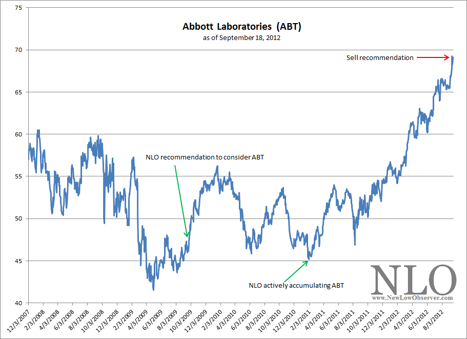
After highlighting the fundamental and technical aspects of Abbott back at $47 on September 24, 2009, (article here) and actively accumulating the stock near the January 31, 2011 low (article here), the stock has risen 47% since 2009 and 53% since 2011 (excluding dividends). The annualized return is equivalent to +13.89% since 2009 and +28% since 2011. The stock outpaced the S&P 500 by roughly 13% from our 2009 review and by 37% since our early 2011 article.

image

Let’s revisit our original assessment of Abbott in 2009. The stock was trading at 14x earnings, 10x cash flow, and sporting a 3.4% dividend yield. Today, Abbott is currently trading at 22x earnings, 12x cash flow, and 3.0% dividend yield. The table below shows the relative change that has occurred since 2009.

2009 2012 % Chg
P/E 14 22 57%
P/CF 10 12.4 24%
Yield 3.4% 3.0% -12%
Price $47.00 $68.90 47%

While our valuation model shows that Abbott is undervalued at a 3% dividend yield, 13x earnings, and 10x cash flow, we’d rather recommend selling the stock only if purchased near the $45-$47 price range as indicated in our prior articles.

Those not interested in following through with our sell recommendation can feel comfortable knowing that ABT is a great long-term holding with a minimum 40% downside cushion since our 2009 posting.  It’s no doubt that income investors can hold shares of Abbott knowing that dividend will be safe and will continue to grow.  Anyone who bought Abbott at $47 would be sitting on yield on cost of 4.3%. Not too bad when 10 Year T-Bill is close to zero.

In any event, we believe it may be a good time to off load shares of Abbott by either selling the entire position or selling the principle while letting the profit runs.

QE3: A Blunt Object with Dull Impact

On September 13, 2012, the Federal Reserve issued a statement (found here) that an additional round of quantitative easing (QE3) was going to be the preferred method for monetary policy going forward.  The  QE3  would be in the form of $40 billion of monthly purchases of agency backed mortgage securities.  The rationale for this policy implementation was explained to be put in place to ensure maximum employment and price stability.  We wonder whether a natural state of maximum employment has already been achieved.  After all,  isn’t it always at the maximum level?

It is necessary to put the implementation of QE3 into perspective.  The first official pronouncement of QE took place on November 24, 2008.  At that time, the stock market, as reflected by the Dow Jones Industrial Average, had already declined –37.66% from the October 2007 high.  The deployment of QE1 at the time resulted in a temporary bounce and then the stock market proceeded to complete the decline to the March 2009 low, an additional decline of –26%. A -26% decline as if there was no effort on the part of the Federal Reserve to stabilize the situation, speaks volumes of the relative ineffectiveness of such a policy.

The second iteration of QE took place in early November 2010.  At the time, the Dow Jones Industrial Average was already in an established rising trend (+75% above the March 2009 low) and tacked on an additional +11.94%, to the April 2011 peak.  After the April 2011 peak, the Dow Jones Industrial Average declined –15.91%.  The implementation of QE2 in 2010 was nearly 5% above the October 3, 2011 low.  Does billions of dollars of money thrown at the economy suggest that it was worth the stagnant or mild gains in the economy?

As we’ve said in our January 2011 article titled “Federal Reserve Isn’t to Blame for the Current Market Run,” and as demonstrated by the relatively mild gains and/or declining returns as represented by the Dow Jones Industrial Average, whenever monetary policy has been put in place, quantitative easing has little impact on the expected outcome for where the stock market and economy will go.  Additionally, we've shown how in periods when the Federal Reserve didn't exist (1864-1913), the stock market would routinely rebound 50% to 100% of prior losses.

Why do we make comparisons between the stock market and Federal Reserve policy when actions taken by the Fed are intended to affect economic activity and not the stock market?  The answer lies in a 2004 paper, co-authored by Ben Bernanke before he became Fed chairman, titled “Monetary Policy Alternatives at the Zero Bound: An Empirical Assessment” which is THE basis for quantitative easing in the United States.  On page 8 of the 113 page document, step one for effective QE (out of three) is stated as follows:

“..using communications policies to shape public expectations about the future course of interest rates…[1]”

This is significant because the stock market is the court of public opinion on all matters relating to current and future economic expectations.  Dow Theory, a 110-year old approach to interpreting the stock market, has the following to say on this matter:

“The Averages Discount Everything — The fluctuations of the daily closing prices of the Dow-Jones rail and industrial averages afford a composite of all the hopes, disappointments, and knowledge of everyone who knows anything of financial matters, and for that reason the effects of coming events (excluding acts of God) are always properly anticipated in their movements.[2]”

All initial communications by the Federal Reserve are meant to sway the public and is voted on by the stock market either rising or falling in acceptance or rejection of the Federal Reserve’s communiqué. The book by Benjamin Graham titled Security Analysis highlights the point that the market is an arena where votes are cast in the following quote:

“The stock market is a voting machine…[3]”

We believe that the Federal Reserve decides exactly how much they have to follow through with their “communication policies” based on the magnitude of the reaction from the financial markets.

For us to believe that quantitative easing is an effective tool in the court of public opinion and ultimately for the economy, we'd like to see both the Dow Jones Industrial Average and Dow Jones Transportation Average to exceed previous all-time highs on the news.  Unfortunately, the latest announcement has not catapulted both indexes to new highs which, according to Dow Theory, puts the latest policy initiative in question.

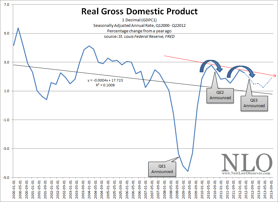
Although there is little to demonstrate that monetary tools being put in place, like quantitative easing, are actually effective, what we are seeing is an emerging trend in when the Federal Reserve decides to take action.  In the chart below we see that when the percentage change from a year ago of real gross domestic product (GDP) has peaked, the Federal Reserve will attempt to take steps to stop the declining trend of GDP.

image

Keep in mind that since QE2, real GDP growth has still managed to trend lower than the period before, on a percentage basis.  This is not the ideal outcome of massive amounts of “liquidity” being “created.”  As can be seen in the chart above, the overall trend in year-over-year (y-o-y) percentage growth in real GDP has reflected a pronounced declining trend in alignment with the peaks of 2000 and 2004.  However, in the entire history of collected y-o-y percentage growth in real GDP, since 1947, the declining trend has been well established and should not be considered a new phenomena.

The fact that QE2 could not demonstrate y-o-y growth greater than the 2010 peak before QE3 was implemented suggests that the stock market and economy are easily susceptible to a major “shock” in spite of the Federal Reserve’s best efforts.  An additional takeaway from our interpretation is that, unless under “emergency conditions,” the Federal Reserve Bank will implement massive amounts of renewed quantitative easing if real GDP appears to have peaked as was the case shortly before the QE3 announcement on September 13, 2012.

[1] Ben S. Bernanke, Vincent R. Reinhart, and Brian P. Sack. “Monetary Policy Alternatives at the Zero Bound:
An Empirical Assessment.” Federal Reserve Bank, Washington D.C. 2004. PDF found here.

[2] Rhea, Robert. The Dow Theory. 1932. Barron’s Publishing, page 19.

[3] Graham, Benjamin. Security Analysis. 1934. page 452. found here.

U.S. Dividend Watch List: September 14, 2012

Below are the 11 companies on our U.S. Dividend Watch List that are within 11% of their respective 52-week lows. Stocks that appear on our watch lists are not recommendations to buy. Instead, they are the starting point for doing your research and determining the best company to buy. Ideally, a stock that is purchased from this list is done after a considerable decline in the price and rigorous due diligence.

Symbol Name Price % Yr Low P/E EPS (ttm) Dividend Yield Payout Ratio
CAH Cardinal Health, Inc.  38.23 2.47% 12.25 3.12 0.95 2.48% 30%
ERIE Erie Indemnity Company  64.05 4.87% 22.47 2.85 2.21 3.45% 78%
ABM ABM Industries, Inc. 18.84 7.77% 19.42 0.97 0.58 3.08% 60%
WGL WGL Holdings, Inc. 39.96 8.50% 20.28 1.97 1.60 4.00% 81%
PPL PP&L Corporation 29.06 8.96% 9.88 2.94 1.44 4.96% 49%
ED Consolidated Edison, Inc.  59.76 9.14% 16.51 3.62 2.42 4.05% 67%
MCD McDonald's Corp.  91.62 9.47% 17.22 5.32 2.80 3.06% 53%
WEYS Weyco Group, Inc.  22.82 9.61% 15.63 1.46 0.68 2.98% 47%
CWT California Water Service 18.44 9.82% 20.95 0.88 0.63 3.42% 72%
ANAT American National Insurance 72.40 10.07% 10.71 6.76 3.08 4.25% 46%
MCY Mercury General Corp. 39.77 10.52% 15.18 2.62 2.44 6.14% 93%
11 Companies

Watch List Review

Cardinal Health (CAH) has retained the top spot for several weeks now.  Despite that, the stock is holding well above the $37 support level.  Fundamentally, our model indicates that Cardinal Health has a downside risk of $33-34 if the market declines and an upside fair value of $57.  The 2.5% yield could provide a good cushion if you are willing to take on such an attractive risk/reward, given the flat yield curve.  In addition, we find the  payout ratio at 30% very compelling.  As Charles Dow said in his January 28, 1902 writing, “Nothing strengthens a stock more than margin of safety in dividend earnings, and nothing weakens a stock more than doubt in regard to stability in of dividends.

We continue to go back to a classic blue-chip name of McDonald’s (MCD).  Fundamentally, the company would be undervalue around a dividend yield of 3.6%.  Given the low interest rate environment we’re in, 3% yield with 50% payout ratio appears to be sound.  Although the global weakness may have taken the stock down, the technical level shows very promising signs.  The stock made a low in June 2012 at $85 then rallied to $92 in mid July 2012.  MCD then retested the low in August at $86.  A break above the $92 would be a very bullish signal for any technical trader.

Yield seekers may turn their attention to Mercury (MCY) and American National (ANAT) with dividend yields of 6% and 4.25%, respectively.  These two insurance companies are trading at a deep discount to their historical book value.  American National trades at half of its tangible book while Mercury trades just slightly (10%) above its book value.  The concern may be from the heavy exposure in the bond or fixed income market.  We believe that has already been baked into the price and we should see the price stablize at their current level, however, one can never be too sure so we suggest 2-3 stage purchases into these insurance companies.

Top Five Performance Review

In our ongoing review of the NLO Dividend Watch List, we have taken the top five stocks on our list from September 16,  2011 and have check their performance one year later. The top five companies on that list can be seen in the table below.

Symbol Name 2011 Price 2012 Price % change
ANAT American National Insurance 70.88 72.3276 2.04%
TMP Tompkins Financial Corp. 36.51 40.42 10.71%
HGIC Harleysville Group Inc.  26.76 59.9 123.84%
SYY Sysco Corp. 27.40 30.34 10.73%
BRO Brown & Brown, Inc. 19.01 26.71 40.50%
Average 37.57%

Real Estate: A Sustainable Rise

The cover story for the September 10th weekly magazine Barron’s is on the recent surge in real estate and how the rise in property prices is no fluke.  In the article by Jonathan R. Laing titled “Happy at Last,” readers are given a cautiously optimistic assessment of what has already been a well established trend in the real estate market.  A distinction in this article is the confidence with which many professionals believe that the current rise in real estate is sustainable for the foreseeable future. 

We agree that real estate will have a sustainable trajectory upward as we outlined in our December 10, 2010 article titled “Real Estate: The Verdict is In” (found here).  We believe that the clear reversal of the indicators that we discussed at the end of 2010 has proven that the real estate market has bottomed.  The following is a review of the indicators that we track that have definitively shown that the direction is up.

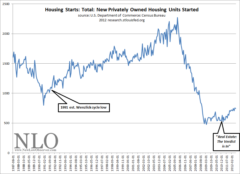
As can be seen in the chart below, U.S. housing starts bottomed in January 2009 and started to base over the next 2 years.  Two months after our December 2010 article, housing starts began to increase at a healthy pace.

image

The broad basing pattern in U.S. housing starts and the relatively mild increase, as compared to the 1991 bottom, seems to indicate a more realistic view on expectations for real estate going forward.

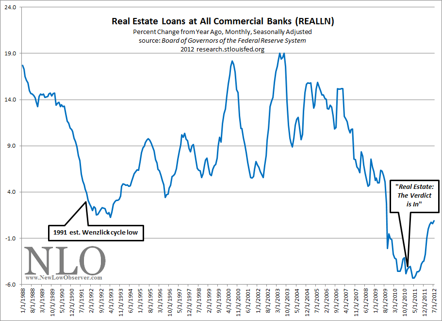
The next chart that we find useful for determining the direction of the real estate market is the real estate loans at all commercial banks.  When we published our December 2010 article, we said that the bottom had occurred in April 2010.  In fact, the actual bottom took place in April 2011 as shown below.

image

The real estate market cannot thrive in an environment where lenders are unwilling to lend.  Tracking the real estate loans by banks is instructive as to what the direction in might be.  Our assessment of this indication suggested that on a relative basis, the declining trend was at, or near, an end.  The dramatic increase in lending since early 2011 has helped push select real estate markets higher.

Much of the research analysis that we do on the topic of real estate is based on the work of Roy Wenzlick.  If there ever was a scientifically accurate approach to analyzing the real estate market, Roy Wenzlick perfected it.  Anyone who read his newsletter, The Real Estate Analyst (published from 1932-1974), would have thought that Wenzlick was strictly a statistician.  However, while Wenzlick was a compiler of significant amounts of data on real estate, he also believed that the market for properties ran on a clearly defined cycle.  On each chart above, we have indicated Wenzlick’s last estimated low for real estate based on that cycle.

The chart below illustrates the importance of considering Wenzlick’s estimate of the real estate cycle because it isn’t the rise that we’re interested in as much as when the next decline begins and when the bottom might occur.

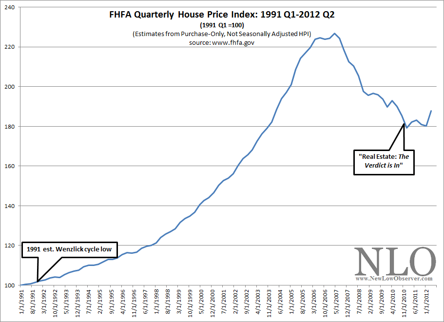
image

The real estate cycle that Roy Wenzlick adheres to pointed to a low in 1991 and a low in late 2009.  In the Federal Housing Finance Agency’s House Price Index (HPI) for the nation, we can seen that 2009 was not quite the end of the decline for real estate.  Knowing that all cycle analysis is a rough estimate, at best, we hedged our view to include the possibility that the bottom would occur as late as the end of 2010.

While the outlook for real estate prices appear to be up for an extended period of time, the stock price of homebuilders like Beazer Homes (BZH), Hovnanian Enterprises (HOV), Toll Brothers (TOL), DR Horton (DHI), Pulte Group (PHI) and Lennar Corp. (LEN) are expected to rise and fall in anticipation of cyclical (short-term) trends.  We continue to recommend considering any of these companies, including homebuilder ETFs like S&P Homebuilders (XHB), when they are within 10% of their respective 52-week lows.  We believe that a revisit of the June 2012 lows will be the prices to watch for as the next buying opportunity for these stocks.

Barron’s is on the right track in terms of where the real estate market has been. However, the fact that Barron’s is favorably highlighting this trend indicates that there may be a short-term reversal in many of the widely followed indicators in the industry.  This suggests that there are immediate long-term opportunities for homebuyers while real values in homebuilder stocks will arrive six to twelve months from now.

A Deteriorating Situation at Warner Chilcott (WCRX)

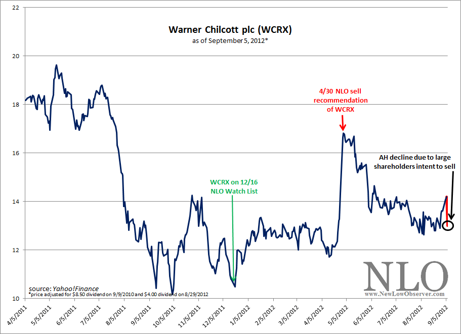
After our sell recommendation of Warner Chilcott (WCRX) on April 30, 2012 (found here), the stock price had been on a 3-month slide.  The stock had declined by $4.02, or -24%, by the first week of August.  

However, on August 8th, after the announcement that the company was no longer for sale, WCRX found some traction and started to move higher and rose from $12.63 to as high as $14.09, nearly +12% in a single month.

image

After the close of trading on September 5, 2012, seemingly out of nowhere, it was announced that the “main” shareholders and company management were going to sell nearly half of their holdings, or nearly 42.9 million shares, in the company (found here) and (found here).  Among the management that is selling shares is CFO Paul Herendeen who will be letting go of 30.9% of the 1 million shares that he owns.

The “main” shareholders, Bain Capital Partners, JPMorgan Partners, and Thomas H. Lee Partners, took Warner Chilcott “…private in 2005 for about 1.6 billion pounds ($2.1 billion)…” (Bloomberg source).  After waiting only a year, the “main” shareholders took WCRX public (raising  $1 billion) as the stock sold below the offering price of $15 (September 21, 2006 IPO data).

According to Value Line Investment Survey dated July 13, 2012, Warner Chilcott has a fair value of $25.76. However, although gyrating wildly, the total debt has increased from 86% in 2006 to 95% in 2012 and a book value that has declined nearly -83% since going public.

News of insider selling and the failure to sell off the company couldn’t have come at a less opportune time.  We believe that there is more downside left with WCRX and reiterate our sell recommendation of April 30, 2012.

Dow Theory: Downside Prospects

We have indicated in our August 2, 2011 posting (found here) the fact that we are now in a bear market.  According to Dow Theory, the primary trend remains in place until the opposite indication has been signaled.  This is best described by Richard Russell in the following remark:

…the Dow Theorist has learned that the last trend should be considered to remain in effect until the contrary has been proved”[1].

We believe that there has not been a reversal of this bear market indication as outlined in our August 7, 2012 Dow Theory analysis (found here).

Despite getting a bear market signal only days earlier, on August 9, 2011 we indicated that a bear market rally (found here) was likely to take place.  Our work on the topic of Dow Theory at that time indicated that there was upside potential to go as far as the prior highs (12,807.51).  From the August 9th low, the Dow Industrials rose as high as 13,338.70, or +23.38%.

From our experience on the topic, bear markets usually connote declines of -30% or more.  However, the bear market that we’ve experienced so far can be characterized from a slight dip to a nice market run to the upside.  While the Dow Jones Industrial Average and the Dow Jones Transportation Average have diverged overall, there has been nothing that we’ve seen since August 2, 2011 to make a person feel like any confidence in the indication.  After all, it has been over a year since the signal and no real fireworks.  Was it really worth reducing market exposure for a non-event?

Since this bull market move began on March 9, 2009, there have been sizable declines of -14% or more in 2010 and 2011 before the stock market continued higher.  The best we can do at this point is assume that 2012 is due for a correction in line with the two previous years and see what the downside prospects might be.

period of decline Dow Industrials % change
April 26, 2010-July 2, 2010 -14.60%
May 2, 2011-October 3, 2011 -19.19%
May 1, 2012-???? -2.09%
   
   
period of decline Dow Transports % change
May 3, 2010-July 6, 2010 -18.72%
July 7, 2011-October 3, 2011 -28.11%
March 15, 2012-???? -6.39%

Because a bear market decline of -30% or more has not taken place, the best we can do is assume that a similar decline to 2010 and 2011 is the most likely outcome…for now.  The previous declines, within the context of a bull market, have averaged –16.90% for the Dow Industrials and –23.42% for the Dow Transports. 

If the Industrials were to decline from the current level by –16.90% it would fall to 11,035.12.  If the Transports were to decline from the current level by –23.42% it would fall to 4,096.84.

As described in our Dow Theory analysis from August 7, 2012 (found here), there are two overhanging non-confirmations of a bull market.  This means that the overall trend of the Industrials and Transports should eventually be down.  In our negative bias against an new bull market, particular emphasis is weighted against the Transportation Index which has been falling while the Industrial Index has been rising.

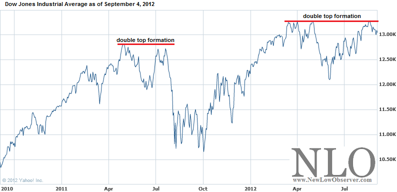
However, the last week of August has provide the Dow Industrial Average with what we consider a double-top.  Although not the most classic double top, it is still a double top. 

image

Double tops and double bottoms were indicated to be very important formations according to Charles H. Dow.  Alternatively, William Peter Hamilton and Robert Rhea arrived at the conclusion that such formations bear little importance when considering the price movement of the indexes.

From our own work on the topic of double tops and double bottoms, we have found that Dow was right about the importance of such a price characteristics and have been able to prove, with significant evidence throughout the history of the Dow indexes, that double tops and double bottoms are critical indicators for determining market direction when applying Dow Theory. 

In this case, a double tops mean that the direction for the stock market is down.  Since the bear market signal, based on Dow Theory, hasn’t resulted in a decline of over -30% for either the Transports or Industrials, were proposing that at the very minimum a decline of 13%–15% should be expected.

[1] Russell, Richard. Richard Russell’s Dow Theory Letters. Issue 166. December 27, 1961. page 1.

U.S. Dividend Watch List: August 31, 2012

Below are the 22 companies on our U.S. Dividend Watch List that are within 11% of their respective 52-week lows. Stocks that appear on our watch lists are not recommendations to buy. Instead, they are the starting point for doing your research and determining the best company to buy. Ideally, a stock that is purchased from this list is done after a considerable decline in the price and rigorous due diligence.

Symbol Name Price % Yr Low P/E EPS (ttm) Dividend Yield Payout Ratio
CAH Cardinal Health, Inc.  39.55 2.57% 12.92 3.06 0.95 2.40% 31%
ERIE Erie Indemnity Company  63.77 4.32% 22.38 2.85 2.21 3.47% 78%
EXPD Expeditors International 36.61 5.11% 21.79 1.68 0.56 1.53% 33%
WGL WGL Holdings, Inc. 39.04 5.97% 19.82 1.97 1.60 4.10% 81%
MCY Mercury General Corp. 38.29 6.33% 14.61 2.62 2.44 6.37% 93%
UNM Unum Group 19.51 6.73% 26.36 0.74 0.52 2.67% 70%
MCD McDonald's Corp.  89.49 6.98% 16.82 5.32 2.80 3.13% 53%
RLI RLI Corp. 63.36 7.15% 12.33 5.14 1.28 2.02% 25%
MATW Matthews International Corp.  29.93 7.35% 13.48 2.22 0.36 1.20% 16%
ANAT American National Insurance 70.69 7.58% 10.46 6.76 3.08 4.36% 46%
OMI Owens & Minor, Inc. 27.99 8.19% 15.21 1.84 0.88 3.14% 48%
CWT California Water Service 18.29 8.80% 20.78 0.88 0.63 3.44% 72%
SJI South Jersey Industries, Inc. 50.62 8.81% 15.92 3.18 1.61 3.18% 51%
BDX Becton, Dickinson and Co. 75.98 9.18% 13.76 5.52 1.80 2.37% 33%
LM Legg Mason, Inc.  24.58 9.93% 22.76 1.08 0.44 1.79% 41%
PPL PP&L Corporation 29.33 9.93% 9.98 2.94 1.44 4.91% 49%
WEYS Weyco Group, Inc.  22.94 10.18% 15.71 1.46 0.68 2.96% 47%
HRL Hormel Foods Corp. 28.72 10.33% 15.96 1.8 0.60 2.09% 33%
IBKC IBERIABANK Corp.  46.91 10.35% 21.13 2.22 1.36 2.90% 61%
VVC Vectren Corp. 28.21 10.67% 14.54 1.94 1.40 4.96% 72%
JNJ Johnson & Johnson  67.43 10.85% 21.41 3.15 2.44 3.62% 77%
ED Consolidated Edison, Inc.  60.62 10.96% 16.75 3.62 2.42 3.99% 67%
22 Companies

Watch List Review

Cardinal Health (CAH) remained at the top spot again this week.  With the 13-F filing released, we found that Loews Corp. doubled its holding of the stock from 50k shares to 100k shares.  In addition to that, the board approved a $750m share repurchase.

Technically speaking, CAH has been trading between a $39 and $43 range for a year.  Any break above the $43 level would be a bullish sign and a break below $39 would mark a bearish signal.  Any trader would take positions now with a stop slightly below $39.  However, we feel that a long-term investor could buy the shares knowing the stock has traded in-line or as expected.  Our model indicates that shares of CAH should be bought anywhere below $40 and would be a bargain around $26.

Erie Indemnity (ERIE) is an insurance broker and is a new addition to our list.  One of the biggest things we noticed is the amount of cash the company has on its books.  ERIE holds $2.76B in cash and the market cap is $3.39B.  That cash holding contributes to 81% of the company value.  Although we don’t know for sure the implication of that, we believe it may be because of the cash reserve they are required to hold.  But when we compared ERIE's cash reserve's to their competitors, it is much higher than most.  Value Line Investment Survey indicates that ERIE is considered at fair value at 15x earnings, thus 22x trailing 12-month earnings and 19x forward earnings doesn’t scream out buy just yet.

McDonald (MCD) is trading just 7% above its 52-week low.  Weakness in Asia and Europe continue to hold the stock back.  The cost of commodities may also contribute to the margin squeeze.  At $87/share, MCD is approaching our ‘buy’ price according to our model.  If the bear market takes its toll, our model indicates that we could possibly see the stock trade at $50/share.  IQTrends (www.iqtrends.com) indicates that this name is approaching its undervalued range at 3.6% dividend yield.

Sell American States Water (AWR) at the Market

We believe that now is the time to consider selling American States Water (AWR) at the market based on a few indications in the water utility industry.

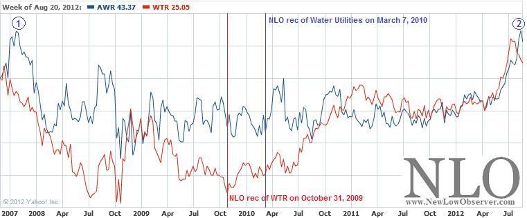
First, the price of American States Water (AWR) at point 2 has achieved the prior high that was set in 2007, at point 1, in the chart below.    Even the most minor downturn from the all-time high suggests that there is considerable downside risk, especially if the stock was bought at or near our March 7, 2010 recommendation of water utilities (found here).

image

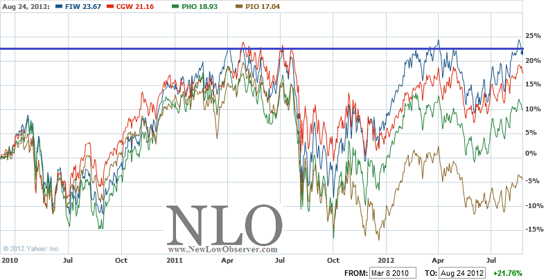
Another factor being considered as part of our sell recommendation of AWR is that the water utility sector has experienced a triple top as indicated by the best performing industry ETF, First Trust ISE Water Index (FIW), since our March 7, 2010 recommendation of water utilities in the chart below (FIW is the blue line).

image

We have to hold our nose to the idea that First Trust ISE Water Index is the best representation of water utilities since its composition is hardly a pure play on the sector. We’ve included the comparison of other water ETFs including the Guggenheim S&P Global Water Index (CGW), PowerShares Water Resources (PHO), and PowerShares Global Water (PIO) to demonstrate the relative weakness of the sector overall.

Finally, the recent run-up in AWR has helped the stock to achieve gains that have exceeded the returns of the Dow Jones Industrial Average (^DJI) from the March 8, 2010 to the present.

image

The overall under-performance of AWR as compared to the Dow Industrials in prior periods suggests that the stock should be sold to take advantage of the exceptional gains since April 2012.

Some will likely argue that there is more upside potential based on the recent move in AWR.  A favorite argument for water utilities is that water is fast becoming “scarce.”  However, our prior disclaimer on the issue of water scarcity, from our October 31, 2009 recommendation of AquaAmerica (found here), encapsulates the problems faced by the industry:

“Although this is a water utility [AquaAmerica (WTR)] and water is critical to life, investors need to understand that companies in this industry aren’t a ‘sure thing.’ The biggest reason for this is that when, and if, water becomes scarce, government regulators will step in to take over (nationalize) what should otherwise be sold at the most profitable price (thereby curbing wasteful consumption.) There is literally an upside cap on profitability to a company like this [AquaAmerica (WTR)] due to the critical importance of the resource being sold.”

The lows experienced after the 2009 bottom and the nearly 3 1/2 year stock market rally indicates that certain positions need to be pared down.  Recommendation to buy American States Water (AWR) based on their fundamentals are likely reflections of past performance being projected too far into the future and would not necessarily hold up in the short to medium-term.  We believe that American Water Works can be acquired at more favorable prices going forward.

Sell Target (TGT) at the Market

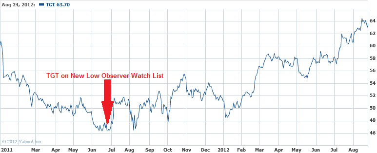
Target (TGT) last appeared on our June 25, 2011 U.S. Dividend Watch List (found here).  At the time, TGT had a dividend yield of 2.59% and was trading at $46.33.  However, Fitch rating agency had just downgraded the company from A to A-.  At the time, we said that TGT was undervalued with a yield of 2% and “…even more attractive at a 2.59% yield.”  Slightly more than one year later, Target is now selling at a 52-week high.

The chart below reflects just how much the market has come to realize the relative undervalued nature of TGT.

image

Because Target (TGT) has gained +37.11% in capital appreciation plus +2.59% in reinvested dividend income, we recommend selling the principal portion that was invested and seek out new opportunities found on our current dividend watch lists.

Gold Stock Indicator: Short-term signal is down

Today we’ve received an indication that on a short-term basis, the direction for gold stocks is down. 

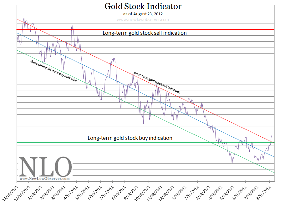
image

As can be seen in the chart of our Gold Stock Indicator, the long-term buy indication has been triggered with the added bonus of a significant double-bottom on May 15th and July 23rd.  This suggests that the long-term trend in the price for the Philadelphia Gold and Silver Stock Index (XAU) is up.  However, as with any trend up or down, there are going to be counter-trend moves.  Already, there have been five buy signals for gold stocks even though the overall trend has been down since November 2010.

Regarding the short-term Gold Stock Indicator being down:

  • For speculators, this means that DUST is a buy.  The minimum downside risk DUST is $30 and could potentially decline to as low as $25.  Remember, both DUST and NUGT are intended to be utilized for short periods of time.
  • Holders of Agnico-Eagle (AEM) should sell their position in this stock as it has increased over +40% since our April 8, 2012 recommendation (found here).  It is suggested that only the principal is sold while the profit is allowed to grow risk-free.

U.S. Dividend Watch List: August 17, 2012

Below are the 17 companies on our U.S. Dividend Watch List that are within 11% of their respective 52-week lows. Stocks that appear on our watch lists are not recommendations to buy. Instead, they are the starting point for doing your research and determining the best company to buy. Ideally, a stock that is purchased from this list is done after a considerable decline in the price and rigorous due diligence.

Symbol Name Price % Yr Low P/E EPS (ttm) Dividend Yield Payout Ratio
CAH Cardinal Health, Inc.  39.70 2.96% 12.97 3.06 0.95 2.39% 31%
ERIE Erie Indemnity Company  63.54 3.94% 22.29 2.85 2.21 3.48% 78%
MCD McDonald's Corp.  87.36 4.44% 16.42 5.32 2.80 3.21% 53%
MCY Mercury General Corp. 37.79 4.94% 14.42 2.62 2.44 6.46% 93%
UNM Unum Group 19.40 6.13% 26.22 0.74 0.52 2.68% 70%
ANAT American National Insurance 70.17 6.79% 10.38 6.76 3.08 4.39% 46%
OMI Owens & Minor, Inc. 28.33 9.51% 15.40 1.84 0.88 3.11% 48%
HRC Hill-Rom Holdings, Inc. 27.05 9.56% 11.66 2.32 0.50 1.85% 22%
MATW Matthews International Corp.  30.64 9.90% 13.80 2.22 0.36 1.17% 16%
EXPD Expeditors International 38.29 9.93% 22.79 1.68 0.56 1.46% 33%
BDX Becton, Dickinson and Co. 76.55 10.00% 13.87 5.52 1.80 2.35% 33%
PPL PP&L Corporation 29.41 10.23% 10.00 2.94 1.44 4.90% 49%
CAG ConAgra Foods, Inc. 24.73 10.45% 22.08 1.12 0.96 3.88% 86%
ADM Archer Daniels Midland Co. 26.17 10.47% 14.22 1.84 0.70 2.67% 38%
WGL WGL Holdings, Inc. 40.73 10.56% 20.68 1.97 1.60 3.93% 81%
RLI RLI Corp. 64.40 10.65% 12.53 5.14 1.28 1.99% 25%
HRL Hormel Foods Corp. 28.64 10.71% 16.46 1.74 0.60 2.09% 34%
17 Companies

Watch List Review

Cardinal Health (CAH) moved from the 3rd spot to the top of our list this week.  With the 13-F filing released, we found that Loews Corp. doubled its holding of the stock from 50k shares to 100k shares.  In addition to that, the board approved a $750m share repurchase.

Technically speaking, CAH has been trading between a $39 and $43 range for a year.  Any break above the $43 level would be a bullish sign and a break below $39 would mark a bearish signal.  Any trader would take positions now with a stop slightly below $39.  However, we feel that a long-term investor could buy the shares knowing the stock has traded in-line or as expected.  Our model indicates that shares of CAH should be bought anywhere below $40 and would be a bargain around $26.

Erie Indemnity (ERIE) is an insurance broker and is a new addition to our list.  One of the biggest things we noticed is the amount of cash the company has on its book.  The ERIE holds $2.76B in cash and the market cap is $3.39B.  That cash holding contributes to 81% of the company value.  Although we don’t know for sure the implication of that, we believe it may be because of the cash reserve they are required to hold.  But when we compared that to their competitors, that cash reserve is much higher than most.  Valueline indicates that Erie is considered at fair value at 15x earnings, thus 22x trailing 12-month earnings and 19x forward earnings doesn’t scream out buy just yet.

McDonald (MCD) is trading just 4% above its 52-week low.  Weakness in Asia and Europe continue to hold the stock back.  Commodity costs may also contribute to the margin squeeze.  At $87/share, MCD is approaching our ‘buy’ price according to our model.  If the bear market take its toll, our model indicates that we could possibly see the stock trade at $50/share.  IQTrends indicate that this name is approach its undervalue range at 3.6% dividend yield.

Top Five Performance Review

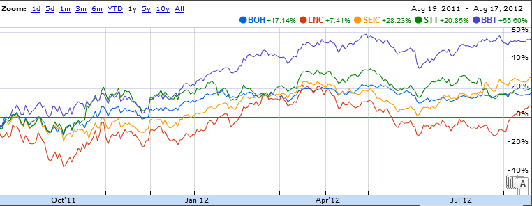
In our ongoing review of the NLO Dividend Watch List, we have taken the top five stocks on our list from August 19,  2011 and have check their performance one year later. The top five companies on that list can be seen in the table below.

Symbol Name 2011 Price 2012 Price % change
BOH Bank of Hawaii Corp. 37.44 47.13 25.88%
LNC Lincoln National Corp. 19.46 23.89 22.76%
SEIC SEI Investments Company  15.71 21.89 39.34%
STT State Street Corp. 31.91 41.91 31.34%
BBT BB&T Corp. 19.27 31.96 65.85%
Average 37.04%
DJI Dow Jones Industrial 10,817.65 13,275.20 22.72%
SPX S&P 500 1,123.53 1,418.16 26.22%

NLO_2012.8.17

Our top five outperformed the market by a wide margin.  Four of the five companies are in the financial sector.  When many companies from the same sector appear in our watch list as the top five, it is a good sign that they are undervalued.

Canadian Dividend Watch List: August 17, 2012

This is a list of Canadian dividend stocks that currently, or in the past, had a history of consecutive dividend increases. For those wishing to find the most complete fundamental information on these companies, we recommend visiting one of Canada’s leading financial websites, the Financial Post (found here). However, Yahoo!Finance probably has the better long-term charts and historical dividend data.

Symbol Name Price P/E EPS Yield Price/Book % from low
IGM.TO IGM Financial Inc. 37.25 11.3 3.3 0.40% 2.19 1.20%
FFH.TO FAIRFAX FINANCIAL HOLDINGS LTD. 379.97 0 0 2.70% 1.07 3.59%
GS.TO Gluskin Sheff + Associates, Inc. 13.89 8.37 1.27 4.50% 5.26 5.47%
SJR-B.TO Shaw Communications, Inc. 20.01 19.33 1.52 4.90% 2.58 5.71%
SNC.TO SNC-Lavalin Group Inc. 37.41 14.06 1.98 1.60% 2.89 7.13%
PWF.TO Power Financial Corporation 25.31 11.37 2.42 5.60% 1.53 7.15%
AGF-B.TO AGF Management Limited 11.56 8.9 1.02 9.40% 0.94 7.24%
RBA.TO Ritchie Bros. Auctioneers Incorporated 19.25 32.08 0.77 2.60% 3.19 7.54%
CCA.TO Cogeco Cable Inc. 37.08 7.3281 5.06 2.70% 1.55 7.63%
EMP-A.TO Empire Company Limited 58.21 10.64 4.99 1.70% 1.16 8.91%

Watch List Summary

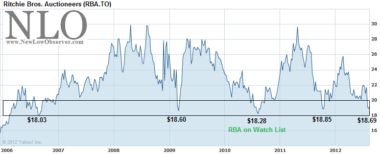
Of particular interest on this Canadian Watch List is Ritchie Bros. Auctioneers (RBA).  The very first time that this company appeared on our list was August 23, 2010 when the stock was trading at $18.94.  Immediately after showing up on our list, RBA vaulted to $29.66 or +56% by April 29, 2011.

image

After attaining the $29.66 level, Ritchie Bros. declined –36% back to the $18.85 level.  RBA then rose nearly +37% by late February 2012 before returning to the current level of $19.25.  The consistency of RBA to rise from the $18/$19 level in the last 6 years has got to end somewhere.  The stock market is very quick to take away anything that appears too easy.  Therefore, we need to find a reasonable margin for error if we were to enter into such a transaction.

According to Yahoo!Finance, Ritchie Bros. is “…an industrial auctioneer, sells various equipment to on-site and online bidders. The company, through unreserved public auctions, sells a range of used and unused industrial assets, including equipment, trucks, and other assets utilized in the construction, transportation, agricultural, material handling, mining, forestry, petroleum, and marine industries.”

We normally don’t rely on “stories” behind a stock because such analysis typically leads to false hope and unrealistic expectations.  However, here is what we think the “story” on RBA might be.  As secular bear markets tend to coincide with a commodity bull market, there will be a high demand for the very equipment that RBA auctions.  As many companies try and fail to enter into the capital intensive mining and farming sector, RBA will be quick to step in and auction the equipment that will be in high demand.  The more auctions, while there is exceptional demand for the equipment, the better the earnings for RBA.

image

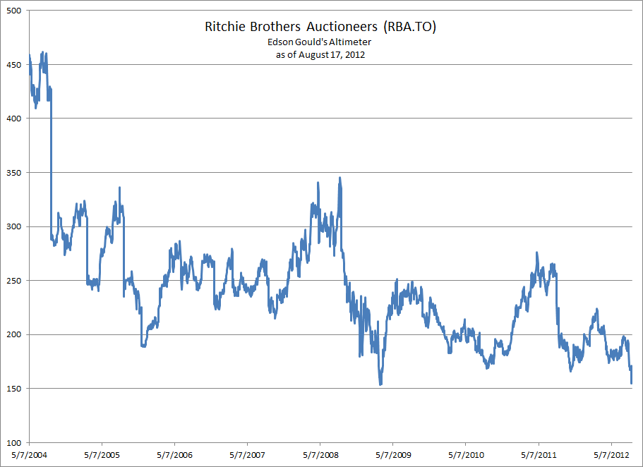
According to Edson Gould’s Altimeter, Ritchie Bros. hit an extreme low in 2009.  Through all of the gyrations in the market since, RBA’s Altimeter is now trading at the equivalent level as the 2009 low.

In terms of the downside risk on RBA, we believe that a critical support level is at $17.84.  According to Dow Theory, if RBA were to fall significantly below this level then the next downside targets would be (indicates percentage decline from current price of $19.25):

  • $15.81 (-17.87%)
  • $13.78 (-28.42%)
  • $11.75 (-38.96%)

From a Dow Theory standpoint, RBA is dancing along that fine line of $17.84 and has successfully done so for the last 6 years.  This suggests that the stock has either pent up value or is going to get crushed to the downside.  Cautious as we might be under normal circumstances, we believe that RBA is worth considering at the current price with another planned purchase if the stock declines to the $13.78 level.

Dividend Investors: Beware of Payments in Gold

As long-term investors in precious metals, we have featured several articles that warned about the pitfalls of gold and silver investing rather than highlighting the redeeming attributes in the sector.  One reason for this is the one-sided analysis that permeates throughout the gold and silver investment community.

Too often there are voices clamoring for attention about reasons to invest in gold and silver and very few of those same voices willing to say “dump the junk.”  Some analysts in the gold sector will defy logic by recommending gold stocks in an obvious declining trend rendering their analysis moot since anyone can use the rationale “we’re in a bull market” to justify their claims.

One sure sign that we’re in a gold bull market is when gold and silver mining companies start paying ever increasing dividends.  In a 2009 article titled “Why Silver Beats Gold As a Precious Metals Play,” we said, “be mindful of the coming competitive dividend war between precious metal companies.”  Apparently, precious metal stocks have not disappointed in sharing the wealth in the current gold bull market. According to Morningstar.com, in the last five years the top ten dividend increasing companies in the precious metal sector has averaged +29.61%.  We don’t expect this trend to reverse in the near term.

Symbol Company 5-year dividend growth rate
AEM Agnico-Eagle 84.42%
AUY Yamana Gold 50.61%
IAG IamGold 29.87%
DRD DRDGold 26.08%
NEM Newmont Mining 20.11%
GG Goldcorp 19.26%
ABX Barrick Gold 18.31%
BVN Buenaventura 17.97%
RGLD Royal Gold 17.50%
GFI Gold Fields 11.98%
Average dividend growth rate 29.61%
Source: Morningstar.com accessed August 15, 2012

Also, in the same 2009 article and later reiterated in our 2011 article titled “The Coming Precious Metals Dividend War,” we said the following, “one gold or silver company is going to ‘jump the shark’ and make the dividend payments in the actual metal. When that time comes, it will be fair warning to protect your positions, though this may be indistinguishable to ebullient gold bugs at the time.”  When we published our October 13, 2011 article titled “Gold Resource: Gold Dividend Means Sell” we felt that precious metal investors had been given fair warning that “…it may be an indication of a cyclical or short-term top in the gold market.”

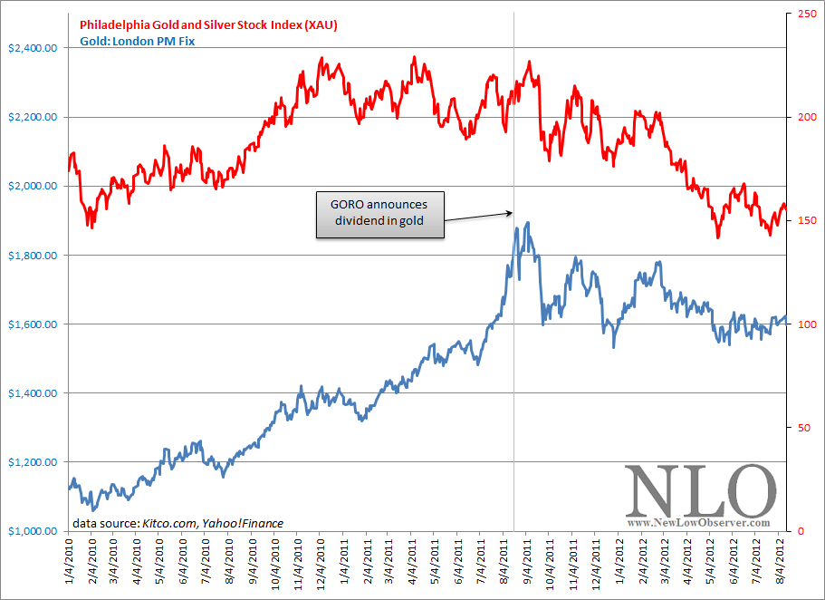
The announcement by Gold Resource (GORO) that the option for an “in-kind” dividend in the form of gold was on August 17, 2011 (PDF found here).  Three trading days later, the price of the SPDR Gold Shares (GLD), according to Yahoo!Finance, peaked at $184.59.  Twelve trading days after GORO’s announcement, according to Kitco.com, the London PM fix for gold closed at the peak price of $1,895.  At the same time, the long established Philadelphia Gold and Silver Stock Index (XAU) declined as much as –33% by May, 15, 2012 and has settled at a loss of -26.80%.

image

As the precious metals dividend war heats up, the timing, nature of the dividend, and the quality of the company will provide for some perspective as to whether we are at a short/long-term peak in the precious metal market.

However, as we’ve said in the past, companies that pay dividends in gold have historically had difficulty in retaining such a policy.  Those companies that currently have a policy of offering dividend payments in gold should be expected to discontinue such distributions at some point down the road.  When that change in policy arrives, the news could push the respective gold and silver stock prices well below known “undervalued” levels.

If you must invest in precious metal stocks, we’d opt for those that are part of the XAU Index or the HUI Gold Bug Index and pay their dividends only in the form of cash.

Insurance Watch List: August 13, 2012

The following is one of our personal favorite watch lists. We started tracking the insurance industry in January 2011 and we’re very impressed with the results so far.

Anyone who wishes to be successful in insurance stocks should read the book The Davis Dynasty by John Rothchild. The book starts with Shelby Collum Davis investing approximately $50,000 to $100,000 that ultimately grew to $900 million after 47 years. The strategies employed by Davis seem more accessible to average investors as opposed to Warren Buffett’s leveraged strategies and education from Benjamin Graham.

Symbol Name Price P/E EPS Yield P/B Dividend payout ratio % from low
MCY Mercury General Corporation 37.3 14.24 2.62 6.6 1.1 2.44 93.13% 3.90%
ERIE Erie Indemnity Company 63.69 22.37 2.85 3.4 4.49 2.21 77.54% 4.19%
OB OneBeacon Insurance Group, Ltd. 12.69 22.38 0.57 6.6 1.07 0.84 147.37% 5.75%
TWGP Tower Group Inc. 18.76 47.14 0.4 4 0.71 0.75 187.50% 5.87%
FRFHF Fairfax Financial Holdings Limited 385 33.64 11.85 0 1.13 0 0.00% 5.90%
UNM Unum Group 19.39 26.31 0.74 2.7 0.65 0.52 70.27% 6.07%
FSR Flagstone Reinsurance Holdings SA 6.8 - -1.3 2.3 0.58 0.16 -12.31% 6.08%
WSH Willis Group Holdings Public Ltd. 35.5 14.99 2.37 3 2.29 1.08 45.57% 7.45%
ANAT American National Insurance Co. 70.73 10.46 6.76 4.3 0.58 3.08 45.56% 7.64%
THG The Hanover Insurance Group Inc. 35.16 14.55 2.42 3.4 0.6 1.2 49.59% 8.02%
ESGR Enstar Group Limited 93.78 7.69 12.19 0 1.07 0 0.00% 8.35%
MIG Meadowbrook Insurance Group Inc. 7.07 18.51 0.38 2.8 0.61 0.2 52.63% 8.44%
UNAM Unico American Corp. 10 20.83 0.48 2 0.71 0.2 41.67% 8.58%
RLI RLI Corp. 63.37 12.34 5.14 2 1.59 1.28 24.90% 8.88%
KFS Kingsway Financial Services Inc. 1.96 - -1.02 0 0.23 0 0.00% 8.89%
AIZ Assurant Inc. 34.91 5.6 6.23 2.3 0.59 0.84 13.48% 9.09%
NSEC National Security Group Inc. 8.35 - -3.16 4.6 0.77 0.4 -12.66% 9.15%
UVE Universal Insurance Holdings Inc. 3.31 8.11 0.41 9.6 0.82 0.32 78.05% 9.97%

Watch List Summary

On top of our watch list is Mercury General (MCY).  Because we like MCY as a trade and plan to buy the stock in our partnership account, we’d like to recommend an article with a negative view to offset our current favorable perspective.  The article is titled “ "Mercury General: High Yield, And High Risk" and outlines many good reasons to avoid the stock (found here).  Our experience with stocks near a new low is that there are great articles that can counteract much of the positive that we might see in a stock.  However, we believe that the aforementioned article is a good antidote to our recommendation.

According to Morningstar.com , MCY is considered a “buy” at $31 and at fair value at $45.  Our own model suggests that MCY is significantly undervalued at $39 and a “buy” at $45. Investment Quality Trends (www.iqtrends.com) indicates that when MCY is at a yield of 4.5% or higher, the stock should be considered for purchase.  Currently, MCY has a dividend yield of approximately 6.60%.  Keep in mind that we do not buy stocks for their dividend yield.  Instead, we use the company’s consistently increasing dividend as the only proof that the company management can:

  • increase earnings over time
  • reward current shareholders

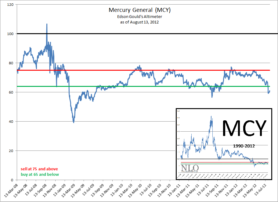
Looking at Edson Gould’s Altimeter reveals that in the short-term Mercury General is undervalued.  However, when contrasted against the long-term picture from 1990 to the present, it is revealed that MCY has undergone a massive amount of change in valuation (see inset).

image

The new reality of Mercury General’s altimeter is a far cry from what it was in the past.  We’ve had to adjust our expectations for the stock with this new reality.  For now, the buy range for the Altimeter is at 65 and below suggesting that any price below $39.65 is reasonable.  MCY should be sold when the stock trades at or above 75 or $45.75.  Based on the current price of $37.30, MCY could potentially rise 22% from the current level.

Additionally, we see the downside risk, under “normal” market conditions, to be limited to the $31-$33 price range (approximately –17% from the current level).  Again, we see MCY as a reasonable way to achieve decent gains in the short to medium-term (approximately 10%-20% in the next year).

Also of particular interest to us is the second company on our list, Erie Indemnity (ERIE).  Erie seems like the type of company that should get bought out by Warren Buffett.  The aggressive rate that the dividend has been increased over the years has pushed this stock into the bargain basement.  ERIE has absolutely no debt with $2.76 billion in cash.  While ERIE is trading at a new one year low, Dow Theory suggests the following downside targets to consider:

  • $60.77
  • $50.46 (fair value)
  • $40.13

We suspect that ERIE will eventually sell close to the fair value level of $50.46 before rebounding to higher prices.  This is a great stock where dollar cost averaging as the price declines will definitely pay off (see more of the pros and cons of dollar cost averaging here).

Clean Harbors (CLH): Downside Targets

On February 9, 2012, when the stock was trading at $64.28, we reviewed the Speed Resistance Lines for Clean Harbors (CLH).  At that time we indicated the Clean Harbors had the following downside targets (found here):

  • $43.53
  • $31.00
  • $22.53

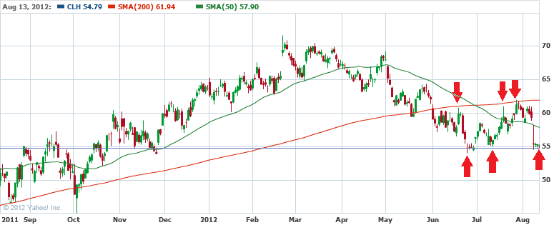
Currently, Clean Harbors (CLH) has declined to the $54.80 level which, in our view, happens to be a critical support level for shareholders of the stock.  As can be seen in the chart below, the price of CLH fell below the 200-day moving average (red line) on June 1, 2012.  Additionally, on three occasions the price of CLH attempted and failed to exceed the 200-day moving average (red line).

image

CLH is now bouncing along the support level of $55 (blue line).  It is not clear whether the stock is going to retest the 200-day moving average which presently sits at $61.94.  However, any additional decline in the stock price will likely lead to falling to $47.83.