Category Archives: Charles H. Dow

Incorrect Interpretations of Market Peaks

In a MarketWatch article titled “7 Ways to Spot a Market Top” (found here), it is suggested that there are key ways to tell whether or not we are at a top in U.S. stock markets.  First, we’re going to selectively choose (cherry pick) the points that we can refute or demonstrate weaknesses.  Second, we’re going show how, even at a stock market peak, abandoning new investment opportunities can potentially be a mistake.

Starting with the first of the “7 Ways to Spot a Market Top” is the claim that:

While the U.S. stock market is trading at record highs, three blue-chip Chinese companies -- Petro China (PTR), China Mobile (CHL) and Yanzhou Coal are trading near 52-week lows, points out Brad Lamensdorf, chief investment officer of the Lamensdorf Market Timing Report. All three stocks peaked in January [2013]and have been skidding ever since. Given the key role China plays in the global economy, ‘this looks like a bad sign for US stocks,’ Lamensdorf said.

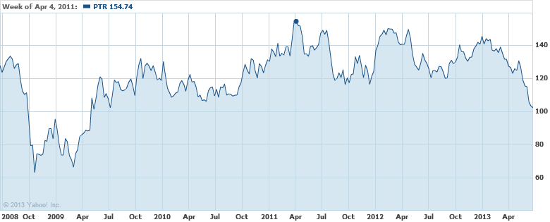
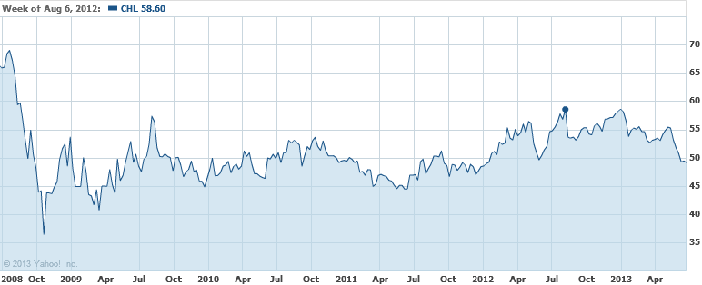
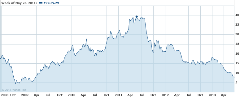
While it cuts us deep to suggest that a 52-low implies proof that a top in the market is at hand (don’t forget our vested interest on this topic), there are clear weaknesses in this argument.  First and foremost, look at the chart for the respective stocks.
image

For PetroChina (PTR) the stock peaked in April 2011.  Since then, the stock has been unable to exceed the prior peak.  A technical analyst would have immediately recognized this and would not make the basis of their analysis the 2013 peak because it is lower than the 2011 top.
image

In the case of China Mobile (CHL), the stock peaked in August 2012.
image

In the instance of Yanzhou Coal (YZC), the stock peaked in May of 2011.  If what Mr. Lamensdorf says is true, U.S. stocks should have shown more signs of weakness before the most recent declines.  Based on the information that we’ve provided, the first of 7 ways to spot a market top is very weak at best.

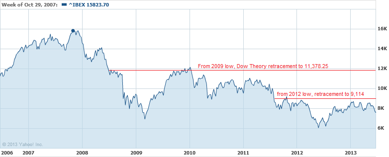
The second of 7 ways to spot a market top reflects on the performance of the Spanish stock market indexes.  Unfortunately, there is no PROOF that, based on the movement of the three indexes, that we’ve seen the top in the U.S. stock market.  Instead, it only reflects on what has happened in Spain.  In addition, the time span that is used is narrow at best.  What is a better alternative to indicate a possible top in the market?  First and foremost, Dow Theory could have been a better guide for consideration of when and if we were at a market top in advance of the actual peaks.  As an example, the Spanish IBEX 35 Index, is shown below from 2006 to the present.
image

From the peak of the IBEX 35 Index in 2007, the decline was down to the March 2009 low near 6,936.90.  The increase of the IBEX 35 Index could have been expected to increase at least half of the prior decline before giving clear indications of a change in direction in the market.  According to Dow Theory the best case scenario would be for the market to retrace 50% of the previous decline.

Our own example of a real-time application of Dow Theory projections in advance of a market top is our April 3, 2009 posting titled “Bear Market Rally Targets” (found here), when the Dow was at 8,017.59.  At that time, we said that the Dow Jones Industrials Average had an upside target of 10,360.02 based on the Dow Theory 50% principle.  Dow Theory clearly outlines how to interpret market direction based on the stock market movement after the retracement of the 50% principle.  Therefore, it would have been clear that the decline was in the cards and not helped by the European Financial crisis.

In our considered opinion, calling the top is easy after the fact, however the tools were in place to allow for understanding the potential upside limits beforehand.  Additionally, there is no proof that the Spanish markets have topped out, based on such a short time frame (June 2012 to June 2013).   In fact, according to the precepts of Dow Theory, the marginal top of January 2013 could not be considered to be “in” until the IBEX 35 declines below the 2012 low.

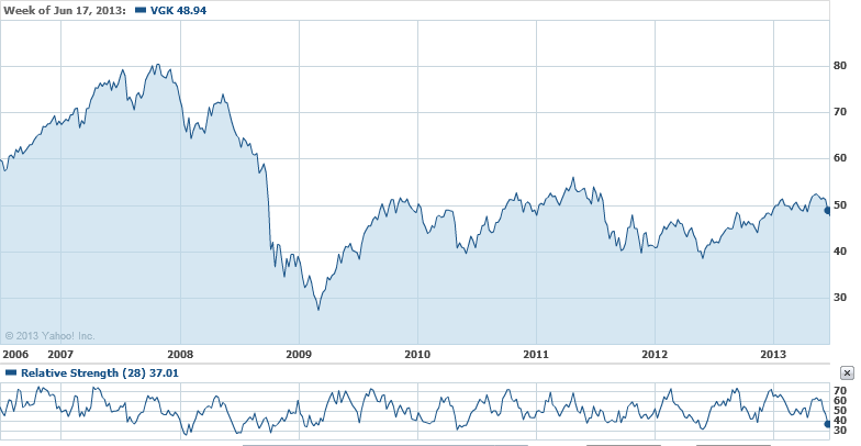
The third of 7 ways to spot a market top is based on the FTSE Europe relative strength index.  The indicator only shows the last year of movement.  The problem with this is that we don’t have a “relative” view on which to test the accuracy of this indication.  Although not the exact index and without the exact measure of time for which the indicator is at (a considerable weakness to leave out such information because we cannot independently test what should be widely available), we’ve outlined the Vanguard FTSE Europe ETF (VGK) with a relative strength indicator on a 28-period trailing interval.
image

As can be seen above, the RSI has not necessarily give a clear indication of where the top in the market is when reviewed over a period from 2006 to the present.  As an example, in 2012, the two RSI peaks resulted in higher market levels afterwards.  Likewise, the RSI low of 2010 resulted in an even lower level for the Vanguard ETF in 2012.  Worse still, the early 2008 low in the RSI was much lower than the early 2009 RSI low.  However, the 2009 low in price was a staggering –58% lower than the early 2008 price for the Vanguard ETF.

Again, without the source of the RSI provided and the exact index that was used over a substantial period of time to verify the quality of the indicator, it would be difficult to suggest that the information provided was enough to prove that we could use the information to identify a market top, or bottom.

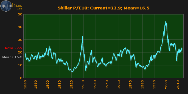
The fourth of the 7 ways to spot a market top refers to the Schiller P/E or CAPE ratio valuation of global equity markets.  Again, this view only reflects the current point in time.  It leaves out the perspective of other times in history, relative to when the S&P 500 Index was at respective peaks and troughs in history, compared to the same countries.  However, we do have a good source to help see how this may not be the top, according to CAPE valuations.
image

The chart above is the Shiller P/E or CAPE ratio from GuruFocus.com (found here).  According to the chart, it would appear that on a historical basis, the U.S. stock market should trade back to the mean P/E level of 16.5 after trading to the historical peak level of 22.9.  However, there are two serious problems with this perspective.  First, it ignores the fact that at nearly 50% of the times that the S&P has been at the same level in the past, the market continued much higher than the current level in 1929 and 2000.  In the case of the year 2000, the market doubled the P/E level that we are currently at.  The second problem is that the S&P 500 index didn’t exist before 1957.  Therefore, anything before 1957 is based on a theoretical P/E ratio that is not even “real.”  In fact, everything prior to 1957 is based on the belief that an imaginary S&P 500 would have replicated the performance of the Dow Jones Industrial Average).  We’ve already pointed out the deceptiveness of P/E ratios and how they can be astronomical at market bottoms and miniscule at market tops in our article titled “P-E Ratios: Lessons from Confliction Indications” (found here).

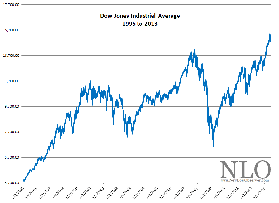
In the fifth of the 7 ways to spot a market top, the article refers to the S&P 500 activity from 1996 to the present.  Yes, it is true that the S&P 500 has failed to exceed the prior peaks of 2000 and 2007 by a wide margin.  However, choosing the S&P 500 strictly fits the argument.  Additionally, it seems to be the point of the author that prior peaks are a indication of a market top.  However, if the Dow Jones Industrial Average were applied to the same period of time then it could be argued that you cannot pick a market top based on prior peaks.
image

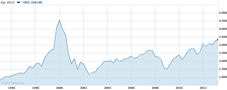
In each instance of a peak for the Dow, the index went higher, as opposed to the S&P 500.  Furthermore, If we looked at the Nasdaq Composite Index, then we could say, based on the flawed logic of prior peaks being the top in the market, that we’re a long way from the top in the stock market, as seen in the chart below.
image

The sixth of 7 ways to spot a market top relates to the 50-moving average of the S&P 500 Index.  According to the article, Mark Luschini, chief investment strategist at Janney Montgomery Scott says:

“'As a matter of fact, with the S&P 500’s recent pullback to 1,600, it actually suggests an interim bottom,’ says Luschini. The index has bounced around and off of the 50-day moving average of 1,615, ‘so for the time being, that’s pretty good support for the market,’ he adds.”

Suffice to say, this wasn’t actually a way to spot a market top.  We’re not sure why this was included.

Finally, the seventh of the 7 ways to spot a market top discusses the price of oil but it doesn’t relate this back to the stock market as the previous 6 points attempted, somewhat.  Despite this fact, we have to point out the comment made by the analyst about the price of oil.  The article states:

“As crude gets more expensive, OPEC members have an incentive to ramp up production. But in such times, [Tim] Evans doesn’t view the higher prices as bullish.”

Unfortunately, in the chart that is included with Mr. Evans commentary, we can see that the price of oil increased from January 2007 and peaked June 2008 and collapsed to the April 2009 low.  Coincidentally, the stock market had a similar movement over the exact period of time. As Charles H. Dow, co-founder of the Wall Street Journal, said:

For the past 25 years the commodity market and the stock market have moved almost exactly together. The index number representing many commodities rose from 88 in 1878 to 120 in 1881. It dropped back to 90 in 1885, rose to 95 in 1891, dropped back to 73 in 1896, and recovered to 90 in 1900. Furthermore, index numbers kept in Europe and applied to quite different commodities had almost exactly the same movement in the same time. It is not necessary to say to anyone familiar with the course of the stock market that this has been exactly the course of stocks in the same period ( source: Dow, Charles. Review and Outlook. Wall Street Journal.February 21, 1901.)”

With this in mind, it is possible to suggest that because oil is relatively far from the peak, there may still be some upside left.  After all, in the period from 2007 to the present, whenever oil rose, so too did the stock market.  Why should we expect anything different going forward? Especially when the price for oil hasn’t exceed the 2008 peak.

Our next point is regarding the abandonment of investments if and when you “know” that the stock market has peaked.  In our posting titled “Complete 2008 Transaction Summary” (found here), we show every position that we took in 2008, the length of time that we held each position and the gain or loss for each position.  It is important to note that although the stock market was in the process of collapsing, we were able to make long only positions based on stocks from our U.S. Dividend Watch List and end the year with gains of +14% as opposed to Dow Industrials and S&P 500 declines of -38% and greater.

Another source for inspiration of investing in stocks at stock market peaks can be derived from the work of Jeremy Siegel’s article titled “Nifty Fifty Revisited” (PDF here).  In the article by Siegel, the highest P/E stocks (at a market peak; 1972) for that era were selected to determine their performance over a long-term basis (1972 to 1995). If, as a long-term investor, you’re interested in beating inflation by a wide margin, then avoiding new purchases at the peak in the market, because you think we’re at a peak, isn’t as rational as it would seem.  It might make sense if you have a well established system (that is profitable, of course) in place.  However, the work of Siegel suggests that for long-term investors, avoiding new purchases at market peak could be a costly trade off.

In our personal experience, a la 2008, we can’t suggest that our performance will be replicated again.  However, what we can claim is that, aside from dumb luck, abandoning investment opportunities because the market has peaked or is falling could be just as mistaken as calling market tops, and bottoms, based on spurious notions that are unsubstantiated.
Dow Theory: The Beginning of a Cyclical and Secular Bull Market?

The world of Dow Theory was abuzz after the Dow Jones Industrial Average and the Dow Jones Transportation Average charged to all-time highs on March 5, 2013 (found here).  At the time, the Dow Jones Industrial Average had finally capitulated to the inexorable forces that had long since propelled the Dow Jones Transportation Average above the 2011 all-time high.  The confirmation of a Dow Theory bull market came when the Dow Jones Industrial Average finally exceeded the all-time high of 14,164 set in October 2007.

The action of the Dow Industrials and Transports has been so compelling that Dow Theorist Richard Russell acquiesced to the strength of the market on March 11, 2013 by saying the following:

“Yes, I know that this market is uncorrected during its long rise from the 2009 low, and I know that there are risks in buying an uncorrected advance that is becoming uncomfortably long in the tooth, but my suggestion is that my subscribers should take a chance (after all, Columbus took a chance) and take a position in the DIAs.”

In the same posting, Russell later punctuates the point by saying:

“I really believe that subscribers should take a flyer on this market. After all, after weeks of flirting with a new high in the Industrial Average, the Dow finally confirmed the previous record high of the Transportation Average. With the Industrials and the Transports both in record high territory, I think being in the market is justified under Dow Theory.”

By all indications, this Dow Theory bull market indication is the real deal, especially when it is endorsed by Russell’s 55 years of experience on the topic.  The implications of this signal are significant for one very important reason, this time we’ve achieved a secular bull market indication (learn about cyclical and secular trends).

Throughout stock market history, cyclical primary bull markets tend to last 2-4 years.  These bull markets require rapt attention to the nuances and vagaries of changes in the trend.  The last indication of a cyclical primary bull market was on July 23, 2009, when the Dow Industrials traded at 9,069.29.  Based on our interpretation of Dow Theory, we received a cyclical primary bear market indication on August 2, 2011 when the Dow Jones Industrial Average was at 11,866.62.

Secular bull markets, on the other hand, require very little attention and have typically lasted between 15 and 18 years.  Secular bull markets are the proverbial sweet spot of investing with the trend, where “buy-and-hold” is the rule. The two most prominent secular bull markets resulted in the Dow Jones Industrial Average increasing by 10-fold or more. From 1942 to 1966, the Dow rose from 100 to 1000 and in the period from 1982 to 2000, the Dow went from 1,000 to 11,722. If the current implications are correct, we could be on the cusp of a run to Dow 100,000.

Volume: The Lone Holdout

The three major components of Dow Theory are the Industrials, Transports and trading volume.  As described above, the Industrials and Transports have achieved the required all-time highs at (or near) the same time which would indicated that we are in a new cyclical AND secular bull market.  However, volume has been the holdout in the current move higher.

In the seminal book on Dow Theory titled The Stock Market Barometer, written by William Peter Hamilton, it says the following about trading volume, “It is worth while to note here that the volume of trading is always larger in a bull market than in a bear market. It expands as prices go up and contracts as they decline.

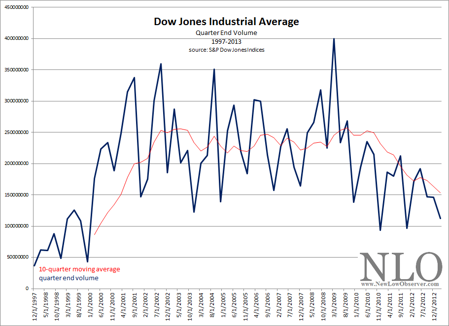
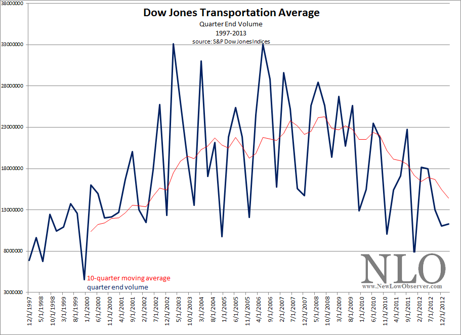
The average trading volume for the Industrials and Transports has been in a declining trend (contracting) since the 2009 low, as seen in the charts below.

image

image

In order for Dow Theory to have relevance, increasing volume needs to accompany the rise of the stock market to ensure that there is sufficient participation and interest.  Unfortunately, average trading volume, as indicated in the above charts for the respective indexes, has been trending lower since 2009.  This suggests that we could only be in an extended  cyclical bull market, within a secular bear market, rather than at the beginning of a cyclical and secular bull market.  The key to understanding trading volume and its interpretation are found in the table below.

volume price interpretation
decrease decrease positive
decrease increase negative
increase decrease negative
increase increase positive

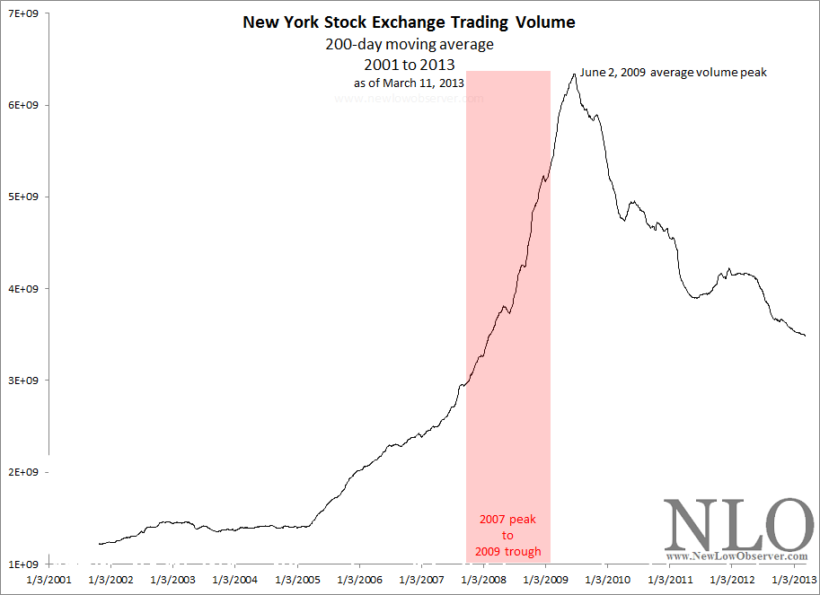
In the days before volume was tabulated for the individual Dow indexes, the New York Stock Exchange trading volume was the proxy for the market trend in conjunction with the Industrials and Transports.  Below is the  200-day average trading volume of the NYSE since 2001.

image

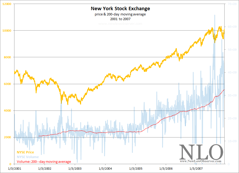
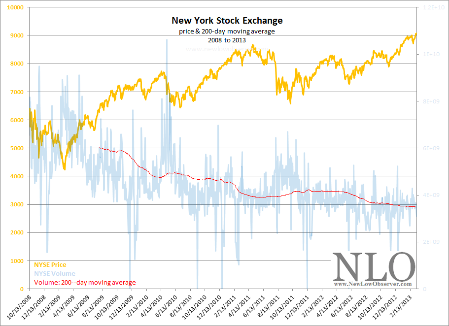
What is evident is the dramatic rise and peak of average trading volume during the decline of the stock market from the peak in 2007 to the bottom in 2009.  However, once the market started taking off, the trading volume uncharacteristically plunged.  To emphasis the point, below we have included the charts for the cyclical bull markets from 2001-2007 and 2009 to the present.

image

In the chart from 2001, we can see that NYSE average trading volume hit a peak in 2002 and then flat-lined for a couple of years until 2005.   However, as the strength in the stock market grew, the trading volume accelerated to new highs.  This was the hallmark of a true bull market run, rising prices and rising volume.

image

In the chart from 2008, the average trading volume for the NYSE has had a declining trend throughout the whole bull market run from 2009 to the present.  As indicated in the table above, declining volume with increasing prices should be interpreted as a negative.  After volume has been in a declining trend for so long, the only alternative is for a dramatic increase.

When the increase in volume arrives, the question then becomes, will there be a dramatic increase or decrease in stock market price?  Will the general public’s lack of participation be the catalyst that charges the market to move higher?  This situation has to be resolved at some point.

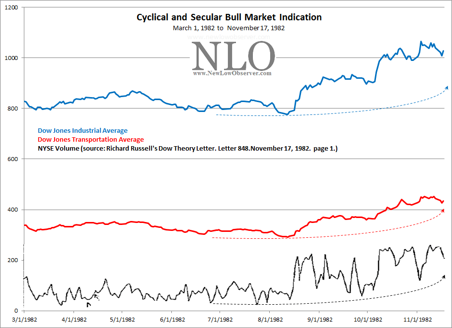
To round out our thoughts on the potential secular bull market signal that we recently received, we thought we would compare it to the last secular bull market change in trend.  In the period from 1966 to 1982, the Dow Industrials never traded significantly above 1,000.  However, that all ended in late 1982 when the stock market broke above 1,000 and never looked back.

Below is a chart of the Industrials, Transports and NYSE trading volume from March 1982 to November 1982:

image

The most important information to be gleaned from this chart is the fact that all three of the essential indicators for Dow Theory were confirming each other at a critical point in time.  They all achieved clear bull market indications by rising in unison.  The current divergence between the Dow indexes with the NYSE trading volume suggests that we will be witness to the greatest transition in the history of the stock market.

The above examination of trading volume, based on a what we believe to be reliable sources, has us concerned that a new secular bull market is not really what we’re witness to.

As William Peter Hamilton has said in The Stock Market Barometer:

“The professional speculator is no more superfluous than the pressure gauge of the steam-heating plant in your cellar. Wall Street is the great financial power house of the country, and it is indispensably necessary to know when the steam pressure is becoming more than the boilers can stand.”

The pressure in the market is building and we may be watching the beginning of the most spectacular stock market blow-off ever.  Just before an even more astonishing decline.

Dow Theory: Waiting for Confirmation

Today the Dow Jones Transportation Averaged (DJT) closed at a new all-time high.

Continue reading

The Convergence of Stock Market Forces

In our last posting of Dow Theory we mentioned the need for caution on premature calls of a new bull market.  We pointed out that with the Dow Transports and Dow Industrials so close to their respective all-time highs, investors should wait for confirmation of both indexes before getting too excited.  Now we’d like to introduce another observation of Charles H. Dow’s with regards to stock market cycles which might be the perfect antidote to further movement higher.

In June 2010, we published an article titled “The 4 to 4 1/2 Year Market Cycle” (found here).  In that article, we quoted Dow as saying the following:

Continue reading

Dow Theory Update

We may be on the cusp of a Dow Theory cyclical and secular bull market signal.  However, where the rubber hits the road when it comes to Dow Theory is discretion and confirmation.  Discretion is needed for the purpose of avoiding frequent and erroneous calls. Confirmation is needed to ensure the quality of the analysis. We’re hoping that the chart below clarifies what investors need to know about the recent stock market activity.

Continue reading

Dow Theory: Not Broken, Just Misunderstood

Barron’s attempts at Dow Theory has failed miserably…again. In the September 29, 2012 article by Jacqueline Doherty titled “Broken Dow Theory,” it is suggested that “A lagging transportation sector historically has been considered a bad omen…” and then recites the standard, sub-standard nomenclature “…less shipping means fewer goods are being produced and purchased, which means the economy is slowing and the stock market could be headed for a fall.” Doherty goes on to cite data from Bespoke Investment Group asserting that even though the Transportation index has fallen behind the market in general, it may not mean that the stock market, as represented by the S&P 500, necessarily needs to follow the same script.

Fortunately, Dow Theory is very specific about how to interpret the Dow Jones Industrial and Transportation Averages since the publication of Robert Rhea’s book The Dow Theory. Nowhere in the rules of Dow Theory is there any indication that the vacillations of the S&P 500 are remotely part of the interpretation of the theory. Especially since the S&P 500 came onto the scene over 60 years after the creation of the Dow Industrials.

Despite the fact that there are some Dow Theorists who frequently use the S&P 500 as a substitute for indications of a rising or falling market (this isn’t Dow Theory), there is little evidence that using the additional index is necessary. Alternate indexes are only necessary when and if the Dow Jones Industrial and Transportation Averages no longer exist.

While the prevailing opinion is that the Dow Industrials isn’t a relevant index reflective of the market as a whole, a distinction should be made between a “lagging” index and a “divergent” index. A lagging index is one which is going in the same direction as the other but is not increasing/decreasing at the same rate. A divergence is when one index goes up while the other index is going down. The chart below shows two failures and one divergence between the Industrials and Transports.

image_thumb[8]

When one index cannot make new highs in accordance with the other index, it should be considered a significant failure and a warning sign. A perfect example is when the Transportation Index made a new high in 2008 and the Industrial Index could not follow through. The subsequent decline in both indexes was staggering.

In situations where there has been a divergence between the Dow Industrials and Transports, it is the Transports that typically leads the divergence to the upside or downside, meaning that the Transports will provide a clue as to the potential market direction in spite of the action of the Dow Industrials. Although historically this has been the case, Barron’s has unwittingly legitimized the view that the spread between the Dow Industrials and Dow Transports is some form of Dow Theory. In no way is this the case. In fact, in the period from 1896 to 1984, the Transports have exceeded the Industrials, on a percentage basis, 15 out of 25 Dow Theory bull and bear market moves.

Year DJI beat by DJT beat by Year DJI lost by DJT lost by
1896 33.50%   1899 -13.30%  
1900   51.00% 1902 -6.40%  
1903 88.60%   1906 -7.30%  
1907 24.50%   1909 -5.30%  
1910 10.10%   1912 -13.80%  
1914 78.70%   1916 -3.10%  
1917 64.80%   1919 -26.00%  
1921 18.40%   1922   -2.30%
1923 192.30%   1929   -3.80%
1932   15.60% 1937   -21.40%
1938   20.60% 1938   -6.40%
1939   20.30% 1939 -5.30%  
1942   64.40% 1946   -16.50%
1947   39.40% 1948   -20.50%
1949   92.50% 1953   -6.50%
1953 3.80%   1956   -27.80%
1957   819.90% 1959   -12.40%
1960 5.80%   1961 -2.90%  
1962   48.80% 1966   -7.00%
1966   19.20% 1968   -22.30%
1970   82.40% 1972   -14.50%
1974   10.00% 1976 -13.10%  
1978   86.50% 1981   -10.60%
1982   44.00% 1983   -9.70%
1984   177.80% 1984   -31.00%
           
  DJI DJT   DJI DJT
Total 520.50% 1592.40% Average: -9.65% -14.18%

The table above reflects the percentage by which the respective indexes exceeded the other from either the bull market low or the bear market top. In the timeframe indicated above, the Transports have routinely exceeded the Industrials to the upside by nearly three times. The same is true for Dow Theory bear market moves where the Transports have excessive downside moves as compared to the Dow Jones Industrial average by nearly 50%.

The pattern of excessive gains and losses in the Transports versus the Industrials has remained the case since 1984. As an example, at the peak in 2007, the Dow Industrials declined –54% while the Transports declined –60%. On the rise from the 2009 bottom, the Industrials and Transports registered gains of +110% and +162% based on their respective peaks. Excessive gains and losses, by the Transports above that of the Industrials, demonstrates that the Transports usually act as a leading indicator of market direction.

It should be noted that before the work of Wall Street Journal editor William Peter Hamilton and author Robert Rhea on the topic of Dow Theory, Charles H. Dow (co-founder of the Wall Street Journal) created and analyzed the Rail Index (now Transports) without the existence of the Dow Industrials for 12 years, from 1884 to 1896, for indications of market direction. Those 12 years are the basis of what Dow was able to formulate his observations on the market.

Unfortunately, the Barron’s article goes on to quote a CIO who states that the “…Nasdaq 100 and S&P 500 are better leading indicators than the transports.” Based on the available data, the Nasdaq 100 has not been able to exceed the all-time high set in January 2000. Additionally, the S&P 500 has not managed to exceed the all-time high set in October 2007. In the bull market run since the 2009 low, the Transportation Average has managed to exceed its all-time high unlike the Nasdaq 100 and S&P 500.

Finally, Barron’s quotes data from Bespoke which reviews, “…periods when the S&P 500 exceeded the transport index by 10 percentage points over a 50-day trading period. Going back to 1928, the S&P 500 gained 1% in the subsequent six months, not awful although below the average six-month gain of 3.5%.” Using a “50-day trading period” to arrive a conclusion about the next six months is inadequate in making even a cyclical determination of a bull or bear market based on Dow Theory, let alone a secular indication. Dow Theory is about the primary trend of the market which tends to last from 3-4 1/2 years at a time.

In order to make a “complete” secular and cyclical analysis based on Dow Theory, interpretation should begin at the prior dual Industrial and Transport peaks in 2007/2008, at minimum. Until there is a dual Industrial and Transport new high, cyclical new highs in one index or the other would be a bear market reaction as indicated in our August 9, 2011 note titled “Bear Market Rally Targets.” Our indication that a bear market rally was about to take place was with 2% of the October 3, 2011 low, giving full opportunity to seek out new investment opportunities before the bear market rally to the current peak in the Industrials. The current divergence of the two indexes is confirmation of the fact that we’re still in a bear market rally until the prior 2009-2011/2012 highs are exceeded for a cyclical bull market and all-time highs for a new secular bull market.

Until 1956, Barron’swould include Dow Theory analysis in the Market Laboratory section every week. Since 1956, Dow Theory would show up only in feature articles from experts on the topic. Now, it seems that anyone making mention of either the Dow Industrials or Dow Transports can suffice as knowledgeable on the topic of Dow Theory.

Naturally, there are many critics who adamantly speak out against Dow Theory, which is surprising since Charles H. Dow’s work of creating the Wall Street Journalalong with his theories of the stock market are the foundation of both fundamental and technical analysis in the United States. However, the critics, even without knowing the nuances of Dow Theory, are justified in their claims especially when the “analysis” is so incomplete and inaccurate.

If the goal is to do away with Dow Theory and eliminate the indexes then that is fine. However, if the goal is to actually interpret the theory in some mediocre fashion then it should be done by someone who has actually studied the topic extensively. Barron’s, a place where William Peter Hamilton and many other great Dow Theorists were prominently featured, is doing a disservice by connecting unrelated and disparate themes and suggesting that somehow the theory is “broken.”

Nasdaq 100 Watch List: March 16, 2012

Below are the Nasdaq 100 companies that are within 20% of their respective 52-week lows. This Nasdaq 100 Watch List is strictly for the purpose of researching whether or not the companies have viable business models or are about to go out of business. These companies are deemed highly speculative unless otherwise noted.

Symbol Name Price P/E EPS Yield Price/Book payout % from Low
CHRW C.H. Robinson Worldwide 65.67 25.06 2.62 2.00 8.55 50.38% 5.41%
VOD Vodafone Group Plc 26.41 12.28 2.15 3.60 1.02 44.19% 8.64%
EA Electronic Arts Inc. 17.46 0 -0.52 0.00 2.45 0.00% 8.79%
CTRP Ctrip.com Int'l 24.68 22.09 1.12 0.00 3.03 0.00% 12.08%
APOL Apollo Group 42.59 12.08 3.53 0.00 4.07 0.00% 14.86%
FSLR First Solar 29.08 0 -0.46 0.00 0.66 0.00% 14.99%
AMZN Amazon.com 185.05 135.07 1.37 0.00 10.82 0.00% 15.07%
RIMM Research In Motion 14.38 3.39 4.25 0.00 0.68 0.00% 15.50%
VMED Virgin Media Inc. 24.18 65.18 0.37 0.70 7 43.24% 17.84%
SRCL Stericycle, Inc. 86.88 32.3 2.69 0.00 6.11 0.00% 18.93%
DTV DIRECTV 47.47 13.68 3.47 0.00 -10.53 0.00% 19.21%
EXPD Expeditors Int'l of Wash 45.81 25.59 1.79 1.10 4.71 27.93% 19.76%

Watch List Summary

A company that we’re considering buying is C.H. Robinson Worldwide (CHRW), the first company on our list.  The primary consideration that we have is always the downside risk.  We almost ignore the upside targets and projections in order to come up with an idea on the best ways to avoid loss.

The following are two perspectives on the way to view the potential downside risk of buying CHRW. First, according to Dow Theory, CHRW has three significant downside targets that should be considered carefully. The three downside targets are as follows:

  • $60.34 (fair value)
  • $52.91
  • $38.06

The way we approach the Dow Theory downside targets is to buy CHRW if it falls to $60.34 (fair value according to Dow Theory). However, we prepare ourselves for the worst case scenario by expecting that CHRW will decline to the $38.06 level, the low for 2009. With this assumption, we ensure that our initial purchase does not include 100% of what we'd normally invest. Instead, we only invest 30%, 50% or 65% of the amount that we'd ordinarily invest. The remainder of funds is set aside for the possibility that the stock declines. Naturally the greater the amount invested initially, the greater the loss or gain if the stock declines or rises.

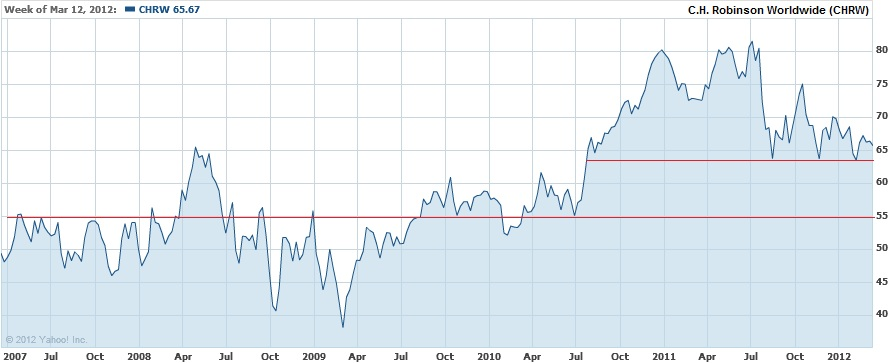
The second way to view CHRW's downside risk is strictly from the "technical" patterns based on a chart from the last 5 years.

3-16-2012

From a "technical" standpoint, there are significant support levels at $63.50, $55 and $38. These technical levels are not very different from Dow Theory even though the technical levels based on the chart above are strictly based on the visual cues. We specifically chose the last 5 years because Charles H. Dow has said that best way to gauge a company's future prospects is usually through careful consideration of the period when earnings, book value, price and other fundamental attributes are at their worst. For us, the inclusion of 2007 to 2009 is the best reflection of the worst that has been experienced recently.  With either approach to reviewing the downside risk of a stock, the purpose is ensure that you do not get caught off guard at the prospect of a major price decline.

Watch List Performance Review

In our ongoing review of the Nasdaq 100 Watch List, we have taken the topic 5 stocks from our March 6, 2011 Nasdaq 100 Watch List.   The top 5 companies from the watch list are provided below with the closing price from March 7, 2011 to March 6, 2012.

Symbol Company 2011 2012 % Change
CSCO Cisco Systems, Inc. $18.40 $20.03 8.86%
CEPH Cephalon, Inc. $56.17 $81.49 45.08%
AMGN Amgen Inc. $52.32 $67.38 28.78%
TEVA Teva Pharmaceutical Industries  $50.32 $43.08 -14.39%
ATVI Activision Blizzard, Inc $11.27 $12.65 12.24%
Average 16.12%
NDX Nasdaq 100 $2,328.07 $2,712.78 16.52%

3-6-2011 Top 5

Our primary goal at the New Low Observer is to achieve 10% gains within the span of a year inside of our tax deferred accounts.  In the case of AMGN, CEPH and ATVI our goal of 10% within a year was accomplished within the first four months.  CSCO was the last 10% gain that arrived at the end of the 1-year period.  Teva Pharmaceutical (TEVA) severely underperformed for the remainder of the 1-year period.  CEPH did not last very long since it was acquired by none other than Teva Pharmaceutical.  Cephalon was acquired by TEVA within two months of being on our watch list.

Our specific recommendation of Cephalon at $58.99 on February 15, 2011 and the subsequent acquisition explains why we’re drawn to companies at a new low.

4-Year Cycle Update

On June14, 2010, we wrote an article titled “AMarket Cycle Worth Observing.”  Inthat article, we proposed that there was significant validity in the beliefthat the stock market ebbs and flows in a 4 to 4 ½ year cycle.
In aneffort to make our point, we provided examples from Charles H. Dow, co-founderof the Wall Street Journal, and Richard Russell editor of the Dow Theory  Letters (www.dowtheoryletters.com).  The examples were drawn from the late 19thand 20th century.  The purposeof connecting such disparate periods was to show that regardless of the changein times, some attributes of the stock market remain intact.
In ourclosing paragraph on the 4-year cycle we said the following:
“If my observations on thistopic are correct, then we have at least until January 2011 to June 2011 beforethe half cycle is complete. Afterwards, the market would either trade in arange or establish a well-defined bottom in accordance with the 4 to 4 ½ yearmarket cycle.”
Ourarticle of June 14, 2010 came after an -11% decline in the Dow Jones IndustrialAverage.  Subsequent market action led tothe Dow Jones Industrial Average rising +25.71%.  Coincidentally, the Dow Industrials peaked onApril 29, 2011 at 12,810.54 with two failed attempts at reaching new highs inJuly 2011.
Because we’rewithin 9 months of the second half of the 4-year cycle, we believe that thereis approximately another year to go of the stock market continuing to trade ina range or reaching an ultimate low.  
For themarket to trade in a range we expect that the Dow Jones Industrial Average doesnot exceed the high of 12.810.54 by more than 10% while not falling below10,655.30.  If both the Dow Industrialsand Dow Transports exceed their respective highs we would view such action as anew cyclical bull market.  Our downsidetarget for an ultimate low on the Dow Jones Industrial Average is tentativelyset at 8,540.36.
Althoughgiving our prognostication one year in advance (as indicated in an April 2010posting below), we were off by only one month for the last peak in the market. Furthermore, the evidence suggests that the 4-year cycle is still inplay.  We feel that an appropriateinvesting strategy can be constructed around this concept.  If investing in stocks is a must, then we’drecommend considering the relatively undervalued current and former dividendincreasing stocks from our latest dividend list below.
Symbol
Name
Price
P/E
EPS
% Yield
Price/Book
% from Low
Tootsie Roll
23.77
32.82
0.72
1.40
2.03
4.12%
C.R. Bard, Inc.
85.81
22.05
3.89
0.90
3.96
6.14%
Becton, Dickinson
74.24
13.22
5.62
2.50
3.26
6.70%
John Wiley & Sons
44.77
15.7
2.85
1.80
2.66
6.88%
California Water Service
17.83
18.29
0.98
3.40
1.64
7.09%
Owens & Minor
27.8
15.61
1.78
2.90
1.93
7.46%
Clorox Company
67.76
19.54
3.47
3.60
-116.98
8.64%
West Pharmaceutical
38.55
21.28
1.81
1.90
1.85
8.73%
Frisch's Restaurants
20.27
22.93
0.88
3.30
0.8
9.92%

Dow Theory: 1903-1907

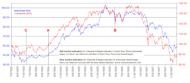
Bull market indication (A):According to Edwards & Magee's book Technical Analysis of Stock Trends, the bull market began at point A. From the point of the bull signal to the respective market tops, the DJI gained 100% and DJT gained 37%. The NLO team believes that at point (C) on 12/4/1903, the DJI confirmed the 11/30/1903 DJT signal that a bull market was in progress by exceeding the late Oct 1903 peaks. From the point of the bull signal to the respective market tops, the DJI gained 126% and DJT gained 47%.
Bear market indication (B): On 4/24/1906 the DJI confirmed the 4/19/1906 DJT bearish move. The signal came when the DJT dropped below the Sept 1905 low and the DJI dropped below the December 1905/March 1906 lows. From the point of the bear signal to the respective market bottoms, the DJI lost -42% and the DJT lost -35%. The NLO team is in agreement with the Edwards and Magee as to when the bear market began.
Please consider donating to the New Low Observer. Thank you.

Dow Theory: 1900-1903

The following is the beginning of a series that examines prior bull and bear market indications according to Dow Theory since 1900.  We will include opinions and insights from the leading Dow Theory proponents and commentators from the respective periods, whenever possible.
Industrials (DJI), Transports (DJT)

Text in chart:

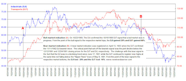
Bull market indication (A): On 10/22/1900, the DJI confirmed the 10/16/1900 DJT signal that a bull market was in progress.  From the point of the bull signal to the respective market tops, the DJI gained 29% and the DJT gained 60%.
Bear market indcation (B): A bear market indication was registered on April 13, 1903 when the DJT confirmed the 11/11/1902 DJI bearish move.  The critical point that set off the bearish signal was the joint delcine below the 12/12/1901 and 12/24/1901 closing prices for the DJT and DJI, respectively.  The challenge with this bear signal is the fact that the DJI was in a declining trend since June 17, 1901 while the DJT continued to register new highs at the same time not falling below the "Nipper Panic" lows of May 9, 1901.  From the point of the bear signal to the respective market bottoms, the DJI lost -30% and the DJT lost -16%.

Our Primary Concern: Retaining Profits

We have frequently claimed that our goal was never to have trading strategy while dealing with dividend paying stocks.  In fact, the whole purpose of mining the field of dividend stocks is to increase the odds that we can compound our investment income.
However, a recent example reminds us of the importance of being cognizant that “good” stock selecting isn’t enough.  Adherence to Charles H. Dow’s concept of recognizing values and seeking fair profits is critical to long-term success in the stock market.
In the article titled “When Timing Meets Opportunity,” we’ve outlined the importance of timing when selecting stocks.  That article demonstrated that a focus on stocks near a new one-year low was about as good as any time for starting investment research.  Stocks at a new low represent the best marker for determining values.  Keep in mind that our focus is on stocks that increase their dividend every year or members of the Nasdaq 100.  Thereafter, an individual would need to run through whichever fundamental and technical analysis necessary to make a decision that seems appropriate.  Our philosophy is to consider our portfolio allocation based on what Dow Theory indicates.  If we’re in a bull market we have a higher concentration in a single stock.  If we’re in a bear market then we have lower concentration in a single stock. In general, this addresses the “value” component according to Charles H. Dow.
The aspect regarding seeking fair profits, another Charles Dow tenet, was outlined in our article titled “Seeking Fair Profits in Investment Portfolios.”  That article specifically references quotes by Charles Dow regarding when to take a profit on a stock.  Strangely, Dow recommended taking “fair profits” of 5%.  The New Low Observer Team is a little more adventurous since we seek 10% or more.  However, the point remains that as investors we need to put our expectations in perspective before we commit our money.  Not after we’re stuck with large gains or losses.
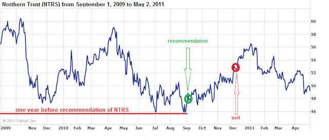
A recent example that we have come across is the case of Northern Trust (NTRS).  Northern Trust (NTRS) typifies what usually happens to a well-timed play on values when the appreciation for “fair profits” isn’t understood.  Northern Trust was recommended on September 1, 2010.  This was almost literally at the one year low from the period of September 1, 2009 to September 1, 2010.
After receiving “only” 10.96% in a period of 64 days, we issued a Sell recommendation on Northern Trust (NTRS) feeling that an annualized gain of nearly 40% wasn’t worth quibbling about.  In the sell recommendation, we indicated that we expected the upside target to be first $56 and thereafter $59.  Almost as impossible as it seems, Northern Trust peaked at $56.86 and turned down from there.  Nearly 7 months on, Northern Trust (NTRS) has ranged from a 19% gains to the current 4%. In addition, this represents a loss of nearly half of the gain that was generated at the time of our sell recommendation.
The situation with Northern Trust typifies our experience and observation when investing in dividend increasing stocks.  Great companies with considerable qualitative elements rise for a moment and revert back to their prior low for inexplicable reasons.  In regards to the general ebb and flow of individual stocks, we’re primarily concerned with accepting what is reasonable and fair rather than what we typically want which is usually for the stock to got back to the previous one-year high.
As rudimentary as it seems, we feel that an understanding of values and seeking fair profits, as espoused by Charles Dow, is essential to long-term success in the stock market.
Please revisit New Low Observer for edits and revisions to this post. Email us.