
- Japan
- Market Indicator
- Price Momentum Indicators
- Richard Russell
- Silver
- Speed Resistance Lines
- U.S. Dividend Watch List

As the Dow Jones Industrial Average and Dow Jones Transportation Average have achieved highs above their respective 2007 peaks, the Dow Jones Utility Average has not fared as well. In fact, the Utility Average has been in a declining trend since April 2013.
It has been almost two months since our last Dow Theory posting. This is as it should be, since Dow Theory does not require a daily accounting of changes to the market. As indicated in Robert Rhea’s The Dow Theory:
“There are three movements of the averages, all of which may be in progress at one and the same time. The first, and most important, is the primary trend: the broad upward or downward movements known as bull or bear markets, which may be of several years’ duration. The second, and most deceptive movement, is the secondary reaction: an important decline in a primary bull market or rally in a primary bear market. These reactions usually last from three weeks to as many months. The third, and usually unimportant, movement is the daily fluctuation.” (source: Rhea, Robert. The Dow Theory. Barron’s, New York. 1932. Page 32.)
Posted in Dow Industrials, Dow Theory, Dow Theory Bull Market indication, Dow Transports, downside
Tagged members
Since the bull market run began in 2009, Apple (AAPL) analysts have been making persuasive arguments for the stock. The fundamental case for Apple includes price-to-earnings, price-to-sales, cash reserves, China as an untapped market, etc. However, as investors have found out, it is the price that matters most as Apple’s stock has taken a hit from the high of $702 on September 19, 2012 to the current price of $443 (March 18, 2013). While fundamentals are important, there is one obvious problem and that is the trading volume.
In the section on Dow Theory, in the Edwards and Magee book Technical Analysis of Stock Trends, volume is interpreted in the following manner:
“…in a Bull Market, volume increases when prices rise and dwindles as prices decline; in Bear Markets, turnover [volume] increases when prices drop and [volume] dries up as they [prices] recover (33).”
When we compare the previous bullish moves in Apple’s stock price, we find that the most recent run-up stands out as trading volume has not only failed to increase with the stock price, it has been on a divergent path by declining. However, we need to see how different this most recent rise in the stock price is in contrast with the previous bullish moves.
In the bull market run of Apple from December 30, 1997 to February 29, 2000, the stock price rose +900% while average trading volume increased +1,000%.

In the bull market run of Apple from April 1, 2003 to December 30, 2007, the stock price rose over +1,400% while average trading volume increased +1,000%.

In the bull market run of Apple from January 21, 2009 to the present, the stock price rose nearly +900% while average trading volume decreased -51%.

The obvious problem with the current rise in the price of Apple from the January 21, 2009 low to the September 19, 2012 high is that while the stock price has increased dramatically, the trading volume has fallen precipitously. Already, Apple has inexplicably declined –36% from the high. There is little in the way to indicated that the blood-letting is over.
According to Robert Rhea, in his book The Dow Theory, “…the volume of trading has proved to be such a useful guide in attaining proficiency in the art of forecasting market trends that it is necessary to urge all students to study intently the relation of volume to price movement (88).”
It would be foolish for us to think that the decline in volume, from 2009 to the present, while the stock price increased wasn’t a warning sign. It is suggestive of the fact that all was not well and therefore the party had to end at some point in time. This is despite the otherwise glowing fundamentals that are associated with Apple.
Now, if the almighty Apple can decline –36% in spite of the glowing fundamentals as the Dow Industrials and Dow Transports keep going higher, then what is the fate of two main components of Dow Theory? By all indications, we should be considered to be in a bear market based on the fact that the price of the Industrials and Transports is increasing as the trading volume dries up.
From our vantage point, there are two distinct outcomes possible for the stock market, based on the above quoted sources. Either the stock market explodes higher than anyone has ever imagined possible or the stock market declines, –20% to –30% from the current level, as average trading volume skyrockets. However, our experience so far has been for volume to decrease as the price increased. Therefore, by our logic, when and if volume starts to increase it will be because institutions will be selling instead of buying the market.
While we have constructed two possibilities, the probabilities are something else altogether. We think that the fact that volume has been in a clear declining trend, the probabilities favor a decline of the stock market over a sustained increase. To put this idea into perspective, when we wrote our April 14, 2012 article titled “Consider the Downside Prospects for Apple,” we said that Apple would decline to $424 (found here). After the article was written, Apple increased by +11%. However, after Apple peaked, the stock declined –30% from the price where our article was written. Our only question is, was it worth seeing a rise of +11% only to realize a loss of –30%?
Notes:
Comments Off on Apple’s Pain May Be a Warning for the Dow Indices
Posted in AAPL, Dow Industrials, Dow Theory, Dow Theory Non confirmation, Dow Transports
When discussion of market valuation comes up, the mention of price-to-earnings ratios (p/e ratio) is often brought up to possibly explain if the market is overvalued or undervalued. The arguments generally follow along the line of reasoning that when the stock market rises then so too will the p/e ratio which will indicated when the market is overvalued on a relative basis. Alternatively, when the stock market is in a declining trend, the p/e ratio will also decline to historical lows allowing for a good indication of when the market is undervalued. The point usually is that there is a correlating relationship between the rise and fall of the stock market and p/e ratios.
While the line of reasoning regarding p/e ratios and stock market valuation is logical and can easily be demonstrated over a majority of stock market history, there have been periods when an inverse relationship between the stock market and the p/e ratio suggests a shift in market direction. The periods of an inverse relationship should shed light on the challenges and limits of using p/e ratios for determining market valuation. The following are examples of periods where high p/e ratios represented a stock market that either has nearly bottomed or was about to take off and periods when a low p/e ratio indicated that the market was about to trade in a range or decline.
Starting with the first example of an inverse relationship between the S&P 500 and the p/e ratio (data compiled by Robert Schiller; S&P 500 index did not exist before 1957) was the period of 1905 as seen in the chart below.

The short period of time that this conflicting signal occurred was followed by both the inflation-adjusted S&P 500 and the unadjusted Dow Jones Industrial Average being mired in substantial underperformance in the period from 1905 until 1924-27 as seen in the charts below.


According to Robert Schiller’s work, on an inflation adjusted basis, the S&P 500 meaningfully broke above the 1905 level in 1927 while the Dow Jones Industrial Average achieved new heights after 1924. Within this extended period of time from 1905 to 1927, the inverse relationship between the real S&P 500 index and the p/e ratio occurred again during June 1913-November 1914 period, where the index declined while the p/e ratio increased. This was followed by an increase in the real S&P 500 from December 1914 to December 1915 before the overall decline continued to the 1921 low.
The low of the stock market in 1921 was punctuated with the stock market exceeding a p/e ratio of 50 times before going into deficit due to a lack of earnings. This happened to be the time when the Dow Jones Industrial Average was at 65 before going to the 1929 high of 381 and the real S&P 500 at 83 before the 1929 high of 416, as tabulated by Schiller-S&P.
Another significant period when the p/e ratio of the market declined in the face of a rising market was January 1929 to November 1929. During this period, The Dow Industrials increased from 296 to 381 and the real S&P 500 increased from 311 to 416, or 27% and +33%, respectively. The chart below shows the p/e ratio for ALL S&P Industrials in the period from January 1928 to November 1929 (source: Fisher, Kenneth. The Wall Street Waltz. Contemporary Books, Chicago. 1987. page 68-69).

This is an instance where the stock market still had plenty of room to run on the upside in 1928 and much less upside potential as 1929 was coming to an end. The performance of the S&P 500 after this mixed signal was –80%. In the January to November 1929 period, the Dow Industrials saw the p/e ratio decline from 19 to 14.
Punctuating the inverse relationship between p/e ratios and the market’s valuation was the period from 1932 where the p/e ratio for the Dow Jones Industrial Average rose well above 50 and ultimately went into deficit at a time when the stock market, despite the onset of the “Great” Depression, was to move higher and never look back.
The next period of a clear inverse relationship between the stock market and the p/e ratio was from 1934 to 1937 as indicated in the chart of the Dow Jones Industrial Average below.

The culmination of this inverse relationship was the 1937 peak in the Dow Jones Industrial Average which was followed by a -50% decline in the index to the 1942 low. As the market declined from the 1937 peak, the p/e ratio for the Dow Industrials began to rise to above 25 times in 1938. The Dow Industrials, with the p/e ratio catapulting from the low of nearly 14 times in 1937 to over 25 times in 1938, gained +50% from March 1938 to November 1938.
The next period of divergence between the stock market and its respective p/e ratio was from 1960 to 1973 when the Dow Industrials rose from 700 to 1,050 as the p/e ratio declined from 21 times to 11 times. The Dow Jones Industrial Average was not able to meaningfully exceed the 1,000 mark until 1982.

This same scenario has been played out in individual stocks, with the p/e ratio declining as the stock rises and the p/e ratio rising substantially as the stock declines. Our interpretation of these significant “outliers” is that they may render the use of p/e ratios, as a determining factor of market under/overvaluation, relatively challenging. This does not mean that such ratios cannot be useful for valuation metrics. Instead, it suggests that such a consideration should be put into proper perspective with the understanding that there is a limit to the value that price-to-earnings ratios can provide in determining market valuation.
To us, the most important element that needs to be incorporated when considering the p/e ratio is when it didn’t seem to work as expected for the respective stock or index. In the examples given above, the exceptions should prove to be instructive when deciding if a favorite stock or index is over-valued or under-valued.
Posted in Dow Industrials, P/E ratio, S&P 500, values
Barron’s attempts at Dow Theory has failed miserably…again. In the September 29, 2012 article by Jacqueline Doherty titled “Broken Dow Theory,” it is suggested that “A lagging transportation sector historically has been considered a bad omen…” and then recites the standard, sub-standard nomenclature “…less shipping means fewer goods are being produced and purchased, which means the economy is slowing and the stock market could be headed for a fall.” Doherty goes on to cite data from Bespoke Investment Group asserting that even though the Transportation index has fallen behind the market in general, it may not mean that the stock market, as represented by the S&P 500, necessarily needs to follow the same script.
Fortunately, Dow Theory is very specific about how to interpret the Dow Jones Industrial and Transportation Averages since the publication of Robert Rhea’s book The Dow Theory. Nowhere in the rules of Dow Theory is there any indication that the vacillations of the S&P 500 are remotely part of the interpretation of the theory. Especially since the S&P 500 came onto the scene over 60 years after the creation of the Dow Industrials.
Despite the fact that there are some Dow Theorists who frequently use the S&P 500 as a substitute for indications of a rising or falling market (this isn’t Dow Theory), there is little evidence that using the additional index is necessary. Alternate indexes are only necessary when and if the Dow Jones Industrial and Transportation Averages no longer exist.
While the prevailing opinion is that the Dow Industrials isn’t a relevant index reflective of the market as a whole, a distinction should be made between a “lagging” index and a “divergent” index. A lagging index is one which is going in the same direction as the other but is not increasing/decreasing at the same rate. A divergence is when one index goes up while the other index is going down. The chart below shows two failures and one divergence between the Industrials and Transports.
![image_thumb[8]](https://i0.wp.com/www.newlowobserver.com/wp-content/uploads/2012/10/image_thumb8.png "image_thumb[8]")
When one index cannot make new highs in accordance with the other index, it should be considered a significant failure and a warning sign. A perfect example is when the Transportation Index made a new high in 2008 and the Industrial Index could not follow through. The subsequent decline in both indexes was staggering.
In situations where there has been a divergence between the Dow Industrials and Transports, it is the Transports that typically leads the divergence to the upside or downside, meaning that the Transports will provide a clue as to the potential market direction in spite of the action of the Dow Industrials. Although historically this has been the case, Barron’s has unwittingly legitimized the view that the spread between the Dow Industrials and Dow Transports is some form of Dow Theory. In no way is this the case. In fact, in the period from 1896 to 1984, the Transports have exceeded the Industrials, on a percentage basis, 15 out of 25 Dow Theory bull and bear market moves.
| Year | DJI beat by | DJT beat by | Year | DJI lost by | DJT lost by | ||||||
| 1896 | 33.50% | 1899 | -13.30% | ||||||||
| 1900 | 51.00% | 1902 | -6.40% | ||||||||
| 1903 | 88.60% | 1906 | -7.30% | ||||||||
| 1907 | 24.50% | 1909 | -5.30% | ||||||||
| 1910 | 10.10% | 1912 | -13.80% | ||||||||
| 1914 | 78.70% | 1916 | -3.10% | ||||||||
| 1917 | 64.80% | 1919 | -26.00% | ||||||||
| 1921 | 18.40% | 1922 | -2.30% | ||||||||
| 1923 | 192.30% | 1929 | -3.80% | ||||||||
| 1932 | 15.60% | 1937 | -21.40% | ||||||||
| 1938 | 20.60% | 1938 | -6.40% | ||||||||
| 1939 | 20.30% | 1939 | -5.30% | ||||||||
| 1942 | 64.40% | 1946 | -16.50% | ||||||||
| 1947 | 39.40% | 1948 | -20.50% | ||||||||
| 1949 | 92.50% | 1953 | -6.50% | ||||||||
| 1953 | 3.80% | 1956 | -27.80% | ||||||||
| 1957 | 819.90% | 1959 | -12.40% | ||||||||
| 1960 | 5.80% | 1961 | -2.90% | ||||||||
| 1962 | 48.80% | 1966 | -7.00% | ||||||||
| 1966 | 19.20% | 1968 | -22.30% | ||||||||
| 1970 | 82.40% | 1972 | -14.50% | ||||||||
| 1974 | 10.00% | 1976 | -13.10% | ||||||||
| 1978 | 86.50% | 1981 | -10.60% | ||||||||
| 1982 | 44.00% | 1983 | -9.70% | ||||||||
| 1984 | 177.80% | 1984 | -31.00% | ||||||||
| DJI | DJT | DJI | DJT | ||||||||
| Total | 520.50% | 1592.40% | Average: | -9.65% | -14.18% |
The table above reflects the percentage by which the respective indexes exceeded the other from either the bull market low or the bear market top. In the timeframe indicated above, the Transports have routinely exceeded the Industrials to the upside by nearly three times. The same is true for Dow Theory bear market moves where the Transports have excessive downside moves as compared to the Dow Jones Industrial average by nearly 50%.
The pattern of excessive gains and losses in the Transports versus the Industrials has remained the case since 1984. As an example, at the peak in 2007, the Dow Industrials declined –54% while the Transports declined –60%. On the rise from the 2009 bottom, the Industrials and Transports registered gains of +110% and +162% based on their respective peaks. Excessive gains and losses, by the Transports above that of the Industrials, demonstrates that the Transports usually act as a leading indicator of market direction.
It should be noted that before the work of Wall Street Journal editor William Peter Hamilton and author Robert Rhea on the topic of Dow Theory, Charles H. Dow (co-founder of the Wall Street Journal) created and analyzed the Rail Index (now Transports) without the existence of the Dow Industrials for 12 years, from 1884 to 1896, for indications of market direction. Those 12 years are the basis of what Dow was able to formulate his observations on the market.
Unfortunately, the Barron’s article goes on to quote a CIO who states that the “…Nasdaq 100 and S&P 500 are better leading indicators than the transports.” Based on the available data, the Nasdaq 100 has not been able to exceed the all-time high set in January 2000. Additionally, the S&P 500 has not managed to exceed the all-time high set in October 2007. In the bull market run since the 2009 low, the Transportation Average has managed to exceed its all-time high unlike the Nasdaq 100 and S&P 500.
Finally, Barron’s quotes data from Bespoke which reviews, “…periods when the S&P 500 exceeded the transport index by 10 percentage points over a 50-day trading period. Going back to 1928, the S&P 500 gained 1% in the subsequent six months, not awful although below the average six-month gain of 3.5%.” Using a “50-day trading period” to arrive a conclusion about the next six months is inadequate in making even a cyclical determination of a bull or bear market based on Dow Theory, let alone a secular indication. Dow Theory is about the primary trend of the market which tends to last from 3-4 1/2 years at a time.
In order to make a “complete” secular and cyclical analysis based on Dow Theory, interpretation should begin at the prior dual Industrial and Transport peaks in 2007/2008, at minimum. Until there is a dual Industrial and Transport new high, cyclical new highs in one index or the other would be a bear market reaction as indicated in our August 9, 2011 note titled “Bear Market Rally Targets.” Our indication that a bear market rally was about to take place was with 2% of the October 3, 2011 low, giving full opportunity to seek out new investment opportunities before the bear market rally to the current peak in the Industrials. The current divergence of the two indexes is confirmation of the fact that we’re still in a bear market rally until the prior 2009-2011/2012 highs are exceeded for a cyclical bull market and all-time highs for a new secular bull market.
Until 1956, Barron’swould include Dow Theory analysis in the Market Laboratory section every week. Since 1956, Dow Theory would show up only in feature articles from experts on the topic. Now, it seems that anyone making mention of either the Dow Industrials or Dow Transports can suffice as knowledgeable on the topic of Dow Theory.
Naturally, there are many critics who adamantly speak out against Dow Theory, which is surprising since Charles H. Dow’s work of creating the Wall Street Journalalong with his theories of the stock market are the foundation of both fundamental and technical analysis in the United States. However, the critics, even without knowing the nuances of Dow Theory, are justified in their claims especially when the “analysis” is so incomplete and inaccurate.
If the goal is to do away with Dow Theory and eliminate the indexes then that is fine. However, if the goal is to actually interpret the theory in some mediocre fashion then it should be done by someone who has actually studied the topic extensively. Barron’s, a place where William Peter Hamilton and many other great Dow Theorists were prominently featured, is doing a disservice by connecting unrelated and disparate themes and suggesting that somehow the theory is “broken.”
Comments Off on Dow Theory: Not Broken, Just Misunderstood
Posted in Barron's, Charles H. Dow, Dow Industrials, Dow Theory, Dow Transports
Tagged members
An article titled “Apple-less Dow faces changes to make-up,” found in the Financial Times, suggests that the current owners responsible for the composition of the Dow Industrials are considering ways to make it possible to add Apple (AAPL) to the 116-year old index. The myopic view of changing the Dow Industrials simply for the purpose of adding AAPL will haunt the index managers and investors alike.
In the past, the changes in the composition of the Dow have been ill-timed to begin with. In our article titled "Dow Jones' Decline Largely Impacted by Index Changes," we highlight the fact that composition changes routinely negatively impacted the Dow Industrials. Additionally, we have demonstrated that the changes to the Dow Industrials from 1929 to 1932 was the sole contributor to the decline of the index by -89%, when compared to the Barron's 50 Index in the same time frame.
In a follow-up article titled “After the Crash, Recovery was Faster Than Most People Think” we show how the irresponsible changes to the Dow Industrials from 1929 to 1932 was the reason for the index to take 25 years to get back to the 1929 high.
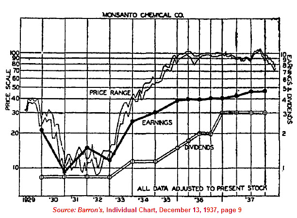
We’ve shown that many high quality stocks (the purpose of the Dow Industrials is to represent “high quality” stocks) were able to reach their 1929 high in 8-9 years instead of 25 years like with the Dow Industrials (as reflected in the Monsanto Chart below). The extended delay in getting back to the prior high was due solely to a losing trader's mentality of buying high and selling low applied to addition and subtractions to the Dow Industrials.
The recent addition of Unitedhealth Group (UNH) to the Dow Industrial Average, replacing Kraft Foods (KFT) exemplifies the "buy" high mentality of those who manage the index. United Health is being added after nearly 215% gains in the stock since the March 2009 low. This compares to "only" a 100% gain in Kraft Foods since the same starting point, see chart below.

To emphasize our point, since the March 9, 2009 low, the following are the major index returns:
As the theory goes, the performance of a well diversified index should achieve moderate gains and moderate declines. The Dow Industrials have performed as though it was a well diversified index, rather than one composed of only 30 companies. On the flip side of the diversification theory, a highly concentrated portfolio should have higher volatility both up and down. For a sense of perspective, the Russell 2000 does not contain Apple while the Nasdaq Composite does. The absence of Apple in the Russell index did not inhibit its ability to effectively match the performance of the Nasdaq Composite.
As we’ve pointed out in our article titled “Broader Market And Dow Theory Suggest Proceeding With Caution,” if the Value Line Geometric Index is any indication, broad participation of the rise from 2009 is faltering (see chart below).

This is a warning that the narrow focus on a few companies at the top (based strictly on market cap) is going to collapse upon itself or more focus on values not related to the largest cap stocks is necessary. Market history suggests that broad based equal-weighted indexes that don't make new highs is the canary in the coal mine. Anyone seeking Apple’s (AAPL) inclusion to the Dow Industrials are fated to repeat the mistakes of the past with unsurprising outcomes to follow.
Comments Off on “Apple-Less Dow” is a Good Thing
Posted in AAPL, Apple Computer, Dow, Dow Industrials, Dow Transports
Below is a chart of the Dow Jones Industrial Average Altimeter. Our best interpretation of the current altimeter pattern is that the Dow Industrials need to exceed the previous high set in April of 2011 in order for us to feel that a new bull market has emerged.

As we’ve described before, the Altimeter reflects the relative value of a stock or index compared to the dividend that is paid. Those interested in knowing what the dividend for the Dow Industrials is can find that information in Barron’s Market Laboratory section under Indexes’ P/Es & Yields (found here).
Surprisingly, the formation of the Dow Industrials Altimeter is exactly the same formation as the Value Line Geometric Index, as seen in the chart below:

In a previous article (found here), we talked about how the Value Line Geometric Index (VLIC) is an equal weighted index that reflects how all stocks are doing since the bull market began in the first quarter of 2009. The fact that the Value Line Geometric Index has not achieve a new high suggests that there is limited participation by all stocks in the market. Therefore, confidence in new highs by large cap stocks, as reflected in the Dow Industrials and S&P 500, should not be trusted.
We believe that there is limited upside potential based on the Dow Theory non-confirmation (article found here) and the broader market as reflected in the VLIC Index.
We have indicated in our August 2, 2011 posting (found here) the fact that we are now in a bear market. According to Dow Theory, the primary trend remains in place until the opposite indication has been signaled. This is best described by Richard Russell in the following remark:
“…the Dow Theorist has learned that the last trend should be considered to remain in effect until the contrary has been proved”[1].
We believe that there has not been a reversal of this bear market indication as outlined in our August 7, 2012 Dow Theory analysis (found here).
Despite getting a bear market signal only days earlier, on August 9, 2011 we indicated that a bear market rally (found here) was likely to take place. Our work on the topic of Dow Theory at that time indicated that there was upside potential to go as far as the prior highs (12,807.51). From the August 9th low, the Dow Industrials rose as high as 13,338.70, or +23.38%.
From our experience on the topic, bear markets usually connote declines of -30% or more. However, the bear market that we’ve experienced so far can be characterized from a slight dip to a nice market run to the upside. While the Dow Jones Industrial Average and the Dow Jones Transportation Average have diverged overall, there has been nothing that we’ve seen since August 2, 2011 to make a person feel like any confidence in the indication. After all, it has been over a year since the signal and no real fireworks. Was it really worth reducing market exposure for a non-event?
Since this bull market move began on March 9, 2009, there have been sizable declines of -14% or more in 2010 and 2011 before the stock market continued higher. The best we can do at this point is assume that 2012 is due for a correction in line with the two previous years and see what the downside prospects might be.
| period of decline | Dow Industrials % change |
| April 26, 2010-July 2, 2010 | -14.60% |
| May 2, 2011-October 3, 2011 | -19.19% |
| May 1, 2012-???? | -2.09% |
| period of decline | Dow Transports % change |
| May 3, 2010-July 6, 2010 | -18.72% |
| July 7, 2011-October 3, 2011 | -28.11% |
| March 15, 2012-???? | -6.39% |
Because a bear market decline of -30% or more has not taken place, the best we can do is assume that a similar decline to 2010 and 2011 is the most likely outcome…for now. The previous declines, within the context of a bull market, have averaged –16.90% for the Dow Industrials and –23.42% for the Dow Transports.
If the Industrials were to decline from the current level by –16.90% it would fall to 11,035.12. If the Transports were to decline from the current level by –23.42% it would fall to 4,096.84.
As described in our Dow Theory analysis from August 7, 2012 (found here), there are two overhanging non-confirmations of a bull market. This means that the overall trend of the Industrials and Transports should eventually be down. In our negative bias against an new bull market, particular emphasis is weighted against the Transportation Index which has been falling while the Industrial Index has been rising.
However, the last week of August has provide the Dow Industrial Average with what we consider a double-top. Although not the most classic double top, it is still a double top.

Double tops and double bottoms were indicated to be very important formations according to Charles H. Dow. Alternatively, William Peter Hamilton and Robert Rhea arrived at the conclusion that such formations bear little importance when considering the price movement of the indexes.
From our own work on the topic of double tops and double bottoms, we have found that Dow was right about the importance of such a price characteristics and have been able to prove, with significant evidence throughout the history of the Dow indexes, that double tops and double bottoms are critical indicators for determining market direction when applying Dow Theory.
In this case, a double tops mean that the direction for the stock market is down. Since the bear market signal, based on Dow Theory, hasn’t resulted in a decline of over -30% for either the Transports or Industrials, were proposing that at the very minimum a decline of 13%–15% should be expected.
[1] Russell, Richard. Richard Russell’s Dow Theory Letters. Issue 166. December 27, 1961. page 1.
Dow Theory Review
Charting a Path for the Dow
Now comes the challenge of determining the downside targets for the Dow Jones Industrial Average. To accomplish this task, we’ve gone back to the secular bear markets of 1906-1924 and 1966-1982 for some insight as to what might occur going forward. It is important to understand that the signature of a secular bear market is that it will not increase very much above the initial peak and declines significantly below the initial peak multiple times.
In the chart below, we have the price action of the Dow Jones Industrial Average from 1906 to 1924.

In the chart below, we have the price action of the Dow Jones Industrial Average from 1966 to 1982.

There is considerable debate about where the peak of the current secular bear market began. Although we believe that the secular trend began at the 2007 peak, we’re being conservative by considering that the most recent secular bear market began at the 2000 peak, as represented in the chart below.

Beneath each trough is the number corresponding to the major declines within the secular bear market. In each chart there are at least three major market declines while the peaks remain in close proximity to the original market peak.
It is our view that the first decline of the Dow Jones Industrial Average in the secular bear market trend later becomes a minimum downside target. In the current market, we believe that the Dow Jones Industrial Average will revisit the 8,200 level. If the Industrials were to revisit the 8,200 level, the total decline would be approximately -32% from the closing price of June 1, 2012.
Review
Posted in Dow Industrials, Dow Theory Non confirmation, Dow Transports
Tagged members
As a stock market historian, the single best benchmark for all market analysis is the years from 1929 to 1954. This is the period when the Dow Jones Industrial Average peaked at 381.10 in 1929 and fell to the astoundingly low level of 41.20, a decrease of 89.19% in a period less than three years. 1954 was the year when the Dow Jones Industrial Average finally went above the 381.10 level and never looked back.
In my article titled "Dow-Jones' Decline Largely Impacted by Index Changes" on SeekingAlpha.com, I explained that the Industrial Average probably would have never gone as low as it did nor would it have remained below the 1929 peak for as long as it did had it not been for the frequent changes to the index which resembled a trader’s mentality rather than a “long-term” investor. In the following article, I wish to demonstrate that, the market actually recovered much faster than most people think. Additionally, if we were to experience a similar 89% decline in the stock market, we probably can expect that the subsequent recovery would come faster than we think.
Below are a list of 28 companies that reflects their respective high price of 1929 and the low price of 1932. The percentage decline in some cases mirrors what happen to the Dow-Jones Industrial Average with all of the changes to the index during the same timeframe.

As we can see, many companies were dramatically impacted by the decline from 1929 to 1932. However, what is most surprising is the time it took to achieve the break-even point. Exactly half of the companies on the list managed to break even after only eight years in 1937. This is less than the time it took for our current market to get back to the 2000 break-even point. One of the more fantastic recoveries that I’ve seen is the price of Dow Chemical, which recovered all of its losses by 1933. This required a 233% gain in less than a year after hitting bottom.
Another point that can be made for these companies is that if taken as a group (similar to a stock index) it took an average of 12 years for the index to break even. This is in stark contrast to the Dow Industrials finally closing above the 1929 peak in 1954, some 25 years later. This also splashes considerable water on the theory that it was WWII that finally got the stock market (economy) out of the “Great” Depression. The break even of the market based on my calculations explains why 1941-1943 was the beginning of a new bull market according to Dow Theory (depending on the Dow Theorist that you want to believe). That bull market indication was in force until 1966.
If this data seems suspect, then it probably is. After all, I selected the companies that fit my model. Critics could also claim that my retrospective analysis works great in theory but doesn’t hold up to the real world. Others could say that changes to the Industrial Average was necessary and meant that the prior companies didn’t reflect the qualitative standards of a premier index of the Dow. However, a careful analysis of Poor’s High and Low Prices for the periods from 1924 to 1940 would show that an alarmingly large number of companies, both high and low quality, achieved a break even in their respective prices long before the year 1954.
see also:
Posted in Dow, Dow Industrials