Category Archives: Dogs of the Dow

Income Bellwethers: October 2019

In October 2019, Morningstar.com published their DividendInvestor which contains their Income Bellwether Watchlist.  Below is the performance of the stocks based on the top highest and lowest dividend yield from September 11, 2019 to September 11, 2020.

image

As the data continues to demonstrate, low yield generally outperforms high yield.  This has been resoundingly shown in our Dogs of the Dow in the period from 1996 to 2019.

  • Of the stocks that beat the performance of the S&P 500 gain at +11.33%, 75% had dividend yields below the average yield (3.25%) of the entire watchlist.
  • The entire list of stocks lost -5.73%.
  • The conversion/merger of United Technologies marginally impacted return data.
  • Of note is the change in the performance by selecting the 2nd, 3rd, 4th stocks versus the top 3.
  • The 2,3,4 group beat the S&P 500 by 0.74%.
  • Only the top ten low yield stocks did not beat the Dow Jones Industrial Average.

see also:

Income Bellwethers: September 2019

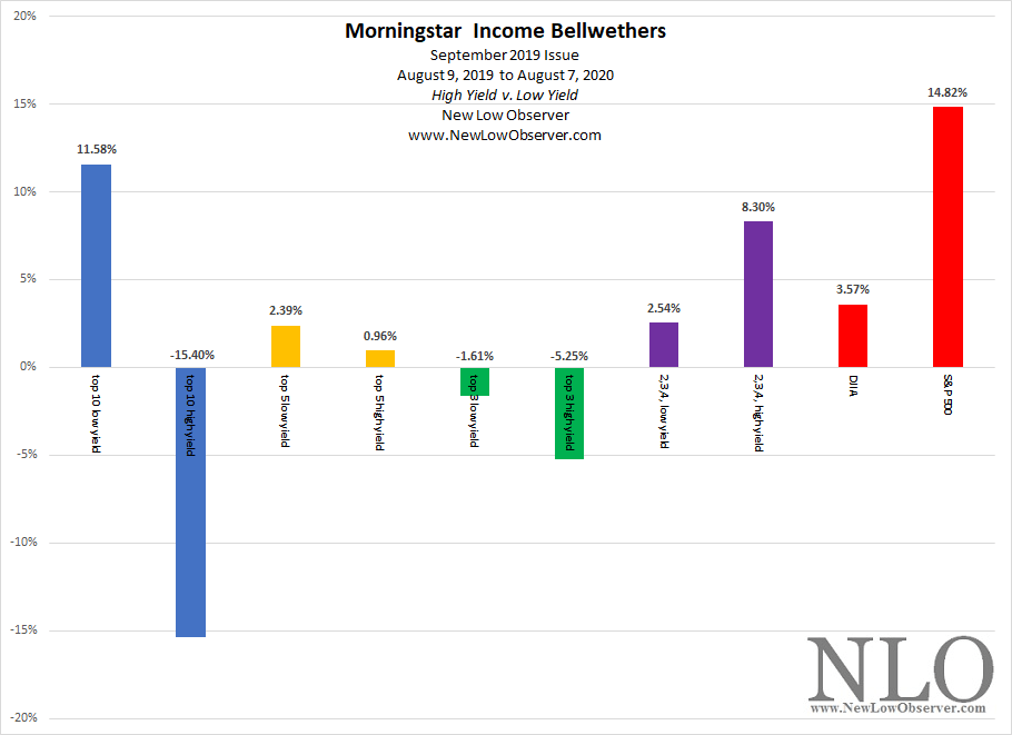
In September 2019, Morningstar.com published their DividendInvestor which contains their Income Bellwether Watchlist.  Below is the performance of the stocks based on the top highest and lowest dividend yield from August 9, 2019 to August 7, 2020.

image

As the data continues to demonstrate, low yield generally outperforms high yield.  This has been resoundingly shown in our Dogs of the Dow in the period from 1996 to 2019.

  • Of the stocks that beat the performance of the S&P 500 gain at +14.82%, 74% had dividend yields below that average yield of the entire watchlist.
  • The entire list of stocks gained +1.72%.
  • The conversion/merger of United Technologies marginally impacted return data.
  • Of note is the change in the performance by selecting the 2nd, 3rd, 4th stocks versus the top 3.
  • No group beat the S&P 500 which is severely affected by lopsided market weighting.
  • Top 10 low yield stocks beat the Dow Jones Industrial Average.

see also:

Dogs of the Dow: 1994

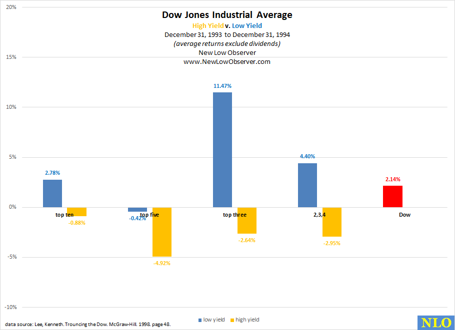
In our continued pursuit to gather data that contradicts our view that low yield stocks outperform the high yield stocks (aka Dogs of the Dow) as presented in Michael O’Higgins’ book Beating the Dow, we have obtained the performance of the top ten, top five, top three and the 2nd, 3rd, and 4th stocks in the high and low yield groups then contrasted their performance against the Dow Jones Industrial Average for the same year.

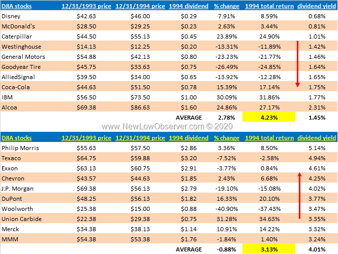
In this case, the year under consideration is 1994 and we have added the list of ten stocks and their price with the dividend yield.

image


1994 Data Breakdown

image

After reviewing the data and adjusting for splits, the Dogs of the Dow (High Yield stocks) again underperformed the Low Yield stocks.

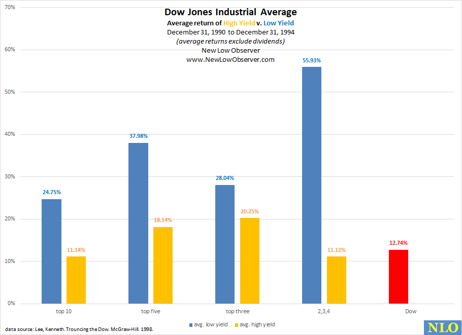
Average Return 1991-1994

image

On average, from 1991 to 1994, the Low Yield stocks continue to outpace the Index and the High Yield (Dogs of the Dow) stocks at more than double the rate.

see also:

Dogs of the Dow: 1993

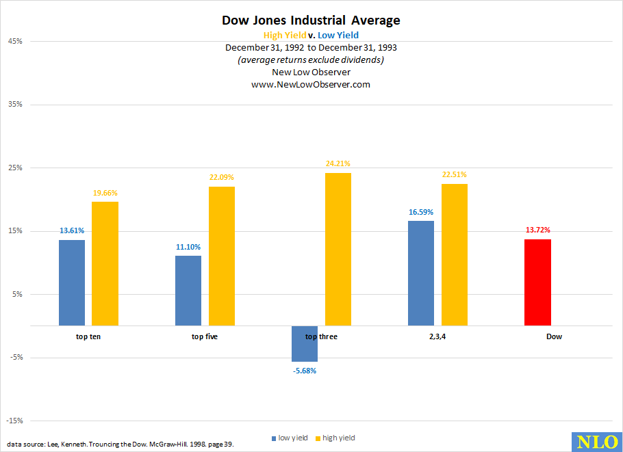
In our continued pursuit to gather data that contradicts our view that low yield stocks outperform the high yield stocks (aka Dogs of the Dow) as presented in Michael O’Higgins’ book Beating the Dow, we have obtained the performance of the top ten, top five, top three and the 2nd, 3rd, and 4th stocks in the high and low yield groups then contrasted their performance against the Dow Jones Industrial Average for the same year.

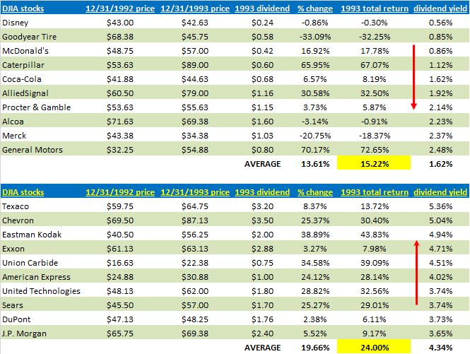
In this case, the year under consideration is 1993 and we have added the list of ten stocks and their price with the dividend yield.

image


1993 Data Breakdown

image

This is the first year where High Yield stocks (Dogs of the Dow) exceeded the returns of the Low Yield stocks.

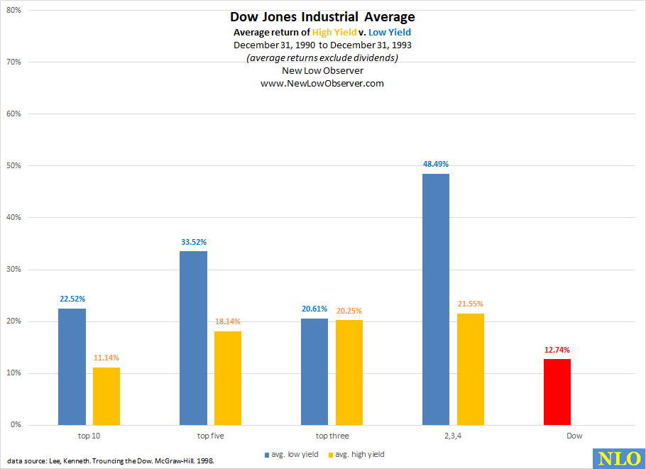
Average Return 1991-1993

image

The average return for the period from December 31, 1990 to December 31, 1993 continues to show the Low Yield stocks exceeding the index in each grouping.  However, the High Yield stocks are gaining ground with the top ten stocks failing to prove their ability to beat the Index.

see also:

Dogs of the Dow: 1992

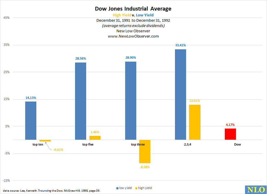
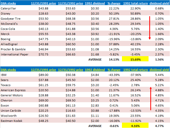
In our continued pursuit to gather data that contradicts our view that low yield stocks outperform the high yield stocks (aka Dogs of the Dow) as presented in Michael O’Higgins’ book Beating the Dow, we have obtained the performance of the top ten, top five, top three and the 2nd, 3rd, and 4th stocks in the high and low yield groups then contrasted their performance against the Dow Jones Industrial Average for the same year.

In this case, the year under consideration is 1992 and we have added the list of ten stocks and their price with the dividend yield.

image


1992 Data Breakdown

image

For the second year in a row, the top ten stocks in the high yield category underperformed the Dow Jones Industrial Average AND the low yield category.

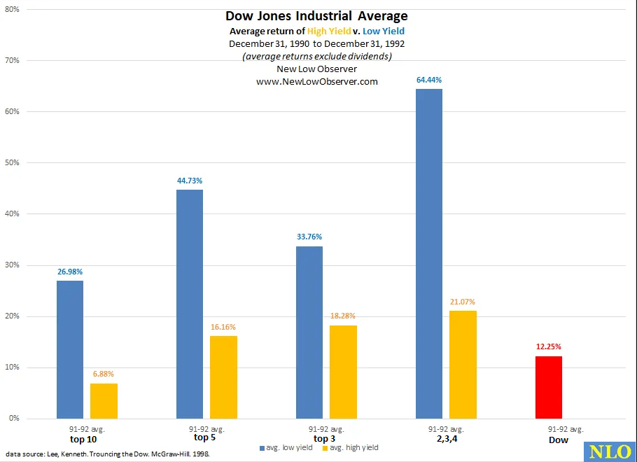
Average Return 1991-1992

image

The average return for the period from December 31, 1990 to December 31, 1992 highlights the strength of the low yield stocks.  However, for the top ten high yield stocks, they could not outperform the Dow Jones Industrial Average.

see also:

A Strategy For the Coppock Curve

On, August 1, 2020, we said the following:

“Last month, the Coppock Curve dipped into negative territory flagging us to closely monitor this indicator for a buy signal. In addition to monitoring the Dow Jones Industrial Average, we created a model to back test this strategy against individual stocks. So far, we are very satisfied with the outcome.”

Based on our prior work, we have developed a strategy to compliment the indications made by the Coppock Curve when applied to the Dow Jones Industrial Average. Continue reading

Dogs of the Dow: 1991

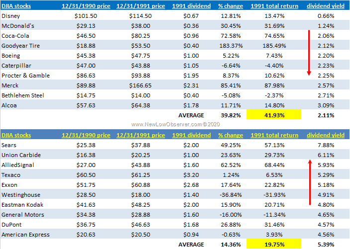
In our continued pursuit to gather data that contradicts our view that low yield stocks outperform the high yield stocks (aka Dogs of the Dow) as presented in Michael O’Higgins’ book Beating the Dow, we have obtained the performance of the top ten, top five, top three and the 2nd, 3rd, and 4th stocks in the high and low yield groups then contrasted their performance against the Dow Jones Industrial Average for the same year.

In this case, the year under consideration is 1991 and we have added the list of ten stocks and their price with the dividend yield.

image


1991 Data Breakdown

image

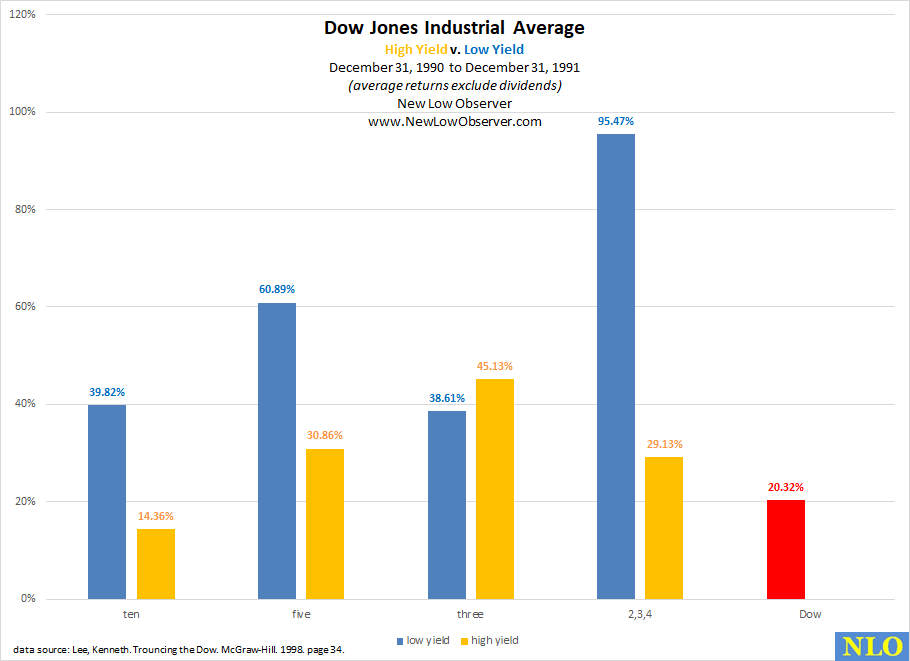
The data should be considered amazing because the exceptional yield that is offered by the high yield stocks (Dogs of the Dow) an investor generally foregoes nearly double the return.  Also notice that the high yield stocks had 4 of the ten companies on their list that failed (bankruptcy, forced liquidation) while only one company in ten on the low yield list has failed (so far).

see also:

Income Bellwethers: Graphic

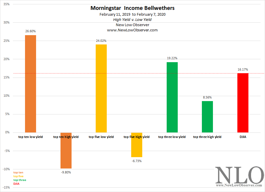
This is a follow-up graphical representation of the performance of Morningstar’s Income Bellwethers.  In the comparison that we ran, we contrast the high yield with the low yield in a one year period.  The period under consideration runs from February 11, 2019 to February 7, 2020.

image

As the data continues to demonstrate, low yield outperforms high yield.  This has been resoundingly shown in our Dogs of the Dow in the period from 1996 to 2019.

DJIA in Review: Week 25

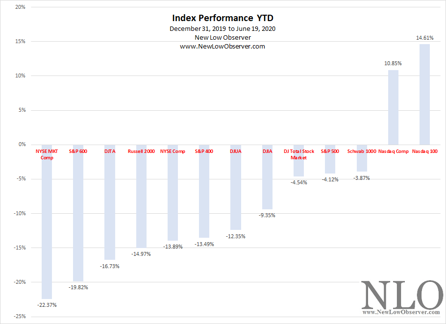
Below is the year-to-date (YTD) performance of various major indexes and from December 31, 2019 to June 19, 2020.

image

The following is the breakdown of the Dogs of the Dow (found here) in week 25, compared to other fundamental ratios. Continue reading

DJIA in Review: Week 23

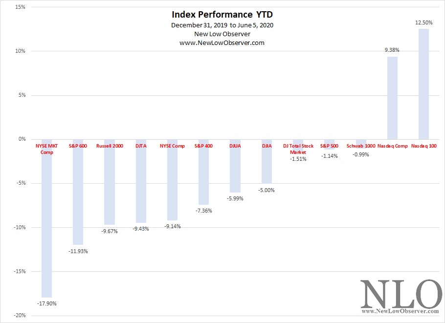
Below is the year-to-date (YTD) performance of various major indexes and from December 31, 2019 to June 5, 2020.

image

The following is the breakdown of the Dogs of the Dow (found here) in week 23, compared to other fundamental ratios. Continue reading

DJIA in Review: Week 21

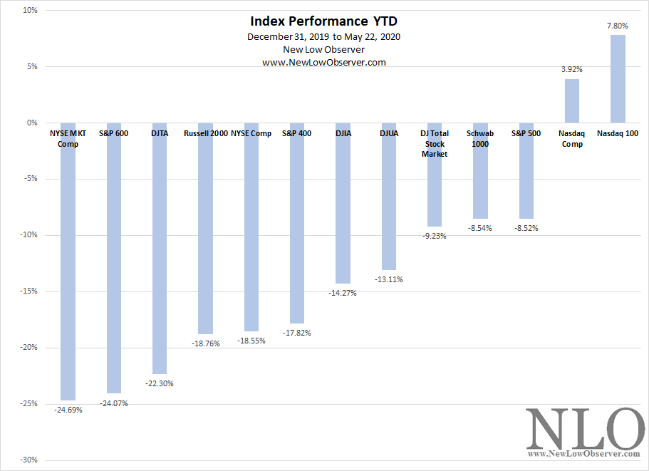
Below is the year-to-date (YTD) performance of various major indexes and from December 31, 2019 to May 22, 2020.

image

The following is the breakdown of the Dogs of the Dow (found here) in week 21, compared to other fundamental ratios. Continue reading

DJIA in Review: 2020-19

The following is the breakdown of the Dogs of the Dow (found here) in week nineteen, compared to other fundamental ratios. Continue reading

DJIA in Review: Week 10

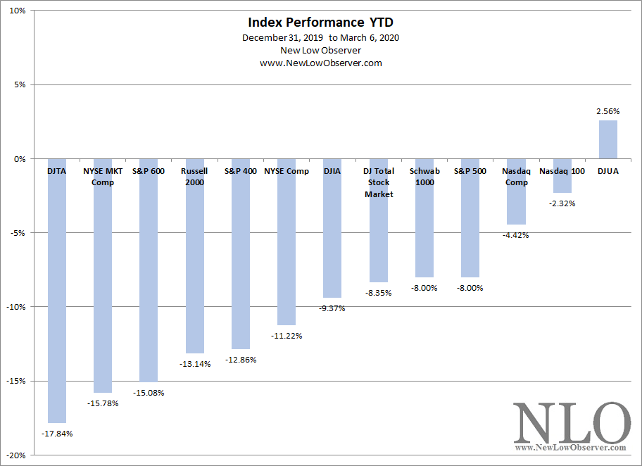
Below is the year-to-date (YTD) performance of various major indexes and from December 31, 2019 to March 6, 2020.

image

The following is the breakdown of the Dogs of the Dow (found here) in week ten, compared to other fundamental ratios. Continue reading

Dogs of the Dow: Week 9

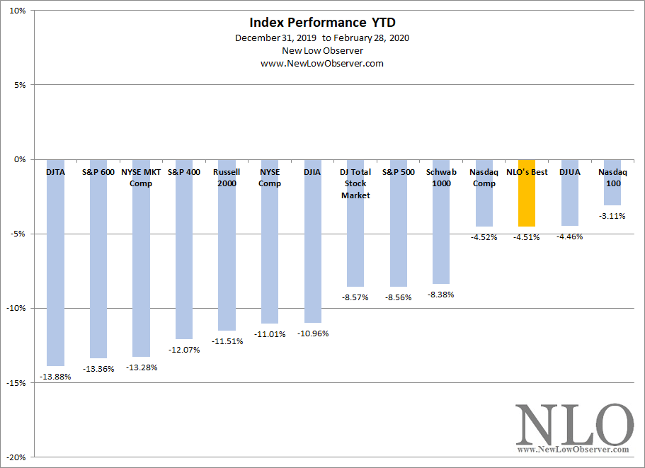
Below is the year-to-date (YTD) performance of various major indexes from December 31, 2019 to February 28, 2020.

image

Although NLO’s Best lost –4.51%, the groups that we would have selected declined –7.57% or –7.32%.  So while –4.51% is less than half the loss of the Dow Jones Industrial Average (our benchmark), our personal favorites would not have done as well.

There is a need to point out the rationale of investing in the major indexes or choosing to buy an S&P 500 Index fund.  The conventional wisdom is that the more broadly diversified the index the lower the volatility and risk.  The trade-off of choosing a broadly diversified index is that you’ll achieve relatively diminished returns on the upside.

Along with diversification, quality is a key component to the change in indexes on the way up and down.  Conventional wisdom suggests that higher quality will be last to fall and lower quality will be first to fall.  Magnitude of change also is assumed to change along the spectrum of quality.  Higher quality generally does well in the early stages of a rise and decline.  Lower quality generally overperforms in the late stages of a rise and severely underperforms in early stages of a decline.

Although broadly diversified, indexes like the Russell 2000 or S&P 600 hold lower quality stocks which results in a more rapid decline in price.  Alternatively, narrowly diversified indexes like the Nasdaq 100 and Dow Jones Utility Average thrive as their quality of holdings leave investors less willing to sell in a general market decline.

We take a certain level of pride in the fact that, on the whole, our stocks of choices reflect higher quality in spite of the extremely low number of positions that are included.  We believe that our overall analysis puts investors in a better position when making the choice between buying an S&P 500 Index Fund with zero expense ratios while having limited funds to invest with.

The following is the breakdown of the Dogs of the Dow (found here) in week nine, compared to other fundamental ratios and varying portfolio sizes. Continue reading

DJIA in Review: 2020-7

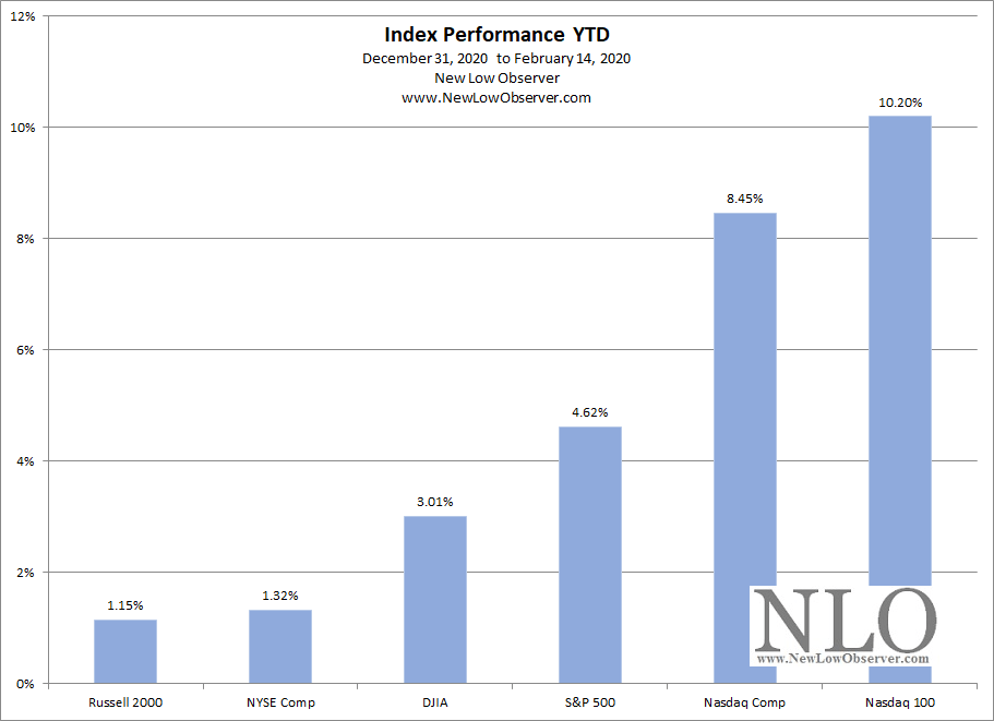
Below is the year-to-date (YTD) performance of various major indexes and from December 31, 2019 to February 14, 2020.

image

The following is the breakdown of the Dogs of the Dow (found here) in week seven, compared to other fundamental ratios. Continue reading