The following is the breakdown of the Dogs of the Dow (found here) in week six, compared to other fundamental ratios. Continue reading
-
Topics
Archives
-
-
Recent Posts
-
-
-
-

The following is the breakdown of the Dogs of the Dow (found here) in week six, compared to other fundamental ratios. Continue reading
In March 2019, Morningstar published their Income Bellwether Watchlist with data from February 11, 2019. Below is the performance of the stocks based on the highest and lowest dividend yield from February 11, 2019 to February 7, 2020 (intraday).

Based on the data, High Yield stocks severely underperformed the Dow Jones Industrial Average, even in the best case scenario. Meanwhile, the Low Yield stocks trounced the Dow Jones Industrial Average. This data confirms our work in the Dogs of the Dow.
Posted in Dogs of the Dow, Income Bellwethers
The following is the breakdown of the Dogs of the Dow (found here) in week five, compared to other fundamental ratios. Continue reading
The following is the breakdown of the Dogs of the Dow (found here) in week four, compared to other fundamental ratios. Continue reading
The following is the breakdown of the Dogs of the Dow (found here) in week three, compared to other fundamental ratios. Continue reading
According to the book Beating the Dow by Michael O’Higgins, the Penultimate Profit Prospect:
“…is not, strictly speaking, a portfolio, but rather a single stock, the second lowest priced high-yielder [among the ten lowest yielding stocks in the Dow Jones Industrial Average] (O’Higgins, Michael. Beating the Dow. 2000. page 199.).”
The first step in determining the second lowest priced stock of the high-yielders is to rank all of the Dow Jones Industrial Average stocks by their dividend yield.
After ranking these stocks, you then re-rank the ten highest yielding stocks by price from lowest to highest. The second lowest priced stock was Pfizer (PFE) based on the year end 2018 price and dividend yield.
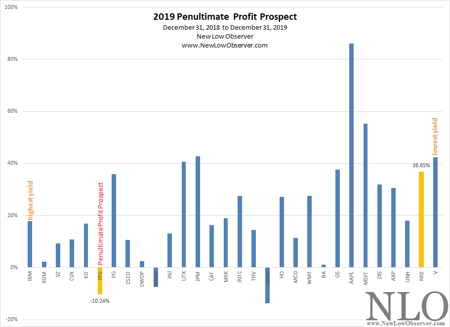
When ranked by yield, from highest to lowest, and then selecting the second lowest priced stock from among the top ten highest yielding stocks we arrive at a change in price that is pegged at –10.24% for Pfizer (PFE).
Again, our spectrum analysis attempts to find the opposite scenario to determine if it would result in an outcome that confirms the assessment or arrives at a different conclusion. To keep the process as simple as possible, we’ve elected to choose the second lowest yielding stock (Nike), regardless of price, to see if it would perform any better than O’Higgins Penultimate Profit Prospect stock.
When we contrast the performance of the Penultimate Profit Prospect with the second lowest yielding stock, we find that the returns are –10.24% versus +36.65%, respectively. This seems unusual to us but consistent with the data that we’ve run on the Dogs of the Dow in the period from 1996-2019. The low yielding stocks routine outperform the high yielding stocks.
So, in order to stretch the concept even further, we’ve ranked the 30 stocks of the Dow Jones Industrial Average from highest yielding to lowest yielding in the period from 1997 to 2019. Then, we compared the individual ranks for each year to determine the average rate of change for that specific ranking. Below is the graphing of the individual performance with the stock ranked number 1 being the highest yielding while the stock ranked 30 being the lowest yielding from 1997-2019.
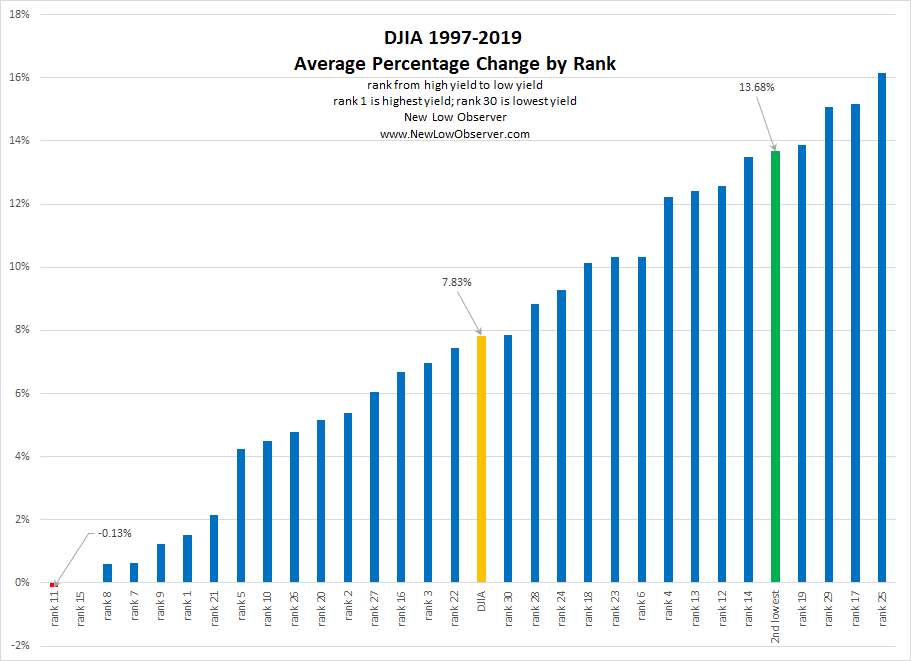
Based on the ranking of the data, the true penultimate profit prospect would seem to be the stock with second lowest dividend yield. In this case, the 2nd lowest yielding stocks gained +13.68% in the period from 1997 to 2019.
The following is the breakdown of the Dogs of the Dow (found here) in week two, compared to other fundamental ratios. Continue reading
The following is the breakdown of the Dogs of the Dow (found here) in week one, compared to other fundamental ratios. Continue reading
Below is the Dogs of the Dow for 2020 with the breakdown of the other categories that we track.
Below is a chart of the performance of the Dogs of the Dow from December 31, 2018 to December 31, 2019.
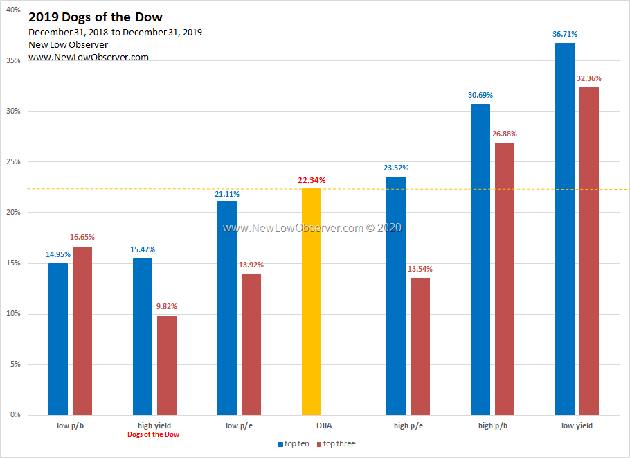
In 2019, the Dogs of the Dow (high yield) failed to exceed the performance of the Dow Jones Industrial Average. In addition, the Dogs of the Dow (high yield) severely underperformed the low yield stocks by a margin of +15%.
Our commentary from the January 2019 Dogs of the Dow watch list had the following to say:
“Our preference is for stocks in the highest p/e or lowest yield stocks.”
While the top 3 stocks in the high p/e category underperformed the Dow Jones Industrial Average with a gain of +13.54%, the low yield group crushed the index with gains of +36.71% and +32.36%.
1996-2019 Long-Term Performance
Below is our long-term performance of the Dogs of the Dow from 1996 to 2019 for both the top ten and top 3 stocks for the respective categories.
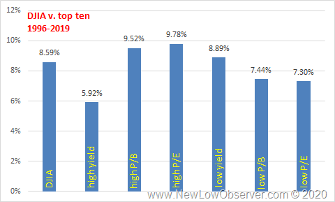
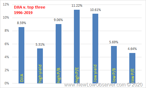
As is the case, the Dogs of the Dow (high yield) underperform the DJIA and the low yield category. High P/E stocks seem to win the day with above average gains on a long term basis. This is counter to the belief that investors should buy low p/e stocks.
see also:
Posted in Dogs of the Dow, Low Yield
Below we list the performance of the various categories of Dow Jones Industrial Average stocks as compared to the index.
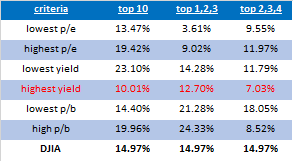
The category highlighted in red is the original “Dogs of the Dow” where the ten highest yielding stocks are bought and held for one year and sold at the end of the year. So far, the Dow is beating the Dogs of the Dow by almost 5%.
When contrasting the performance of the Dogs of the Dow against taking the opposite category, stocks providing the lowest dividend yield, we see that across all groupings, the Dogs of the Dow consistently underperform.
For each group, the data set that is thought to be “bad” generally outperformed the category that typically is thought to be “good.” For example, the highest p/e stock bet lowest p/e stocks, lowest yield stocks beat highest yield stocks and highest p/b stocks beat out lowest p/b stocks (except top 2,3,4) .
Worth noting is the fact that the top 2,3,4 group of stocks only outperformed the top 1,2,3 group of stocks in both of the p/e categories. This is a stark contrast to what we indicated occurred in prior years of data.
Posted in Dogs of the Dow
In a recent article, Bloomberg BusinessWeek referred to their “The Death of Equities” article that was published on August 13, 1979.
Bloomberg owned up to an article that they didn’t have much to do with and used it as a point of reference for the market’s change since 1979. It seems that very often, bad calls are buried when they can be used as lessons. Good job Bloomberg BusinessWeek.

What stood out to us about the article is the reference to the performance of the Dow Jones Industrial Average at +9,000% compared to the S&P 500 Index at +7,000%. Many contend that the Dow Jones Industrial Average is an outdated index and that the S&P 500 is “better” because of the broader diversification being representative of the U.S. economy.
Our view has always been, go with the index that has the longest history of data. In this case, the Dow Jones Industrial Average has published record of data going back to 1896 while the S&P 500 goes back to 1957. Also, greater concentration does better than broad diversification when selecting within the “blue chip” category of stocks.
See Also:
On January 1, 2019, we posted our list of the “Dogs of the Dow”. In that list we broke down all the categories that we track. Our closing remark was as followings:
“Our preference is for stocks in the highest p/e or lowest yield stocks.”
Our preference is based on evidence going back to 1996, which shows that low yielding stocks don’t outperform the index which is contrary to Michael O’Higgins book Dogs of the Dow,which claims that the way to beat the index is to invest in the ten highest yielding stocks at the beginning of each year.
Additionally, the data has demonstrated that stocks with the highest p/e or lowest yield generally beat the index and crush the highest yielding stocks. Below, we list the performance of the various categories of Dow Jones Industrial Average stocks as compared to the index.
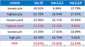
So far, the best performing category of stocks among the top ten, which is the best relative comparison to the top ten highest yielding stocks, is the lowest yielding stocks with a gain of +23.95%. This gain exceeds the top ten highest yielding stocks by nearly 100%.
Not to be outdone, the ten highest p/e stocks gained +21.70% as compared to the ten highest yielding stocks with a gain of +12.42%.
The changes related to DowDuPont (DWDP) has had a material impact on the data and has been excluded from the categories of the “ten highest p/e”, “ten lowest p/b”, and the “lowest 2,3,4: lowest p/b”.
If the next best stock were added to the “ten highest p/e” category it would have increased the return to +22.92%, the “ten lowest p/b” group would have seen a reduction from +14.35% to +13.16% while adding CVX to the “lowest 2,3,4: lowest p/b” reduced the category performance.
Below is the individual breakdown of the stocks and their performance. The data is as of July 5, 2019. Continue reading
Posted in Dogs of the Dow
Below is the Dogs of the Dow for 2019 with the breakdown of the other categories that we track. Continue reading
Posted in Dogs of the Dow
Below is a chart of the performance of the Dogs of the Dow from January 2, 2018 to December 31, 2018.
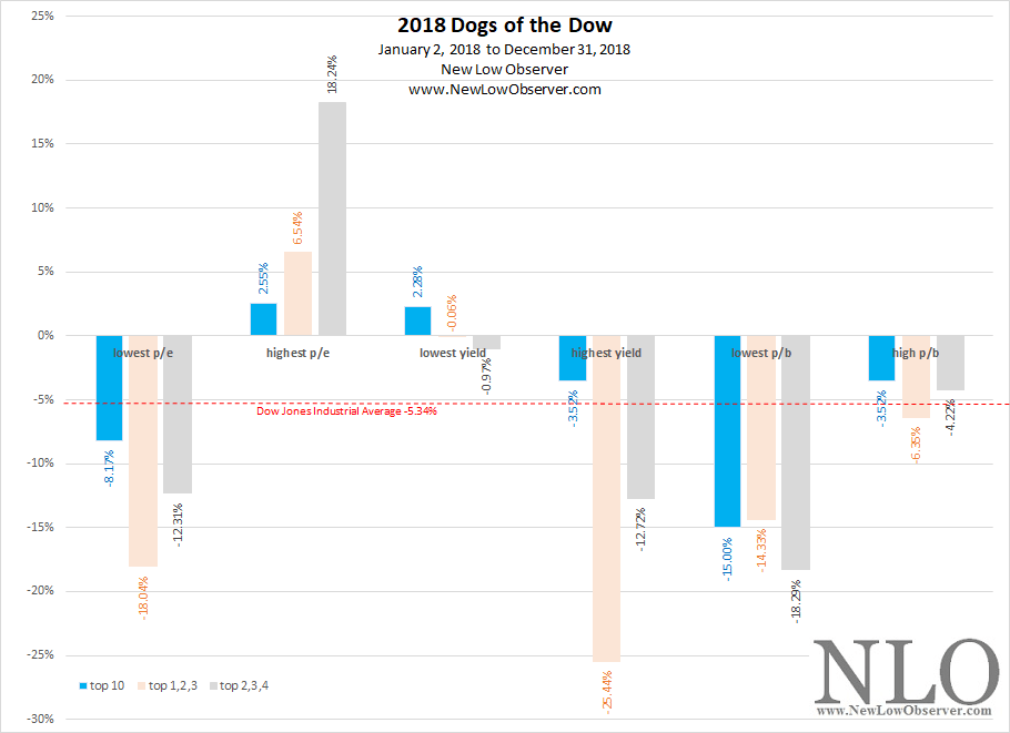
The top ten highest yielding stocks are the traditional Dogs of the Dow. For the year 2018, the highest yielding stocks beat the Dow with a loss of –3.52% compared to the Dow’s decline of –5.34%.
Ten Highest Yielding Stocks Compared to the Dow 1996-2018
| year | Dogs of Dow | DJIA |
| 2018 | -3.52% | -5.34% |
| 2017 | 19.45% | 25.10% |
| 2016 | 16.10% | 13.40% |
| 2015 | -1.20% | -2.20% |
| 2014 | 7.00% | 7.50% |
| 2013 | 30.30% | 26.50% |
| 2012 | 5.70% | 7.30% |
| 2011 | 12.20% | 5.50% |
| 2010 | 15.50% | 11.00% |
| 2009 | 12.90% | 18.80% |
| 2008 | -41.60% | -33.80% |
| 2007 | -1.40% | 6.40% |
| 2006 | 24.80% | 16.30% |
| 2005 | -8.90% | 0.60% |
| 2004 | 0.50% | 3.10% |
| 2003 | 23.60% | 25.30% |
| 2002 | -12.20% | -16.80% |
| 2001 | -7.80% | -7.10% |
| 2000 | 2.70% | -6.20% |
| 1999 | 1.10% | 25.20% |
| 1998 | 7.80% | 16.10% |
| 1997 | 17.30% | 22.60% |
| 1996 | 24.50% | 26.00% |
Noteworthy Stats
Analysis Review
Posted in 2nd, 3rd, 4th, Dogs of the Dow