Author Archives: nlo-admin

P-E Ratios: Lessons From Conflicting Indications

When discussion of market valuation comes up, the mention of price-to-earnings ratios (p/e ratio) is often brought up to possibly explain if the market is overvalued or undervalued.  The arguments generally follow along the line of reasoning that when the stock market rises then so too will the p/e ratio which will indicated when the market is overvalued on a relative basis.  Alternatively, when the stock market is in a declining trend, the p/e ratio will also decline to historical lows allowing for a good indication of when the market is undervalued.  The point usually is that there is a correlating relationship between the rise and fall of the stock market and p/e ratios.

While the  line of reasoning regarding p/e ratios and stock market valuation is logical and can easily be demonstrated over a majority of stock market history, there have been periods when an inverse relationship between the stock market and the p/e ratio suggests a shift in market direction.  The periods of an inverse relationship should shed light on the challenges and limits of using p/e ratios for determining market valuation.  The following are examples of periods where high p/e ratios represented a stock market that either has nearly bottomed or  was about to take off and periods when a low p/e ratio indicated that the market was about to trade in a range or decline.

Starting with the first example of an inverse relationship between the S&P 500 and the p/e ratio (data compiled by Robert Schiller; S&P 500 index did not exist before 1957) was the period of 1905 as seen in the chart below.
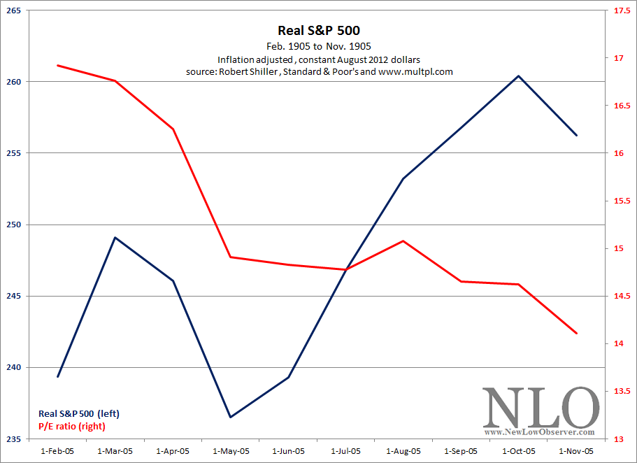
image

The short period of time that this conflicting signal occurred was followed by both the inflation-adjusted S&P 500 and the unadjusted Dow Jones Industrial Average being mired in substantial underperformance in the period from 1905 until 1924-27 as seen in the charts below.

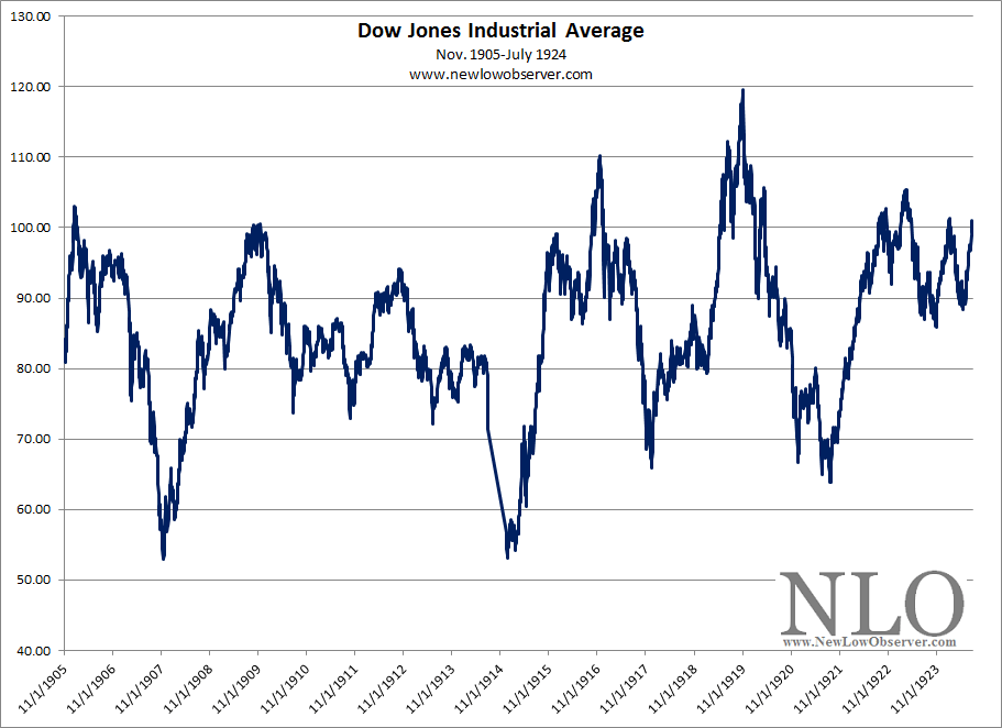
image

image

According to Robert Schiller’s work, on an inflation adjusted basis, the S&P 500 meaningfully broke above the 1905 level in 1927 while the Dow Jones Industrial Average achieved new heights after 1924.  Within this extended period of time from 1905 to 1927, the inverse relationship between the real S&P 500 index and the p/e ratio occurred again during June 1913-November 1914 period, where the index declined while the p/e ratio increased.  This was followed by an increase in the real S&P 500 from December 1914 to December 1915 before the overall decline continued to the 1921 low.

The low of the stock market in 1921 was punctuated with the stock market exceeding a p/e ratio of 50 times before going into deficit due to a lack of earnings.  This happened to be the time when the Dow Jones Industrial Average was at 65 before going to the 1929 high of 381 and the real S&P 500 at 83 before the 1929 high of 416, as tabulated by Schiller-S&P.

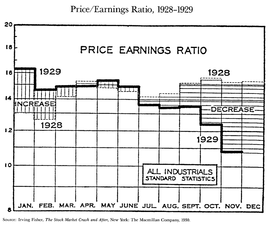
Another significant period when the p/e ratio of the market declined in the face of a rising market was January 1929 to November 1929.  During this period, The Dow Industrials increased from 296 to 381 and the real S&P 500 increased from 311 to 416, or 27% and +33%, respectively.   The chart below shows the p/e ratio for ALL S&P Industrials in the period from January 1928 to November 1929 (source: Fisher, Kenneth. The Wall Street Waltz. Contemporary Books, Chicago. 1987. page 68-69).
image

This is an instance where the stock market still had plenty of room to run on the upside in 1928 and much less upside potential as 1929 was coming to an end.  The performance of the S&P 500 after this mixed signal was –80%.  In the January to November 1929 period, the Dow Industrials saw the p/e ratio decline from 19 to 14.

Punctuating the inverse relationship between p/e ratios and the market’s valuation was the period from 1932 where the p/e ratio for the Dow Jones Industrial Average rose well above 50 and ultimately went into deficit at a time when the stock market, despite the onset of the “Great” Depression, was to move higher and never look back.

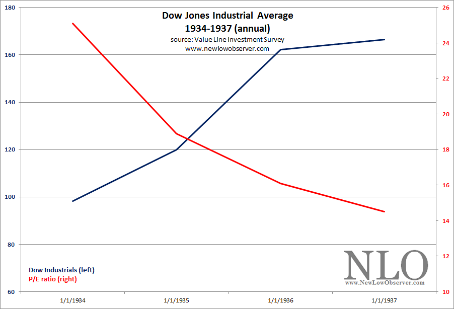
The next period of a clear inverse relationship between the stock market and the p/e ratio was from 1934 to 1937 as indicated in the chart of the Dow Jones Industrial Average below.
image

The culmination of this inverse relationship was the 1937 peak in the Dow Jones Industrial Average which was followed by a -50% decline in the index to the 1942 low.  As the market declined from the 1937 peak, the p/e ratio for the Dow Industrials began to rise to above 25 times in 1938.  The Dow Industrials, with the p/e ratio catapulting from the low of nearly 14 times in 1937 to over 25 times in 1938, gained +50% from March 1938 to November 1938.

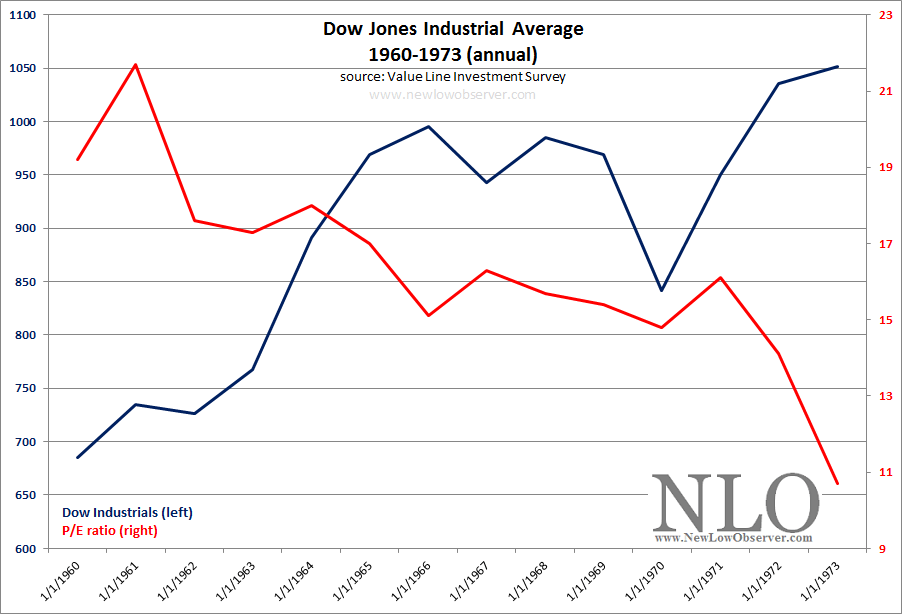
The next period of divergence between the stock market and its respective p/e ratio was from 1960 to 1973 when the Dow Industrials rose from 700 to 1,050 as the p/e ratio declined from 21 times to 11 times.  The Dow Jones Industrial Average was not able to meaningfully exceed the 1,000 mark until 1982.
image

This same scenario has been played out in individual stocks, with the p/e ratio declining as the stock rises and the p/e ratio rising substantially as the stock declines.  Our interpretation of these significant “outliers” is that they may render the use of p/e ratios, as a determining factor of market under/overvaluation, relatively challenging.  This does not mean that such ratios cannot be useful for valuation metrics.  Instead, it suggests that such a consideration should be put into proper perspective with the understanding that there is a limit to the value that price-to-earnings ratios can provide in determining market valuation.

To us, the most important element that needs to be incorporated when considering the p/e ratio is when it didn’t seem to work as expected for the respective stock or index.  In the examples given above, the exceptions should prove to be instructive when deciding if a favorite stock or index is over-valued or under-valued.
U.S. Dividend Watch List: October 19, 2012

We saw 50 companies on our watch list last week.  This week, we have 46 companies on our U.S. Dividend Watch List that are within 11% of their respective 52-week lows. Stocks that appear on our watch lists are not recommendations to buy. Instead, they are the starting point for doing your research and determining the best company to buy. Ideally, a stock that is purchased from this list is done after a considerable decline in the price and rigorous due diligence.

Symbol Name Price % Yr Low P/E EPS (ttm) Dividend Yield Payout Ratio
INTC Intel Corp.  21.26 0.21% 9.28 2.29 0.90 4.23% 39%
IBKC IBERIABANK Corp.  44.95 1.10% 20.25 2.22 1.36 3.03% 61%
JW-A John Wiley & Sons Inc. 44.00 1.76% 13.54 3.25 0.80 1.82% 25%
CRR Carbo Ceramics, Inc. 63.03 2.76% 11.04 5.71 1.08 1.71% 19%
CLC Clarcor Inc. 44.62 2.76% 18.36 2.43 0.54 1.21% 22%
ETP Energy Transfer Partners 42.25 2.97% 8.97 4.71 3.58 8.47% 76%
ERIE Erie Indemnity Company  63.09 3.21% 22.45 2.81 2.21 3.50% 79%
MCD McDonald's Corp.  88.72 3.26% 16.68 5.32 3.08 3.47% 58%
EXPD Expeditors International 35.32 3.27% 21.02 1.68 0.56 1.59% 33%
ABM ABM Industries, Inc. 18.47 3.47% 19.04 0.97 0.58 3.14% 60%
MATW Matthews International Corp.  29.08 4.30% 13.10 2.22 0.36 1.24% 16%
OMI Owens & Minor, Inc. 28.60 4.49% 15.54 1.84 0.88 3.08% 48%
SRCE 1st Source Corp.  21.44 4.53% 11.23 1.91 0.68 3.17% 36%
WGL WGL Holdings, Inc. 39.55 5.05% 20.08 1.97 1.60 4.05% 81%
APD Air Products & Chemicals, Inc. 79.99 5.10% 12.68 6.31 2.56 3.20% 41%
SFNC Simmons First National Corp.  23.70 5.10% 15.39 1.54 0.80 3.38% 52%
SJW SJW Corp. 23.80 5.40% 21.06 1.13 0.71 2.98% 63%
HRL Hormel Foods Corp. 28.90 5.94% 16.06 1.80 0.60 2.08% 33%
UBSI United Bankshares, Inc.  23.80 6.25% 14.51 1.64 1.24 5.21% 76%
FDS FactSet Research Systems Inc. 91.07 6.66% 22.10 4.12 1.24 1.36% 30%
CAT Caterpillar Inc. 83.86 7.17% 9.38 8.94 2.08 2.48% 23%
GRC Gorman-Rupp Company 26.45 7.48% 18.12 1.46 0.40 1.51% 27%
CASY Caseys General Stores, Inc. 49.27 7.58% 16.31 3.02 0.66 1.34% 22%
ED Consolidated Edison, Inc.  60.47 7.85% 16.70 3.62 2.42 4.00% 67%
CWT California Water Service 18.51 7.99% 21.03 0.88 0.63 3.40% 72%
BDX Becton, Dickinson and Co. 75.65 7.99% 13.70 5.52 1.80 2.38% 33%
VVC Vectren Corp. 29.31 8.52% 15.11 1.94 1.40 4.78% 72%
DBD Diebold, Inc. 30.46 8.55% 10.05 3.03 1.14 3.74% 38%
MSEX Middlesex Water Company  18.86 8.58% 23.58 0.80 0.74 3.92% 93%
RAVN Raven Industries, Inc.  27.25 8.61% 18.66 1.46 0.42 1.54% 29%
AMAT Applied Materials Inc. 10.84 8.73% 13.06 0.83 0.36 3.32% 43%
ANAT American National Insurance 72.40 8.74% 10.71 6.76 3.08 4.25% 46%
CBSH Commerce Bancshares, Inc.  37.68 7.53% 12.64 2.98 0.92 2.44% 31%
WEYS Weyco Group, Inc.  23.79 9.63% 16.29 1.46 0.68 2.86% 47%
IBM International Business Machines 193.36 9.21% 13.90 13.91 3.40 1.76% 24%
WABC Westamerica BanCorp.  44.73 9.36% 14.91 3.00 1.48 3.31% 49%
THFF First Financial Corp. 29.73 9.83% 10.85 2.74 0.94 3.16% 34%
RBCAA Republic BanCorp., Inc.  20.53 10.08% 4.07 5.05 0.66 3.21% 13%
LLTC Linear Technology Corp.  31.20 10.33% 18.57 1.68 1.00 3.21% 60%
SON Sonoco Products Co. 31.65 10.63% 16.07 1.97 1.20 3.79% 61%
SJI South Jersey Industries, Inc. 51.49 10.68% 16.19 3.18 1.61 3.13% 51%
EMR Emerson Electric Co. 48.25 10.69% 14.62 3.30 1.60 3.32% 48%
UTX United Technologies Corp. 77.99 10.77% 16.35 4.77 2.14 2.74% 45%
TMP Tompkins Financial Corp. 39.69 10.80% 13.36 2.97 1.44 3.63% 48%
SBSI Southside Bancshares, Inc.  20.70 10.84% 9.95 2.08 0.80 3.86% 38%
GD General Dynamics Corp. 67.17 10.84% 9.85 6.82 2.04 3.04% 30%
46 Companies

Watch List Review

The weakness in the markets continued to suppress many blue-chip companies.  First on our list is Intel (INTC) which is trading well below $22 and yields 4.23%.  Earnings estimates continue to come down for the next year.  Analysts now expect INTC to earn $2.13 this year and next.  That places their current and forward P/E at 10.  With such low valuations and room to grow the dividend, we believe the risk-reward profile for this stock is compelling and will wait to purchase more shares should it trade down to $16. YTD, the INTC is down -12% compared to the S&P 500 gain of +14%.

Another blue-chip name and Dow component that popped up on our list this week is IBM (IBM).  We all know about the big purchases by Warren Buffett in this name last year.  Anyone who was interest in piggybacking on the Buffett trade may have their chance as the stock is approaching the 52-week low.  We suspect that Buffett would be buying more on its way down as well.  One should go back to review Buffett's 2011 letter which stated the following about IBM:

I won’t keep you in suspense. We should wish for IBM’s stock price to languish throughout the five years.

Let’s do the math. If IBM’s stock price averages, say, $200 during the period, the company will acquire
250 million shares for its $50 billion. There would consequently be 910 million shares outstanding, and we would own about 7% of the company. If the stock conversely sells for an average of $300 during the five-year period, IBM will acquire only 167 million shares. That would leave about 990 million shares outstanding after five years, of which we would own 6.5%.

If IBM were to earn, say, $20 billion in the fifth year, our share of those earnings would be a full $100
million greater under the “disappointing” scenario of a lower stock price than they would have been at the higher price. At some later point our shares would be worth perhaps $1 1⁄2 billion more than if the “high-price” repurchase scenario had taken place.

The logic is simple: If you are going to be a net buyer of stocks in the future, either directly with your own money or indirectly (through your ownership of a company that is repurchasing shares), you are hurt when stocks rise. You benefit when stocks swoon. Emotions, however, too often complicate the matter: Most people, including those who will be net buyers in the future, take comfort in seeing stock prices advance. These shareholders resemble a commuter who rejoices after the price of gas increases, simply because his tank contains a day’s supply.

Fundamentally, the stock is trading very close to its ‘undervalued’ range (1.80% yield) according to IQTrends (www.iqtrends.com).  The weak guidance from the current quarterly earnings report pressured the stock and pushed it below the $200 level.

CMG Conservative Support Broken, Is $146 Next?

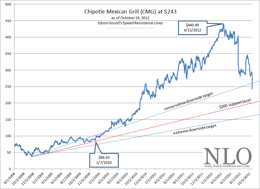
Today Chipotle Mexican Grill (CMG) broke below our conservative downside target support level.  Our downside target for Chipotle is based on Edson Gould’s Speed Resistance Line [SRL] and was initially constructed in our October 25, 2011 article (found here).  In that article, we arrived at a conservative downside target of $200.59.  However, as the price of the stock roses it became necessary to revise the downside target.  A revision of the conservative and extreme downside targets was done on October 6, 2012 (found here).

The chart below graphically represents what we believe is likely to transpire in the short-term:

image

It appears that CMG will decline to $233.23 with a high level of certainty and potentially to the $200 support level as was initially  indicated in our very first SRL analysis done on October 25, 2011.  The only remaining question is whether or not CMG will fall to our extreme downside targets as NFLX and GMCR did when we constructed SRLs for those stocks.

Our extreme downside target of $146 is based on our October 6, 2012 CMG revised target as seen in the chart below:

image

Transaction Alert: Sold WAG, XEC and UNM at the Market

Today we sold the principal portion in shares of Walgreen (WAG), Cimarex (XEC) and Unum (UNM).

  • On July 16 ,2012, we posted a transaction alert indicating that we would buy Unum (UNM) the following day (found here).  The gain in the stock has been +10.43%.  The annualized rate of return is 48.76%.
  • On July 17, 2012, we posted a transaction alert indicating that we bought Cimarex (XEC) at the market (found here).  The gain has been +16.70%.  The annualized rate of return is 85.47%.
  • On October 14, 2011 (found here), Walgreen topped our U.S. Dividend Watch list which prompted our research and purchase of the stock. The gain in WAG has been 9.70%.  The annualized rate of return is 9.70%.

All of the stocks sold comprised 22% of our portfolio. We continue to hold shares of the companies (profit portion) allowing us to slowly build a well diversified portfolio and continue to see capital appreciation and compounding of the income.

Procter & Gamble: If Overvalued, When Should You Buy?

We read a great article by Vince Martin titled “Procter & Gamble Is Severely Overvalued” (found here).  Martin went through a detailed analysis of the reasons why Procter & Gamble (PG) should be considered an overvalued stock.  Because Martin did not mention selling the stock (a cardinal sin of dividend investors), given such a strongly titled article, we thought we’d try to estimate what the downside risk for PG might be so that investors could prepare for when to buy the stock.

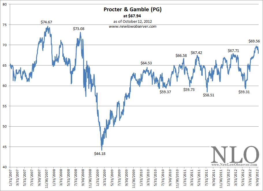
Keep in mind that as of October 12, 2012, Procter & Gamble (PG) has a price chart with the following activity since early 2007:

image

Overall, the price of PG has vacillated widely with a high of $74.67 and a low of $44.18.  Dow Theory suggests that the midpoint of such a range is the dividing line between a stock that is bullish or bearish.  In this case, the midpoint is $59.43.  As can be seen by the rise from the 2009 low, PG has found significant support at or near the $59 level.  This suggests that there is a bullish bias for this stock as accumulation seems to occur just below $60.  Keep in mind that any significant decline below $59 is considered bearish and could be the beginning of a retest of the 2009 low.

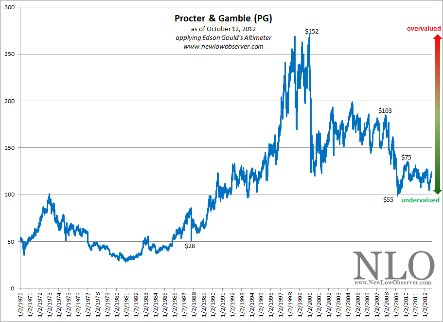
Although the article noted above did not indicate that there was a specific downside target to “fair” valuation or undervaluation, we believe that such a point must exist.  So far, Dow Theory and price activity since 2010 suggests that a fair or undervaluation sits around the $57-$59 level.  However, when viewed from Edson Gould’s Altimeter, PG seems to be trading at the equivalent of 1991 prices as seen in the chart below:

image

Gould’s Altimeter indicates that based on the current dividend, provided there are no dividend increases going forward, PG is undervalued and has critical support at the $55 level.  Any further increases in the dividend will only increase the undervaluation of the PG profile.  For now, Edson Gould’s Altimeter confirms what Dow Theory seems to indicate and that is that at the $55-$59 range, Procter & Gamble should be aggressively accumulated.

Another area of concern is the dividend payout ratio.  According to the article mentioned above:

“Assuming that 2013 dividends are paid at 60 cents quarterly -- a 6.7% raise, lower than any hike in the past decade -- the dividend will have risen 50 percent from 2008 to 2013, a period over which earnings are expected to rise just 14 percent. That is simply not sustainable, and as a result, in fiscal 2013, PG's payout ratio will almost definitely surpass 60 percent. In fact, on a free cash flow basis, PG's payout ratio has already passed that level, jumping from 58 percent in FY2011 to nearly 66 percent in FY2012.”

At some point, the dividend payout ratio can become the Achilles’ heel for PG if earnings aren’t sustainable.  However, we believe that the earnings profile of PG will evolve and remain sustainable over time.  In fact, while Value Line Investment Survey confirms Martin’s expectation for an annual decrease in earnings of -8% for 2013, PG is projected to increase their earnings by +53% in 2015-2017, bringing the fair value estimate of the stock to $97.  This fair value estimate comes with a 100% “earnings predictability” rating from Value Line (dated 9/28/2012).

Obviously, anything can happen with a stock during such volatile times.  However, we believe that Procter & Gamble, while not cheap, is a reasonable stock to accumulate if an investor is looking for a 4 to 6-year holding period.  Aggressive accumulation of PG should take place if the stock declines to $59 and below.

U.S. Dividend Watch List: October 12, 2012

Below are the 50 companies on our U.S. Dividend Watch List that are within 11% of their respective 52-week lows. Stocks that appear on our watch lists are not recommendations to buy. Instead, they are the starting point for doing your research and determining the best company to buy. Ideally, a stock that is purchased from this list is done after a considerable decline in the price and rigorous due diligence.

Symbol Name Price % Yr Low P/E EPS (ttm) Dividend Yield Payout Ratio
INTC Intel Corp. 21.48 0.38% 9.10 2.36 0.90 4.19% 38%
ABM ABM Industries, Inc. 18.12 1.51% 18.68 0.97 0.58 3.20% 60%
EXPD Expeditors International 34.78 1.70% 20.70 1.68 0.56 1.61% 33%
IBKC IBERIABANK Corp. 45.25 1.78% 20.38 2.22 1.36 3.01% 61%
CLC Clarcor Inc. 44.69 2.92% 18.39 2.43 0.54 1.21% 22%
ERIE Erie Indemnity Company 63.20 3.39% 22.49 2.81 2.21 3.50% 79%
WGL WGL Holdings, Inc. 39.09 3.82% 19.84 1.97 1.60 4.09% 81%
JW-A John Wiley & Sons Inc. CL 'A' 45.06 4.21% 13.86 3.25 0.80 1.78% 25%
MATW Matthews International Corp. 29.13 4.48% 13.12 2.22 0.36 1.24% 16%
ETP Energy Transfer Partners L P 42.61 3.85% 9.05 4.71 3.58 8.40% 76%
CRR Carbo Ceramics, Inc. 64.49 5.14% 11.29 5.71 1.08 1.67% 19%
HRL Hormel Foods Corp. 28.83 5.68% 16.02 1.80 0.60 2.08% 33%
PBI Pitney Bowes Inc 13.36 5.70% 3.91 3.42 1.50 11.23% 44%
CAT Caterpillar Inc. 82.82 5.84% 9.26 8.94 2.08 2.51% 23%
OMI Owens & Minor, Inc. 29.06 6.17% 15.79 1.84 0.88 3.03% 48%
VVC Vectren Corp. 28.78 6.55% 14.84 1.94 1.40 4.86% 72%
ED Consolidated Edison, Inc. 59.83 6.71% 16.53 3.62 2.42 4.04% 67%
SON Sonoco Products Co. 30.59 6.92% 15.53 1.97 1.20 3.92% 61%
STBA S&T BanCorp., Inc. 16.85 7.46% 14.28 1.18 0.60 3.56% 51%
SRCE 1st Source Corp. 22.06 7.56% 11.55 1.91 0.68 3.08% 36%
MCD McDonald's Corp. 92.51 7.67% 17.39 5.32 3.08 3.33% 58%
BUSE First Busey Corp. 4.76 7.69% 19.04 0.25 0.16 3.36% 64%
APD Air Products & Chemicals, Inc. 82.00 7.74% 13.00 6.31 2.56 3.12% 41%
UTX United Technologies Corp. 75.96 7.88% 15.92 4.77 2.14 2.82% 45%
UNM Unum Group 19.75 8.04% 26.69 0.74 0.52 2.63% 70%
ANAT American National Insurance 72.01 8.16% 10.65 6.76 3.08 4.28% 46%
PNY Piedmont Natural Gas Co., Inc. 31.28 8.24% 20.05 1.56 1.20 3.84% 77%
VLY Valley National BanCorp. 9.85 8.24% 14.49 0.68 0.65 6.60% 96%
CWT California Water Service 18.58 8.40% 21.11 0.88 0.63 3.39% 72%
SJW SJW Corp. 24.59 8.90% 21.76 1.13 0.71 2.89% 63%
LM Legg Mason, Inc. 24.39 9.08% 22.58 1.08 0.44 1.80% 41%
FDS FactSet Research Systems Inc. 93.28 9.25% 22.64 4.12 1.24 1.33% 30%
MDU MDU Resources Group Inc. 21.48 9.31% 19.01 1.13 0.67 3.12% 59%
AMAT Applied Materials Inc. 10.90 9.33% 13.13 0.83 0.36 3.30% 43%
BDX Becton, Dickinson and Co. 76.62 9.38% 13.88 5.52 1.80 2.35% 33%
GD General Dynamics Corp. 66.10 9.53% 9.69 6.82 2.04 3.09% 30%
RBCAA Republic BanCorp., Inc. 20.49 9.87% 4.06 5.05 0.66 3.22% 13%
RLI RLI Corp. 68.06 10.02% 13.24 5.14 1.28 1.88% 25%
SFNC Simmons First National Corp. 24.83 10.11% 16.12 1.54 0.80 3.22% 52%
NJR New Jersey Resources Corp. 45.27 10.12% 20.03 2.26 1.60 3.53% 71%
RAVN Raven Industries, Inc. 27.68 10.32% 18.96 1.46 0.42 1.52% 29%
PPL PP&L Corporation 29.44 10.34% 10.01 2.94 1.44 4.89% 49%
DOV Dover Corp. 55.33 10.35% 12.03 4.60 1.40 2.53% 30%
SJI South Jersey Industries, Inc. 51.49 10.68% 16.19 3.18 1.61 3.13% 51%
JCI Johnson Controls Inc 25.87 10.70% 10.31 2.51 0.72 2.78% 29%
MSEX Middlesex Water Company 19.23 10.71% 24.04 0.80 0.74 3.85% 93%
CAH Cardinal Health, Inc. 40.89 10.78% 13.11 3.12 0.95 2.32% 30%
STR Questar Corp. 20.20 10.81% 17.12 1.18 0.68 3.37% 58%
EMR Emerson Electric Co. 48.35 10.92% 14.65 3.30 1.60 3.31% 48%
COP ConocoPhillips 56.17 10.96% 6.56 8.56 2.64 4.70% 31%
50 Companies

Watch List Review

Topping out list this week is Intel (INTC). The stock continues to be under pressure especially after Advance Micro Devices (AMD) issued a profit warning. Speculation about job cuts, as much as 2,340 jobs (20% of the work force), is also circulating. AMD shares were down -14% on Friday. Despite that, Intel share were down just less than -1%.  At the current price, INTC is yielding 4.19% with a conservative payout ratio of 38%. While the short-term picture seems grim, with the PC market slowing to a halt, we still believe the that there is significant value built into INTC and it shouldn’t be ignored. Again, we took a position in Intel about a week ago and would be very excited to see it trade down to $16.

ABM Industries (ABM) has been trading in a "line" formation (between $18-$20) for nearly three months. The stock appears to be retesting the $18 level we saw in mid-July. The company announced a definitive agreement to purchase Air Serv which provides facility management services to airlines and airports. ABM expects to add $650 million to their top line through this acquisition. Based on that, we assume a Price-to-Sales ratio of 0.24 which is a decent figure. Our valuation model shows a possible downside to $15 and upside to $24, a –19%/+34% risk/reward.

Top Five Performance Review

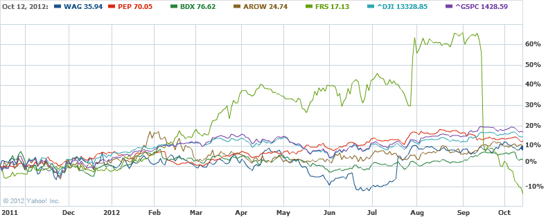
In our ongoing review of the NLO Dividend Watch List, we have taken the top five stocks on our list from October 14, 2011 and have check their performance one year later. The top five companies on that list can be seen in the table below.

Symbol Name 2011 Price 2012 Price % change
WAG Walgreen Co. 32.90 35.94 9.24%
PEP PepsiCo Inc. 62.09 70.05 12.82%
BDX Becton, Dickinson and Co. 73.85 76.62 3.75%
AROW Arrow Financial Corp. 22.73 24.74 8.84%
FRS Frisch's Restaurants, Inc 19.52 17.13 -12.24%
Average 4.48%
DJI Dow Jones Industrial 11,644.49 13,328.85 14.46%
SPX S&P 500 1,224.58 1,428.59 16.66%

image

Our top five underperformed the market by nearly 10% partly due to the loss from Frisch (FRS).  All of the stocks on our watch list achieved a +10% gain within a year.  In fact, 4 of 5 stocks achieved 15% gains within the year. 

Despite the year end losses in FRS, it should be noted that in the process to FRS having a losing year, it also had the largest increase in the year.  FRS gained as much as +67% before collapsing within the last two months.  The performance of FRS is among the primary reasons why we choose to consider selling if the gain exceeds the historical average.

Carbo Ceramics is Worth Considering Now

At the time that Carbo Ceramics (CRR) was trading at $82.79,  we said the following in our May 28, 2012 article (found here):

“Based on the current dividend for Carbo Ceramics, we have anticipated that the stock price will decline to $62.40 before the next buy indication is triggered.”

Interestingly, Carbo Ceramics fell as low as $62.41 on a closing basis on October 10, 2012.  Although this is one penny above the prior $62.40 buy indication, the recent increase of the dividend from $0.24 to $0.27 put the stock well within the buy range, as shown below.  Our estimate of $62.40 was based on Edson Gould’s Altimeter which has given reasonable buy and sell recommendations in the past.

image

As indicated in the chart, there are points where Carbo Ceramics has fallen well below the normal buy range.  On two prior occasions, Carbo Ceramics fell as low as the equivalent of today’s $43.74 and $42.12.  We are not putting it past this company to accomplish a similar decline this time around.  However, this is why we recommend the purchase of this stock in two phases.

image

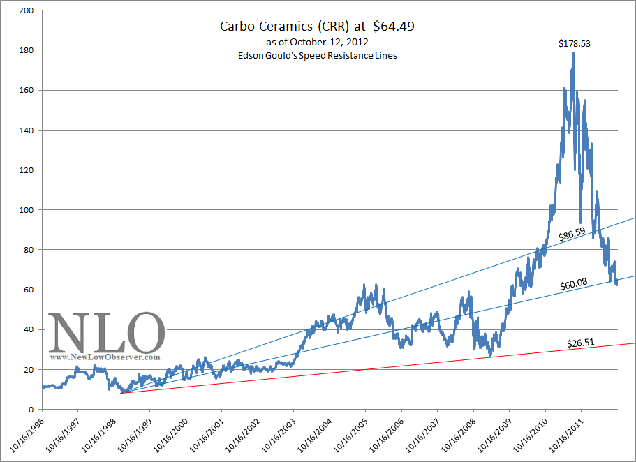
When Edson Gould’s Speed Resistance Lines [SRL] are applied to Carbo Ceramics we can see that the stock has taken back a majority of the gains that have accrued from the 2008 low to the most recent peak.   The SRL indicates that the extreme downside target of $60.08 is about to be reached shortly.  However, there does exist the possibility of going back to point where CRR established its critical support at $26.51.

According to Dow Theory, Carbo Ceramics has the following downside targets:

  • $60.29
  • $43.40
  • $26.51

As indicated in our portfolio (found here), we have already completed the first of the two purchases for CRR and are waiting for either the price to rise to the sell range or decline to the $43.74 level before implementing the next purchase.  The sell range currently stands at $96.

Note: This stock is worth considering only with the appropriate amount of due diligence by confirming the fundamental attributes and proper consideration of the downside risk as indicated above.

Gold Stock Indicator

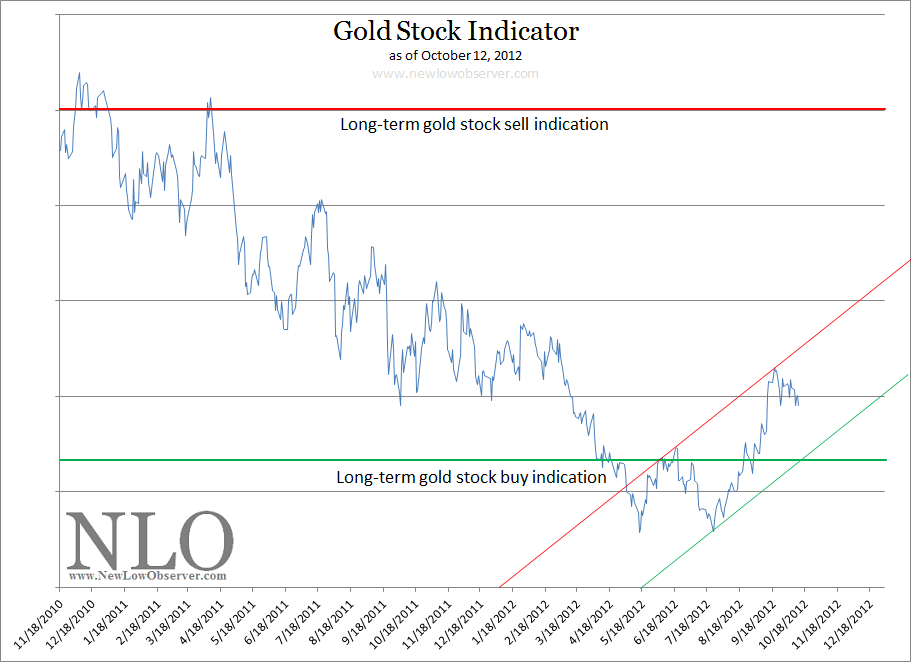
Based on our preliminary work, we believe that gold stocks, as represented by the Philadelphia Gold and Silver Stock Index, will reach our long-term gold stock sell indication between July 15, 2013 and November 25, 2013.

image
This is our best estimate based on the current trajectory of our Gold Stock Indicator. As we get closer to the dates, we will be better able to project the gold stock long-term sell indication with what we believe to be a certain level of accuracy.

This estimate is subject to change if the short-term gold stock buy indication (green diagonal line) is broken to the downside which would bring us back to the long-term gold stock buy indication. The scenario that could easily break the downside trendline is a general stock market decline.  Although Dow Theory indicates that this is a possibility, we're waiting for the appropriate confirmation either up or down. 

The best example of where the stock market is right now is reflected in the chart below, from our September 21, 2012 Dow Altimeter:

Royal Gold (RGLD) Speed Resistance Lines

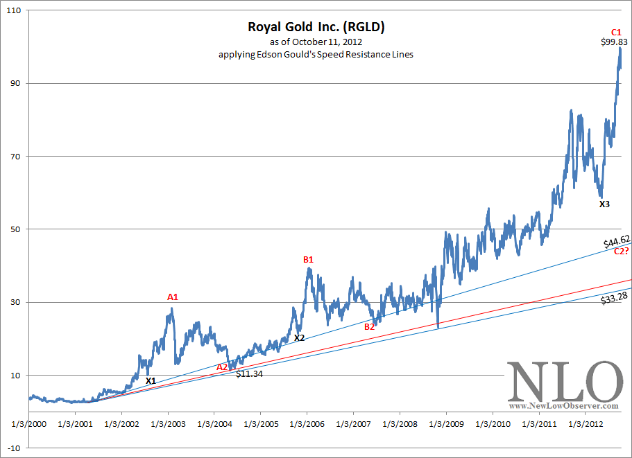
In the chart below we’ve provided Edson Gould’s Speed Resistance Lines (SRL).

image

What is interesting about the above chart is the following:

  • Point A1 to point A2 declined –60%
  • Point B1 to point B2 declined –40%
  • Point C1 to point C2 is a projected decline of –55%

The SRL for Royal Gold at $44.62 doesn’t seem outlandish given what has already occurred in the previous declines from prior peaks.  The X marks the first decline after a “minor” parabolic move that was later exceeded on a larger scale to point A1, B1 and C1.  Additionally, the  X reflects the minimum retracement from the top and has provided consistent support for the price for RGLD.

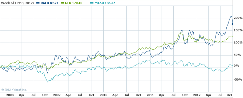
We’d consider buying RGLD if it declines to either of the support levels of X3 or C2.  The movement of RGLD has been consistent with the price of gold (GLD) which is in stark contrast with gold stocks as represented by the Philadelphia Gold and Silver Stock Index (^XAU), as indicated in the chart below.

image

Comparing Two Dividend Strategies: Redux

Two years ago, we created a dividend watch list and compared that list to the one created by Scott’s Investments at around the same period of time.  Both stock lists were generated after the close of market on Friday October 8, 2010 and before the stock market opened on Monday October 11, 2010.  A month and a half after the lists were created, we submitted an article titled “Comparing Two Dividend Strategies” in which we compared the relative performance of both lists.  The stock list created by Scott’s Investments was focused on companies that had dividend yields of 4% or greater.  The stock list that we created had a focus on companies that have had a dividend increasing policy of ten years or more and were within 20% of their respective 52-week low.

Understandably, some argued that it was disingenuous to compare two stocks lists after such a short period of time.  For this reason, we are presenting the performance of the same two lists to see if there are any nuances or changes that we need to make in our initial assessment about the performance of the stock lists created on the weekend of October 8, 2010.

As was done in our November 17, 2010 article comparing both stock lists, we will compare the top eleven companies on the New Low Observer list (found here) to the eleven companies that were provided by Scott’s Investments in the article titled “11 High Yield stocks Worth Considering Now.” The comparison of the two lists will cover the period from October 8, 2010 to October 5, 2012 based on capital appreciation for the purpose of comparing to the S&P 500, Nasdaq 100 and Dow Jones Industrial Average.  Additionally, we will provide to the total return of both lists to determine which approach yielded the most favorable returns.

The first list that we’ll review is Scott’s Investments with the following 11 companies:

Symbol Name 10/8/2010 10/5/2012 Cap. Appr. total return
(Q) Qwest Inc. (acquired) 6.34 6.02 -5.05% -5.05%
(MO) Altria Group Inc. 22.77 34 49.32% 55.18%
(FTR) Frontier Communications 7.4 4.77 -35.54% -30.67%
(PGN) Progress Energy Inc. (acquired) 42.28 47.48 12.30% 12.30%
(POM) Pepco Holdings, Inc. 17.8 19.37 8.82% 13.47%
(WIN) Windstream Corporation 11.01 10.17 -7.63% -0.97%
(CTL) CenturyLink, Inc. 36.32 39.82 9.64% 15.72%
(SO) Southern Company 35.54 45.97 29.35% 33.48%
(TEG) Integrys Energy Group, Inc. 49.55 55.2 11.40% 15.65%
(CNP) CenterPoint Energy, Inc. 15.23 21.41 40.58% 44.96%
(HCP) HCP, Inc. 34.02 45.51 33.77% 38.50%
average return 13.36% 17.51%

The standout performers from the Scott’s Investments list were Altria Group (MO) with a total return of +55.18% and CenterPoint Energy (CNP) with a gain of +44.96%.  Both stocks exceeded the returns of the Nasdaq 100 in the same period of time indicating that even dividend stocks can generate the high returns necessary beat even the majority of the top high growth stocks.  The stocks that underperformed were Frontier Communications (FTR) which lost –30.67%, Qwest Inc. (Q) with a loss of –5.05% and Windstream Corp. (WIN) with a loss of –0.97%.  The recurrent theme of rural and non-traditional telecommunication companies suggests the hard times that these companies may have had since October 2010.

The average return of Scott’s Investments list based on capital appreciation was +13.36% and +17.51% on a total return basis.  This compares to the Dow Jones Industrial Average rising +23.66% and the S&P 500 index returning  +25.39%, on a capital appreciation basis.

The next list is the New Low Observer with the following companies:

Symbol Name 10/8/2010 10/5/2012 Cap. Appr. total return
(CL) Colgate-Palmolive Co. 71.95 108.45 50.73% 52.57%
(CAG) ConAgra Foods, Inc. 20.85 27.79 33.29% 37.17%
(NTRS) Northern Trust Corp.  46.84 47.35 1.09% 3.14%
(WST) West Pharmaceutical 34.22 53.73 57.01% 58.31%
(BBT) BB&T Corp. 22.71 33.64 48.13% 50.92%
(MDT) Medtronic 32.39 44.67 37.91% 40.52%
(BEC) Beckman Coulter (acquired) 47.78 83.5 74.76% 74.76%
(SBSI) Southside Bancshares  17.86 21.91 22.68% 33.52%
(USB) U.S. BanCorp. 21.84 34.92 59.89% 62.87%
(WAFD) Washington Federal  14.95 16.72 11.84% 12.90%
(FUL) HB Fuller Company 19.96 30.77 54.16% 55.40%
average return 41.04% 43.82%

The top performing stocks on a total return basis were Beckman Coulter (BEC) with +74.76%, U.S. Bancorp. (USB) with +62.87% and West Pharmaceutical (WST) with 58.31%.  The worst performing stocks were Northern Trust (NTRS) at +3.14%  and Washington Federal (WAFD) at +12.90%.

The average return of the New Low Observer list of stocks based on capital appreciation was +41.04% and +43.82% on a total return basis.  The average return of the New Low Observer list of stocks exceeded the return of the Nasdaq 100 (QQQ), Dow Industrials (DIA) and S&P 500 (SPY) by +2.32%, +17,38% and +15.65%, respectively.

A very important distinction is that Scott’s Investments was indicated to be for the purposes of trading and not necessarily to be held for the long-term.  Conceivably, the list by Scott’s Investments could have been bought and sold at substantial gains already.  However, as the title of the article highlighted high yield stocks, we believe that there was an implied need to hold the stocks for an extended period of time in order to achieve the maximum benefit.  With the aforementioned thoughts in mind, special attention should be directed to the total returns of the stocks with high yields as compared to the low yield dividend stocks on the New Low Observer list.

The high yield stocks, although sporting an average yield of 6.25% at the time the article was published, generated at total return that was less than half that of the New Low Observer list with an average yield of 2.31%. It wasn’t as if the companies on Scott’s Investments list were considerably better or worse than those on the New Low Observer list.  However, from our work on the topic, high yielding stocks typically result in lower average returns especially when examined over longer periods of time.

This concept of high yielding stocks generating lower returns presents a challenge because some investors have no choice but to seek out high yield investments to meet their immediate financial needs.  However, without a strict criteria for choosing high yield investments, some stocks offer the siren song of mediocre total returns.  In addition, the longevity of the high yield can be compromised due to excessive payout ratios and detrimental borrowing simply for the purpose of sustaining a high dividend yield.  Alternatively, low yield stocks can generate high quality total returns that warrant a second look, as long as the immediate need for substantial income is not the goal.

The primary purpose of examining any stock list is to isolate outstanding strategies that can be easily replicated and applied.  Because successful investing hinges on time and total return, it becomes essential for new and seasoned investors to understand the strategies that work consistently as early as possible, in order to increase total return.  We believe that the success of great investors like Warren Buffett, Peter Lynch, John Templeton and Shelby Collum Davis lies not only in the strategy that they employed but how early they were able to recognize the strength of such an investment approach.

As this examination attempts to demonstrate, choosing stocks that have a history of dividend increases and near a new 52-week low provides a superior starting point for investors who are not in need of immediate income. Additionally, those who seek stocks that have high yields need to accept the potential trade-off of lower total returns.

Nasdaq 100 Watch List: October 5, 2012

Below are the Nasdaq 100 companies that are within 10% of their respective 52-week lows. Stocks that appear on our watch lists are not recommendations to buy. Instead, they are the starting point for doing your research and determining the best company to buy. Ideally, a stock that is purchased from this list is done after a considerable decline in the price and rigorous due diligence.

Symbol Name Price P/E EPS Yield P/B % from low
INTC Intel Corporation 22.68 9.63 2.36 4 2.31 1.84%
EXPD Expeditors International of Washington 35.55 21.16 1.68 1.6 3.65 2.07%
ATVI Activision Blizzard 11.3 16.1 0.7 1.6 1.2 2.91%
DELL Dell Inc. 9.66 5.75 1.68 3.4 1.68 3.32%
MRVL Marvell Technology Group 9.25 11.84 0.78 2.6 1.09 3.35%
LRCX Lam Research Corporation 32.26 23.9 1.35 0 1.16 3.50%
WCRX Warner Chilcott plc 13.3 11.67 1.14 0 15.18 5.35%
CHKP Check Point Software Technologies 46.72 16.86 2.77 0 2.92 8.20%
BBBY Bed Bath & Beyond Inc. 61.6 14.31 4.3 0 3.57 8.60%
TEVA Teva Pharmaceutical Industries 40.12 11.27 3.56 2.1 1.55 8.79%
MCHP Microchip Technology Inc. 33.25 21.47 1.55 4.2 3.18 9.99%

Watch List Summary

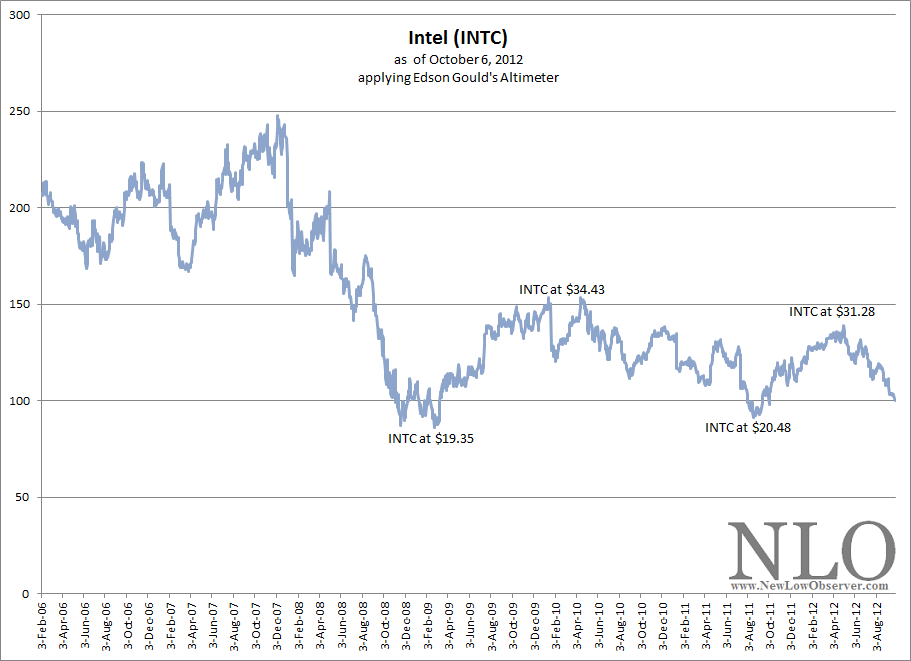
As we’ve indicated in our most recent Transaction Alert, we bought Intel (INTC).  Below is the Altimeter for Intel since 2006.

image

According to the Altimeter, Intel at it’s worst, a la the 2009 low, has a downside target of $19.35. It is very important to consider the 2009 low because according to Charles H. Dow:

…the very foundation of investments in industrials should be knowledge of what these companies earned, say in 1893 to 1896, making, perhaps, reasonable allowances for economies under consolidation [1].”

It is important to note that the period of 1893 to 1896 had declines in the market as much as -40%. What is useful about Dow’s view on earnings is that they should be judged in comparison to the prior bear market lows for the company in question. In the instance of a company that experienced a low in earnings in a bear market or during a recessionary period, essentially Dow is advocating the use of the worst-case scenario.

According to Value Line Investment Survey, 2009 was the most recent low in earnings and reasonably reflects where we should expect the price of Intel to revert to under a worse case scenario.  Although Intel fell as low as $12 a share in 2009, provided the company can afford to continue dividend increases, we believe additional purchases should take place at $16.

To reiterate, the fundamental reason for our purchase of Intel are as follows:

  • Trading at 9x earnings
  • At $22.47, the stock is within 3% of the one year low
  • The stock has a 4% dividend yield, the ex-dividend date is approximately November 2, 2012
  • INTC has increased the dividend steadily since 1992, the annual rate of increase has averaged 31% since 2003
  • Trading at 5.7x cash flow; Value Line indicates that fair value is at 10x cash flow, nearly double the current price

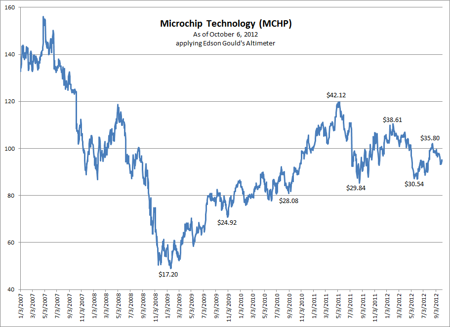
Another stock to watch for is Microchip Technology (MCHP).  This Altimeter for the stock is below:

image

In the chart are the upside and downside levels to look out for.  As an example, the next upside target is $35.80 while the next downside target is $30.54.

Of particular interest about MCHP is the fact that it appeared on our March 20, 2010 watch list as having the highest yield in the Nasdaq 100 index.  That high relative yield translated into a +35% gain one year later for a total return of +39.80%.  As a way to manage risk, we may later buy Microchip Technology (MCHP) instead of Intel for our second 15% purchase for our portfolio.

Watch List Performance Review

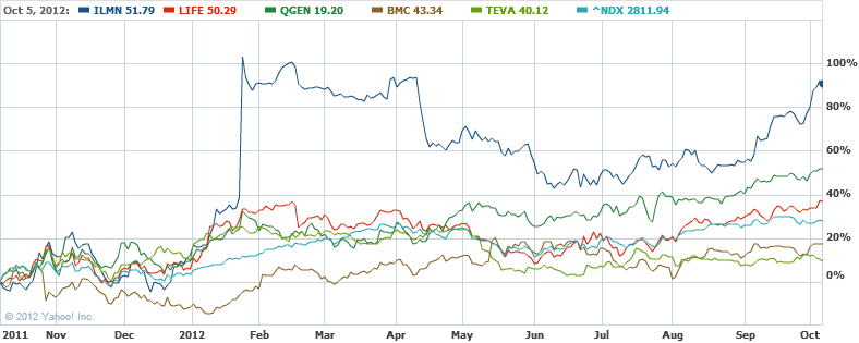
In our ongoing review of the Nasdaq 100 Watch List, we have taken the top five stocks on our list from our October 7, 2011 list and have checked their performance one year later. The top five companies on that list can be seen in the table below.

Symbol Name 10/7/2011 10/5/2012 % change
Illumina, Inc. 27.18 51.79 90.54%
QGEN Qiagen N.V. 12.65 19.2 51.78%
BMC BMC Software, Inc. 36.98 43.34 17.20%
LIFE Life Technologies Corp. 36.82 50.29 36.58%
TEVA Teva Pharmaceutical 36.75 40.12 9.17%
Average gain: 41.06%
NDX Nasdaq 100 2202.76 2811.94 27.66%

image

As reflected in the chart and table above, the top five stocks on our list achieved substantial gains on the average.  Only Teva Pharmaceuticals (TEVA) was unable to keep up the pace.  Six months after the watch list, all of the stocks were able to achieve our minimum annual gain of +10%.

Citation:

  1. George W. Bishop Jr., Charles H. Dow: Economist, Dow-Jones & Company (Princeton, 1967), page 11.

Edson Gould’s SRL: Chipotle Mexican Grill Downside Target Update

In a series of articles examining Edson Gould’s Speed Resistance Lines (SRL), we put some big name stocks to the test.  The test was to see if Gould’s SRL had any reasonable predictive ability to determine the downside targets for the stocks in question.  The results have been astounding and are well worth your careful consideration.

First, we will review the SRLs for Netflix (NFLX) and Green Mountain Coffee Roasters (GMCR) and the outcome of the analysis related to Gould’s indicator.  Next, we will review the updated Chipotle Mexican Grill (CMG) downside target.

The first stock that we applied the SRLs to was Netflix (NFLX) on December 3, 2010.  At that time, NFLX was trading at $205.90.  When the stock rose to the eventual peak of $298.73, we thought that maybe the SRL was a waste of effort.

However, almost one year to the day after we ran the SRL on Netflix, the stock had broke through our conservative downside target of $117.76.  Even more amazing, NFLX later declined below the extreme downside target that we set at $68.63.  Today Netflix trades at $66.56.  Because we’re not short-sellers, we did not take any position on the decline of the stock.  However, we were able to buy the stock at $62 and sell the stock at $100 in the subsequent rebound from the initial low.

The next stock that we applied the SRL to was Green Mountain Coffee Roasters (GMCR) in our October 25, 2011 review of Edson Gould’s formula.  At the time, GMCR was trading at $64.75 after declining –42% from the peak in the stock price on September 19, 2011.  There were some who said that the stock was a bargain and should be bought.  However, Gould’s SRL indicated that at minimum, GMCR was to decline to $59.93 and possibly decline to the $37.21 level.

In a May 2, 2012 revision of Gould’s SRL for Green Mountain Coffee Roasters (GMCR), when the stock was trading at $28.50, we suggested that the stock could trade down to $22.53 with and additional downside target of $8.30.  Today GMCR trades at $22.13 (see chart above).

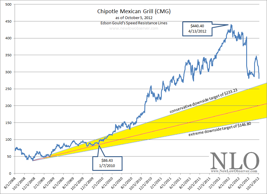
In the same October 25, 2011 review of Green Mountain Coffee Roasters, we covered Chipotle Mexican Grill (CMG).  At that time, Gould’s indicator suggested that CMG had a conservative downside target of $200.59 and an extreme downside target of $114.16.  As we’ve indicated in the past, SRLs are based based on the highest price the stock attains. In this case, CMG rose as much as +45.70% since our October 25, 2011 article.  Below is the revised SRL for CMG.

image

Based on the high of $440.40, Chipotle Mexican Grill has a conservative downside target of $233.23 and an extreme downside target of $146.80.  We’re cautious about anyone who suggests that CMG is a “good buy” or “undervalued” at the current price. Already, we’re within striking distance of the $233.23 conservative downside target as CMG trades at $280.93 after hedge fund manager David Einhorn recently recommended selling the stock short (article found here).  If past use of SRL is any indication, when CMG declines below the upward trending conservative downside line, you can be assured that the stock will hit $233.

Again, our purpose of using SRLs to determine the downside risk of a stock that we’d like to buy but don’t want to chase.  We’re willing to wait for the eventual decline or admit that we missed the boat on a great investment opportunity.  Again, we don’t sell stocks short because we’re interested in acquiring great companies at the best price possible.

Disclaimer: This piece is a continuation of the examination of Edson Gould's speed resistance line as explained in prior articles. This is not an endorsement to sell short at the current levels nor buy these stocks once falling below the extreme downside targets since the stocks have been randomly selected, at best.

U.S. Dividend Watch List: October 5, 2012

Below are the 27 companies on our U.S. Dividend Watch List that are within 11% of their respective 52-week lows. Stocks that appear on our watch lists are not recommendations to buy. Instead, they are the starting point for doing your research and determining the best company to buy. Ideally, a stock that is purchased from this list is done after a considerable decline in the price and rigorous due diligence.

Symbol Name Price % Yr Low P/E EPS (ttm) Dividend Yield Payout Ratio
INTC Intel Corp.  22.68 1.84% 9.61 2.36 0.90 3.97% 38%
CLC Clarcor Inc. 44.24 1.89% 18.21 2.43 0.54 1.22% 22%
EXPD Expeditors International 35.55 2.07% 21.16 1.68 0.56 1.58% 33%
IBKC IBERIABANK Corp.  45.73 2.86% 20.60 2.22 1.36 2.97% 61%
CRR Carbo Ceramics, Inc. 63.17 2.98% 11.06 5.71 1.08 1.71% 19%
ABM ABM Industries, Inc. 18.49 3.59% 19.06 0.97 0.58 3.14% 60%
FRS Frisch's Restaurants, Inc 19.39 5.15% 45.09 0.43 0.64 3.30% 149%
WGL WGL Holdings, Inc. 39.70 5.44% 20.15 1.97 1.60 4.03% 81%
MATW Matthews International Corp.  29.47 5.70% 13.27 2.22 0.36 1.22% 16%
MCD McDonald's Corp.  91.00 5.91% 17.11 5.32 3.08 3.38% 58%
ERIE Erie Indemnity Company  64.77 5.95% 23.05 2.81 2.21 3.41% 79%
JW-A John Wiley & Sons Inc. 45.89 6.13% 14.12 3.25 0.80 1.74% 25%
ETP Energy Transfer Partners 43.59 6.97% 9.25 4.71 3.58 8.21% 76%
ED Consolidated Edison, Inc.  60.22 7.40% 16.64 3.62 2.42 4.02% 67%
VVC Vectren Corp. 29.10 7.74% 15.00 1.94 1.40 4.81% 72%
HRL Hormel Foods Corp. 29.45 7.95% 16.36 1.8 0.60 2.04% 33%
CWT California Water Service 18.59 8.46% 21.13 0.88 0.63 3.39% 72%
BUSE First Busey Corp.  4.80 8.60% 19.20 0.25 0.16 3.33% 64%
ANAT American National Insurance 72.39 8.73% 10.71 6.76 3.08 4.25% 46%
LM Legg Mason, Inc.  24.35 8.90% 22.55 1.08 0.44 1.81% 41%
PPL PP&L Corporation 29.12 9.15% 9.90 2.94 1.44 4.95% 49%
PBI Pitney Bowes Inc  13.81 9.26% 4.04 3.42 1.50 10.86% 44%
UNM Unum Group 19.98 9.30% 27.00 0.74 0.52 2.60% 70%
CAH Cardinal Health, Inc.  40.52 9.78% 12.99 3.12 0.95 2.34% 30%
OMI Owens & Minor, Inc. 30.17 10.23% 16.40 1.84 0.88 2.92% 48%
APD Air Products & Chemicals 83.90 10.24% 13.30 6.31 2.56 3.05% 41%
MCY Mercury General Corp. 39.91 10.83% 15.23 2.62 2.44 6.11% 93%
27 Companies

Watch List Review

Topping out list this week is Intel (INTC).  We’ve been watching and waiting for the number one chip maker to appear on our list and it did so at the top.  Pressure from the slowing PC market and little presence in the tablet market pushed the stock down below $23.  Earning estimates has been coming down and analysts now expect the company to earn $2.19 next year, a forward P/E of 9.6.  Current dividend yield is 4% and payout ratio of 38%.  We were excited to see this stock trade down to the current level that added Intel to our holdings (refer to our transaction alert here).

Clarcor (CLC), maker of filtration products, came into our top five for the first time.  The company raised its dividend by 12.5% at the end of September.  Although dividend yield is only 1.22%, it is higher than its 5-yr average yield of 0.9%.  The stock has been under pressure because profit in the third-quarter fell 5% and missed analysts’ consensus by $0.09.  We don’t know much about this company but should have more information on it soon.

Market Cycles Revisited

Below is a revised piece that was originally published on December 15, 2008 at our former blog at Dividend Inc. (original posting found here.)  This posting is necessary for all visitors to our site.  It covers the market cycles based on what we believe are the best sources of data.  These cycles are subject to revision if more consistent data can be located and verified.

Article Summary:

  • Stock market cycles are 33 years with the mid-point being 17-19 years.
      • as an example, if the peak in the bull market was 2007 then the next peak is expected near 2040.
  • Real estate cycles are 18 years with the mid-point being 8-10 years.
      • as an example, if the bottom was in 2010 the next bottom will be near 2028 (our latest RE article based on this cycle can be found here).
  • Inflation cycles are 50 years with the mid-point being 25-29 years.
      • as an example, the last peak in inflation was 1980, the next peak is expected near 2030.

December 15, 2008 Article:

In the right hand column I have added the cycles for three different markets. The cycles that I have added are for the stock market, real estate market and inflation. These three are necessary for anyone who is interested in investing, saving or spending their money in the "long-term." As far as I'm concerned the long-term is only as long as you're willing to wait for the next cycle top. If a person doesn't have the time to wait until the next cycle top then they should be in the most conservative "guaranteed money" vehicles that are available. I have a section on the lower right hand column that quotes the most current money market and certificate of deposit rates that can be obtained.

First is the stock market which has, in general, a full cycle of 33 years from peak to peak or trough to trough. In the most recent period, the stock market had a run from the bottom in 1974 to 2007 (33 years). The period when the Dow went from 100 to 1000 took 32 years. When the Dow went from 1000 in 1983 until 10,000 which was accomplished in 17-19 years or half the 33 year cycle range.

Another perspective on the stock market cycle could be viewed from the length of prior bull and bear markets. In the preceding bear market when the Dow stayed at or below 1000 from 1966 to 1982 lasted for 16 years. The bull market in the Dow from 100 in 1942 until the high of 1000 in 1966 lasted for 24 years. When the Dow was at 100 in 1906 and didn't cross over 100 until 1925 lasted 18 years. Obviously there are many ways to view the stock market cycles. I have chosen to use 33 year cycles until better or more convincing information comes along.

Next, we have the real estate cycle. There is only one source that I rely upon for real estate and that is Roy Wenzlick. Mr. Wenzlick's insights and statistical analysis of St. Louis and national real estate is unparalleled. The way that I found Roy Wenzlick was while thumbing through the 1987 book, "The Wall Street Waltz," by Kenneth Fisher. In the last paragraph referencing Mr. Wenzlick's real estate cycle chart we have this quote from Mr. Fisher, "The next long cycle trough isn't until 1990, which means that real estate has some bad years still coming- perhaps until 1992." When you add 18 years to 1990 or 1992 you get the next real estate cycle bottom in 2008 to 2010. As we are already in 2008 the bottom might be in however I'll opt for 2009 or 2010 just to play it safe. How prescient is that? What's more fascinating is that Mr. Wenzlick passed away in 1989 but his research on real estate is still useful. Mr. Wenzlick called almost all real estate cycle peaks and troughs since the initiation of his Real Estate Analyst newsletter in 1932.

Finally, we have the inflation cycle which has an inverse relationship to the interest rate cycle. The inflation cycle is much longer than the prior two cycles and lasts 50 years from peak to peak or trough to trough. As some readers will remember, our last peak in inflation was around 1980. From 1980 we have seen inflation slowly fall from double digit figures to our current level of nearly zero. Presently we are on track towards 25 to 27 years of a reversal in inflation. The only thing left before we're on that path is to get past the next couple years of disinflation/deflation.

A good book to refresh yourself on where we have come from and where we are going to, in terms of inflation, is titled, "Is inflation Ending? Are You Ready?" This book, written by Forbes columnist A. Gary Schilling, was published in 1983 and predicted everything that has happened since. The chapter titled "Apocalypse Now? The Risk of a Financial Collapse" is interesting since the subsection headings have titles that are eerily relevant to today. Some sample titles are:

  • Thrift institutions: Why Merging the Strong and the Weak May Be Throwing Good Money after Bad (WaMu, IndyMac and Citigroup)
  • Municipalities: Will Defaults Throw the Market into Turmoil? (California, anyone?)
  • Financial Markets: Speculative Excesses Could Cause a Panic (Fannie Mae, Freddie Mac, Bear Stearns, Lehman, Merrill Lynch)
  • Money Market Funds: The threat of a Redemption Stampede (recent breaking of the buck)

If you could have read this book back in 1983 then you probably wouldn't be surprised by any of the headlines that we see today.

The cycle information that I have provided on the right hand column is intended to be for reference purposes. I expect that as time passes these cycle periods will be reviewed and changed according to the quality research and data that I come across. I feel that as investors we should put all of our investments in perspective especially relative to the "big picture." Investing, saving or hoarding any other way would be spitting into the wind.

Sources:

  • Fisher, Kenneth. Wall Street Waltz. Contemporary Books. 1987. page 132.
  • Shilling, A. Gary and Sokoloff, Kiril. Is Inflation Ending? Are You Ready?. McGraw-Hill. 1983. page 151

Transaction Alert: Bought Intel (INTC) at $22.84

  • We have taken a 15% position in Intel (INTC) at the average price of $22.84.  We expect to add to this position as the price declines to the $16 level.

Intel (INTC) is being purchased for the following reasons:

  • Trading at 9x earnings
  • At $22.47, the stock is within 3% of the one year low
  • The stock has a 4% dividend yield, the ex-dividend date is approximately November 2, 2012
  • INTC has increased the dividend steadily since 1992, the annual rate of increase has averaged 31% since 2003
  • Trading at 5.7x cash flow; Value Line indicates that fair value is at 10x cash flow, nearly double the current price

Dow Theory: Not Broken, Just Misunderstood

Barron’s attempts at Dow Theory has failed miserably…again. In the September 29, 2012 article by Jacqueline Doherty titled “Broken Dow Theory,” it is suggested that “A lagging transportation sector historically has been considered a bad omen…” and then recites the standard, sub-standard nomenclature “…less shipping means fewer goods are being produced and purchased, which means the economy is slowing and the stock market could be headed for a fall.” Doherty goes on to cite data from Bespoke Investment Group asserting that even though the Transportation index has fallen behind the market in general, it may not mean that the stock market, as represented by the S&P 500, necessarily needs to follow the same script.

Fortunately, Dow Theory is very specific about how to interpret the Dow Jones Industrial and Transportation Averages since the publication of Robert Rhea’s book The Dow Theory. Nowhere in the rules of Dow Theory is there any indication that the vacillations of the S&P 500 are remotely part of the interpretation of the theory. Especially since the S&P 500 came onto the scene over 60 years after the creation of the Dow Industrials.

Despite the fact that there are some Dow Theorists who frequently use the S&P 500 as a substitute for indications of a rising or falling market (this isn’t Dow Theory), there is little evidence that using the additional index is necessary. Alternate indexes are only necessary when and if the Dow Jones Industrial and Transportation Averages no longer exist.

While the prevailing opinion is that the Dow Industrials isn’t a relevant index reflective of the market as a whole, a distinction should be made between a “lagging” index and a “divergent” index. A lagging index is one which is going in the same direction as the other but is not increasing/decreasing at the same rate. A divergence is when one index goes up while the other index is going down. The chart below shows two failures and one divergence between the Industrials and Transports.

image_thumb[8]

When one index cannot make new highs in accordance with the other index, it should be considered a significant failure and a warning sign. A perfect example is when the Transportation Index made a new high in 2008 and the Industrial Index could not follow through. The subsequent decline in both indexes was staggering.

In situations where there has been a divergence between the Dow Industrials and Transports, it is the Transports that typically leads the divergence to the upside or downside, meaning that the Transports will provide a clue as to the potential market direction in spite of the action of the Dow Industrials. Although historically this has been the case, Barron’s has unwittingly legitimized the view that the spread between the Dow Industrials and Dow Transports is some form of Dow Theory. In no way is this the case. In fact, in the period from 1896 to 1984, the Transports have exceeded the Industrials, on a percentage basis, 15 out of 25 Dow Theory bull and bear market moves.

Year DJI beat by DJT beat by Year DJI lost by DJT lost by
1896 33.50%   1899 -13.30%  
1900   51.00% 1902 -6.40%  
1903 88.60%   1906 -7.30%  
1907 24.50%   1909 -5.30%  
1910 10.10%   1912 -13.80%  
1914 78.70%   1916 -3.10%  
1917 64.80%   1919 -26.00%  
1921 18.40%   1922   -2.30%
1923 192.30%   1929   -3.80%
1932   15.60% 1937   -21.40%
1938   20.60% 1938   -6.40%
1939   20.30% 1939 -5.30%  
1942   64.40% 1946   -16.50%
1947   39.40% 1948   -20.50%
1949   92.50% 1953   -6.50%
1953 3.80%   1956   -27.80%
1957   819.90% 1959   -12.40%
1960 5.80%   1961 -2.90%  
1962   48.80% 1966   -7.00%
1966   19.20% 1968   -22.30%
1970   82.40% 1972   -14.50%
1974   10.00% 1976 -13.10%  
1978   86.50% 1981   -10.60%
1982   44.00% 1983   -9.70%
1984   177.80% 1984   -31.00%
           
  DJI DJT   DJI DJT
Total 520.50% 1592.40% Average: -9.65% -14.18%

The table above reflects the percentage by which the respective indexes exceeded the other from either the bull market low or the bear market top. In the timeframe indicated above, the Transports have routinely exceeded the Industrials to the upside by nearly three times. The same is true for Dow Theory bear market moves where the Transports have excessive downside moves as compared to the Dow Jones Industrial average by nearly 50%.

The pattern of excessive gains and losses in the Transports versus the Industrials has remained the case since 1984. As an example, at the peak in 2007, the Dow Industrials declined –54% while the Transports declined –60%. On the rise from the 2009 bottom, the Industrials and Transports registered gains of +110% and +162% based on their respective peaks. Excessive gains and losses, by the Transports above that of the Industrials, demonstrates that the Transports usually act as a leading indicator of market direction.

It should be noted that before the work of Wall Street Journal editor William Peter Hamilton and author Robert Rhea on the topic of Dow Theory, Charles H. Dow (co-founder of the Wall Street Journal) created and analyzed the Rail Index (now Transports) without the existence of the Dow Industrials for 12 years, from 1884 to 1896, for indications of market direction. Those 12 years are the basis of what Dow was able to formulate his observations on the market.

Unfortunately, the Barron’s article goes on to quote a CIO who states that the “…Nasdaq 100 and S&P 500 are better leading indicators than the transports.” Based on the available data, the Nasdaq 100 has not been able to exceed the all-time high set in January 2000. Additionally, the S&P 500 has not managed to exceed the all-time high set in October 2007. In the bull market run since the 2009 low, the Transportation Average has managed to exceed its all-time high unlike the Nasdaq 100 and S&P 500.

Finally, Barron’s quotes data from Bespoke which reviews, “…periods when the S&P 500 exceeded the transport index by 10 percentage points over a 50-day trading period. Going back to 1928, the S&P 500 gained 1% in the subsequent six months, not awful although below the average six-month gain of 3.5%.” Using a “50-day trading period” to arrive a conclusion about the next six months is inadequate in making even a cyclical determination of a bull or bear market based on Dow Theory, let alone a secular indication. Dow Theory is about the primary trend of the market which tends to last from 3-4 1/2 years at a time.

In order to make a “complete” secular and cyclical analysis based on Dow Theory, interpretation should begin at the prior dual Industrial and Transport peaks in 2007/2008, at minimum. Until there is a dual Industrial and Transport new high, cyclical new highs in one index or the other would be a bear market reaction as indicated in our August 9, 2011 note titled “Bear Market Rally Targets.” Our indication that a bear market rally was about to take place was with 2% of the October 3, 2011 low, giving full opportunity to seek out new investment opportunities before the bear market rally to the current peak in the Industrials. The current divergence of the two indexes is confirmation of the fact that we’re still in a bear market rally until the prior 2009-2011/2012 highs are exceeded for a cyclical bull market and all-time highs for a new secular bull market.

Until 1956, Barron’swould include Dow Theory analysis in the Market Laboratory section every week. Since 1956, Dow Theory would show up only in feature articles from experts on the topic. Now, it seems that anyone making mention of either the Dow Industrials or Dow Transports can suffice as knowledgeable on the topic of Dow Theory.

Naturally, there are many critics who adamantly speak out against Dow Theory, which is surprising since Charles H. Dow’s work of creating the Wall Street Journalalong with his theories of the stock market are the foundation of both fundamental and technical analysis in the United States. However, the critics, even without knowing the nuances of Dow Theory, are justified in their claims especially when the “analysis” is so incomplete and inaccurate.

If the goal is to do away with Dow Theory and eliminate the indexes then that is fine. However, if the goal is to actually interpret the theory in some mediocre fashion then it should be done by someone who has actually studied the topic extensively. Barron’s, a place where William Peter Hamilton and many other great Dow Theorists were prominently featured, is doing a disservice by connecting unrelated and disparate themes and suggesting that somehow the theory is “broken.”