

- Japan
- Market Indicator
- Price Momentum Indicators
- Richard Russell
- Silver
- Speed Resistance Lines
- U.S. Dividend Watch List
Transaction Alert
Posted in ABX, CRR, gold, gold bugs, Gold Stock Indicator, Transaction Alert
Tagged members
Does the Budget Surplus Affect the Price of Gold?
Subscriber R.G. asks:
“Will the precious metal sector be affected in anyway by the CBO budget surplus? http://www.marketwatch.com/story/cbo-sees-115-billion-june-budget-surplus-2013-07-09”
Our response:
As far as we can tell, a government budget surplus or deficit does not materially correspond to an increase or decrease in the price of gold. Take a look at the chart below:
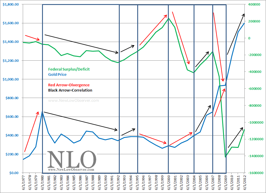
Taking artistic license on the matter, over the past 36 years, we’ve seen equally as many periods of correlation as divergence in the budget deficit/surplus and gold on a short-term basis. In addition, although the deficit has dramatically increased since 1980, the price of gold has fallen and increased equally as much on a long-term basis.
Our only conclusion is that there is no substantive value in seeing a relationship between the U.S. budget and the price of gold.
Citations:
-
Federal Reserve Economic Data. Federal Surplus or Deficit [-] (FYFSD), Millions of Dollars, Annual, Not Seasonally Adjusted. Link: https://research.stlouisfed.org/fred2/graph/?id=FYFSD, accessed July 9, 2013
-
USA Gold. Daily Gold Price History. Link: http://www.usagold.com/reference/prices/history.html, accessed July 9, 2013
Precious Metal Juniors or Majors?
Reader T.H. asks:
“What is your position on miner shares since the absolute destruction of share prices across the board? does it make a difference to differentiate between juniors and large miners? this sector could be setting up with spectacular gains if timed right.”
Our Response:
There are two types of gold stocks right now, investments and speculations. The investment category are those gold stocks that are members of the XAU or HUI index. Constituents of Market Vectors Junior Gold Miners ETF (GDXJ) are the gold stocks that are speculations.
Because many of the gold stocks that are part of the GDXJ will die on the vine, the best opportunity for taking advantage of the juniors is with GDXJ. However, keep in mind that GDXJ is a "product" and not an asset. Theoretically, assets can be held for the long-term while products must have a "sell by" date or price.
Below we have listed the gold and silver stocks that are ranked by payout ratio:
| Symbol | Name | Price | P/E | EPS | Yield | P/B | % from yr low | payout ratio |
| ABX | Barrick Gold Corporation | 14.11 | - | -0.86 | 5.8 | 0.61 | 5.13% | -93.02% |
| KGC | Kinross Gold Corporation | 4.61 | - | -2.16 | 3.4 | 0.53 | 1.99% | -7.41% |
| GOLD | Randgold Resources Limited | 62.69 | 14.1 | 4.44 | 0.8 | 2.09 | 0.66% | 10.81% |
| GFI | Gold Fields Ltd. | 4.94 | 5.03 | 0.98 | 2.9 | 0.7 | 5.57% | 14.29% |
| HL | Hecla Mining Co. | 2.78 | 61.48 | 0.04 | 0.4 | 0.69 | 4.40% | 25.00% |
| BVN | Compa | 14.12 | 6.19 | 2.28 | 3.9 | 0.98 | 5.38% | 25.44% |
| AU | AngloGold Ashanti Ltd. | 12.79 | 17.3 | 0.74 | 1.7 | 0.88 | 2.28% | 28.38% |
| SLW | Silver Wheaton Corp. | 19.34 | 11.99 | 1.61 | 2.5 | 2.08 | 8.73% | 29.81% |
| HMY | Harmony Gold Mining | 3.475 | 10.63 | 0.33 | 2.7 | 0.36 | 5.32% | 30.30% |
| GG | Goldcorp Inc. | 24.31 | 13.74 | 1.77 | 2.5 | 0.84 | 9.45% | 33.90% |
| FCX | Freeport-McMoRan Copper & Gold | 27.6 | 8.96 | 3.07 | 4.6 | 1.45 | 4.27% | 40.72% |
| NEM | Newmont Mining Corporation | 27.12 | 8.27 | 3.29 | 5 | 0.97 | 2.26% | 42.55% |
| AUY | Yamana Gold, Inc. | 9.19 | 18.4 | 0.5 | 2.8 | 0.87 | 7.37% | 52.00% |
| AEM | Agnico Eagle Mines Limited | 27.8 | 18.6 | 1.49 | 3.3 | 1.37 | 0.22% | 59.06% |
| RGLD | Royal Gold, Inc. | 42.04 | 32.76 | 1.28 | 1.9 | 1.12 | 8.28% | 62.50% |
| GORO | Gold Resource Corp | 8.75 | 17.82 | 0.49 | 4.3 | 5.04 | 10.23% | 73.47% |
| AUQ | AuRico Gold Inc. | 4.54 | 27.67 | 0.16 | 3.6 | 0.55 | 12.47% | 100.00% |
| PAAS | Pan American Silver Corp. | 11.56 | 40.35 | 0.29 | 4.4 | 0.62 | 2.21% | 172.41% |
The precious metal stocks are arranged by the payout ratio, which in our opinion is the best measure of sustainability of the dividend. Dividend payout ratios of 50% and less are the most likely to be maintained. However, the trials that lay ahead in the precious metal sector may require more cuts in the dividend.
Two notes of caution are required. First, we’re not yield chasers and advise that gold stocks are not purchased based on dividend yield. Second, Barrick Gold (ABX) and Kinross Gold (KGC) are wild card speculations, with payout ratios in the minus column due to negative annual earnings. Investment in these companies are highly volatile plays that will pay off big. However, the challenge will be sitting through the gut wrenching declines that may be ahead.
Gold Stock Indicator
The Gold Stock Indicator (GSI) is on course to retest the June 26, 2013 low.
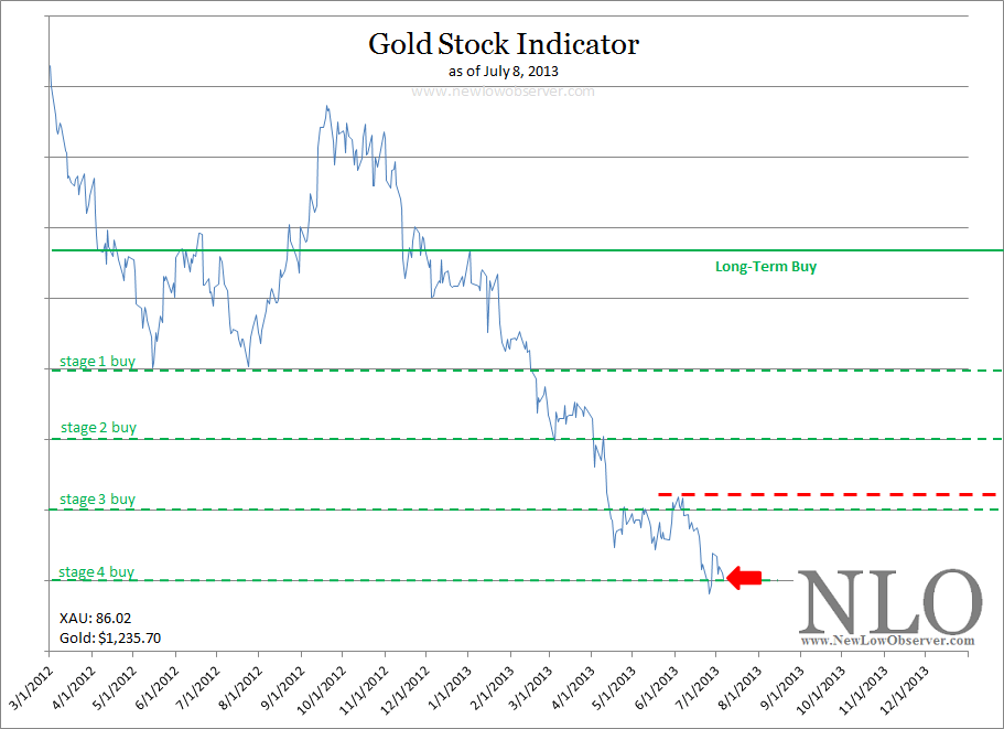
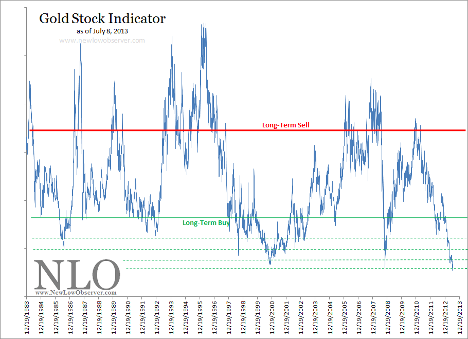
Our theory on the GSI at the current level suggests that a steady purchase of gold stocks at or below current prices.
Dividend Watch List: July 5, 2013
Below are the 12 companies on our U.S. Dividend Watch List that are within 11% of their respective 52-week lows. Stocks that appear on our watch lists are not recommendations to buy. Instead, they are the starting point for doing your research and determining the best company to buy. Ideally, a stock that is purchased from this list is done after a considerable decline in the price and rigorous due diligence.
Investing in Foreign & Emerging Stock Markets
Subscriber R.G. asks:
“If emerging markets possess such a gambit due to their lack of similar history in the past how can we analyze the markets in order to capitalize on their surges of demand which quickly taper[s] off?”
Our general view on foreign and emerging markets is similar to that of Warren Buffett’s when he said:
“'If I can't make money in the $4 trillion US market, I shouldn't be in this business. I get $150 million earnings pass-through from the operations of Gillette and Coca-Cola. That's my international portfolio’ (source: Ellis, Charles D. Wall Street People. page 56. link here.)”
There seems to be little need to invest in foreign or emerging markets. However, if there is a desire to invest in foreign markets then Dow Theory provides a reasonable template for how to approach investing in such a market. In a section titled “Dow's Theory True of Any Stock Market,” William Peter Hamilton says the following:
“The law which governs the movement of the stock market, formulated here, would be equally true of the London Stock Exchange, the Paris Bourse or even the Berlin Boerse. But we may go further. The principles underlying that law would be true if those Stock Exchanges and ours were wiped out of existence. They would come into operation again, automatically and inevitably, with the re-establishment of a free market in securities in any great capital. So far as, I know, there has not been a record corresponding to the Dow-Jones averages kept by any of the London financial publications. But the stock market there would have the same quality of forecast which the New York market has if similar data were available. (source: Hamilton, William Peter. Stock Market Barometer. Harper & Brothers Publishers, New York. page 14. link here.)”
When we speak of Dow Theory, we are referring to the emphasis of values, fundamentals in relation to price as they pertain to individual stocks and the stock market. We are putting less emphasis on the strict technical analysis of the equivalent industrial and transportation indexes.
To be clear, because we live in the United States we emphasize investing in the U.S. However, according to Hamilton, it does not matter which country that you’re in, investors should embrace the comparative advantage of living in a country other than the United States and should become experts of value opportunities in that region.
Posted in Dow Fair Value, Dow Theory, Value Investing, values
Gold: 50% Principle
From a Dow Theory perspective, downside targets rely heavily on the concept of the 50% principle. Although mistakenly attributed to E. George Schaefer by Richard Russell, the 50% principle is derived from Charles H. Dow’s “great law of action and reaction.” Dow describes the “law” in the following manner:
“The market is always responsive to the great law of action and reaction. The longer the swing one way the longer it will be the other. One of the best general rules in speculation is the theory that reaction in an advance or a decline will be at least one-half of the primary movement [50% principle].
“The fact that the law is working through short ranges and long ones at the same time makes it impossible to tell with certainty what any particular swing may do; but for practical purposes, it is not infrequently wise to believe that when a stock has risen 10 points, and as a result of one or two short swings [double tops] does not go above the high point, but rather recedes from it, that it will gradually work off 4 or 5 points.[1]”
In another excerpt from Dow’s work, on the topic of the 50% principle, Dow says:
“It often happens that the secondary movement in a market amounts to 3/8 to ½ of the primary movement.[2]”
Again, Dow emphasis the concept of the 50% principle:
“Whoever will study our averages, as given in the Journal for years past, will see how uniformly periods of advance have been followed by periods of decline, amounting in a large proportion of cases to from one-third to one-half of the rise. [3]”
Finally, George Bishop, one of the greatest authors on the topic of Charles H. Dow, concludes:
“The law of action and reaction applies to both the general market and to individual stocks. This law states that the reaction to an advance or decline will approximate half the original movement.[4]”
Dow Theory 50% Principle for Gold
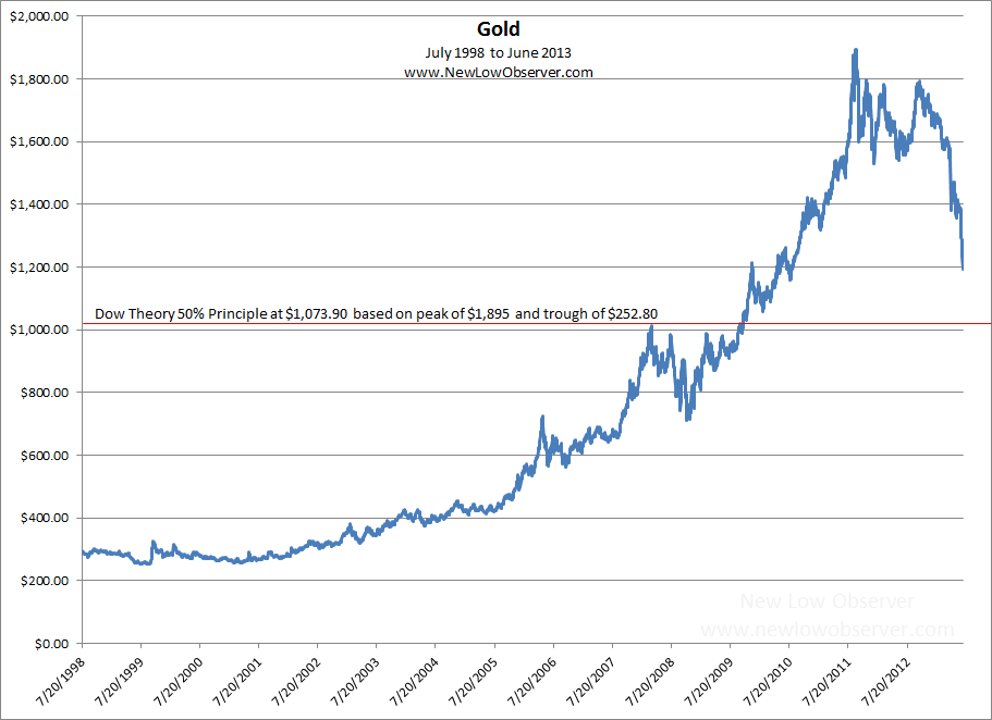
Dow Theory downside targets for the price of gold, based on the peak of $1,895 and the initial low of $252.80 based on the closing price, is charted below (July 20, 1999 and September 5, 2011, respectively):
Citations:
-
[1] Dow, Charles H. Wall Street Journal. October 19, 1900.
-
[1] Bishop, George. Charles H. Dow and the Dow Theory. Appleton-Century-Crofts. New York. 1960. page 119.
-
[1] Sether, Laura. Dow Theory Unplugged. W&A Publishing. 2009. page 112.
-
[2] Dow, Charles H. Wall Street Journal. January 22, 1901.
-
[2] Bishop, George. Charles H. Dow and the Dow Theory. Appleton-Century-Crofts. New York. 1960. page 120.
-
[2] Sether, Laura. Dow Theory Unplugged. W&A Publishing. 2009. page 117.
-
[3] Dow, Charles H. Wall Street Journal. January 30, 1901
-
[3] Bishop, George. Charles H. Dow and the Dow Theory. Appleton-Century-Crofts. New York. 1960. page 120.
-
[3] Sether, Laura. Dow Theory Unplugged. W&A Publishing. 2009. page 199.
-
[4] Bishop, George. Charles H. Dow and the Dow Theory. Appleton-Century-Crofts. New York. 1960. page 231.
Posted in 50% principle, Charles Dow, Charles H. Dow, gold, gold bugs
Emerging Markets and Gold
Drawing from the work of Bhartia and Seto in the article titled "Present and Emerging Risks to the Gold Trade" (found here) and "Emerging Consumers Drive Gold Prices: Who Knew?" (found here) it is claimed that the driver for the price of gold since 2000 has been the emerging economies.
From our perspective, we have struggled to jump on board the explanation that India and China, or emerging markets, are the primary contributing influence on the rise in the price of gold. In our experience, when the small players (in any market) are piling in on a particular trade, it is worth examining the elements that are making it possible.
What stands out the most in our review of Bhartia and Seto’s work is the following comment:
“The impact of the Asian financial crisis is instructive. As the economies in the region fell into recession, the purchasing power of consumers in Southeast Asia declined commensurately. Thailand, Indonesia, and Korea all became netsellers of gold, albeit briefly (see Exhibit 1). In line with the drop in demand and the drop in the regional stock markets, gold prices fell 25% (see Exhibit 2).”
This is an instance where it appears that correlation of a select period of time has fit the argument more than explained the reasons why the price of gold has increased. Unfortunately, this examination overlooks or omits the performance of the same regional stock markets from 1980 to 1993, a period that reflected massive gains in the respective emerging stock markets even as the price of gold crashed or was unchanged from the peak in 1980 to 1993, and ultimately to 2000. As an example:
-
The Thai Set Stock Index increased 16 times (16x) from 1980 to the 1993 peak (found here) & (confirmed here) In the same time frame (1980-1993), gold declined -61%.
-
In the case of the KOSPI or Korean stock index, it increased 11 times (11x) from 1980 to the 1993 peak (chart here). In the same time frame (1980-1993), gold declined -61%.
-
In the case of the Indonesian stock market, it increased 6 times (6x) from 1982 to 1992/1993 (chart here). In the same timeframe, gold was unchanged.
Our belief is that the overall rise in the stock market reflects a general increase in economic wealth of the country. Unfortunately, Bhartia and Seto cannot demonstrate that the emerging market consumer demand to push the price of gold higher in a period when the emerging economies grew from 1980 to 1993. Nor could they demonstrate that currency collapse and a crashing economy had enough impact to move the price of gold higher.
If Bhartia and Seto are correct that emerging markets are moving the price of gold higher today, then the ability and opportunity, due to significant economic growth, to buy gold should have increased enough to move the needle in a positive direction from 1980 to 1993. Unfortunately, when countries normally associated with a long tradition for appreciating the value of gold and/or high savings rate experienced substantial economic wealth, the price of gold did not increase. In fact, from 1980 to 1993, the price of gold declined substantially. Also, as the respective currencies were on the brink of collapse in 1996 and 1997, gold managed to decline -37%.
The economic law of demand suggests that as prices go higher, demand will decline. That has not been the case in emerging economies when it comes to gold, as demonstrated by Bhartia and Seto. Worse still, when emerging markets are piling into a trade (any trade), it may mean that the easy money has been made, in the short term.
Rather than considering emerging markets as leaders of a movement towards better investment decisions, we should be reassessing the role of that investment and its ability to generate reasonable risk-reward outcomes.
Dividend Watch List: June 28, 2013
Below are the 11 companies on our U.S. Dividend Watch List that are within 11% of their respective 52-week lows. Stocks that appear on our watch lists are not recommendations to buy. Instead, they are the starting point for doing your research and determining the best company to buy. Ideally, a stock that is purchased from this list is done after a considerable decline in the price and rigorous due diligence.
1925 to 1932: A Question for Precious Metal Investors
Posted in 1929, gold, gold bugs, Gold Stock Indicator
Bitcoin: Downside Target Met
On April 10, 2013, we posted the SRL for Bitcoin, the electronic “currency” (found here). The goal was to was see if we could determine the downside target using Edson Gould’s Speed Resistance Lines (SRL). Based on the published chart, we had a conservative downside target of $92.57 and an extreme downside target of $79.18. The chart below depicts the outcome, so far:
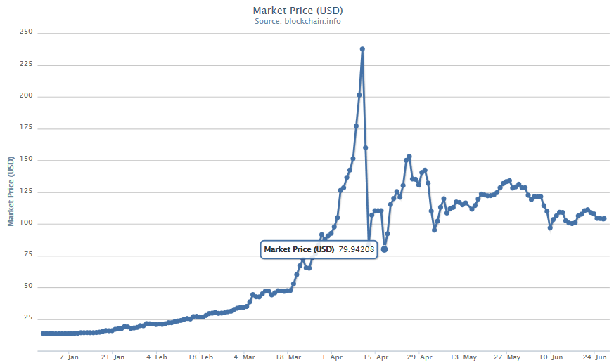
Depending on the source, on an intra-day basis, Bitcoin fell at or below the extreme downside target as projected.
Posted in Bitcoin, Edson Gould, speed resistance line, SRL
Incorrect Interpretations of Market Peaks
In a MarketWatch article titled “7 Ways to Spot a Market Top” (found here), it is suggested that there are key ways to tell whether or not we are at a top in U.S. stock markets. First, we’re going to selectively choose (cherry pick) the points that we can refute or demonstrate weaknesses. Second, we’re going show how, even at a stock market peak, abandoning new investment opportunities can potentially be a mistake.
Starting with the first of the “7 Ways to Spot a Market Top” is the claim that:
While the U.S. stock market is trading at record highs, three blue-chip Chinese companies -- Petro China (PTR), China Mobile (CHL) and Yanzhou Coal are trading near 52-week lows, points out Brad Lamensdorf, chief investment officer of the Lamensdorf Market Timing Report. All three stocks peaked in January [2013]and have been skidding ever since. Given the key role China plays in the global economy, ‘this looks like a bad sign for US stocks,’ Lamensdorf said.
While it cuts us deep to suggest that a 52-low implies proof that a top in the market is at hand (don’t forget our vested interest on this topic), there are clear weaknesses in this argument. First and foremost, look at the chart for the respective stocks.
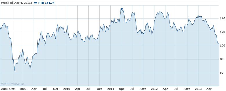
For PetroChina (PTR) the stock peaked in April 2011. Since then, the stock has been unable to exceed the prior peak. A technical analyst would have immediately recognized this and would not make the basis of their analysis the 2013 peak because it is lower than the 2011 top.
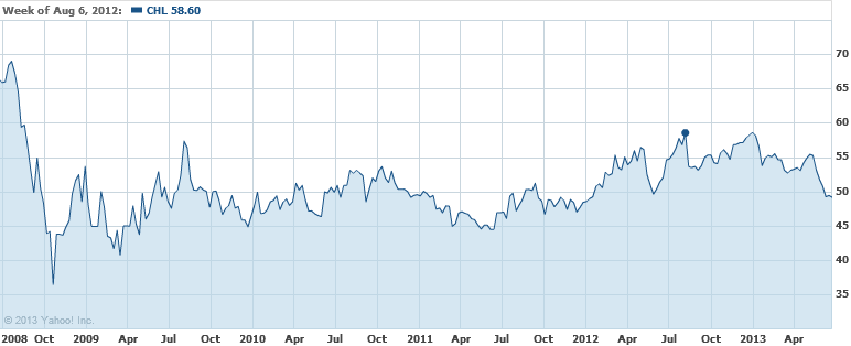
In the case of China Mobile (CHL), the stock peaked in August 2012.
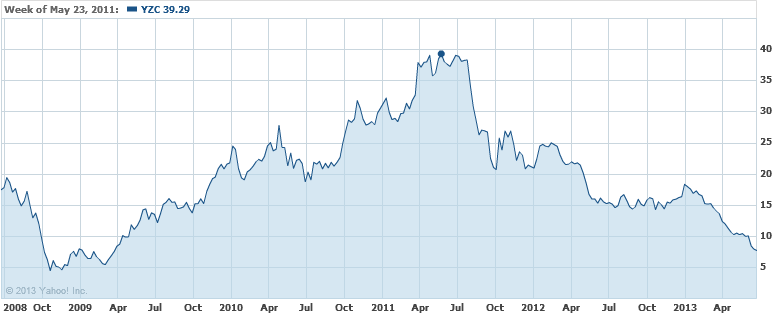
In the instance of Yanzhou Coal (YZC), the stock peaked in May of 2011. If what Mr. Lamensdorf says is true, U.S. stocks should have shown more signs of weakness before the most recent declines. Based on the information that we’ve provided, the first of 7 ways to spot a market top is very weak at best.
The second of 7 ways to spot a market top reflects on the performance of the Spanish stock market indexes. Unfortunately, there is no PROOF that, based on the movement of the three indexes, that we’ve seen the top in the U.S. stock market. Instead, it only reflects on what has happened in Spain. In addition, the time span that is used is narrow at best. What is a better alternative to indicate a possible top in the market? First and foremost, Dow Theory could have been a better guide for consideration of when and if we were at a market top in advance of the actual peaks. As an example, the Spanish IBEX 35 Index, is shown below from 2006 to the present.
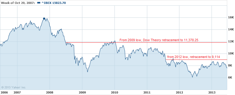
From the peak of the IBEX 35 Index in 2007, the decline was down to the March 2009 low near 6,936.90. The increase of the IBEX 35 Index could have been expected to increase at least half of the prior decline before giving clear indications of a change in direction in the market. According to Dow Theory the best case scenario would be for the market to retrace 50% of the previous decline.
Our own example of a real-time application of Dow Theory projections in advance of a market top is our April 3, 2009 posting titled “Bear Market Rally Targets” (found here), when the Dow was at 8,017.59. At that time, we said that the Dow Jones Industrials Average had an upside target of 10,360.02 based on the Dow Theory 50% principle. Dow Theory clearly outlines how to interpret market direction based on the stock market movement after the retracement of the 50% principle. Therefore, it would have been clear that the decline was in the cards and not helped by the European Financial crisis.
In our considered opinion, calling the top is easy after the fact, however the tools were in place to allow for understanding the potential upside limits beforehand. Additionally, there is no proof that the Spanish markets have topped out, based on such a short time frame (June 2012 to June 2013). In fact, according to the precepts of Dow Theory, the marginal top of January 2013 could not be considered to be “in” until the IBEX 35 declines below the 2012 low.
The third of 7 ways to spot a market top is based on the FTSE Europe relative strength index. The indicator only shows the last year of movement. The problem with this is that we don’t have a “relative” view on which to test the accuracy of this indication. Although not the exact index and without the exact measure of time for which the indicator is at (a considerable weakness to leave out such information because we cannot independently test what should be widely available), we’ve outlined the Vanguard FTSE Europe ETF (VGK) with a relative strength indicator on a 28-period trailing interval.
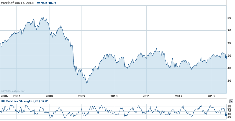
As can be seen above, the RSI has not necessarily give a clear indication of where the top in the market is when reviewed over a period from 2006 to the present. As an example, in 2012, the two RSI peaks resulted in higher market levels afterwards. Likewise, the RSI low of 2010 resulted in an even lower level for the Vanguard ETF in 2012. Worse still, the early 2008 low in the RSI was much lower than the early 2009 RSI low. However, the 2009 low in price was a staggering –58% lower than the early 2008 price for the Vanguard ETF.
Again, without the source of the RSI provided and the exact index that was used over a substantial period of time to verify the quality of the indicator, it would be difficult to suggest that the information provided was enough to prove that we could use the information to identify a market top, or bottom.
The fourth of the 7 ways to spot a market top refers to the Schiller P/E or CAPE ratio valuation of global equity markets. Again, this view only reflects the current point in time. It leaves out the perspective of other times in history, relative to when the S&P 500 Index was at respective peaks and troughs in history, compared to the same countries. However, we do have a good source to help see how this may not be the top, according to CAPE valuations.
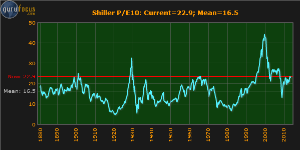
The chart above is the Shiller P/E or CAPE ratio from GuruFocus.com (found here). According to the chart, it would appear that on a historical basis, the U.S. stock market should trade back to the mean P/E level of 16.5 after trading to the historical peak level of 22.9. However, there are two serious problems with this perspective. First, it ignores the fact that at nearly 50% of the times that the S&P has been at the same level in the past, the market continued much higher than the current level in 1929 and 2000. In the case of the year 2000, the market doubled the P/E level that we are currently at. The second problem is that the S&P 500 index didn’t exist before 1957. Therefore, anything before 1957 is based on a theoretical P/E ratio that is not even “real.” In fact, everything prior to 1957 is based on the belief that an imaginary S&P 500 would have replicated the performance of the Dow Jones Industrial Average). We’ve already pointed out the deceptiveness of P/E ratios and how they can be astronomical at market bottoms and miniscule at market tops in our article titled “P-E Ratios: Lessons from Confliction Indications” (found here).
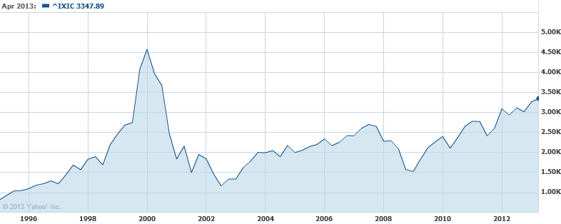
In the fifth of the 7 ways to spot a market top, the article refers to the S&P 500 activity from 1996 to the present. Yes, it is true that the S&P 500 has failed to exceed the prior peaks of 2000 and 2007 by a wide margin. However, choosing the S&P 500 strictly fits the argument. Additionally, it seems to be the point of the author that prior peaks are a indication of a market top. However, if the Dow Jones Industrial Average were applied to the same period of time then it could be argued that you cannot pick a market top based on prior peaks.
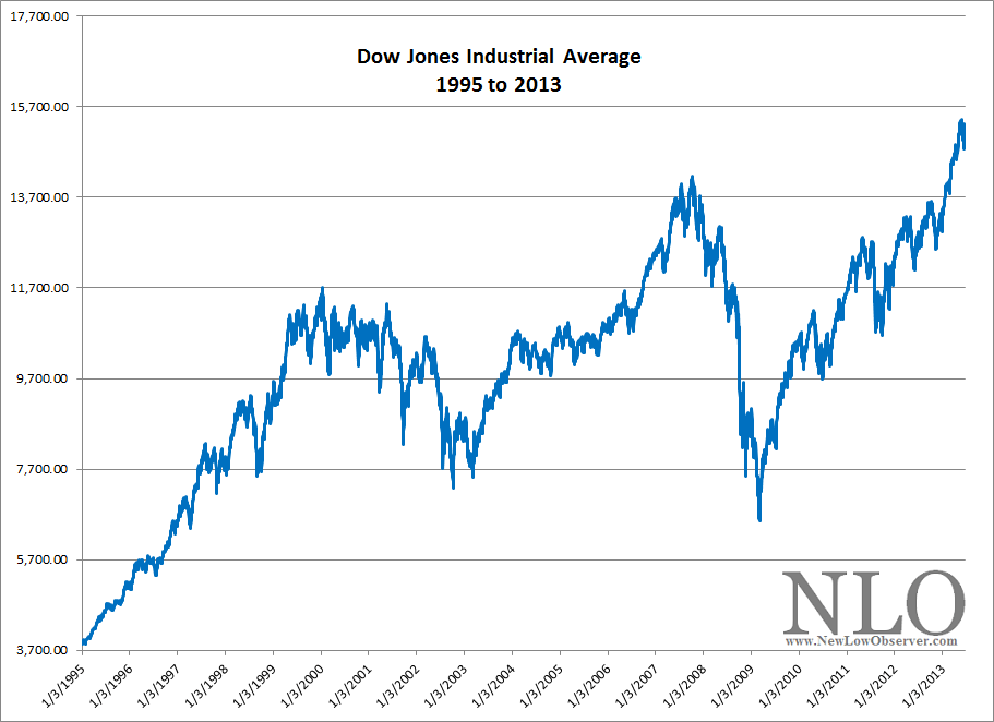
In each instance of a peak for the Dow, the index went higher, as opposed to the S&P 500. Furthermore, If we looked at the Nasdaq Composite Index, then we could say, based on the flawed logic of prior peaks being the top in the market, that we’re a long way from the top in the stock market, as seen in the chart below.
The sixth of 7 ways to spot a market top relates to the 50-moving average of the S&P 500 Index. According to the article, Mark Luschini, chief investment strategist at Janney Montgomery Scott says:
“'As a matter of fact, with the S&P 500’s recent pullback to 1,600, it actually suggests an interim bottom,’ says Luschini. The index has bounced around and off of the 50-day moving average of 1,615, ‘so for the time being, that’s pretty good support for the market,’ he adds.”
Suffice to say, this wasn’t actually a way to spot a market top. We’re not sure why this was included.
Finally, the seventh of the 7 ways to spot a market top discusses the price of oil but it doesn’t relate this back to the stock market as the previous 6 points attempted, somewhat. Despite this fact, we have to point out the comment made by the analyst about the price of oil. The article states:
“As crude gets more expensive, OPEC members have an incentive to ramp up production. But in such times, [Tim] Evans doesn’t view the higher prices as bullish.”
Unfortunately, in the chart that is included with Mr. Evans commentary, we can see that the price of oil increased from January 2007 and peaked June 2008 and collapsed to the April 2009 low. Coincidentally, the stock market had a similar movement over the exact period of time. As Charles H. Dow, co-founder of the Wall Street Journal, said:
“For the past 25 years the commodity market and the stock market have moved almost exactly together. The index number representing many commodities rose from 88 in 1878 to 120 in 1881. It dropped back to 90 in 1885, rose to 95 in 1891, dropped back to 73 in 1896, and recovered to 90 in 1900. Furthermore, index numbers kept in Europe and applied to quite different commodities had almost exactly the same movement in the same time. It is not necessary to say to anyone familiar with the course of the stock market that this has been exactly the course of stocks in the same period ( source: Dow, Charles. Review and Outlook. Wall Street Journal.February 21, 1901.)”
With this in mind, it is possible to suggest that because oil is relatively far from the peak, there may still be some upside left. After all, in the period from 2007 to the present, whenever oil rose, so too did the stock market. Why should we expect anything different going forward? Especially when the price for oil hasn’t exceed the 2008 peak.
Our next point is regarding the abandonment of investments if and when you “know” that the stock market has peaked. In our posting titled “Complete 2008 Transaction Summary” (found here), we show every position that we took in 2008, the length of time that we held each position and the gain or loss for each position. It is important to note that although the stock market was in the process of collapsing, we were able to make long only positions based on stocks from our U.S. Dividend Watch List and end the year with gains of +14% as opposed to Dow Industrials and S&P 500 declines of -38% and greater.
Another source for inspiration of investing in stocks at stock market peaks can be derived from the work of Jeremy Siegel’s article titled “Nifty Fifty Revisited” (PDF here). In the article by Siegel, the highest P/E stocks (at a market peak; 1972) for that era were selected to determine their performance over a long-term basis (1972 to 1995). If, as a long-term investor, you’re interested in beating inflation by a wide margin, then avoiding new purchases at the peak in the market, because you think we’re at a peak, isn’t as rational as it would seem. It might make sense if you have a well established system (that is profitable, of course) in place. However, the work of Siegel suggests that for long-term investors, avoiding new purchases at market peak could be a costly trade off.
In our personal experience, a la 2008, we can’t suggest that our performance will be replicated again. However, what we can claim is that, aside from dumb luck, abandoning investment opportunities because the market has peaked or is falling could be just as mistaken as calling market tops, and bottoms, based on spurious notions that are unsubstantiated.
Posted in 50% principle, Charles Dow, Charles H. Dow, commodities, Market cycles, S&P 500
Gold Stock Indicator: Now is the Time
On June 24, 2013, the Gold Stock Indicator (GSI) declined below the 2008 low for a brief moment. Today, June 25, 2013, the GSI is at the 2008 low.
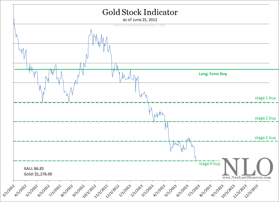
Any activity in the gold stock arena below the “stage 4 buy” level is uncharted waters for us. We will continue to post transaction alerts based on our partnership account. However, successfully navigating to this point without over-committing our resources was the ultimate goal of this exercise. We hope this effort has been practical and saved our readers money they would have otherwise lost at much higher levels in gold stocks.
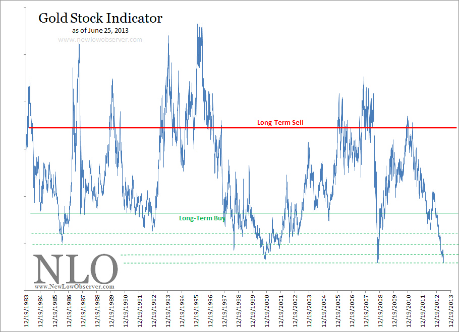
We would not be surprised to see a considerable sell-off in gold stocks in the near-term. However, based on the GSI since 1983, now is a reasonable time to line up gold and silver stocks that are part of the Philadelphia Gold and Silver Index (found here) or the Amex Gold Bugs Index (found here) for investment opportunities.
Posted in gold, gold bugs, Gold Stock Indicator