On May 5, 2011, when the iShares Silver Trust (SLV) was trading at $33.72, we said the following:
“…we’d like to see the price decline to the dashed blue line at $15.41 or below.”

On May 5, 2011, when the iShares Silver Trust (SLV) was trading at $33.72, we said the following:
“…we’d like to see the price decline to the dashed blue line at $15.41 or below.”
Since the Coppock Curve flashed a buy indication at the end of March 2016, the Dow Jones Industrial Average gained +17.80% while the S&P 500 gained +15%. Our strategy of purchasing Guggenheim S&P 500 Equal Weight ETF (RSP) has proven well timed and is up +16.70%. Below is an update to the Coppock Curve.
The chart below outlines the Year-over-Year (Y-o-Y) percentage change in the S&P 500 earnings since 1960. From what we can tell, the slide from the 2010 peak in Y-o-Y earnings in the S&P may have bottomed in 2015 and is on a path to the 2013 peak which could be followed by the 1964 recovery peak.
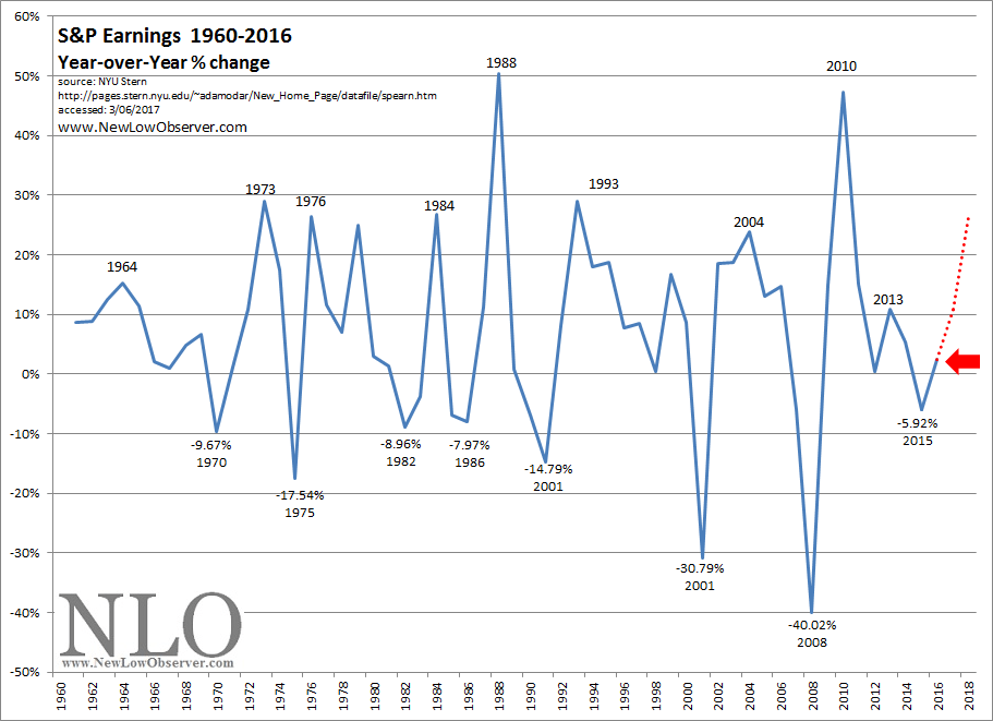
What stands out about the current move upward is the fact that the decline went into negative territory. While the decline wasn’t as low as we’d like, at or below the 1970 level, we have to accept that there are few times this indication went negative without a very strong recovery to the upside. For now, we’re hedging our commentary by watching for the 2013 level before going on to the 1964 peak.
However, we suspect that the recovery in S&P earnings could test the 1976 peak. What does that translate into for the stock market. Although not as low as the 1975 trough, the Dow Jones Industrial Average nearly doubled within a two year period. Let’s call for a +50% increase in the Dow Jones Industrial Average from the 2015 low. This would bring the index to 24,153.57 by 2018.
Resource Links:
Posted in Dow Industrials, Earnings, recessions, S&P 500
Top Five Watch List Performance Review
In our ongoing review of the NLO Dividend Watch List, we have taken the top five stocks on our list from March 4, 2017 and have checked the performance one year later. The top five companies on that list can be seen in the table below.
| Symbol | Name | 2015 Price | 2016 Price | % change |
| AIG | American International Group, Inc. | 52.30 | 64.22 | 22.8% |
| MON | Monsanto | 85.89 | 114.97 | 33.9% |
| AROW | Arrow Financial Corp. | 26.39 | 34.75 | 31.7% |
| LLY | Eli Lilly & | 73.60 | 83.78 | 13.8% |
| IPCC | Infinity Property & Casualty Corp | 75.55 | 96.10 | 27.2% |
| Average | 25.9% | |||
| DJI | Dow Jones Industrial | 17,006.77 | 21,005.71 | 23.5% |
| SPX | S&P 500 | 1,999.99 | 2,383.12 | 19.2% |
We highlighted the top two companies last year. Needless to say, they've done well. However, our assessment of Monsanto (MON) was not accurate as we suggested our reader to be more careful of the projected valuation. Valueline estimated shares to be undervalued by 40% at the time and shares have risen 33% since last year. As for AIG (AIG), shares were trading 30% below book value last year. Since then, shares have climbed 22%.
U.S. Dividend Watch List: March 3, 2017
Another week, another record high which lead to potential rate hike by the Fed. We'll have an update to the Coppock Curve mid week. Until then, please review the list below for dividend paying company trading at or near the low.
Posted in Dividend Achiever Watch List, Dividend Achievers, Dividend Watch List
Tagged members
For anyone who claims that the current bull market is a Federal Reserve induced binge based on manipulated interest rates, this market still needs to exceed the bull markets that followed the declines of 1835 & 1852, bringing the Dow Jones Industrial Average above the 24,768.
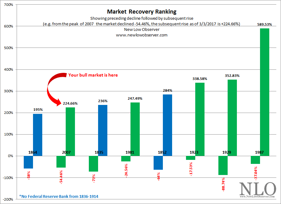
This market has a way to go in order to exceed bull markets that occurred when there was no Federal Reserve Bank. The next stop for the Dow Jones Industrial Average, to beat the bull market that began in 1842 and culminated in a gain of +236% by 1852, is 21,673.
We could easily see new highs in the stock market, however, it ain’t because of the Fed. More here.
Posted in cycle analysis, Federal Reserve Bank
Performance Review
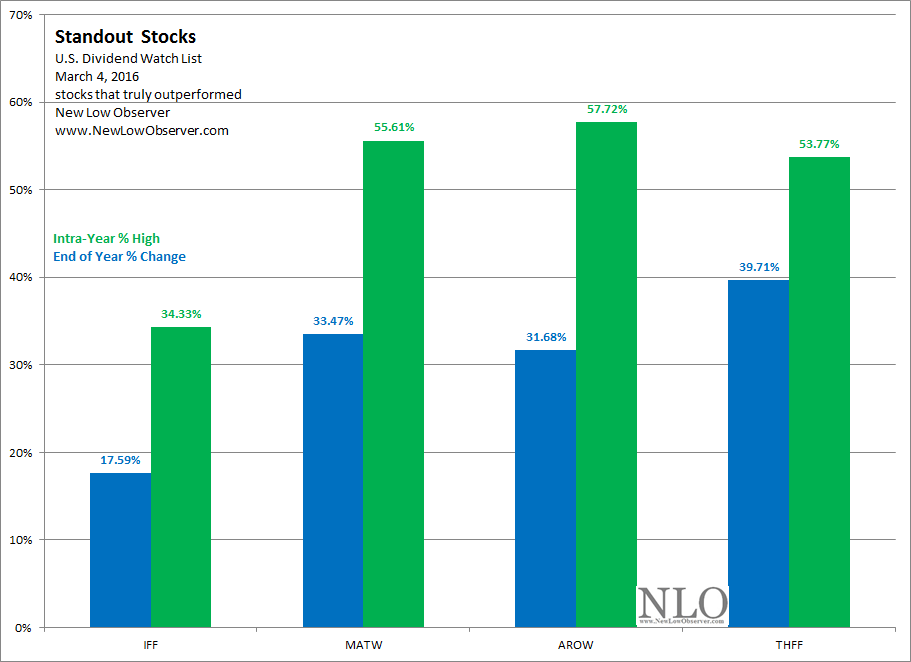
The analyst estimates for the U.S. Dividend Watch List published on March 4, 2016 show a relatively consistent pattern. The level of out-performance was primarily centered on the stocks that were considered to be high risk while stocks most favored by analysts barely exceeded their expected 1-year returns, on a relative basis. The categories that we’ve created are displayed below:
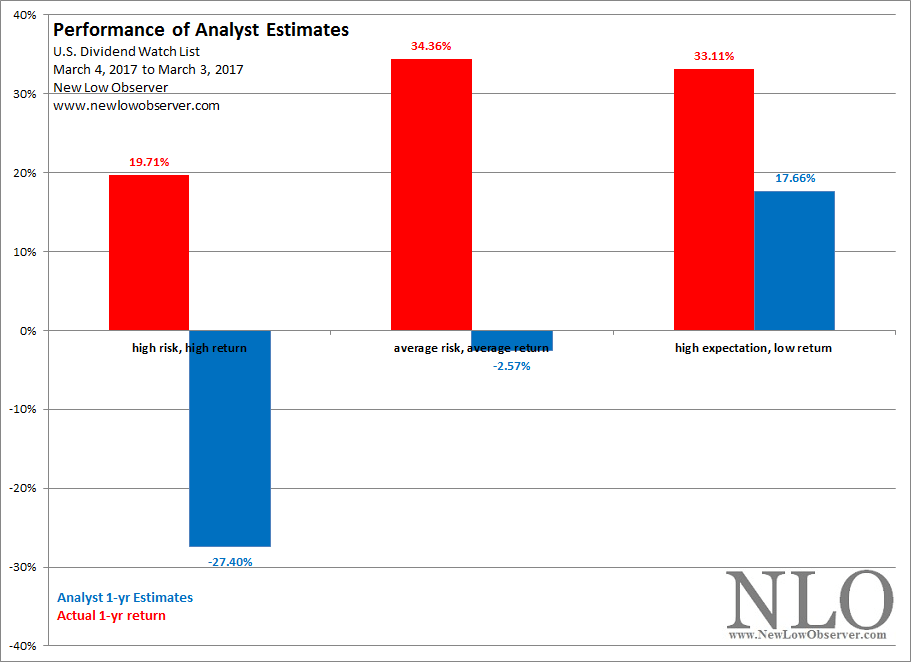
While the actual return for the “high expectation, low return” category exceeded the analyst estimates by +15.45%, the margin was far less than the +36.93% and +47.11% for the “average risk” and “high risk” groups, respectively.
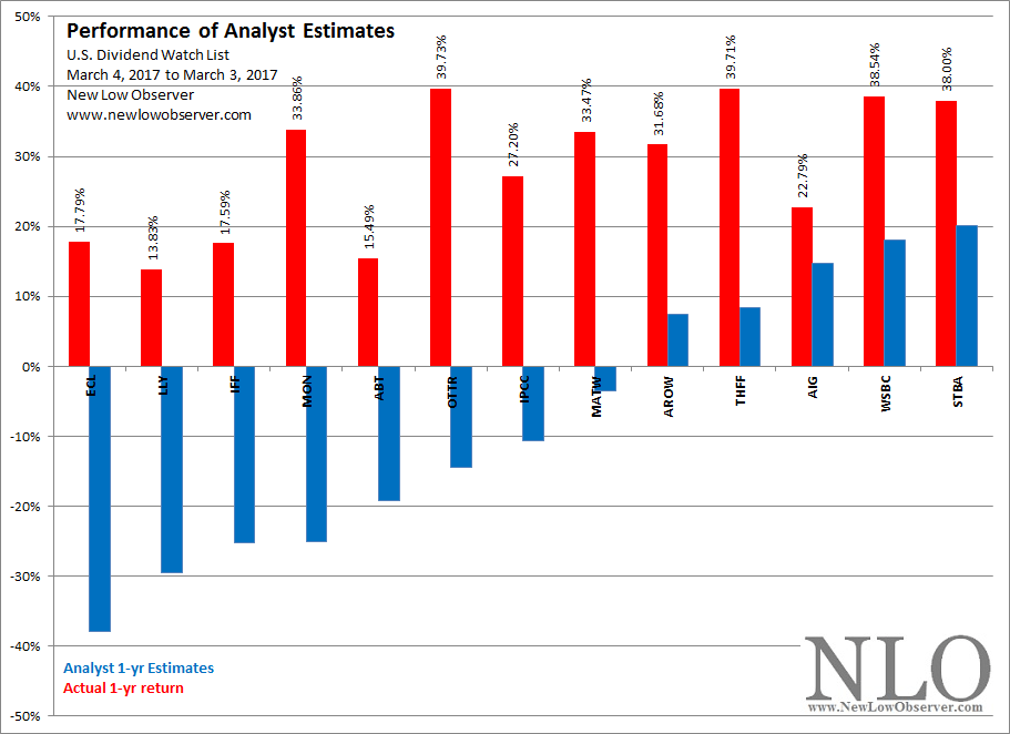
Stocks that stood out in the past year are those that actually had greater percentage change from the March 4, 2016 level than the March 3, 2017 level. These are stocks that are down from their highs. It should be noted that none of these standout stocks are found in the “high expectation” category and three of the four stocks are found in the “average risk” group.
Posted in Analyst Estimate
On March 11, 2016, we did a review of Ecolab providing the following conclusion:
“With the stock already trading below most fundamental averages, a purchase plan at the current level and lower would be ideal. A three-part purchase plan at the current price (50%), at the ascending $83.03 level (25%) and approximately at the ascending $61.91 level (25% would be acceptable.”
Since our posting last year, Ecolab (ECL) has increased +17.57%. This isn’t proof of the quality of analysis, however, we believe our updated could provided insight for future developments related to the directions of the stock price.
We will review the December 14, 2007 Value Line Investment Survey and compare their 2010-2012 projections and see how Value Line’s estimates were far short of their own expectations. Afterwards, we will review Value Line Investment Survey’s March 3, 2017 numbers and projections and see how their estimates stack up going forward.
Finally, we’ll revisit the technicals that we presented last year and see how that has played out and potential outcomes going forward.
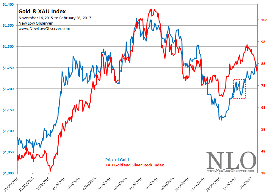
Since our January 2017 posting on gold and precious metals stocks, the price of gold has increased +3.48% while at the same time precious stocks have declined –5.87%. There are some contradictions in the movement of each indicator which we will interpret below.
Performance Review
The following is the performance review for the watch list from our February 16, 2016 Canadian Dividend Watch List.
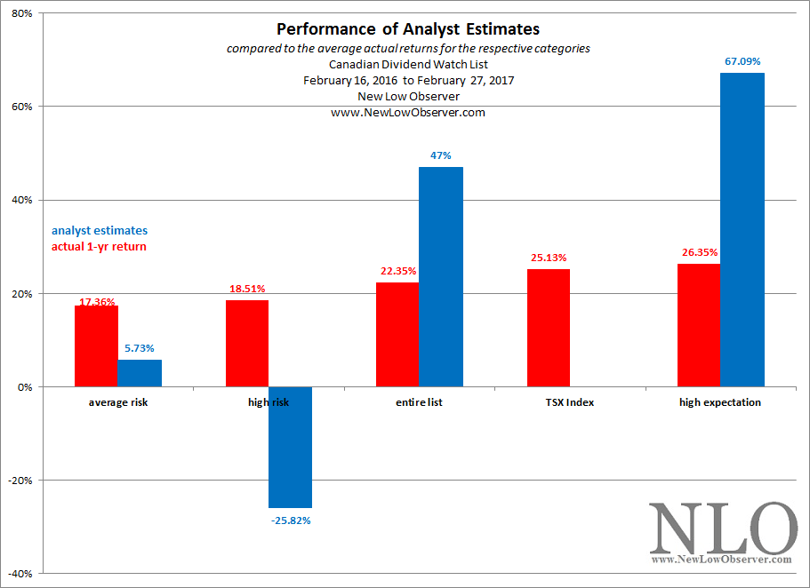
Looking at the categories above, the average actual 1-year return was led by the “high expectation, low return” with a gain of +26.35% followed by the Toronto Stock Exchange with a gain of +25.13%. Coming in last was the “average risk, average returns” group with a gain of +17.36%.
However, the distinguishing aspect of this review is the fact that analyst estimated gains show a high level of underperformance for the “high expectation, low return” group as compared to the “average risk, average return” and “high risk, high return” categories. Both categories (average risk and high risk) exceeded analyst estimates, making for better risk adjusted investment returns.
Below is a list of Bitcoin commentary that we believe is instructive in highlighting the valued of analysis (fundamental, technical or otherwise). The current run up in price was highlighted in our article titled “Bitcoin: Speculators Unite” published on October 7, 2014.
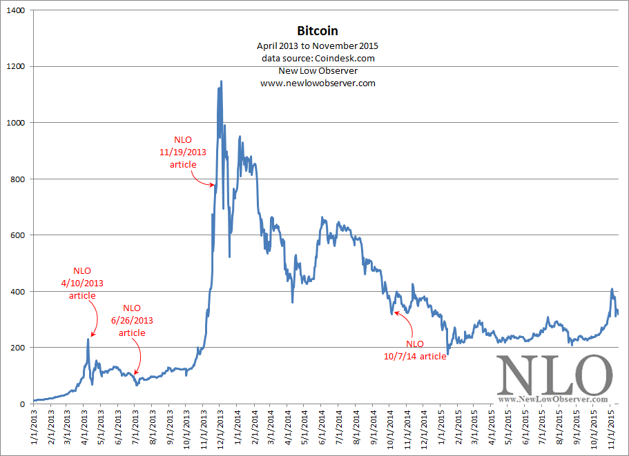
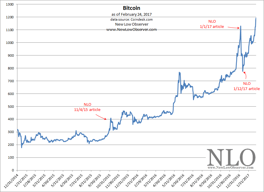
Our only third-party proof of the October 7, 2014 article can be found on SeekingAlpha.com under the stocktalks section under the symbol COIN. For reasons unknown, although the article is shown to have been posted an error appears at the provided link. Some of the other Bitcoin articles posted to our site can be found on SeekingAlpha.com at the blog section of our page.
Posted in Bitcoin
Previous Year Performance Review
In our on going review of the NLO Dividend Watch List, we have taken the top five stocks on our list from February 19, 2016 and have checked the performance one year later. The top five companies on that list can be seen in the table below.
| Symbol | Name | 2015 Price | 2016 Price | % change |
| AIG | American International Group, Inc. | 51.53 | 62.50 | 21.3% |
| SIAL | Sigma-Aldrich Corp. | 139.76 | 139.76 | 0.0% |
| SWK | Stanley Black & Decker | 92.00 | 126.65 | 37.7% |
| JCI | Johnson Controls Inc | 34.88 | 41.91 | 20.2% |
| FLO | Flowers Foods Inc | 16.36 | 19.57 | 19.6% |
| Average | 19.7% | |||
| DJI | Dow Jones Industrial | 16,391.99 | 20,624.05 | 25.8% |
| SPX | S&P 500 | 1,917.78 | 2,351.16 | 22.6% |
The top five companies on our watch list had an average gain of 19.7% which trailed the average 6%. One of the factor contributing to our underperformance, if you consider 19.7% as such, came from Sigma-Aldrich (SIAL) which didn't trade up or down due to the acquisition. Shares remained flat for the entire year. Although we spoke little about the list, we were lucky enough to highlight two companies with exceptional performance. Stanley Black & Decker (SWK) and Cintas (CTAS) were the two companies our team eluded to. Cintas rose 42% and Stanley Black & Decker rose 37%. Our justification for their consideration was because they were part of an elite group called Dividend Aristocrat.
U.S. Dividend Watch List: January 17, 2017
Another week, another record for the market. The bull continued to push the market higher but in contrary, the number of company approaching the low has not decline much. Below are 22 companies on our watch list. Continue reading
Posted in Dividend Achiever Watch List, Dividend Achievers, Dividend Watch List
Tagged members
A review of economic data encompassing the financial crisis to the present as presented on February 14, 2017, a must read.

Posted in data, economy, Federal Reserve Bank
We executed the following transaction(s):
On August 31, 2015, we reviewed the Bloomberg Commodity Index had the following to say:
“While achieving the extreme downside target doesn’t mean that the decline in the index has ended, the majority of the decline from the 2008 peak is behind us.”
“We believe that those interested in the investment opportunities in commodity stocks should review the top tier stocks that have 7% or more individual commodity weighting in the Bloomberg Commodity Index.”
Based on that assessment, the following sectors would have been represented in individual commodity stocks:
What has been the sector ETF performance of the related categories? Below is the respective charts with percentage change:
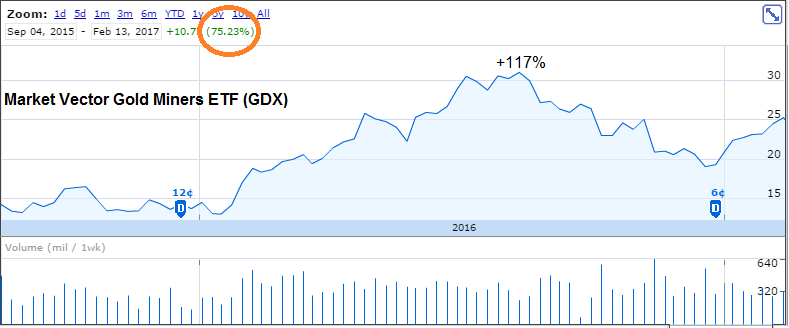
The gold ETF rose as high as +117% and currently sits with gains of +75%. Notice that there was marginal downside action for the sector after September 4, 2015.
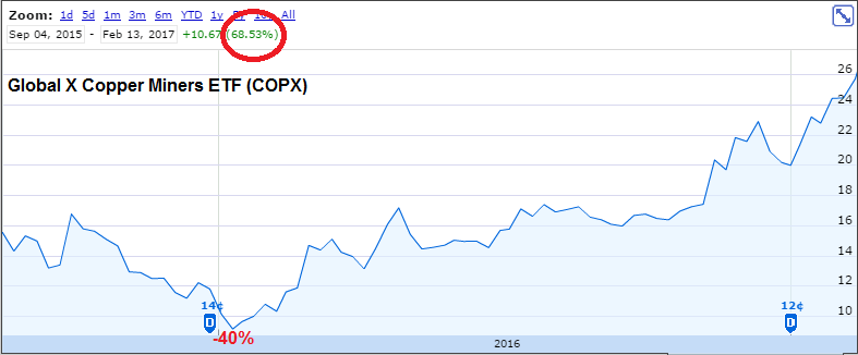
The copper miner ETF did not fair as well immediately after September 2015, falling as much as –40%. However, the recover has been dramatic with the ETF chalking up an “in-line” performance with the gold ETF at +68% gains.
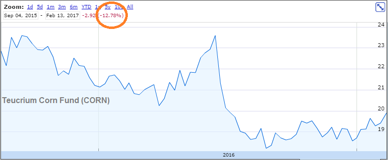
The Teucrium Corn Fund has underperformed with a decline of –12.78% since the late August 2015 call on commodities. This may be the sector to watch as it may be an outperformer in the category, if market conditions continue.
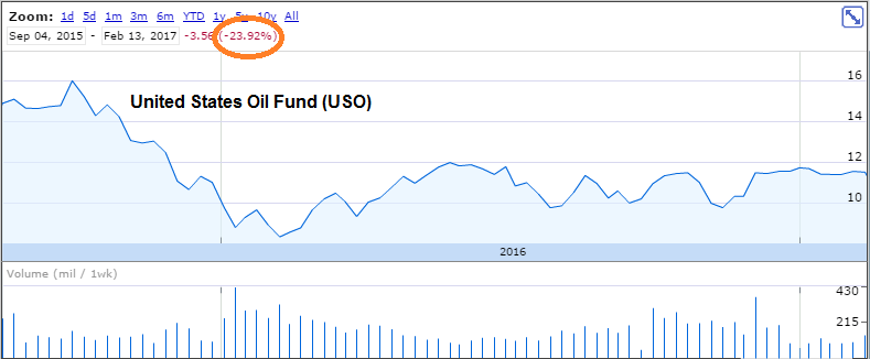
The United States Oil Fund (USO) has suffered in a similar fashion as the corn fund but by a greater magnitude at a decline of –24%.
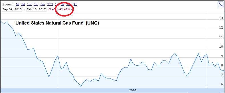
Getting crushed in this category was the United States Natural Gas Fund (UNG) with a decline of –42%.
Unsurprisingly, the individual stocks affected by the representative sectors have had much better performance than the sector ETFs with losses. As an example, our real-time purchases of Flowers Foods (FLO), Raven Industries (RAVN) and Helmerich & Payne (HP) had exceptional gains within the context of a declining sector at +36%, +63% and +74%, respectively. Each of these stocks are heavily impacted by the segments of the above sectors of the Bloomberg Commodity Index. The dichotomy between the commodity and the representative stocks explains why we have a long-held belief that the stocks are better for investors, in the short and long-term, rather than the pure play on the commodity itself.
Below is the updated review of the Bloomberg Commodity Index (BCOM) and our take on what to expect going forward.
On February 10, 2017, Sears (SHLD) CEO Eddie Lampert put out a press release indicating that the company will generate savings of $1 billion in 2017. The reaction by investors was a staggering +29% increase in the stock price.
Apparently, the timing of the news of “cost savings” managed to coincide with news that the same CEO of Sears just settled a $40 million conflict of interest lawsuit alleging that “…Lampert had stripped the company of its best assets to benefit himself and his hedge fund.” This news was also reported on February 10, 2017 but seemed to have been “overlooked” by the general public or institutional investors may have acted in unison to support the effort to look the other way.
Lampert’s claims that the current efforts will revive Sears fly in the face of overwhelming evidence to the contrary. While Sears continues to pile on debt, the bond rating agencies have negative outlooks on the actual repayment of that debt. Additionally, Sears stock price, since Lampert came on board as CEO, has been in perpetual decline, having fallen more than –80%.
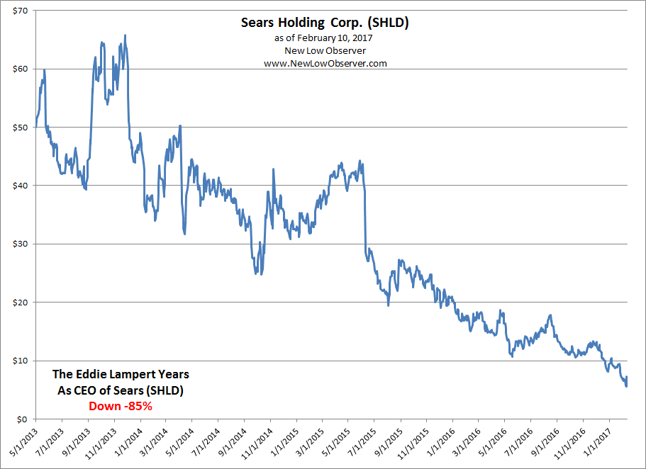
The evidence suggest that the latest news of cost cutting is a cover for the settlement of the lawsuit. As always, “the defendants said in court papers that the $40 million settlement was not an admission that the lawsuit's claims are valid.” We hear this all the time, “I’m giving away $40 million of my assets but the plaintiffs claims are illegitimate.” However, the clear conflict of interest on this matter suggests that anyone who continues to hold their position in Sears will not be rewarded for the value that has been lost since Lampert came on board.
Posted in SHLD