Category Archives: XAU

Netflix and Speed Resistance Lines

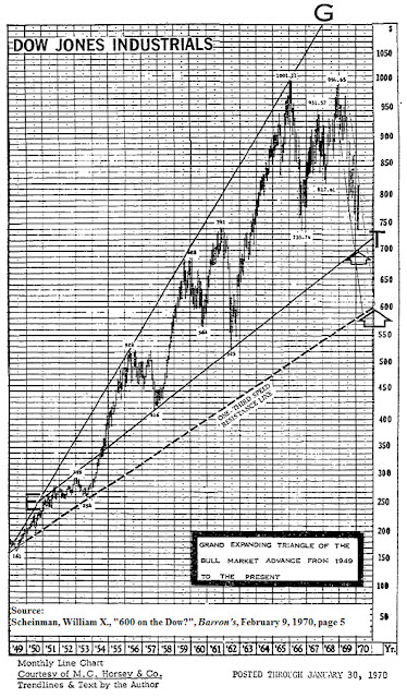
In a February 9, 1970 Barron’s article titled “600 on the Dow?” William X. Scheinman provides an interesting chart of the Dow Industrials (DJI) that outlines what he believes to be the target level that the DJI would fall to before rebounding. This analysis included macro economic analysis that supported the reasons why the Dow was expected to go to 600.

What is most compelling in Scheinman’s analysis is the accuracy of the target level that the DJI was expected to reach. An element that leaves some unanswered questions is that Scheinman had predicted that the DJI would reach 600 within the same year that the article was written. Of course, The DJI didn’t reach 600 until 1974. This has to do with Scheinman’s cycle analysis which is separate and distinct from the topic which we will examine. Being aware of this inconsistency and leaving it aside for the time being, we’ve attempted to understand the rational and methodology of how Scheinman was able to arrive at 600 on the DJI when it was trading at 755.68.

Scheinman indicates that he obtained his method for accurately predicting the level of the DJI from Edson Gould. According to Scheinman, Gould used what is known as the 1/3 speed resistance line measurement to gauge price change and elapsed time which was purported to be two key determinants of crowd psychology in the market. Scheinman goes on to say:

“Resistance lines decline or ascend at one-third or two-thirds the rates of actual declines and advances between significant bottoms and tops. Resistance to advance or decline is frequently encountered at such trendlines; however, if the resistance line is decisively penetrated, the price-action often tends to accelerate in the direction of the penetration.”
In an example provided by Scheinman below, he plots the bull market of the DJI from 1949 to 1970. In that chart, we can see that the dashed line, the one-third speed resistance line, intersects with the 600 level on the DJI.

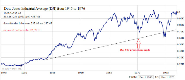
As far as we can tell, the 1/3 speed resistance line is calculated by dividing the peak of the market move by 3.  To be as conservative as possible, we’ve added the 1/3 speed resistance figure to the low of the first major decline in the bull run.  In this case, the first major low in the bull market from 1949 to 1966 was at the 1953 low of DJI 254.  The peak is indicated to be 1001 (1001/3=333.66).  Then we add 333.66 to 254 arriving at a figure of 587.66.  In order to account for the extremes, we assume that 1/3 the peak is the point at which the market finally settles.  In this case, 1/3 of the peak value is 333.66.  We feel that the conservative and extreme values help to establish a range which a market or stock that has had a near parabolic rise will finally settle at or near. 

According to our calculations for the market run from 1949 to 1966, 587.66 and 333.66 were the conservative and extreme downside targets for the market, respectively.  However, in the article, Scheinman says that the potential worst-case scenario level would be 597.61.  For the most part, Scheinman’s estimate was fairly accurate in terms of where the reversal in the market occurred.  The bottom in the stock market took place on December 9, 1974 at the 579.94 level.

In the chart of the Dow from 1945 to 1976 below, it should be noted that a large amount of “overshooting” of the 1/3 speed resistance line occurred when the low did take place in 1974 instead of 1970 as predicted by Scheinman.  In the case of the Dow, the index overshot the 1/3 speed resistance line in 1974 by 15%.  However, the price was well within the established, albeit wide, range of 587.66 to 333.66.

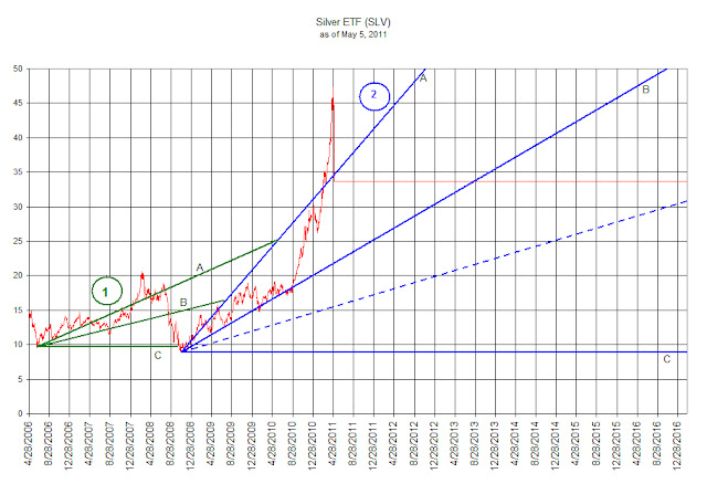
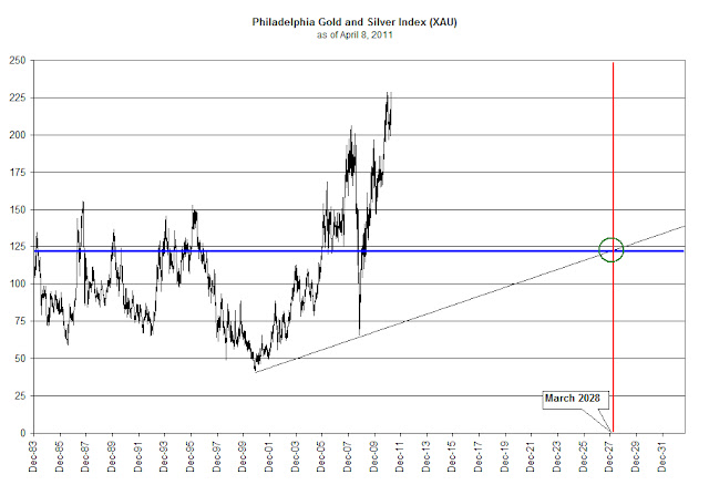
We decided to see how consistent the 1/3 speed resistance line would be if applied to three different situations.  First, we’ll review the bull market in the Dow Industrials (DJI) from 1982 to 2007. Next, we’ll run this model using the Philadelphia Gold and Silver Index (XAU) from the bear market bottom of 2001 to the present.  Finally, we’re going to see how this model works against Netflix (NFLX), a member of the Nasdaq 100, in a real-time example.

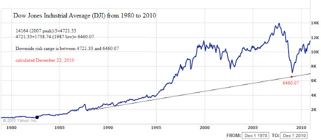
In the case of the bull market run from 1982 to 2007, we divided the peak of the market at 14,164 by 3 and arrived at 4721.33.  We then added 4721.33 to the first major low in the market after the beginning of the bull market which was in 1987 at 1738.74.  The sum of the two figures is 6460.07 for the conservative and 4721.33 for the extreme scenarios. 

When we review the actual bottom in the DJI in 2009 of 6547.05 we can see that the difference between the most conservative estimate and the 2009 low was off by 86.98 points.  There is no instance of the DJI overshooting the 1/3 speed resistance line.  Although coming within 1.5% of an estimated target seems exceptional, the real challenge becomes, would an investor commit money to an investment before the price level actually hits a projected target?  Once invested, could an investor stomach a further decline of 27% or more? [(6460.07-4721.33)/6460.07=26.92%]

In the case of the bull market run in the XAU Index, we divided the peak of the index at 206.37 in 2008 by 3 and arrived at 68.79.  We then added 68.79 to the first major low in the index after the beginning of the bull run, which was at 49.83 on November 19, 2001.  The sum of the two figures is 118.62.  When we contrast the difference between the two numbers, 118.62 and the actual low of 65.72, we see that conservative estimate was accomplished, however a further decline of 45% to below the extreme level was established instead.  Reasonably near the extreme end of the range, but who is willing to hold on after a 45% drop?
Finally, in reviewing the chart pattern of Netflix (NFLX), we have the peak of NFLX at $298.73.  The conservative estimate for the stock is that it would fall to $148 which has already taken place.  The extreme downside target would be $99.58.  Because of the nature of the rise, we believe that Netflix (NFLX) is slated to fall at least to the $99.58 level. 
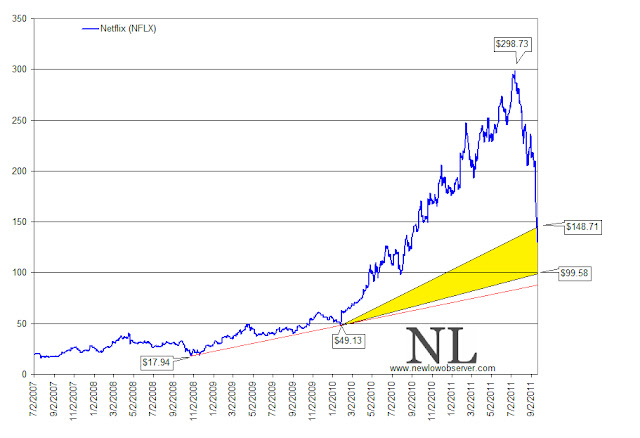
If for any reason investors become interested in buying Netflix (NFLX), the ideal time to do it appears to be at a price at or below $99.58.  However, the difficulty may be that the sentiment that pushed the stock price to $298.73 would likely be just the opposite to push the price down.  Only time will tell whether Netflix is going to conform to technical patterns created by Edson Gould.
Please consider donating to the New Low Observer. Thank you.

iShares Silver Trust (SLV) Debrief

On April 14, 2011, we provided what we believed to be the downside target for the Philadelphia Gold and Silver Index (XAU) in anticipation of the current decline that is taking place using Edson Gould’s speed resistance lines (article here).  Although appearing to be very similar, there is a distinct difference between Gould’s resistance lines and Charles Dow’s 1/3 support levels.  Gould’s lines have support levels based on 1/3 of high while Dow’s support levels are based on 1/3 the difference between the prior bottom and the most recent high.


In this review we’re going to tackle the trading pattern of the very controversial iShares Silver Trust (SLV). In the chart below we have drawn the Dow Theory support levels where the price of iShares Silver Trust (SLV) is likely to revert to as part of a normal reaction.  As a point of clarification, according to Dow Theory, a bear market does not begin until the index or stock falls by at least 1/3 of the prior rise.  In the case of (SLV), today’s closing price at $33.72 heralds what is sufficiently below the first support $34.52 and should be considered to be a bear market. 


Although this could be considered a bear market based on Dow Theory, we only need to look back to 2008 to know how quickly and viciously a bear market in precious metals can begin and end.  The precious metals bear market of 2008 crushed the XAU gold and silver stock index with a 68% decline in eight months.  During the same time, the iShares Silver Trust (SLV) declined slightly more that 55%.  


Bear market or not, some observations are worth considering.  First, in the chart below, the overall pattern of the price decline in (SLV) for the Dow Theory indication numbered 1 (in green) is very similar to the current decline represented with the Dow Theory indication numbered 2 (in blue).  Since Dow Theory works on a relative basis, once initiated at a major low, the signals provided are not confused through the distortions of large or small numbers.  Headlines about SLV having declines of historic proportions are grossly exaggerated if there is no comparison on a percentage basis and compared to prior declines.

Second, at the beginning of each run at point 1 and 2, the price of SLV bounced off of the middle line B (also known as the 2/3 support line) before going parabolic. 

Finally, the decline from each peak was rapid and vicious.  One-third of the prior rise was wiped out in a matter of days after the peak.


What remains is a high level of uncertainty for (SLV) going forward.  However, in general, we should see SLV tread water for a brief period of time before falling back to the prior low which began with the current run back in November 2008.   Dow Theory suggests that a reasonable buying opportunity would exist at below line B (blue line B).  However, we wouldn’t jump in at the slightest move below line B.  Instead, we’d like to see the price decline to the dashed blue line at $15.41 or below.

Projecting Downside Targets for Gold and Silver Stocks

In our prior work on the topic of gold and silver, we indicated that the precious metals market had entered into a secular bull market. Our confidence in that thesis was based on the works of Edward Dewey and Edwin Dakins 1947 book titled Cycle: The Science of Prediction. In that book, Dewey and Dakins illustrated the cycles for inflation which indicated that a peak in inflation would occur in 1979 and a trough of inflation would occur around 2006. While the 1979 peak was accurate the 2006 bottom was off by a few years. However, we feel confident that being off by a few years within the context of a 50-year cycle allows for some margin of error.


As investors, the NLO team is primarily concerned with the downside risk and major downside targets. For the gold and silver market, we will use the Philadelphia Gold and Silver Stock Index (XAU) to determine where the next low might occur.


To project the downside target for the XAU, we will use speed resistance lines as pioneered by Edson Gould. William X. Scheinman wrote a piece in Barron’s titled “600 on the Dow” on February 9, 1970 that outlined exactly how Gould’s resistance lines work.


The forecast by Scheinman of a closing low for the Dow at 600 was off by 2.57% when the index closed at 584.56 on October 4, 1974. [As a sidebar, Dow Theory gave a bull market indication in January 1975 that would have investors fully invested.] Although being off by such a small amount, Scheinman also said that the low would occur approximately a year from the date that the article was written. We believe that the tactical error on the part of Scheinman was to expect that the decline would be based strictly on a set time frame rather than based on the level of the resistance line. The chart below is the original piece that was generate by Scheinman from 1970.


In our chart of the Gold and Silver Stock Index, we have drawn the XAU on a daily basis from 1983 to the present. As described by Scheinman, the counter-trend movement should revert to the speed resistance line or two-thirds of the established high. As an example, the previous peak of the XAU on March 14, 2008 was at the 206.37 level. 206.37 divided by 3 is 68.79. The reversal from the 2008 decline was 65.72 on the XAU. This was within 4.5% of the speed resistance level.


Based on the most recent high of 228.95 the downside target for the XAU index is 76.32. We recommend that whenever the XAU index falls at or below the speed resistance line drawn on the chart, between now and just before 2028, as part of the secular rising trend in interest rates/inflation, we would expect that the stocks in the index are underpriced. Confirmation of fair values should be determined for possible speculative positions at these times.


Note: A variation on this method is to divide the high by three then adding the first major low after the start of the bull market, in this case the October 27,2008 low for the XAU. An example of the usefulness of this technical approach to projecting downside targets can be found by dividing the 2007 top in the Dow Jones Industrial Average (14,164) by three and adding the 1987 low (1738.74). This provided a speed resistance line of 6460.07 which was within 2% of the actual March 9, 2009 low. The blue horizontal line, in our chart of the XAU above, represents the expected downside target when adding the October 2008 low to the speed resistance line.
Please revisit New Low Observer for edits and revisions to this post. Email us.

On the Brink of a Secular Bull Market in Precious Metals

In our “Commentary on Gold” dated November 11, 2008, we made some outlandish claims about the lack of performance by three undisputed experts on gold. One claim that we made was that “…when the price of stocks fall so too does the price of gold, and to a greater degree, gold & silver stocks.” This was said after the precious metals and the XAU and HUI indexes had already hit their final lows on October 24, 2008 and October 27, 2008 respectively. We demonstrated our claim through research performed by David Marantette which showed that from 1975 to 2001, declines of 10% or more in the Dow Jones Industrial Average resulted in larger declines in the gold stock indexes and the price of gold.  We completed the research by providing the data from 2001 to 2007.
The point of our December 9, 2008 article was best summed up in our closing paragraph:
“The long term trend in gold and silver stocks as demonstrated by the Philadelphia Gold Stock Index (XAU), which was initiated in November 2000, will eventually head permanently higher. The continuation of that trend will be among the key indicators that the bear market in stocks is at or near an end.”
Our overall assertion was, and is, if precious metals and their stocks continue heading higher so will the general stock market.  If the stock market starts to collapse then so too will the price of gold and silver and to a greater degree gold and silver stocks.
When we wrote our earlier pieces on precious metals, gold enthusiasts argued that the physical metal and the gold stock indexes are completely unrelated and therefore it doesn’t make sense to compare the two, not realizing that we weren’t comparing them at all. Other gold enthusiasts countered that with the price of gold falling only -29% from the March 2008 high investment in that area was justified considering that the Dow and S&P 500 had fallen over -35% in 2008, not realizing that losing less money isn’t the reason why people invest. Not liking the outcome of the data, because it only covered the period from 1975 to 2007, some said that it didn’t go back far enough.To respond to the critics about our data, we gathered prices of gold and silver stocks from 1924 to 1933. That data demonstrated that gold and silver stocks got hammered during that period. Below we have included a previously unpublished Gold Stock Average of the 13 precious metal stocks (out of 21) with complete price history from 1924 to 1933.

Gold Stock index 1924-1933

As you can plainly see, when you exclude the performance of Homestake Mining, the value of the gold stocks fell 76.47% from their peak in 1925 to the bottom in 1932.  This performance is in line with the decline of the Amex Gold Bug Index (HUI) from March 14, 2008 to October 27, 2008; which has 16 precious metal stocks in it.  In the chart below, you can see that the HUI index and the Philadelphia Gold and Silver Index (XAU) fell 70.56% and 68.15% respectively,  within the 8-month period.

Few people will readily agree that all the deflating of the financial system has been expunged from the markets. However, when compared to the deflation that took place from 1924 to 1932, first reflected in the gold stocks and later the entire stock market,  it becomes very clear that the general stock market decline of over 50% and the eight month decline of the gold stock index on such a large scale signaled the end of the deflationary period. For investors, one area we think that holds the most promise is in silver.

On September 9, 2009 we wrote an article titled “Silver Should be the Focus.”  We indicated that if there were a need to participate in the run in precious metals, silver would be the best investment/speculative choice.  At the time, silver closed at $16.36 an ounce.  On Friday September 24, 2010, silver closed at $21.46 with an increase of 31.17%.  During the same period of time, the price of gold increased 30.61%.  So far, the precious metals appear to be in lock step with each other since our last article on the topic.  However, since the bottom in the market on October 24, 2008, the price of gold is up 82% with the price of silver is up 142%.  Although these are considerably large increases in value in a very short period of time, compared to past price increases the current moves are in their infancy.

The most pressing matter for the precious metals market right now is confirmation.  So far, the price of gold and silver has exceeded their respective 2008 highs.  However, the corresponding stock indexes, the XAU and the HUI, have not yet confirmed the trend.  If the trend is confirmed then we will have received the indication of the beginning of a secular bull market in gold and silver.  In our Richard Russell Review posted on July 4, 2010, we outlined Russell’s significant detail on the importance of confirmations.  Although our analysis shows how Russell got the interpretation incorrect, it is well worth re-examining this article since it outlines exactly how to utilize both indicators (price of gold and gold stock index) for confirmation of the trend.
Below is the HUI index with what appears to be the third attempt at the 514.89 level.
 
Although not likely, failure to breach the 2008 peaks for the XAU and the HUI index could mean very hard economic times ahead.  Alternatively, going above the previous peak, which seems much more likelier, may mean that we’re entering the early stages of higher interest rates and inflation.  It is necessary to keep in mind that higher inflation and higher interest rates won’t initially wreck havoc on the economy.
Most investors have the tendency to remember only the periods at the extremes, the real estate bust, the real estate bubble, the dot com bust, the dot com bubble, the gold bubble and the gold bust, skyrocketing interest rate, the current zero interest rate environment.  In every instance, the recollection of such periods is rooted in the final stage. However, what is more important is the slow transition that takes place from trough to the next peak. 
In the case of inflation, the slow transition was the innocuous period, saved for a world war, from 1932 to 1966.  Unfortunately, most investor over concentrate on the period from 1973 to 1980 due to the exaggerated moves upward.  The transitional period brought many cyclical and one secular bull market in the Dow Jones Industrial Average. It is possible that as our inflation rate climbs the Dow Jones Industrial Average could experience a bull market similar to the period form 1949 to 1966.
According to the chart below, periods of inflation coincided or preceded extremely large moves in the stock market.  The period from 1940 to 1947 had a 74% increase in the CPI while at the same time the stock market doubled in value.  Naturally the argument is that the stock market only managed to beat inflation by a small amount over that period.  The reality is that the response by the Dow Industrials was to go from the 100 level in 1941 to the 1000 level in 1966.

Looking at the chart above, it is hard to believe that the CPI increase of 200% in the 1970's would follow the pattern of previous high inflation periods with stocks increasing 10 times in each instance.
While we watch and wait for the confirmation of the new high in the price of gold and silver with the XAU and HUI indexes by breaking above their 2008 highs, our overall assertion still is that if precious metals and their stocks continue heading higher so will the general stock market.