
On February 11, 2014, Mark Hulbert of MarketWatch.com posted an article titled “Scary 1929 Market Chart Gains Traction (found here)”. In the article, Hulbert suggests that the critics of the chart, which shows a parallel between the current market action since July 2012 and 1928-1929, are running out of explanations as to why the chart doesn’t have merit.

One aspect missing from the Hulbert article is what it takes to get from the most recent high of 16,588 to the 1,658 level on the Dow Jones Industrial Average. In order to lose -89% in value, the Dow would need to decline first to 15k, 14k, 13k etc. Leaving out these important hurdles on the downside ignores a wide swath of goings-on that needs to occur in between now and the doomsday low. To fill the void that is unexamined by the Hulbert article, we’re going to review the various ways that the Dow Jones Industrial Average could decline to new lows.
Before offering our downside take on the market, we’d like to refer you to some basic issues that are mandatory to understanding how the stock market decline from 1929 was an anomaly, at best. In previous work on the topic, we’ve addressed reasons why the 1929 stock market decline of -89% had more to do with reshuffling of the index by replacing stocks that had fallen significantly with new stocks that had appeared strong but were on the cusp of major declines. Once the new stocks were added to the index they crashed hard while the stocks that were dropped from the index were at the beginning stages of recovery (2009 article found here).
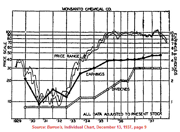
In another piece, we outlined the fact that the decline of 1929 was followed by a recovery that was much faster than most investors know. Our theory is that the multiple changes to the index artificially suppress the index on the way down and on the way up. This resulted in the Dow taking 25 years to achieve breakeven status with 1929. However, stocks that were not part of the index can be seen to achieve breakeven status on average by 1937. One of our favorite examples is found in the chart of Monsanto Corp. below (2010 article found here).
As recently at January 14, 2014, we examined Dow Theory’s 50% Principle for potential downside risk (found here). At the time, we said the following:
“While falling to 11,561.85 isn’t required, it doesn’t hurt to have a sense of the downside risk. Additionally, as the Dow goes higher, the level for the 50% Principle will increase. A retest of the ascending trendline should be expected at minimum.”
That ascending trendline hovered around 14,100 for the Industrial Average on January 14, 2014. Today the ascending trendline offers us support at 14,269.

According to Dow Theory, the Dow Jones Industrial Average has the following downside targets:
-
13,233.47
-
11,561.88
-
9,890.29
Keep in mind that a decline to 9,894.10 would be a loss of -40% for the Dow Jones Industrial Average. As we’ve demonstrated in a February 12, 2009 article, declines of -40% or more in the stock market usually result in a rebound of between +50% to +100% of the previous decline (found here). Since that article was published the Dow has gained +103% and +121% since the low of March 9, 2009.
If we were to take artistic license on the chart presented in Hulbert’s article, we’d swear we could see a distinct pattern known as a “Three Peaks and a Domed House (3PDh).” This pattern, 3PDh, was described in detail in the book George Lindsay and the Art of Technical Analysis by Ed Carlson. For a breakdown on this pattern, we recommend that you read Carlson’s February 11, 2014 article titled "Stock Market Three Peaks and a (Complex) Domed House". Carlson projects a minimum downside of -42% from the December 2013 peak. While we agree that this sounds much better than what is implied in the Hulbert article, our own interpretation of the 3PDh numbers suggest that the downside target is between -16% to -19% from the peak.
We love a declining stock market as much as the next value investor. However, implying that an -89% decline is in the works because the pattern appears similar to 1929 is ignoring the path to far more achievable downside targets.
3 responses to ““Scary” 1929 Chart Says Little About the Future”