Below is the annual New York Times Inflation references from January 1920 to 2020.

See also:

Below is the annual New York Times Inflation references from January 1920 to 2020.
See also:
Posted in NYT, NYT Recession/Depression Index
As we have long advocated, the declining trend in interest rates is coming to an end and the secular trend in rates is up. To provide a decent level of analysis on what might happen going forward, we have a comparison of the Dow Jones Industrial Average to the 3-month Treasury from 1934 to the peak in May 1981.
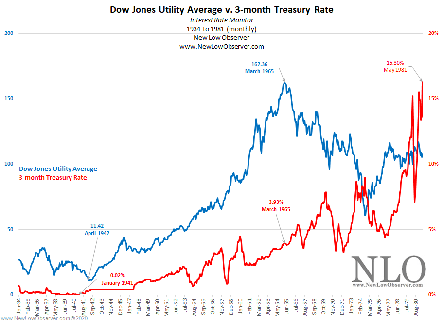
Conventional wisdom says that as interest rates rise then stocks should underperform. However, when contrasted to the interest rate sensitive Dow Jones Utility Average, we see that the index increased +1,321% from the April 1942 low to the March 1965 peak.
We contrast the change in the Dow Jones Utility Average to the 3-month Treasury to highlight what happened to the price of Silver in the same secular trend.
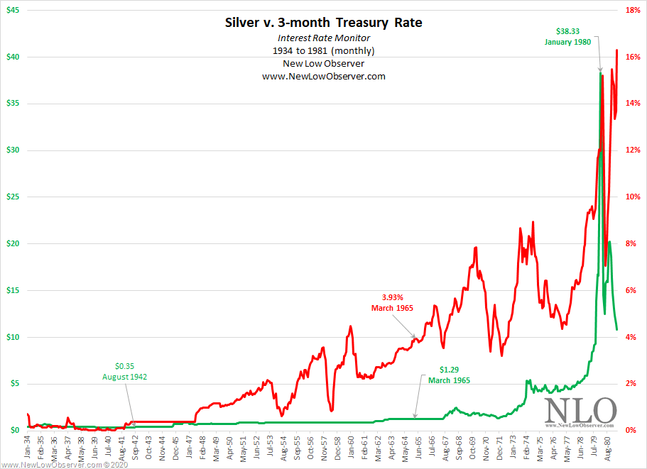
Historically, it is understood that rising interest rates mean rising commodity prices. In the last secular trend, the price of silver increased modestly until, in the late stage of the cycle, all commodity prices go wild. We believe that such a trend is likely to occur again.
Our general conclusion on the secular trend in rising interest rates is that the best alternative in the initial stages is stocks and commodities in late stage of the same trend.
“For the past 25 years the commodity market and the stock market have moved almost exactly together. The index number representing many commodities rose from 88 in 1878 to 120 in 1881. It dropped back to 90 in 1885, rose to 95 in 1891, dropped back to 73 in 1896, and recovered to 90 in 1900. Furthermore, index numbers kept in Europe and applied to quite different commodities had almost exactly the same movement in the same time. It is not necessary to say to anyone familiar with the course of the stock market that this has been exactly the course of stocks in the same period ( source: Dow, Charles H. Review and Outlook. Wall Street Journal.February 21, 1901.)”
Below is the Year-Over-Year percentage change data from FINRA’s Margin Statistics.
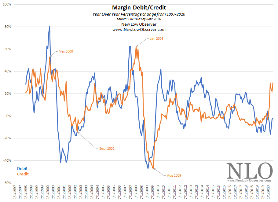
see also: Margin Debit-Credit August 2019
Posted in Margin Debit-Credit
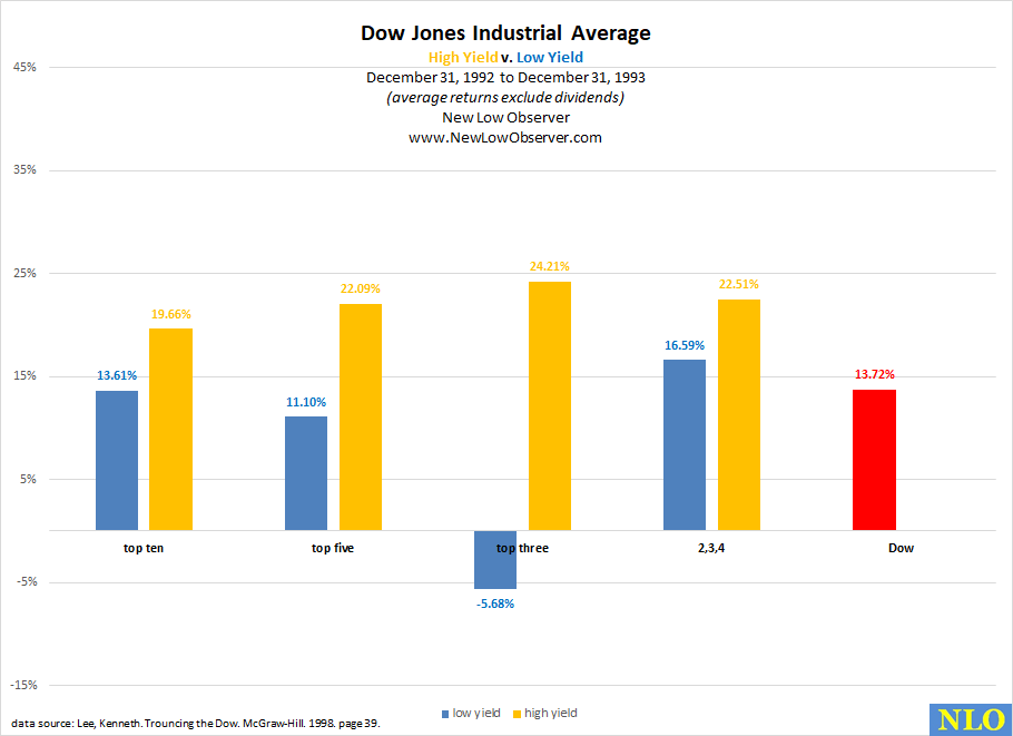
In our continued pursuit to gather data that contradicts our view that low yield stocks outperform the high yield stocks (aka Dogs of the Dow) as presented in Michael O’Higgins’ book Beating the Dow, we have obtained the performance of the top ten, top five, top three and the 2nd, 3rd, and 4th stocks in the high and low yield groups then contrasted their performance against the Dow Jones Industrial Average for the same year.
In this case, the year under consideration is 1993 and we have added the list of ten stocks and their price with the dividend yield.
1993 Data Breakdown
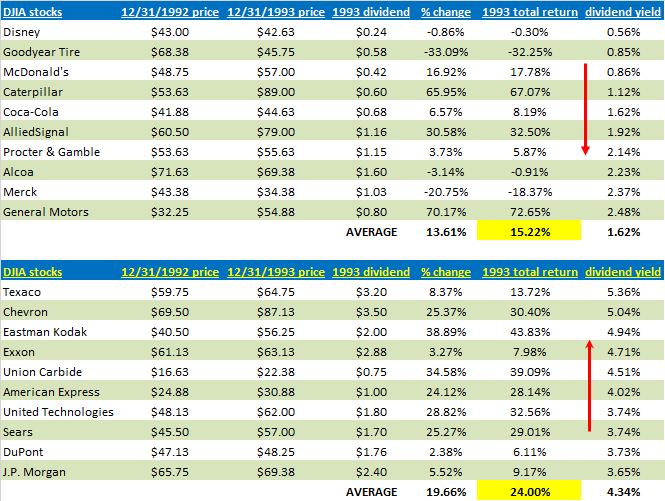
This is the first year where High Yield stocks (Dogs of the Dow) exceeded the returns of the Low Yield stocks.
Average Return 1991-1993
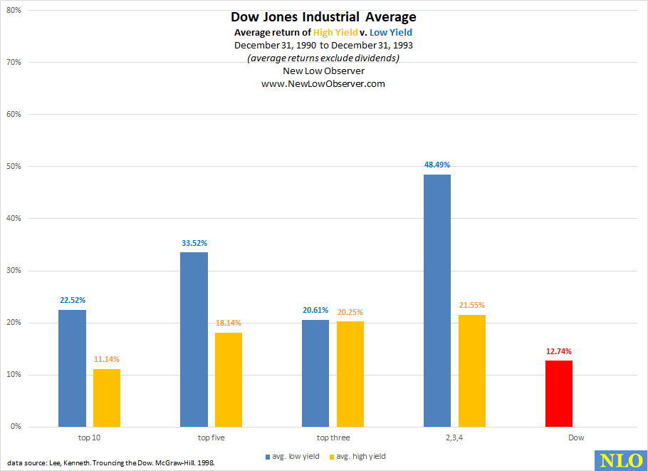
The average return for the period from December 31, 1990 to December 31, 1993 continues to show the Low Yield stocks exceeding the index in each grouping. However, the High Yield stocks are gaining ground with the top ten stocks failing to prove their ability to beat the Index.
see also:
Posted in Dogs of the Dow, high yield, Low Yield
In our continued pursuit to gather data that contradicts our view that low yield stocks outperform the high yield stocks (aka Dogs of the Dow) as presented in Michael O’Higgins’ book Beating the Dow, we have obtained the performance of the top ten, top five, top three and the 2nd, 3rd, and 4th stocks in the high and low yield groups then contrasted their performance against the Dow Jones Industrial Average for the same year.
In this case, the year under consideration is 1992 and we have added the list of ten stocks and their price with the dividend yield.
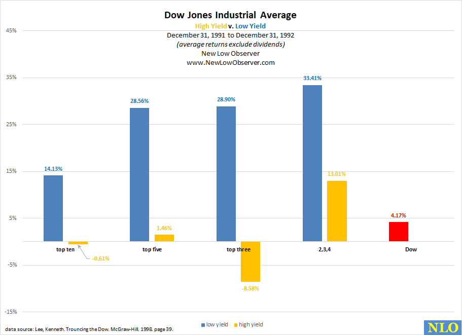
1992 Data Breakdown
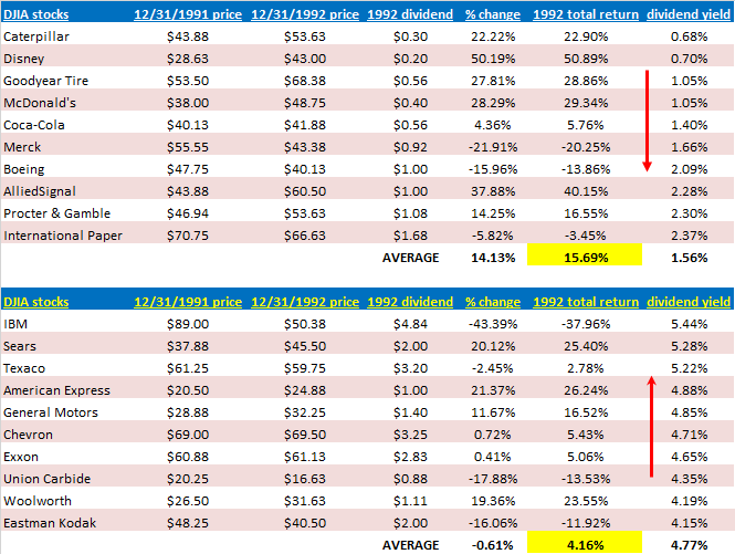
For the second year in a row, the top ten stocks in the high yield category underperformed the Dow Jones Industrial Average AND the low yield category.
Average Return 1991-1992
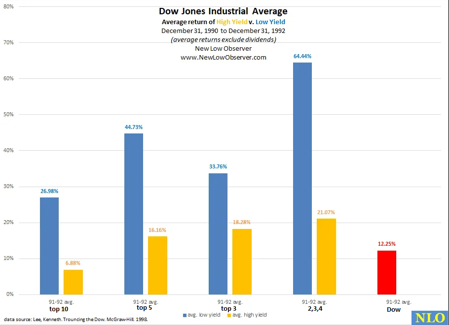
The average return for the period from December 31, 1990 to December 31, 1992 highlights the strength of the low yield stocks. However, for the top ten high yield stocks, they could not outperform the Dow Jones Industrial Average.
see also:
Posted in 1992, Dogs of the Dow, high yield, Low Yield
In our continued pursuit to gather data that contradicts our view that low yield stocks outperform the high yield stocks (aka Dogs of the Dow) as presented in Michael O’Higgins’ book Beating the Dow, we have obtained the performance of the top ten, top five, top three and the 2nd, 3rd, and 4th stocks in the high and low yield groups then contrasted their performance against the Dow Jones Industrial Average for the same year.
In this case, the year under consideration is 1991 and we have added the list of ten stocks and their price with the dividend yield.
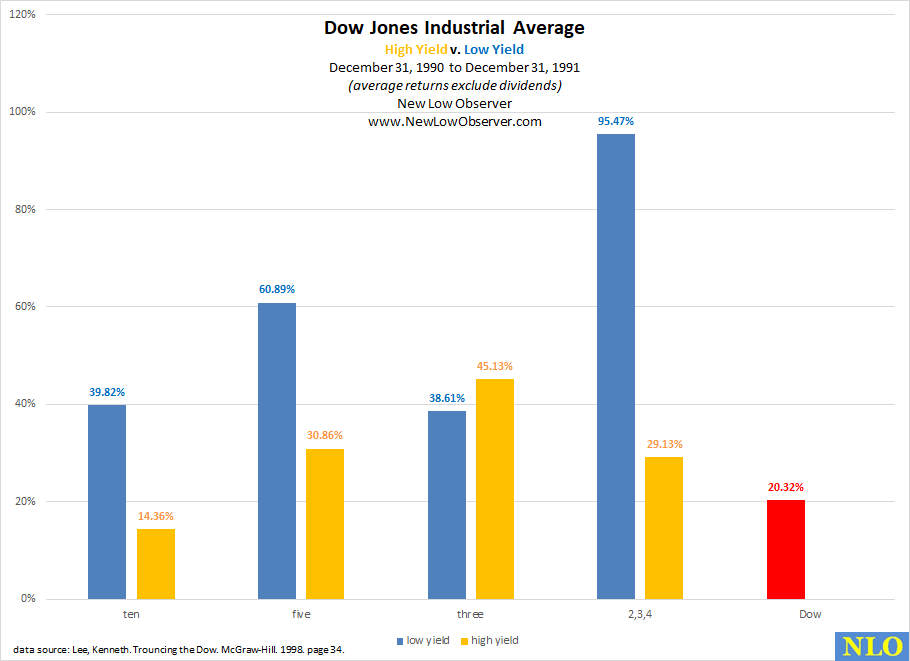
1991 Data Breakdown
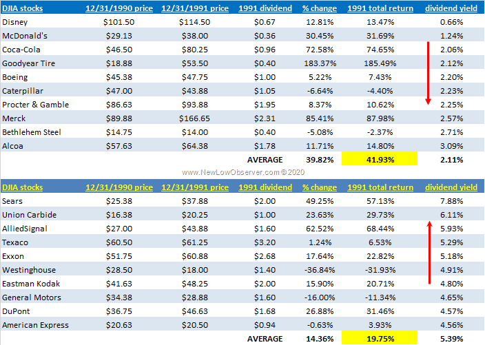
The data should be considered amazing because the exceptional yield that is offered by the high yield stocks (Dogs of the Dow) an investor generally foregoes nearly double the return. Also notice that the high yield stocks had 4 of the ten companies on their list that failed (bankruptcy, forced liquidation) while only one company in ten on the low yield list has failed (so far).
see also:
Posted in 1991, Dogs of the Dow, high yield, Low Yield
Last month, the Coppock Curve dipped into negative territory flagging us to closely monitor this indicator for a buy signal. In addition to monitoring the Dow Jones Industrial Average, we created a model to back test this strategy against individual stocks. So far, we are very satisfied with the outcome. Below is the current status of this indicator when we apply it to the Dow Jones Industrial Average. Continue reading
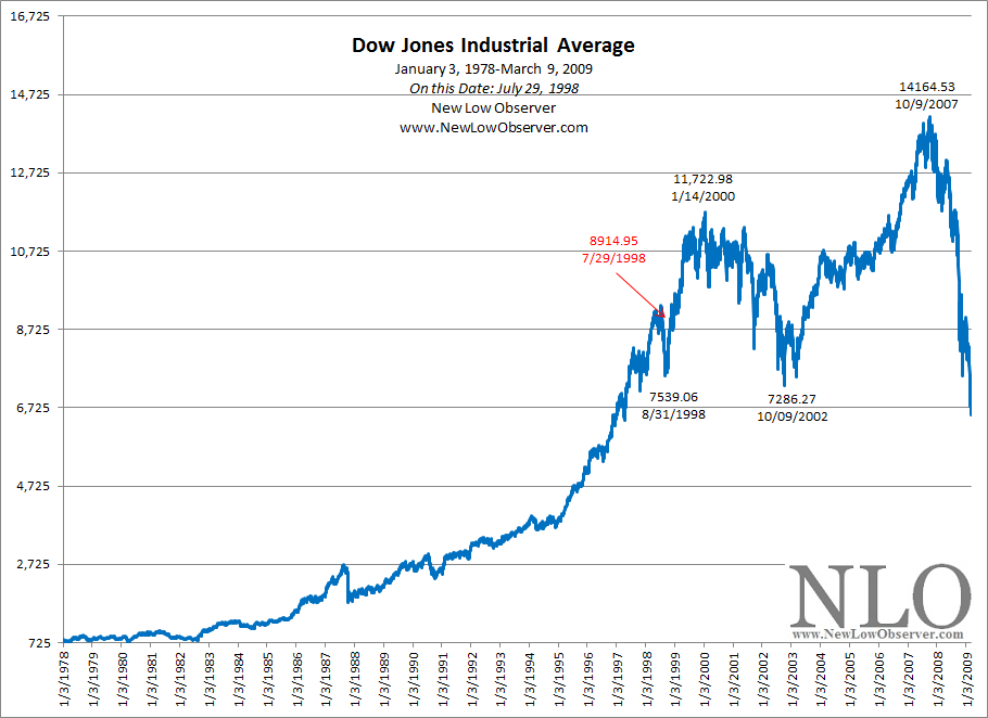
On this date, Richard Russell of the Dow Theory Letters, said the following:
"Wall Street wisdom tells us that the most bullish thing the market can do is advance to new highs.
"Wrong--the most bullish thing a stock average can do is rally to a new high confirmed with the other averages and breadth. But that’s not what has been happening. The recent Dow/S&P highs were not confirmed by the Transports, the Utilities or the advance-decline ratio. In other words, the Dow/S&P advance to new highs was extremely “arrow, which is fine for people holding a handful of the stronger blue-chip stocks but frustrating, if not costly, for those holding a representative portfolio of stocks."
-Russell, Richard. Dow Theory Letters. July 29, 1998. Letter 1257. page 1.
Posted in On This Date, Richard Russell, Top Out Parade
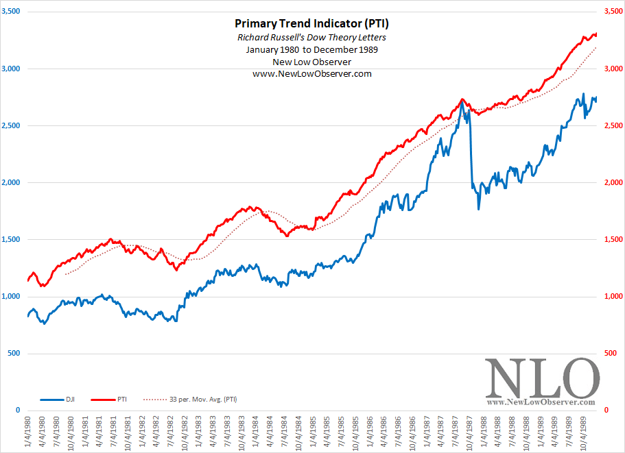
Below is the Richard Russell’s Primary Trend Indicator (PTI) from inception in 1980-1989.
see also: PTI from 1972-1979
Posted in PTI, Richard Russell
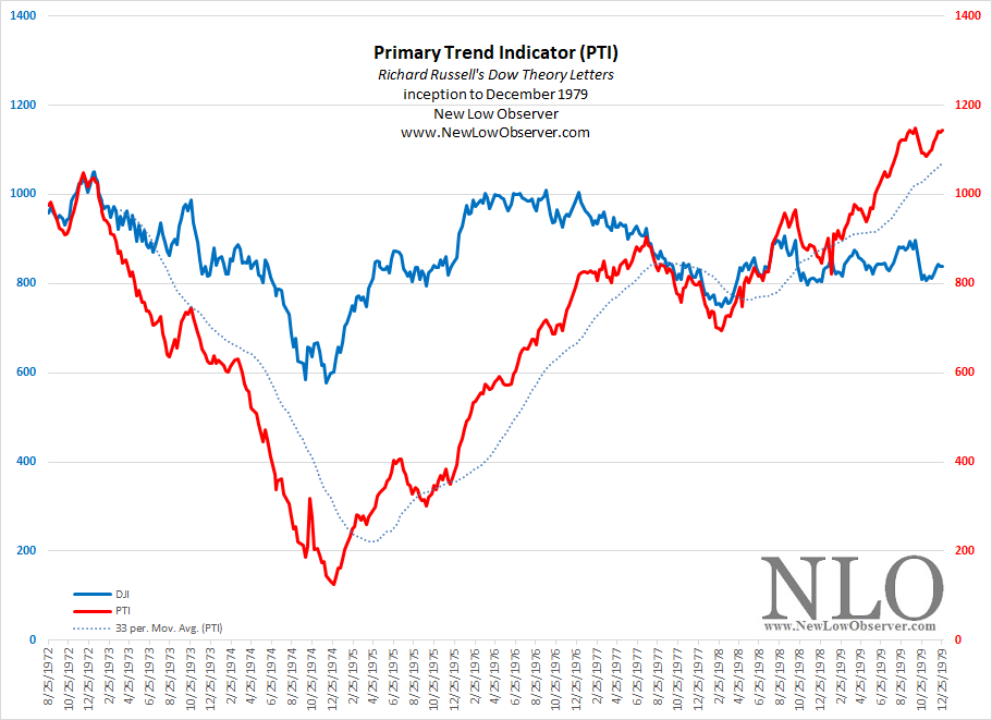
Below is the Richard Russell’s Primary Trend indicator from inception in 1972 to 1979.
Posted in PTI, Richard Russell
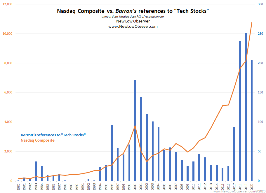
Below is Barron’s references to “tech stocks” relative to the July 1st closing price of the Nasdaq Composite Index from 1980 to 2020.
see also: New York Times Recession/Depression Index 1853-2018
Posted in Barron's, Barron's Data
Source
Krugman, Paul R. "Mexicans Send Message with Votes, but the Results may Not be what they Hope." Los Angeles Times. Jul 24, 1988, page 2.
Claims
Prediction
"Is anyone in the U.S. government prepared to take the lead? Or will we drift, hoping that Mexico's problems will go away, or at least wait until January [1989]? If we do, we risk a foreign policy disaster that will make our Central American worries look trivial."
Outcome
see also: Mexican Peso Crisis
Posted in Krugman, Peso Crisis, S&L Crisis
In our posting from July 15, 2020, we ran the numbers and compared the performance. Below is the latest update of the top ten stocks for anyone who wishes to make new investments in the Canadian stocks that are part of the TSX 60. Continue reading
The following is the breakdown of the Dogs of the TSX (here) in week 29, compared to other fundamental ratios. Continue reading
Income investors seeking dividend may purchase and hold shares based on dividend yield. There is a strategy our team is curious about, one which involves buying shares just to capture the dividend using the shortest possible holding period.
It turns out, that the strategy is called the Dividend Capture Strategy. In short, this strategy is to purchase a dividend paying stock one day prior to the ex-dividend date and selling it on the ex-dividend date.
Critics of this strategy argue that stock prices often drop in accordance with the dividend amount that is paid. While this makes sense, we haven’t seen enough data to support this claim. That is, our team developed a model that can test this theory at the individual level. Below is an example of the Dividend Capture Strategy applied to AT&T (T).
The assumption is that we would buy AT&T one day prior to the last ex-dividend date, July 9, 2020, to capture the $0.52 in dividend. Continue reading