Author Archives: nlo-admin

Gold Stock Indicator: January 9, 2014

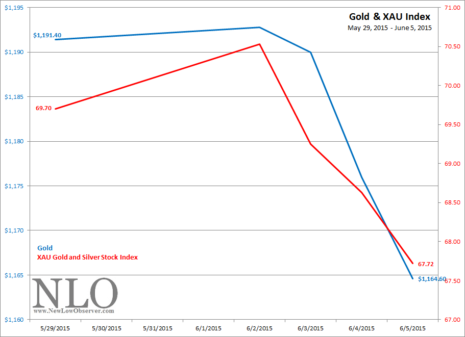
Gold, as represented by the SPDR Gold Trust (GLD), gained +1.89% while gold stocks, represented by the Philadelphia Gold and Silver Stock Index (XAU), gained +7.26% in the last week.

image 

Scary 1929 Chart Nearly One Year Later

In February of 2014, a widely publicized chart circulated about the similarity between a 1928-1929 stock chart and a 2012-2013 chart.  According to Tom McClellan of the McClellan Market Report:

“…between now [February 11, 2014] and May 2014, there is plenty of reason for caution.”

Since February 11, 2014, the Dow Jones Industrial Average has increased +11.06%.  In the period from February 11th to May 31st the index gained +4.52%.  So far, the scary 1929 chart has not held up to the lofty claim of presaging a bear market or a even a –10% decline.  We offered up our own interpretation regarding the chart and said the following:

“We love a declining stock market as much as the next value investor. However, implying that an -89% decline is in the works because the pattern appears similar to 1929 is ignoring the path to far more achievable downside targets.”

Our preliminary downside targets seemed reasonable at the time but were never achieved.  One downside target that we thought was important was the ascending trendline from the 2009 low.

image

We still think that investors should watch the ascending line in the chart above, which currently sits at the 15,780 level.  An additional downside target is the Dow Theory 50% Principle level of 12,286.68.

Commodity Index Review

On October 29, 2013, we did a review of the Dow Jones-UBS Commodity Index (now the Bloomberg Commodity Index [BCOM]) in which we concluded with the following commentary:

“Already we have indicated the extreme downside target for the commodity index at 79.32, based on the work of Edson Gould’s Speed Resistance Lines.  However, if we are in a commodity bull market, as we’ve made reference to in our January 1, 2009 article titled (found here), then there is a good chance that a bounce at the long-term technical support line would mark the end of the cyclical bear move in commodities.”

All along it had been our contention that if the commodity index bounced at the long-term technical support line then the declining trend would be over.  Unfortunately, that bounce never came to pass.  Only on a marginal basis did the price decline stall on or around mid-November 2014.

Since mid-November 2014, the Bloomberg Commodity Index has been in a free fall.  All that we can expect now is for the commodity index to decline to the following downside targets at 102, 83 and finally the extreme downside target of 79.26.

image

Oil and Gas Stock Index Downside Targets

In the period from 2002 to 2009, the NYSE Oil and Gas Stock Index (XOI) presents us with a possible template for what to expect in the current decline in the same index.  Below is Gould’s Speed Resistance Lines (SRL) for 2002 to 2009 of the XOI Index.

image

The above chart shows the conservative downside target of 1,326.48 and the extreme downside target of 543.36.  The mid-point of the downside targets is 934.92.  In the case of the XOI index, it managed to achieved the conservative and mid range for the index.  However, the extreme downside target was not achieved.  The full extent of the decline is indicated in red at the 761.30 level.

Our guess is that the XOI index will accomplish a similar pattern of “performance” on the downside in the current run as was the case in the 2002 to 2009 period.  We’ve charted the progress of the XOI Index in the period from 2008 to the present with Gould’s SRL.

image

The conservative downside target of 1,454.79 has been constructed while the mid-point of 1,015.10 is also indicated.  However, we did not include the extreme downside target of 575.41.  We did indicate in red the 812.08 level which was the extent of the decline in the period from the 2008 high to the 2009 low. 

Suffice to say that we expect the XOI index could easily fall to 1,015.10 and subsequently to the 812.08.  Those interested in the oil sector should start initiating positions at or below the ascending 1,015.10 level.  Two funds that trade in line with the XOI index are PowerShares DB Oil ETF (DBO) and Direxion Daily Energy Bull 3x (ERX).  One ETF that trades the opposite of the XOI index is the Direxion Daily Energy Bear 3x (ERY).

The Real Heavy Hitters of the Dow

On January 5, 2015, Yahoo!Finance published an article titled “CAT Crushing the Dow” in which it indicated:

“Caterpillar (CAT) is getting smacked down by nearly 4% adding considerably to the Dow's (^DJI) pain. The earth moving machine maker was downgraded to underweight from neutral by analysts atJPMorgan (JPM).  The team notes that crude is now down some 50% and that's probably going to be a headwind for companies like CAT that make machines that in part help other companies find oil. Beware of obvious downgrades in skittish tapes.”

On the surface, the fact that CAT ultimately closed down –5.28% clearly impacted the Dow.  In fact, CAT was the stock that had the largest percentage decline of all the stocks in the index.  However, looking at the stocks that are part of the Dow Jones Industrial Average and noting that it is a price weighted index we can easily see that far from “…adding considerably to the Dow’s pain…”, CAT was merely a footnote in the decline of the index.

Below is the ranking of the Dow stocks from the most impact to the least for January 5, 2015.

Symbol Name Price pt. decline % decline % impact on Dow
V Visa Inc. 259.17 -5.85 -2.21% 20.72%
GS Goldman Sachs Group, Inc. 188.34 -6.07 -3.12% 11.05%
MMM 3M Company 160.36 -3.7 -2.26% 7.94%
IBM IBM 159.51 -2.55 -1.57% 7.81%
BA Boeing Company 129.05 -0.9 -0.69% 5.06%
UTX United Technologies 113.12 -1.92 -1.67% 3.92%
CVX Chevron Corporation 108.08 -4.5 -4.00% 3.67%
TRV Travelers Companies, Inc. 104.17 -1.27 -1.20% 3.32%
JNJ Johnson & Johnson 103.79 -0.73 -0.70% 3.27%
HD Home Depot, Inc. 101.26 -2.17 -2.10% 3.16%
UNH UnitedHealth Group 99.12 -1.66 -1.65% 3.01%
NKE Nike, Inc. 93.5 -1.53 -1.61% 2.68%
DIS Disney Company 92.38 -1.37 -1.46% 2.62%
MCD McDonald's Corp. 92.23 -1.03 -1.10% 2.60%
AXP American Express Company 90.56 -2.46 -2.64% 2.54%
XOM Exxon Mobil Corporation 90.29 -2.54 -2.74% 2.53%
PG Procter & Gamble Company 90.01 -0.43 -0.48% 2.46%
CAT Caterpillar Inc. 87.03 -4.85 -5.28% 2.41%
WMT Wal-Mart Stores Inc. 85.65 -0.25 -0.29% 2.22%
DD du Pont de Nemours 71.72 -1.99 -2.70% 1.59%
JPM JPMorgan Chase & Co. 60.55 -1.94 -3.10% 1.14%
MRK Merck & Co. Inc. 58.04 0.85 1.49% 1.00%
VZ Verizon Communications Inc. 46.57 -0.39 -0.83% 0.66%
MSFT Microsoft Corporation 46.33 -0.43 -0.93% 0.65%
KO Coca-Cola Company 42.14 0 0.00% 0.54%
INTC Intel Corporation 35.95 -0.41 -1.13% 0.39%
T AT&T, Inc. 33.55 -0.32 -0.94% 0.34%
PFE Pfizer Inc. 31.16 -0.17 -0.54% 0.30%
CSCO Cisco Systems, Inc. 27.06 -0.55 -1.99% 0.22%
GE General Electric Company 24.6 -0.46 -1.84% 0.19%

Of the 30 stocks, CAT was ranked 18th in terms of impact on the decline in the index.  This is a far cry from dragging the Dow lower.  What is most interesting is that the decline of Boeing (BA) had nearly four times the impact on the index than did CAT even though BA declined only -0.69%. 

What investors really don’t want or need is for the first five stocks (V, GS, MMM, IBM, BA) to have a bad day at the same time as these stock comprise 52% of the Dow’s movement.

Best Buy’s New Normal

On January 17, 2014, we posted Edson Gould’s Speed Resistance Lines for Best Buy (BBY) in an attempt to determine what the extent of the decline might be.  From that posting we said the following:

“Best Buy has had a history of resting [at] the extreme downside target, currently at $14.78.  However, we have split the difference and placed an intermediate downside support level of $22.34.  Again, this is not a recommendation to buy or sell Best Buy, instead, it is an attempt to observe how closely the stock will adhere to the SRLs indicated in the chart.”

image 

Nearly one year later, we can see that although the historical trend had been for BBY to decline to the extreme downside target ( at $14.78), the estimate of $22.34 was a fair assessment of downside risk as the stock has managed to vacillate at or above the ascending $22.34 level seen below.

image

The quality of Gould’s SRL has been fairly consistent and reasonably accurate.  We look forward to introducing additional SRLs of stocks that have established a declining trend to determine downside targets.  The conservative upside target for BBY is $44.85.

Gold Stock Indicator: January 2, 2015

Overall, a quiet couple of weeks for gold and gold stocks as represented by the gold ETF and XAU index, respectively.

image

Continue reading

2015 Estimated Price Changes for Dow Industrials

Below are the estimated price changes for the components of the Dow Jones Industrial Average in the coming year.  The price estimates are based on the current analyst low expectation of annual earnings assuming the stock retains the p/e ratio at the end of 2014.

image

Our experience has been that stocks that are expected to underperform generally do much better than those stocks that are expected to increase in the coming year.

As a test, we’re comparing the performance of the “end of 2014 p/e ratio” against the performance of the stocks if they all had a p/e ratio of 15 as depicted below.

image

Dogs of the Dow – A Look Back at 2014 & Forward to 2015

As the year 2014 comes to an end, we can't help but review a strategy known as The "Dogs of the Dow" which suggests that investors buy the top ten highest yielding stocks from the Dow Jones Industrial Average at the beginning of the year. The table below highlights the performance of the 2014 "Dogs of the Dow."

Dog of the Dow 2014

Ticker Company Beginning of 2014 Price End of 2014 Price Dividend  Yield (1/1/2014) Dividend Yield (12/31/2014) YTD % Chg
T AT&T, Inc.  35.16    33.6 5.2% 5.5% -4.5%
VZ Verizon Communications Inc.  49.14    46.8 4.3% 4.6% -4.8%
MRK Merck & Co. Inc.  50.05    56.8 3.5% 3.1% 13.5%
INTC Intel Corporation  25.96    36.3 3.5% 2.5% 39.8%
PFE Pfizer Inc.  30.63    31.2 3.4% 3.3% 1.7%
MCD McDonald's Corp.  97.03    93.7 3.3% 3.5% -3.4%
CVX Chevron Corporation 124.91  112.2 3.2% 3.8% -10.2%
GE General Electric Company  28.03    25.3 3.1% 3.5% -9.8%
CSCO Cisco Systems, Inc.  22.43    27.8 3.0% 2.7% 24.0%
MSFT Microsoft Corporation  37.41    46.5 3.0% 2.5% 24.2%
  Dog of the Dow Average     3.56% 3.49% 7.04%
S&P 500 1831.98 2058.9 12.39%
Dow Jones Industrial Average 16441.35 17823.07 8.40%

The overall performance of the group was subpar when compared to the S&P 500 but nearly matched the performance of the Dow Jones Industrial Average.

Looking at the subgroup, within the top ten highest yielding stocks, you can clearly see that the big name technology companies outperformed the market, with Intel (INTC) gaining as much as +40%. Not only was Intel the best performer in the group but it was also the best performer in the entire index.

Cisco (CSCO) and Microsoft (MSFT) also had exceptional gains for the year, excluding dividend, of +24%. The worst performing was Chevron (CVX) which was hit by the large declines in the price of oil.

Looking broadly at the index, it was the energy sector and large industrial companies such as General Electric (GE) that was hit the hardest. Large telecoms like AT&T (T) and Verizon (VZ) didn't do as well but their large dividends provided enough of a buffer that the total return was in positive territory.

While we don't have a strong view of the strategy, whether it works or not, we are often curious about the actual performance of other strategies. As such, the table below highlight the 10 companies that are consider the Dogs of the Dow for 2015.

Ticker Company Beginning of 2015 Price Dividend  Yield (1/1/2015)
T AT&T, Inc.  33.59 5.5%
VZ Verizon Communications Inc.  46.78 4.6%
CVX Chevron Corporation 112.18 3.8%
GE General Electric Company  25.27 3.5%
MCD McDonald's Corp.  93.70 3.5%
PFE Pfizer Inc.  31.15 3.3%
MRK Merck & Co. Inc.  56.79 3.1%
XOM Exxon Mobil Corporation  92.45 2.9%
KO The Coca-Cola Company  42.22 2.9%
CAT Caterpillar Inc.  91.53 2.8%
  Dog of the Dow Average   3.59%

It shouldn't surprise anyone that many companies which appeared on the 2014 list are also in the 2015 list. Interestingly, this list consists of various sectors. The telecom sector generally has the largest payout of dividends which put AT&T (T) and Verizon (VZ) on the list by default.

The energy sector has two companies, Chevron (CVX) and Exxon (XOM). Sectors that rely heavily on consumer discretionary spending are McDonald's (MCD) and Coca-Cola (KO). If you believe in big pharma, look no further than Pfizer (PFE) and Merck (MRK). Last but not least are the large industrial names which are pegged to world growth, Caterpillar (CAT) and General Electric (GE).

It seems that investors can select a winner based on the sector that they believe to be the top "theme" for 2015 but a study of what has worked in 2014 may provide some edge to how one can maximize the use of this list.

Technology companies obviously did extremely well in 2014 and if you look back the normal dividend yield for the sector, you would see that they're in the range of 2.0% - 2.5% yield. At the beginning of 2014, Intel was yielding 3.5%, Microsoft and Cisco both yield 3.0%.

Clearly all companies were trading much higher than their historical average yield. As for the strategy highlighted in Dividend Don't Lie by Geraldine Weiss, we should really look at the relative yield rather than the absolute yield when assessing the valuation of a company.

Quick Take: Hyster-Yale Materials

On October 1, 2012, Hyster-Yale Materials (HY) was spun off from Nacco Industries (NC).  Nacco has been a company of particular interest to us since it has increased the dividend every year for nearly 29 years in a row.

Continue reading

Analyst Estimate: U.S. Dividend Watch List

Performance Review

On January 16, 2014, we posted a watch list with the analyst estimates for the expected performance for the coming year.  Below are the graphs with the estimated price changes…

image

…followed by the actual changes as of December 29, 2014.

image

Again, the stocks with the lowest expectations outperformed the stocks that had the highest expections, according to their analysts.

Below is a snapshot of the latest analysts low estimated earnings from our recent U.S. Dividend Watch List.

U.S. Dividend Watch List: December 26, 2014

Top Five Watch List Performance Review

In our ongoing review of the NLO Dividend Watch List, we have taken the top five stocks on our list from December 27, 2013 and have checked the performance one year later. The top five companies on that list can be seen in the table below.

Symbol Name 2013 Price 2014 Price % change
ED Consolidated Edison 55.05 67.76 23.1%
SCG SCANA Corporation 46.96 62.27 32.6%
PM Philip Morris International 86.74 83.34 -3.9%
MXIM Maxim Integrated Products, Inc. 28.10 31.65 12.6%
NHI National Health Investors Inc. 56.32 70.26 24.8%
      Average 17.8%
         
DJI Dow Jones Industrial 16,221.14 17,804.80 9.8%
SPX S&P 500 1,818.32 2,070.65 13.9%

Watch List Review

Our top five companies outperformed the market by a decent margin thanks to two utility companies, Consolidated Edison (ED) and SCANA Corp (SCG). We were completely wrong about the direction of these two companies. We said of utilities at the time that "...we remain bearish on the sector." In hindsight, we were completely wrong about the timing of the call.

We also highlighted Target (TGT) in our review. Although the stock wasn't among the top five, we were convinced that the stock had potential given the one-time event of hacking which brought the stock down. We said:

Events such as this one should not alter the underlying business of the company in the long run. At 16x earnings and a 2.77% dividend yield, we may be tempted to start building a position in the near future.

We took a position in Target on February 12th and the stock is up +31% since.

U.S. Dividend Watch List: December 26,2014

The holiday shortened week didn't stop the market from moving forward. The S&P 500 was up +1.3% while the Dow broke the 18k mark and was up +1.5% for the week. Below are 28 companies on our watch list. Continue reading

Nasdaq 100 Watch List: December 26, 2014

Performance Review

The December 6, 2013 watch list contained the following companies and resulted in the accompanying 1-year results:

Symbol 2013 2014 % change
CTRX 44.99 51.93 15.43%
ALTR 32.12 38.27 19.15%
ISRG 377.38 531.24 40.77%
MXIM 28.46 31.65 11.21%
CHRW 57.89 76.75 32.58%
EBAY 52.01 57.04 9.67%
EQIX 165.48 232.76 40.66%
GOLD 65.44 66.26 1.25%

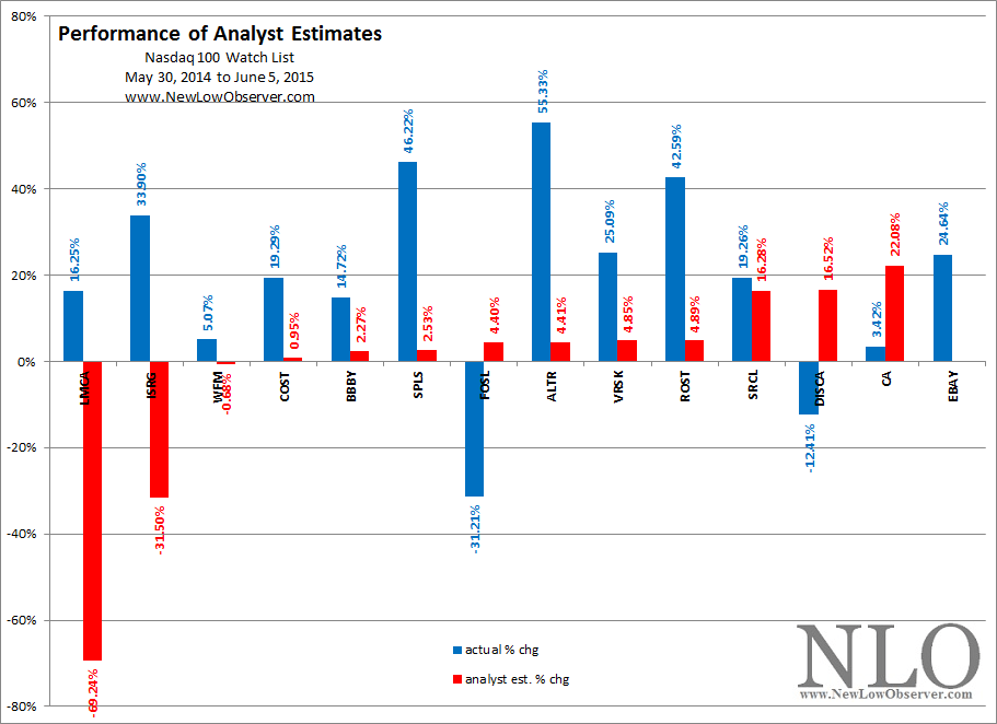
The companies on our watch list from last year gained an average of +21.34% as compared to the Nasdaq 100 which gained +23.11%.  Our analyst estimate section of the watch list from last year shows what the stock on our list were expected to do over the following 12 months.

image

All of the stocks were expected to decline in value, overall.  However, what is most striking about the one year performance is that while companies on the far left were expected to do the worst those on the far right were expected to the best (sort of).  Below is the actual one year performance:

image

A side by side comparison will demonstrate that (again) the trend of performance favors those stocks that have been pinned with the worst expectations.

Nasdaq 100 Watch List: December 26, 2014

The following stocks are on our radar and should be on yours:

Lifespan of Corporations in the S&P 500

On December 4, 2014, the folks at Zerohedge.com (ZH) came out with a blurb titled “Here Is The Reason Why The Average Lifespan Of US Corporations Has Never Been Shorter”.  Overall, the ZH piece is another “…the end is nigh…” narrative that has been a consistent theme since their inception.  The ZH team highlighted the following in reference to James Montier’s GMO article titled “World's Dumbest Idea”, “...there is one point that bears emphasis: the plunge in S&P500 corporate lifespans to record lows…”.

To be specific, Montier says, “One of the other features that stands out as having changed significantly between the era of managerialism and the era of SVM is the lifespan of a company and the tenure of the CEO. Both have shortened significantly.” Also included is the following chart from Montier’s article.

image

On the surface, the evidence and the claim seem to line up pretty well.  As the chart demonstrates, from 1971 to the present, the lifespan of companies in the S&P 500 has consistently declined.  However, there is one observation that stands out in the chart above. What makes it possible for the age of companies in the index to rise or fall within the range of the declining trend?

The age of the companies can increase or decrease simply because companies are added and dropped from the index.  There is no requirement that the stocks in the S&P 500 have a minimum or maximum number of years under their belt in order to be included.  Additionally, investors increasingly demand that the indexes are more reflective of the modern era rather than some bygone periods (a mistake for those who wish to have reliable index).

With this in mind, it has become the nature of the S&P 500 committee to add and drop companies with a frequency and magnitude that nullifies the point of an index.  As an example, since 2003, 37% of the S&P 500 index has been added/dropped.  The average number of companies dropped from the index is 15 each year.

In 2014, eight companies were added to the index.  According the D&B Million Dollar Database, of the companies added to the index, the average age was 19 years.  Using the same database, the companies that were dropped from the index had an average age of 64 years.

Date Added Dropped
3/21/2014 Keurig Green Mountain (1993) WPX Energy (2011)
4/1/2014 Essex Property (2007) Cliff Natural Resources (2011)
6/20/2014 Cimarex Energy (2007) International Game Tech. (1980)
6/30/2014 Affilliated Managers Group (1993) Forest Laboratories (1985; Actavis)
7/1/2014 Martin Marietta Materials (1993) United States Steel (1901)
8/14/2014 Mallinckrodt (1986) Rowan (1948)
9/19/2014 United Rentals (1997) Graham Holdings (1877)
9/19/2014 Universal Health Services (1979) Peabody Energy (1883)

As the drive and desire for performance increases, the age of corporations and tenure of CEOs in S&P 500 companies will likely decrease.  Since the S&P 500 collection of companies does not act like an index, instead merely a reflection of the whims of a speculator, investors should not be alarmed with the age of companies or tenure of CEOs presented to us by S&P handlers.  The changes that have occurred since 1971 are a reflection of overreaching on the part of the index managers.

The lifespan of companies in the index does not mean death and dissolution of companies dropped from the index.

GoPro Downside Target Met

On October 8, 2014, when GoPro (GPRO) was trading at $89.93 we concluded our review of downside targets for the stock with the following commentary:

“This review of GPRO is to determine how accurate the downside targets are.  In addition to the current downside targets, the upside target is indicated to be $103.40.  The parabolic nature of the current rise may not be over.  However, depending on the length of time that passes, investors/speculators interested in GPRO would do well to wait for the stock to fall below the ascending $45.50 before reconsidering the merits of this stock.”

Below is the same chart that was used from October 8th with data to the present.

image

GoPro has achieved our downside target and appears to be on the rebound assuming it can exceed the $60 level.  Speculators should keep an eye on the $31.28 level as it is a legit downside target if the $60 level fails to hold.  This means putting only ¾ of the intended amount into GPRO with the remaining ¼ for the “unlikely” event of falling to $31.28.