Below is the Corn Exchange Bank from 1929 to 1936.


Below is the Corn Exchange Bank from 1929 to 1936.
Posted in 1929, 1936, bank stock, Corn Exchange Bank
Below is the New York Bank Stock Index from 1929-1934.

Posted in 1929, bank stock
As the saying goes, “it is a recession when it happens to others and a depression when it happens to you.”
In the last “Great” Depression from 1929 to 1945, Americans were well aware of the pain and misery that was wrought on the nation. There are even some who wrongly claim that the only reason the United States got out of the “Great” Depression was World War II. Debates aside, below is a percentage change chart of the Dow Jones Industrial Average from 1929 to 1954, the period of time that it took for the index to get back to “break even.”

There is no debate among the average American or Harvard economist about when the last “Great” Depression occurred in the United States. However, when the exact same thing happens to one of our allies, it seem difficult for even the most esteem experts on the “Great” Depression to recognize the current depression simply because it isn’t happening to us.
That ally is Japan. To put our claim in context, we will show you the stock market of Japan as represented by the Nikkei 225 Index in exactly the same format as the Dow Jones Industrial Average above.

Someone please tell us that what Japan is going through isn’t a depression. We use the stock market as the most accurate real-time reflection of the economy, politics, and social well being, which is nothing new to long-time readers of our work.
Let’s reflect for a moment, in Japan from 1989 to 2008:
How is it possible, that a key measure of the health of a nation like Japan could suffer so much and not be recognized to be in an “Even Greater” Depression?
Look at the Dow Jones Industrial Average from 1929 to 1954 again. It took 25 years for the index to break even. Now look at the Nikkei 225 Index, it has already been 29 years and the index is still –40% below the prior peak.
Let’s take a brief refresher course on what was said of Japan prior to the decline of 1990, this from the Dow Theory Letters as published by Richard Russell and dated May 12, 1989:

Or how about the following, dated October 18, 1989:

And this from November 29, 1989:

And finally, this from April 5, 1989:

It is not an uniquely American attribute to forget the past but to blithely walk past the “Even Greater” Depression within our midst while it impacts our ally is a brewing storm.
Investors, politicians, and citizens alike would do well to note the exact same (subtle and not so subtle) slights and invectives being lobbed around today. Meanwhile, due diligence is necessary to first acknowledge the plight of an ally and act in the interest of both nations before it is too late.
Posted in 1929, DJIA, interest rates, Japan, Nikkei, QE, Quantative Easing
There is a contingent of analysts and economists who stand in the way of progress in economic and financial understanding of how stock markets work. One prevailing view is that the rise of interest rates is followed by a decline in the stock market. Worse still, there is the belief that reducing interest rates is the Federal Reserve’s primary tool for dealing with slowing economic growth.
Below, we show how, in spite of a cyclical increase of the Federal Reserve’s discount rate, from early 1925 to mid-1929, the stock market defied modern analysts and economists claims.

In the period from 1925 to 1929, the Federal Reserve embarked in a policy of increasing the discount rate. Below is the performance of the Dow Jones Industrial Average and Dow Jones Transportation Average in the period from 1925 to 1929.

As we all know, the period that followed the peak in stock market in 1929 was declining interest rates and a subsequent stock market decline of nearly –90%.
Were we biased in our selection of the data? Absolutely! We chose the cyclical (short-term) period for one of the most notorious stock market rises and declines and added the cyclical period of rising interest rates to prove a point.
However, if you want to see how the stock market did during a secular (long-term) period of rising interest rates then see our posting titled “The False Narrative of Stocks and Interest Rates” published on January 7, 2019.
sources:
In a CNBC interview that took place on July 1, 2005, Ben Bernanke said:
“We’ve never had a decline in house prices on a nationwide basis.”
This claim is coming from a scholar who specialized in the Great Depression. The Great Depression was an era of nationwide house price declines as represented in the red box below.

Reviewing the work of Roy Wenzlick, we can see that house price declines were not the only measurable metric that real estate suffered on a nationwide basis. Throughout the U.S., in more than 70 large cities we see that rents decreased, number of new dwellings decreased, office vacancies increased, farm land values decreased and real estate transfers decreased. Below data and charts based on the work of Roy Wenzlick demonstrating nationwide trends in real estate. Continue reading
As investors, we’re firm believers in preparing for the worst case scenario. For us, the definitive worst case scenario is found in the markets from 1921 to 1932, covering the early stages of the “Great” Depression. We believe 1921 to 1932 should be examined and re-examined to understand possible risks and remedies for our current perspective on markets.
In our recent musings, we found that the rent data from 1914 to the present at the Federal Reserve Bank of St. Louis had a minor quirk, some information was missing in the sweet spot that we’re most interested. Below is our take on the data and some minor insights.
Again, looking at the data related to the CPI for All Urban Consumers: Rent of Primary Residence (CUUR0000SEHA) on the St. Louis Federal Reserve website, we can see monthly data ranging from 1914 to the present. However, the data in the period from 1915 to 1940 has many gaps that obscure what happened to rental prices (when attempting to chart).
The chart below is the maximum view of the data from 1914 to 2017. The black boxes show, or rather don’t show, the data that is missing from the period in concern (also from 1944-1947).

Although there is some data interspersed from 1915 to 1940, there isn’t enough to generate a complete graphical representation of the period. Below is the charting of the data for Residential Rents in St. Louis covering the period from 1875 to 1944 in work from Roy Wenzlick’s Real Estate Analyst. We’ve highlighted the period of concern in red.

We wanted to know how accurate Wenzlick’s St. Louis residential rents compared to the national data provided by the Federal Reserve. To do this, we took the 1914 data set and peg the percentage change in Wenzlick’s work to the missing data at the Fed through to 1940. The result of this is displayed below:

In the red are the data points based on what would have happened if the starting point of December 2014 Fed data had the same rate of percentage change as Wenzlick’s graphical representation from 1914 to 1940. In the blue, we have the original data set from the Federal Reserve. We’ve extended the available Fed data from the prior period to fill the gaps.
Interestingly, the percentage change from peak to trough in both data sets are fairly close with Wenzlick’s data declining –34.21% and the Fed data falling –38.43%. The January 1923 and September 1924 peaks are consistent with our previous examination of other commodities. For example, in our “1925 to 1932: A Question for Precious Metal Investors” article, we see a 1925 peak in precious metal stocks with the decline ending in 1932.

As best we can tell, the gaps presented in the Federal Reserve data generally coincides with the data offered by Roy Wenzlick. In addition, the data from both sources on the general direction of rents coincides with other commodity related declines from the period of 1923 to 1932.
Posted in 1929, 1932, real estate, Rent, Wenzlick
When talking to any number of clear headed and knowledgeable market analysts, it often shocks me at the confidence and certainty with which the Federal Reserve Bank is credited with the rebound of financials markets from 2009 to 2016. It appears as though this assessment is guided by faith alone and yet there are numbers that seem to support the claim. This article cannot dispel the religious reverence for the Federal Reserve’s apparent powers. However, it is hoped that we can demonstrate that the Federal Reserve may be a bit player on a grand stage of market forces.
On February 11, 2014, Mark Hulbert of MarketWatch.com posted an article titled “Scary 1929 Market Chart Gains Traction (found here)”. In the article, Hulbert suggests that the critics of the chart, which shows a parallel between the current market action since July 2012 and 1928-1929, are running out of explanations as to why the chart doesn’t have merit.

One aspect missing from the Hulbert article is what it takes to get from the most recent high of 16,588 to the 1,658 level on the Dow Jones Industrial Average. In order to lose -89% in value, the Dow would need to decline first to 15k, 14k, 13k etc. Leaving out these important hurdles on the downside ignores a wide swath of goings-on that needs to occur in between now and the doomsday low. To fill the void that is unexamined by the Hulbert article, we’re going to review the various ways that the Dow Jones Industrial Average could decline to new lows.
Before offering our downside take on the market, we’d like to refer you to some basic issues that are mandatory to understanding how the stock market decline from 1929 was an anomaly, at best. In previous work on the topic, we’ve addressed reasons why the 1929 stock market decline of -89% had more to do with reshuffling of the index by replacing stocks that had fallen significantly with new stocks that had appeared strong but were on the cusp of major declines. Once the new stocks were added to the index they crashed hard while the stocks that were dropped from the index were at the beginning stages of recovery (2009 article found here).
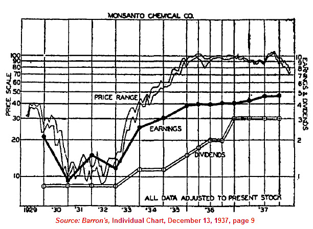
In another piece, we outlined the fact that the decline of 1929 was followed by a recovery that was much faster than most investors know. Our theory is that the multiple changes to the index artificially suppress the index on the way down and on the way up. This resulted in the Dow taking 25 years to achieve breakeven status with 1929. However, stocks that were not part of the index can be seen to achieve breakeven status on average by 1937. One of our favorite examples is found in the chart of Monsanto Corp. below (2010 article found here).
Posted in 1929, 3PDh, Dow Theory, downside, Ed Carlson, George Lindsay, MON, Monsanto
Posted in 1929, gold, gold bugs, Gold Stock Indicator
“London banks, the Bank of England, Germany's Reichsbank, Bank for International Settlement and the Bank of Austria all threw money at CreditAnstalt starting in May of 1930 in a failed attempt to shore up the problem.”
"The element of character in the choice of bank is eliminated, and the competitive appeal is shifted to other and lower standards, such as liberality in making loans. The natural result is that the standards of management are lowered, bankers may take greater risks for the sake of larger profits and the economic loss which accompanies bad bank management increases."Grant, James. Mr. Market Miscalculates. Axios Press. 2008. page 202.
Posted in 1929, Bank of America, Bodenkreditanstalt, Citigroup, CreditAnstalt, National City Bank
Tagged members