Author Archives: nlo-admin

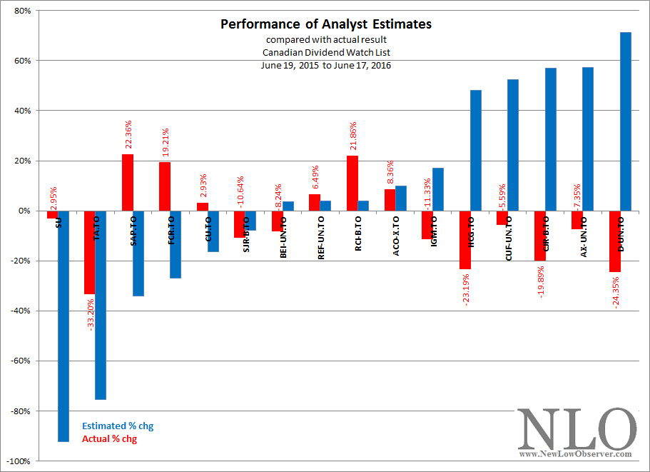
2016 Dogs of the TSX

In our most recent article on “Dogs of the Dow: A Look Back at 2015 & Forward to 2016”, we highlighted the stocks that are part of the Dow Jones Industrial Average that “…an investor annually select[s] for investment the ten Dow Jones Industrial Average stocks whose dividend is the highest fraction of their price [dividend yield] (wikipedia).”

Within the context of this concept, picking the ten highest yielding stocks of the Dow Jones Industrial Average, there is an important qualitative element that is implied by using the Dow.  Michael O’Higgins, author of the 1991 book Beating the Dow which outlined the idea later called “Dogs of the Dow”, said the following of the blue chip index:

“As the most popular indicator of market activity, the Dow is itself an influential barometer of the market and economic conditions. Individually, the 30 stocks that make up the Dow industrials are among the most widely held, widely analyzed, and widely publicized in the world. They are also among the biggest and the strongest. Combined, the 30 Dow components have assets of around 2.5 trillion dollars, nearly five million employees, and sales that exceed the gross national product of every country in the world except China, Germany, India, Japan and the United States.

“These prime companies may gain, lose, spin off, acquire, merge, rename themselves, reorganize, even drop out of the Dow, but they are an integral and vital part of our economic system, and in one form or another they are here to stay.

“The Dow companies and their products and services are household names to most people.”

The very fact that the companies from the Dow Industrials is limited to only 30 widely followed companies is what makes the concept “work”.  This strategy for investing gets extremely thin on performance when applied to the S&P 500 or any other “broad” index.  Part of the reason for this is the fact that some companies that are part of the S&P 500 Index aren’t at a “blue chip” status, yet.  Therefore, the whole point of using the Dow Jones Industrial Average is to isolate the best companies to invest in regardless of the market conditions.  Concerns regarding diversification are addressed here.

Understanding the above commentary about why the Dow Industrials are used, we are now going to apply the same concept to three different categories of stocks within the Toronto Stock Exchange Composite Index.

Continue reading

Dogs of the Dow – A Look Back at 2015 & Forward to 2016

The volatile 2015 has come to a close and we're back to review the viable strategy known as "Dogs of the Dow". At this point, the history of this strategy can be found all over the internet. However, we will review the 2015 performed as well as display what 10 stocks one would consider for this strategy.

Dog of the Dow 2015
Ticker Company Beginning of 2015 Price End of 2015 Price Dividend  Yield (1/1/2015) Dividend Yield (12/31/2015) YTD % Chg
T AT&T, Inc.       33.59            34.4 5.5% 5.6% 2.4%
VZ Verizon Communications
      46.78            46.2 4.6% 4.9% -1.2%
CVX Chevron Corporation     112.18            90.0 3.8% 4.8% -19.8%
GE General Electric Company       25.27            31.2 3.5% 3.0% 23.3%
MCD McDonald's Corp.       93.70          118.1 3.5% 3.0% 26.1%
PFE Pfizer Inc.       31.15            32.3 3.3% 3.7% 3.6%
MRK Merck & Co. Inc.       56.79            52.8 3.1% 3.5% -7.0%
XOM Exxon Mobil Corporation       92.45            78.0 2.9% 3.7% -15.7%
KO The Coca-Cola Company       42.22            43.0 2.9% 3.1% 1.8%
CAT Caterpillar Inc.       91.53            68.0 2.8% 4.5% -25.8%
  Dog of the Dow Average     3.59% 3.97% -1.23%
S&P 500 2,058.90 2,043.94 -0.7%
Dow Jones Industrial Average 17,823.07 17,425.03 -2.2%

The average return from the Dogs were -1.23% which was worse than the S&P 500 (-0.7%) but better than the Dow Jones Industrial (-2.2%). The best performer was McDonald's (MCD) (26.1%) and biggest decline came from Caterpillar (CAT) (-25.8%). It is a second consecutive years that this strategy lagged the market. One statistic we do not see is the rate of increase on the dividend. In 2014, average dividend yield rose by 1.8%. The dog of 2015 started the year with yield of 3.59% and ended the year at 3.85%, an increase of 7.3%. This statistic is impressive given our low rate environment.

The big question on everyone's mind is, does this strategy work?  We don’t pretend to know the answer to that as there is no single strategy that will work consistently.  However, we believe that the "Dogs of the Dow" has its place. The strategy worked once (in 2013) over the past 4 years and buying the market (S&P 500) would have yielded better result.  That being said, the strategy might be fitting for income investor who are capable and willing to withstand the volatility in the market.

What’s In Store for 2016?

We will reiterate that NLO team do not have a strong view on the strategy and tracking it is simply an opportunity to study in hope that we learn something along the way.  The table below highlights 10 companies that are consider the Dog of the Dow for 2016.

Dog of the Dow 2016
Ticker Company Beginning of 2016 Price Dividend  Yield (12/31/2015)
VZ Verizon Communications
      46.22 4.9%
CVX Chevron Corporation       89.96 4.8%
CAT Caterpillar Inc.       67.96 4.5%
IBM IBM     137.62 3.8%
XOM Exxon Mobil Corporation       77.95 3.7%
PFE Pfizer Inc.       32.28 3.7%
MRK Merck & Co. Inc.       52.82 3.5%
PG Procter & Gamble Company       79.41 3.3%
WMT Wal-Mart Stores Inc.       61.30 3.2%
CSCO Cisco Systems, Inc.       27.16 3.1%
  Dog of the Dow Average   3.85%
S&P 500 2,043.94
Dow Jones Industrial Average 17,425.03

Alternative Strategy

One thing to note as you filter through the 2016 list is that there are sectors that will likely payout higher portion of their net income in dividend (i.e. Utilities, Telecom, Consumers). As such, we often see the same companies show up on this list (Verizon, Pfizer). Companies with low payout ratio never appears on the list (American Express, Goldman Sachs). As such, we offer alternative list call 'Dogs of NLO' back in 2013.  The premise of this alternative view is to assess the 10 companies that were trading near its yearly low rather than highest dividend yield.  Three years gone and our dogs have out performed the traditional one by 8%.  Since the start of 2013, the average return was 38% which trailed the market (39%) and outstrip the conventional Dogs of the Dow (29.5%).   The biggest driver to this success may be from the rise in dividend yield.  Assessing yield based on original cost, one will find that yield rose faster from our alternative strategy (see table below).

Strategy Beginning of 2013 Yield 2015 Yield1 % Change
Dog of the Dow 4.07% 4.45% 9.37%
Dog of NLO 2.92% 3.68% 26.14%
1 - Yield on cost (current dividend / original cost)

By no mean do we believe our strategy to be a better one, but it is to offer readers a different view.  Below are the our Dogs of the NLO for 2016.  Let’s come back a year (or two) from now to assess the viability of this strategy.

Dog of NLO 2016
Ticker Company Beginning of 2016 Price Dividend  Yield (12/31/2015)
AXP American Express Company       69.55 1.7%
IBM IBM     137.62 3.8%
GS The Goldman Sachs Group
    180.23 1.4%
CAT Caterpillar Inc.       67.96 4.5%
WMT Wal-Mart Stores Inc.       61.30 3.2%
UTX United Technologies Corporation       96.07 2.7%
MMM 3M Company     150.64 2.7%
PFE Pfizer Inc.       32.28 3.7%
AAPL Apple Inc.     105.26 2.0%
MRK Merck & Co. Inc.       52.82 3.5%
  Dog of NLO Average   2.92%
S&P 500 2,043.94
Dow Jones Industrial Average 17,425.03

U.S. Dividend Watch List: December 18, 2015

Top Five Watch List Performance Review

In our ongoing review of the NLO Dividend Watch List, we have taken the top five stocks on our list from December 19, 2014 and have checked the performance one year later. The top five companies on that list can be seen in the table below.

Symbol Name 2013 Price 2014 Price % change
VMI Valmont Industries, Inc. 123.75 101.52 -18.0%
PB Prosperity Bancshares Inc 54.41 46.83 -13.9%
CFR Cullen/Frost Bankers 70.00 59.96 -14.3%
IBM IBM 158.51 134.90 -14.9%
AIT Applied Industrial Technologies 45.27 38.80 -14.3%
      Average -15.1%
         
DJI Dow Jones Industrial 17,804.80 17,128.55 -3.8%
SPX S&P 500 2,070.65 2,005.55 -3.1%

Valmont Industries (VMI) was trading at its yearly low last year at $123. The stock broke below $100 mark in October but recovered and currently trading at $101.50. We didn't have a strong bias (bull or bear) on the stock. However, we pointed that Value Line projected the company to earned $13.50 per share of cash flow in 2015. That estimate didn't pan out and we are looking at $8.90 per share for 2015. Applying 11x multiple on that figure and we have estimate fair value at $97.9. In hind sight, Value Line was too aggressive but no one could projecte the magnitude of the bear market in commodities. Valmont has a large foot print in agriculture market, particularly in irrigation equipments. Corn is down 28% from its peak in 2014 while soy bean fell 42% from the peak in 2014. Agriculture suppliers will delay or cancel pending captital expenditure. While Value Line estimate fair value to be at 11x cash flow, our analysis place that multiple at 8x. We believe the company is trading at its current fair market value with posssible downside of 23% or around $77.

Prosperity Bancshares (PB) and Cullen/Frost Bankers (CFR) are small community banks and we believed last year that upside was limited even at the low. We were proven right as shares fell 14%.

We were proven wrong on Qualcomm (QCOM) which fell 35%. In early 2015, Qucalcomm boards approved an increase of dividend payment by 14%. This was a very bullish sign for income investors. Current stock price yield 4% dividend payment. We highly believe that dividend will remain safe at current level but hope of significant increase is slim. New Low team remain committed to our position believe that a company with strong balance sheet and dividend yield of 4% should be taken into consideration.

U.S. Dividend Watch List: December 18,2015

The Federal Reserve have final lifted the Fed fund rate by 0.25%. We have an interesting view on this and highlighted in the following post Interest Rate Policy: Bizarre to the Uninitiated. Below are 25 companies to put on your holiday shopping list. Continue reading

Interest Rate Policy: Bizarre to the Uninitiated

On the heels of the first interest rate increase since 2006 we came an article from BloombergBusiness that should be of interest to everyone.  The article highlighted a “bizarre” theory that is quite logical and fits in well with our own long held beliefs.  That theory, touted by “Neo-Fisherians”, proposes that increasing interest rates might be what is needed to push inflation higher, as opposed to the established policy of lowering interest rates, a longstanding position of the Federal Reserve during times of crisis.

image

The article contained the following thoughts:

“Many economists are so perplexed by the lack of inflation in the U.S. after years of unprecedented monetary stimulus that a bizarre, century-old theory is suddenly gaining traction: Maybe higher interest rates are what’s needed to push up consumer prices.  The idea runs counter, of course, to basically everything taught in Economics 101 classes (higher rates, we’re told, discourage rather than encourage spending and therefore curb inflation).”

This idea of “running counter to basically everything taught in Economics 101” almost explains why it may be useful and necessary for application to the current economic environment.  For the most part, Economics 101 is primarily a set of theories that apply only if all other variables remain unchanged, which is usually never the case.  It should be noted that this potential shift in policy couldn’t become an idea in the mainstream thinking until all other possibilities have been exhausted.

The article promotes the idea that the Federal Reserve somehow is on the leading edge of setting policy.  We don’t believe this to be the case.  In our November 2015 article on gold and interest rates, we said that market rate movements take place before the Federal Reserve takes action, rather than the other way around.

image

In a comparable interest rate cycle, from 1948 to 1981, we can see that the discount rate followed each rise in the short-term rate.  Likewise, the most recent rate increase has followed a low and subsequent increase in the 3-month Treasury and the 10-year Treasury, as seen below.

image

Another challenge is with the article’s claim that “…higher rates will make people think the economy is doing better and, as a result, they’ll start spending more. In other words, project strength and strength (as well as a little inflation) will follow.”  This line of reasoning doesn’t fit with the reality of what happens. 

Short-term rate start to rise reflecting the view that the economy has improved which is followed by similar action by the Federal Reserve.  Rising rates reflect a growing sense, and reality, of increased inflation which consumers attempt to stay ahead of by spending more current dollars.  The spending of current dollars initially is about confidence in the economy.  However, the long-term impact in a rising inflation and interest rate environment, is that it quickly becomes about spending current dollars to beating inflation.

A single rate increase by the Federal Reserve in no way makes for a trend.  However, markets often lead the way and what initially seems “bizarre” is only a natural change in regime, a change that we haven’t seen since the early 1940’s.

Clean Harbors Meets Downside Target

On January 28, 2015 we said the following:

“So far, CLH has adhered to the SRL that was initially outlined in 2012.  If we consider the period of 2007 to 2009, when the stock fell as low as $20.54 and extend that same decline to the current period, then CLH could decline as low as $41.40.  This assumption is predicated on the stock market not experiencing a precipitous decline from the current level.  A broad market decline would easily bring CLH to the ascending $23.43 level in the SRL.”

image

The assessment was based on our February 2012 review of Clean Harbors when the stock was trading at $64.28.  Since Clean Harbors has reached our technical target, it is now time to assess the fundamentals through a source like Value Line Investment Survey and Morningstar.  Morningstar typically gives a bearish case on a stock so if Clean Harbors has full coverage it be helpful to carefully read the negative assessment to contrast the upside review.

Gold Stock Indicator: December 11, 2015

Gold and gold stocks continue to struggle in an effort to remain in a trading range rather than collapse.  A fall is coming if we see the general equity markets decline, which would compound the abysmal performance of the precious metal stocks over the last five years.

image

Gold Stock Indicator

Keurig Green Mountain: Achieves Targets, Gets Buyout

On May 19, 2015, we said the following about Keurig Green Mountain (GMCR):

"…the price of GMCR has declined below the conservative and mid-range downside targets of $110.08 and $81.40.  The acceleration of the current decline seems to indicate that achieving the $52.71 extreme downside target is very likely.

"A review of the last SRL done on January 11, 2013 shows that GMCR blasted through the extreme downside target by a wide margin.  The fact that GMCR is prone to extreme moves up and down suggests that the extreme downside target [$52.71] is the point at which to start assessing risk and accumulating shares."

image

On December 7, 2015, Keurig Green Mountain was offered a buyout at the $92 per share or +77% above the December 4, 2015 closing price.

U.S. Dividend Watch List: December 4, 2015

Top Five Watch List Performance Review

In our ongoing review of the NLO Dividend Watch List, we have taken the top five stocks on our list from December 5, 2014 and have checked the performance one year later. The top five companies on that list can be seen in the table below.

Symbol Name 2013 Price 2014 Price % change
MDU MDU Resources Group 23.78 17.69 -25.6%
HP Helmerich & Payne 67.44 53.38 -20.8%
IBM IBM 163.27 140.43 -14.0%
MUR Murphy Oil Corporation 48.92 25.46 -48.0%
SCL Stepan 41.26 52.05 26.2%
      Average -16.5%
         
DJI Dow Jones Industrial 17,958.79 17,847.63 -0.6%
SPX S&P 500 2,075.37 2,091.69 0.8%

Watch List Review

Our top five companies fell on average 16.5% compared to the market which was up less than 1%. Three of the five companies are tied to the energy market which is in a deep bear market. The largest decline came from Murphy Oil (MUR) which lost nearly half of its market value. The fall in oil price was unpredictable and has taken the resource industry on a wild ride.

On the opposite end, the biggest gain came from Stepan (SCL) which is a chemical company. The gain may have been driven from 13% rise in profit in addition to the multiple expansion in the shares. Last year, Stepan was trading at just 15x trailing earnings. Today, it is trading at 17x profit that is 13% higher.

U.S. Dividend Watch List: December 4, 2015

After the S&P broke 2,100 mid-week, the market took a turn falling below 2,050 but regained most of the loss. At the end of the week, there are 19 companies on our watch list. Continue reading

Coppock Curve: November 2015

The market was flat for the month of November. However, it didn't stop the Coppock indicator to fall another -20% or 6.2 points. As always, we remind our readers that the Coppock Curve serves as a buy signal when they it turns upward after moving into negative territory. Continue reading

Western Digital Corp. (WDC)

image

Richard Russell: The Passing of an Icon

image

Read the full tribute here

Cincinnati Financial Group

image

Whole Foods Market

image

Price change since August 1, 2014 recommendation of WFM:

image

We said the following at the time:

“Investors interested in WFM should consider a 3 step purchase plan with the first purchase at the current price with additional  investments at $30 and at $24 or below.  It appears that WFM has considerable price support at the $24 level.”

Gould’s Speed Resistance Lines

image

Gold Stock Indicator: November 20, 2015

Gold and gold stocks continue to languish as there appears to be no catalyst to propel prices higher. 

image

The perception of no reason for gold to increase adds to the despondency of traders and investors which compels selling.  However, we’d like to point out that in spite of the conventional wisdom, the prospect of an interest rate rise is the biggest unambiguous reason for gold to increase in value.  While a Fed rate increase is what everyone is waiting for, history suggests that Fed policy  (government regulated) follows short-term Treasuries (market driven).

image

In a barely perceptible way, the chart above demonstrates that all Federal Reserve rate increases were preceded by a rise in the 3-month Treasury.  The blue arrows indicate the reversal in the declining trend before 3-month Treasuries increased.  From this point, we can easily see that the Federal Reserve’s discount rate follows to the upside not long after.  We’ve only included the point in the interest rate cycle that corresponds to the phase that we are entering, coming from an all-time low to an eventual all-time high.

The price of gold cannot sustain a rise in the face of deflationary forces, which typically brings interest rates down.  As the cycle eventually turns, we will see a sustained increase in the price of gold (with the obligatory volatility).  Analysts will argue that it is not possible for the price of gold to increase in the face of rising interest rates, however, the period from 1948 to 1981 is exactly when gold had its last massive bull market (based on foreign free market price of gold from 1948-1971; U.S. price of gold from 1971-1981).

Gold Stock Indicator

Mercury General Corp.

image