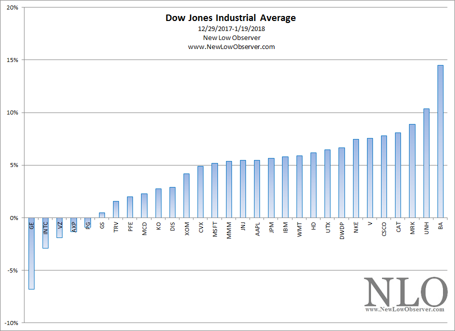
General Electric (GE) appears to be spiraling into oblivion. As we’ve suggested last year, we think that GE is going to be booted from the Dow Jones Industrial Average (DJIA). In this article, we’ll take a look at how GE got to this point and what might be in store for the stock price going forward.
1975-1981
It is possible that the beginning of the end for GE could have been marked by the acquisition of Utah International on December 16, 1976, in a deal that was dubbed “one of the largest acquisition proposals in the nation’s history.” That transaction set in motion the machinations of a complex set of accounting deals and dealings from which GE never seemed to extract itself from.
In the bid to acquire Utah International, General Electric, “…was able to use the pooling method [of accounting] to help boost its profits…” For GE, the “…unrecorded asset value would be reported as a gain…” when the eventual sale of those assets came due. Another benefit for GE would be that “…even if the assets were not later sold, their below market valuation allowed GE to understate its expenses (cost of sales and depreciation) and thereby overstate net income.” The problem with these methods of accounting slight-of-hand is that GE would not be able to wean itself from these strategies. In fact, this approach to acquisition and growth only increases as time went on.
Alarmingly, the acquisition of Utah International came after GE had exited the computer business. As noted at the time, “the computer business proved too much for Fred Borch [GE Chairman & CEO, 1967-1972]. Reg Jones [GE Chairman & CEO 1972-1981] made his mark getting us out of it. Will someone have to bail him [Reginald Jones] out of Utah International?” The combined Borch and Jones years are compared to the period from 2003-2018 during the tenure of Jeff Immelt in the chart below (using the approximate number of trading days going backward from January 19, 2018).

The entrance into the computer business followed by the entry into the mining business was simply one failure after the other. Adding insult to injury is the fact that the period from 1967 to 1981 was a confirmed secular bear market for stocks. However, the Utah International failure introduced the rampant and widespread use of creative accounting which would augment Jack Welch’s [GE Chairman & CEO 1981-2001] tenure during a secular bull market that began when the Dow Jones Industrial Average was trading at the 1,000 level and peaked at above 11,000.
1981-2001
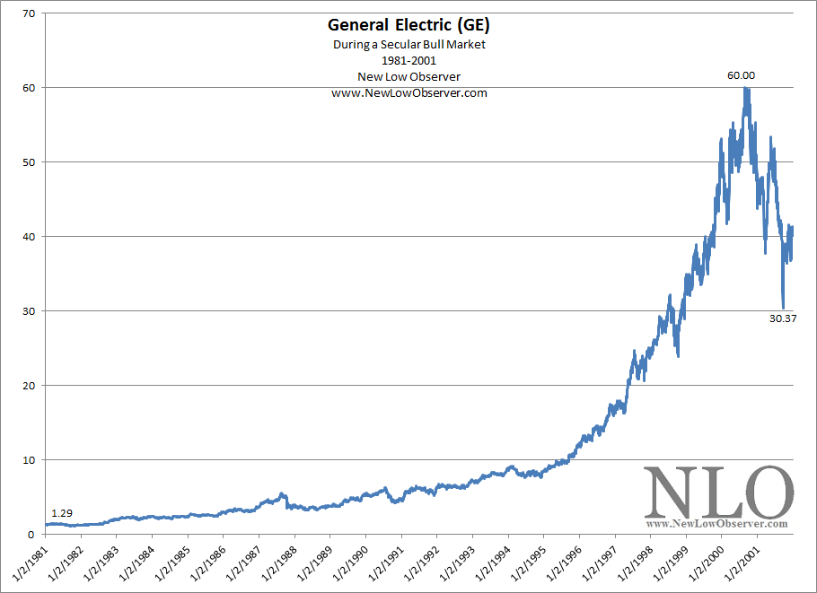
Below is the stock price of GE during the Jack Welch years from 1981 to 2001 which coincided with a secular bull market in the same period of time.

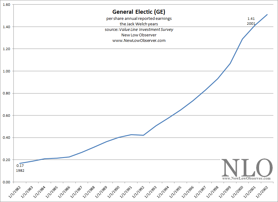
The nature of secular bull markets often see company fundamentals improve and hopefully the stock price will follow. As shown above, the price of GE increased more than 45 times in the period from 1981 to 2000. However, when looking at the per share reported earnings, as provided by Value Line Investment Survey from 1982, we can see that earnings “only” increased a little less than 8 times.

While fundamentals, stock price, and market sentiment often coincide there is no rule that the stock price has to match the fundamentals in any way, shape, or form. However, seeing an “industrial” company’s stock price out-distance the reported earnings by such a wide margin suggests that the stock price might gravitate towards a more “realistic” mean eventually. The perfect setup for this reversion to the mean is a secular bear market, which in our view began in 2000 to 2016 period.
It could seem that choosing the year 2000 as the beginning of secular bear market is arbitrary, at best. However, as noted before, the well established stock market secular cycles and Warren Buffett’s November 1999 commentary of below average market performance for the 2000 to 2016 period is enough to convince us that the period in question isn’t random.
2001-2018
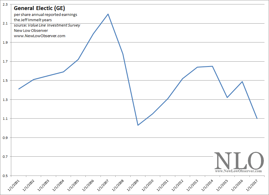
This leads us to the Jeff Immelt era as Chairman & CEO of General Electric from 2001 to 2017. There could not have been a worse period to be in charge of a hobbling industrial giant that is hamstrung with well entrenched accounting methods that work against the company when the stock price isn’t in a rising trend.
Remember, when Immelt took over at GE as Chairman & CEO on September 7, 2001, the stock price was already in the beginning stages of collapse after having fallen –34% up to that point. Even of the price of GE were to trade in range it would be bad news for the company. A falling stock price spelled disaster for investors who were hoping and expecting a rebound to the prior highs.

Many GE investors attribute the decline of GE’s stock price to the management practices of Jeff Immelt. However, much of this view is simply the mistaken attribution of correlation as causation.
If Warren Buffett thought, in late 1999, that we’d be lucky to see average market returns of +4% and GE fundamentals are calibrated to do better when the stock price rises then there is no evidence to suggest that Immelt did anything that was materially harmful (actual inflation adjusted CAGR of the S&P 500 return was +2.27%). Instead, what we’ve witnessed in GE stock price has been a reversion to the mean from the prior period of excess.
Price & Time Targets
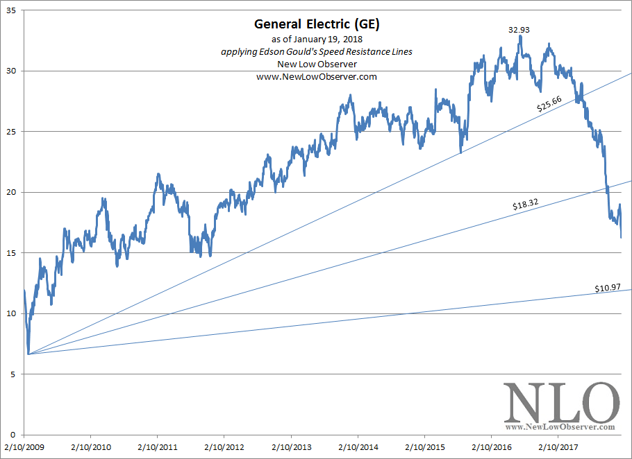
Based on Edson Gould’s “Three Step” rule, GE has one more leg down. In theory, this should bring the GE stock price below the 2009 low. However, there is a lot of ground to cover for GE to get to the 2009 low and there is no guarantee that it will happen. With this in mind, we’ll outline the previous two declines, 2000-2002 & 2007-2009, to establish any possible precedent that might emerge.
-
2000-2002
-
2007-2009
-
2016-present
-
So far, the price of General Electric (GE) has declined approximately –50.62% and has lasted 381 trading days. As seen in the chart below, GE has blasted through Gould’s Speed Resistance Lines at $25.66 and $18.32.

From what we can tell, the price target at the ascending $10.97 level is a lock (approximately $12.18). This would match the decline that was experienced by GE in the period from 2000-2002. The question becomes, will GE match the decline of 2007-2009, on a percentage basis. If so, then GE would decline to as low as $5.27. This would fit exactly with the nature and pattern of declines expressed by Gould in his “Three Step” rule.
Time targets seem to indicated that General Electric will reach the $10.97 or $5.27 low on April 20, 2018. The speed at which the current decline is taking place indicates that sentiment will push the stock to the $5.27 price and the elimination from the Dow Jones Industrial Average is eminent. We see the possible replacements for General Electric in the Dow Jones Industrial Average (DJIA) to be Adobe (ADBE), Expedia (EXPE), Google (GOOG) or Amazon (AMZN). In the case of Google and Amazon, their inclusion into the DJIA is predicated on a 10:1 stock split.
sources:
-
Stuart, Reginald. $1.9 Billion G.E. Bid in Mining Merger. New York Times. December 16, 1975. page 1.
-
Smith, Gene. Acquisition Set Today of Utah International. New York Times. December 20, 1976. page 67.
-
Schilit, Howard. Financial Shenanigans,2nd edition. McGraw Hill. 2002. page 103.
-
Value Line Investment Survey. General Electric. 1982-2018.