Below are the valuation targets for Oracle Corp. (ORCL) over the next 10 years.
-
Topics
Archives
-
-
Recent Posts
-
-
-
-

Below are the valuation targets for Oracle Corp. (ORCL) over the next 10 years.
Below is a chart of Expedia Group (EXPE) from 2006 to 2019 reflecting the year-over-year (YoY) percentage change.
Below is a chart of TripAdvisor Inc. (TRIP) from 2013 to 2019 reflecting the year-over-year (YoY) percentage change.
Below are the valuation targets for New Jersey Resources (NJR) over the next 10 years. Continue reading
A recirculated article is making the rounds about Bitcoin and the parabolic increase in the price in 2017 which suggests that a single anonymous market manipulator is the cause for the price topping out at $20,000.
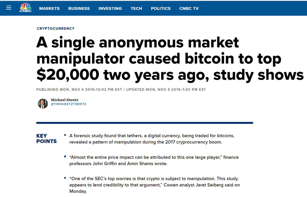
Again, as the story goes, the “digital” currency Tether and its relationship Bitcoin is “almost” the sole reason for the increase in Bitcoin.
Because we have been following the Price of Bitcoin since 2013 and have offered analysis on where the direction of the price would likely go, it is with particular interest that we reviewed the claims of John M. Griffin and Amin Shams. Their work, titled “Is Bitcoin Really Un-Tethered?” published June 13, 2018, offers up an account of the rise in price Bitcoin.
Specifically, Griffin and Shams suggest the following:
“In conclusion, this section finds considerable evidence that Tether is used to buy Bitcoin following Tether printing and negative returns and that this phenomenon has a sizable effect on future Bitcoin prices. This effect also holds for other coins and induces an asymmetric negative autocorrelation in Bitcoin returns (26).”
“By mapping the blockchains of Bitcoin and Tether, we are able to establish that entities associated with the Bitfinex exchange use Tether to purchase Bitcoin when prices are falling. Such price supporting activities are successful, as Bitcoin prices rise following the periods of intervention (33).”
In short, the work of Griffin and Shams does disappoint by saying that the price increase of Bitcoin in 2017 was due to manipulation.
As economists, we’re armchair enthusiasts of Price as laid out in the work of Charles H. Dow, co-founder of the Wall Street Journal and the namesake for the Dow-Jones indexes. For this reason, we think that Price dictates behavior which seems unchanged through the course of history. We believe that the attributes of Price can allow for meaningful interpretations in real time.
Rigging the System
While we have exclusively focused on the Price of Bitcoin, we will offer up some insights on Tether. First and foremost, as stated by Griffin and Shams, “Tether a digital currency pegged to U.S. dollars (from the abstract).”
As we’ve continually stated in the past, anything that is “pegged”, “fixed”, “rigged”, “managed”, or “propped” should leave no one surprised about the outcome. In many respects, it is a function of when, and not if, there is a reckoning.
Throughout the history of pegs to “precious” metals or currencies that are dictates of fiat, any fixed level for a Price will become unrigged, no matter how valiant the effort to maintain such a position. In addition, the most famous decouplings from a propped currency or commodity arrive shortly after the most vociferous claims, by the authorized manipulator, to the contrary (this is also a function of business failures).
The fixed level of Tether will eventually die the death that is common among managed Prices. It is a redundancy to suggest that Tether is manipulated. Any use of Tether is the manipulation of whatever it is applied to. Products or services dependent on Tether will succumb to the inevitable.
Price and Value
Being rigged to the value of the dollar, as is the case of Tether, means that the “value” is always assumed to be one. There may be some variation on the theme but the goal is to see that Tether is “equal” to one U.S. dollar. For this reason, when you look at the Price of Tether, you will see that the Price is one or a fleeting number close to one, good manipulation requires vigilance.
While we cannot see much in the way of Price for Tether, other than being equal to one U.S. dollar, we do have the “market capitalization” to refer to in the change of Tether’s value. In the chart below, we see the market capitalization of Tether from 2015 to 2019.
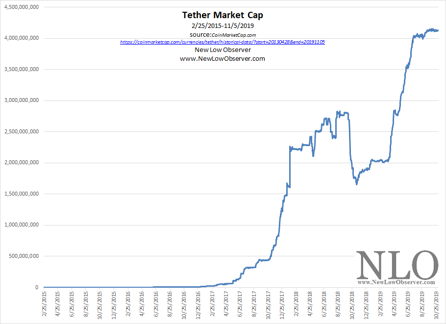
On the surface, there is no discernable pattern other than little change in the period from 2015 to early 2017 and significant change from early 2017 to the present. In the work from Griffin and Shams, they exam the period from March 1, 2017 to March 31, 2018 as this was shortly before the publication date of their article.
We have elected to break our commentary on market capitalization into two segments, which acts as Price based on the work of Charles H. Dow, in the period before and after March 1, 2017 to see if there are any highlights worth mentioning about Tether and the conclusions based on the work of Griffin and Shams.
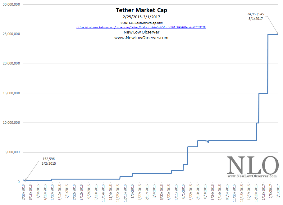
February 2015 to March 2017
From the lowest point in market capitalization on March 2, 2015, Tether managed to increase +16,250% over 731 days as seen in the chart below.
March 2017 to November 2019
From the lowest point in market capitalization, Tether managed to increase +16,435% over 979 days as seen in the chart below.
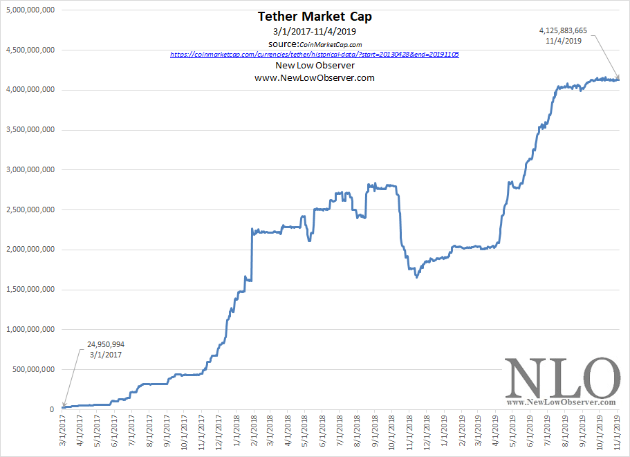
When Griffin and Shams wrote their article based on the data up to March 31, 2018, Tether had seen the market capitalization increase +9,073% over 396 days.
The history of new innovations often experience rates of increase in the early stages that will never be seen again. As seen in the chart below, the early stage is where the most dramatic and disruptive change occurs.
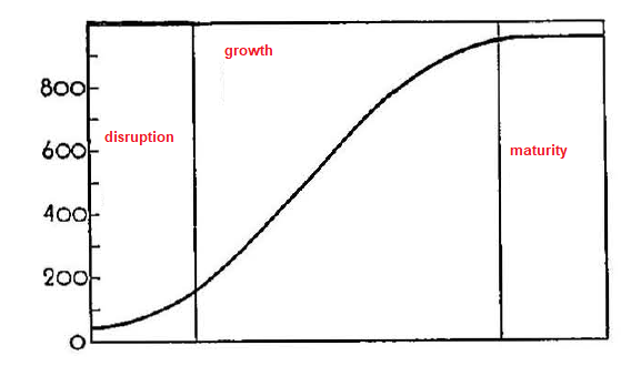
For this reason, it is expected that the first measurement of Tether would see an increase of +16,250% (March 2, 2015-March 1, 2017 or 731 days) while the second period (March 1, 2017-March 31, 2018 or 396 days) under consideration would result in a +9,073% increase over 396 days. However, as a measure of change on a daily basis, the rate was almost exactly the same (22.22% v. 22.91%).
Conclusion That Fits
It makes sense for Griffin and Shams to draw out the cause and consequence of changes in Price. In this case, the claim is that “…price supporting activities are successful, as Bitcoin prices rise following the periods of intervention. (33).” However, excluding an important set of data, potentially as a control group, from the period of inception of Tether from October 6, 2014 to March 1, 2017 leaves the authors open to legitimate claims of incomplete review of the topic.
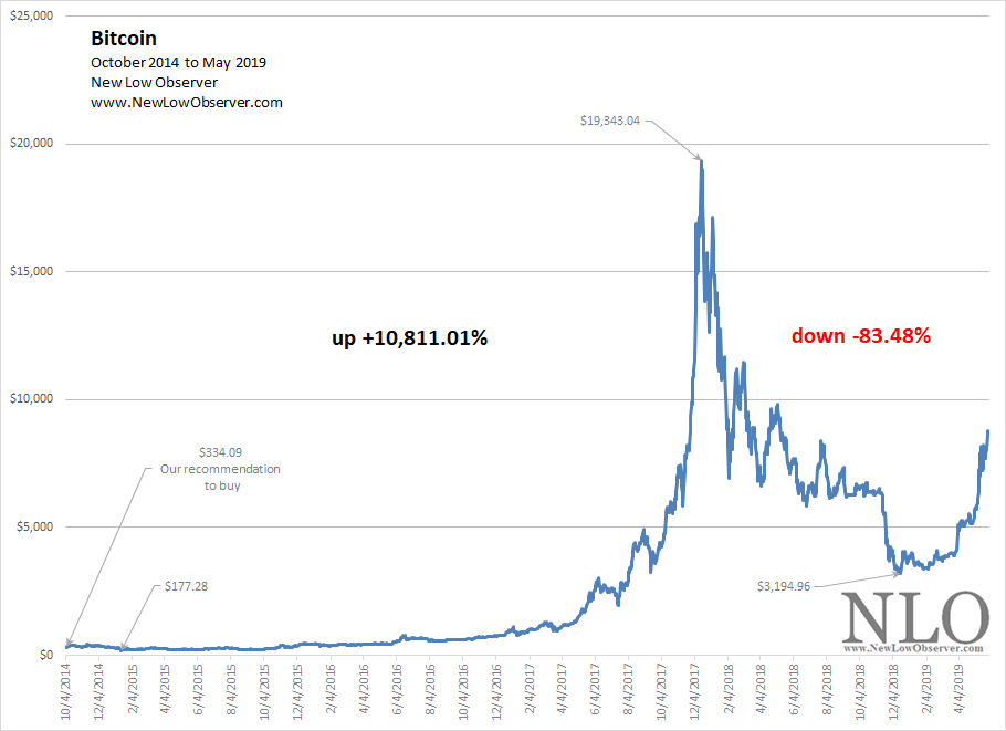
Again, the work of Griffin and Shams is about how Tether is used to manipulate the Price of Bitcoin higher. Our own work on the topic of Bitcoin Price increases and decreases since 2010 show that the increase in 2017 was the second time when the Price increased more than +10,000%.
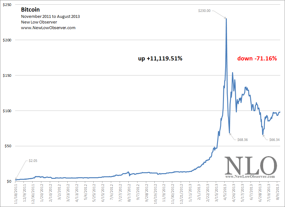
The last time that Bitcoin increased +11,119% was from the low in 2011 to the peak in 2013 (Bitcoin Cycles). This was also a time when Tether did not exist.
We’ve excluded the period from July 2010 to June 2011 when the Price of Bitcoin increased +42,185% (found here). Not having measured the periods prior to March 1, 2017 for Tether or examining the change in the Price of Bitcoin prior to October 6, 2014 results in a conclusion in search of a problem.
Dow on Manipulation
The work of Griffin and Shams may seem incomplete. However, does this mean that they are wrong about significant elements of manipulation affecting Price? Absolutely not. In fact, the work of Charles H. Dow confirms much of what Griffin and Shams highlight as a factor impacting the Price of Bitcoin or the market capitalization of Tether.
On the role of manipulation, Charles H. Dow says:
“The market is always under more or less manipulation (Review and Outlook. Wall Street Journal. July 20, 1901.)"
"...markets are partly made by manipulation. (Charles H. Dow and the Dow Theory. Bishop, George W. Jr. 1960. page 48.)"
However, manipulation has a shelf life and cannot persist forever. Dow says:
"It is difficult to tell at the start whether manipulation is in the direction of values or against them, but it usually becomes clear within a short time (Review and Outlook. Wall Street Journal. November 28, 1901.)"
"Manipulation is effective temporarily, but the investor establishes prices in the end. The object of all speculation is to foresee coming changes in values (Review and Outlook. Wall Street Journal. February 25, 1902.)"
There is a distinct difference between what Dow considers an investor and a speculator. Investors expect to hold their position over a long period of time while speculators are strictly short term in their focus. The adjustment of the Price after a parabolic increase often dictates what the true value is. Dow says:
"Fluctuations in the market are partly manipulation, but more the adjustment of prices to values, which are changed by changing conditions (Review and Outlook. Wall Street Journal. September 1, 1900.).”
On the whole, it appears, as reflected in the continued increase of market capitalization of Tether and the increase in Bitcoin’s Price, that the long term prospects favor a continued growth in spite of the effects of manipulation.
Conclusion
The work of John M. Griffin and Amin Shams highlights the challenges faced by anyone hoping to participate in a “market.” However, in ascribing the Price increase of Bitcoin in 2017 to the manipulation of Tether, they have excluded significant data in Bitcoin and Tether to make their case. Manipulation may have been a factor in the rise and fall of Bitcoin but it can only work for so long before true values are reflected in the Price.
Posted in Bitcoin, manipulation, Tether
Below is a chart of New Jersey Resources (NJR) from 1981 to 2019 reflecting the year-over-year (YoY) percentage change.
On November 4, 2019, Insperity Inc. (NSP) declined as much as –37% on missed earnings estimates and lowered guidance.
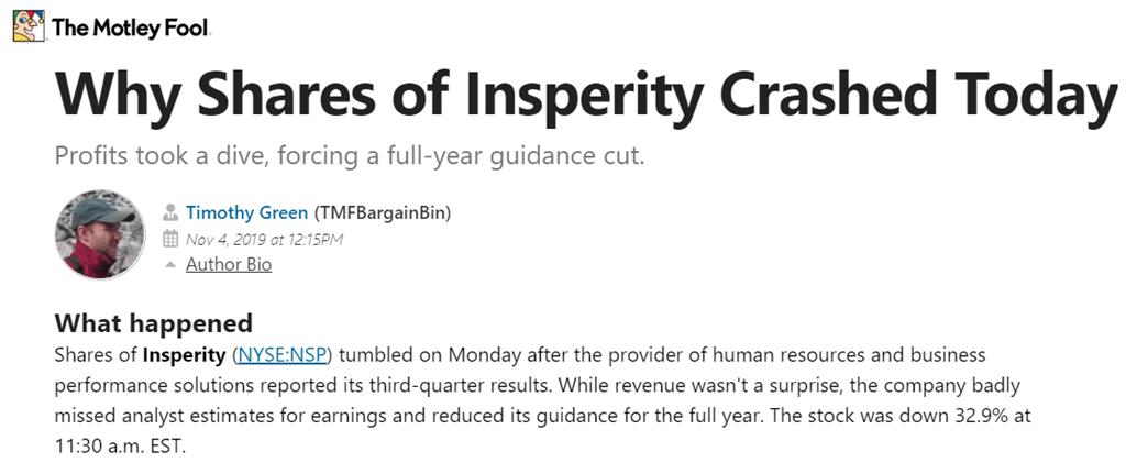
Below are the valuation targets for Insperity Inc. (NSP) for the next 10 years. Continue reading
Top Five Watch List Performance Review
In our ongoing review of the NLO Dividend Watch List, we have taken the top five stocks on our list from November 2, 2018 and have checked the performance one year later. The top five companies on that list can be seen in the table below.
| Symbol | Name | 2018 Price | 2019 Price | % change |
| CHFC | Chemical Financial Corp. | 46.36 | 42.04 | -9.3% |
| AVY | Avery Dennison Corp. | 92.42 | 129.40 | 40.0% |
| ABBV | AbbVie Inc. | 79.56 | 81.75 | 2.8% |
| IBM | IBM | 115.67 | 135.53 | 17.2% |
| ALL | Allstate Corp. | 89.55 | 105.90 | 18.3% |
| Average | 13.8% | |||
| DJI | Dow Jones Industrial | 25,270.83 | 27,347.36 | 8.2% |
| SPX | S&P 500 | 2,723.06 | 3,066.91 | 12.6% |
Prior Year Performance Review
The top five companies from last year list gained +13.8% which is better than S&P 500 and Dow Jones Industrial average. The largest contributor to this out performance was Avery Dennison (AVY). Though Avery Dennison wasn't part of Dividend Achievers or Aristocrats, the company raised its payout by +11%. Of the five companies, the only one that lost value (-9.3%) was Chemical Financial (CHFC).
U.S. Dividend Watch List: November 1, 2019
The S&P 500 closed at all-time highs on Friday but we are waiting for the Dow Jones Industrial Average to follow through. To be extremely bullish of this breakout, we'd like to see the Dow Jones Transport Average break through its all-time high as well. Such action would trigger a bullish indication from a Dow Theory perspective. We are cautiously optimistic but it is difficult to find good values at this junction. Our team has been net seller of stocks and so has Berkshire Hathaway who reported earnings today. Continue reading
Posted in Dividend Achiever Watch List, Dividend Achievers, Dividend Watch List
Tagged members
Below is the performance of the top 5 stocks by fundamental ratios that we follow from our watch list dated November 16, 2018:
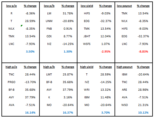
All of the “high” categories exceeded the performance of the “low” categories. The area of exceptional performance was in the high yield stocks exceeding the returns of the low yield stocks. This is generally uncharacteristic as noted in extensive data that we’ve collected since 1996.
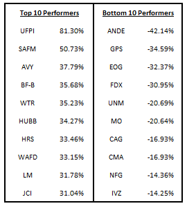
In the last year, the Dow Jones Industrial Average gained approximately +8.14%.
Below are the top five stocks by fundamental ratios for the U.S. Dividend Watch List dated November 1, 2019: Continue reading
Regulators might not approve the deal, but the reality is that UPS, FedEx, and Amazon are in the same business. Inevitably, UPS and FedEx are going to want or need to merge in order to thrive. When and if that occurs, as tired industry behemoths get, they will do it exactly the wrong time.
The chart below highlights the relative price of FedEx and UPS since the IPO of UPS.
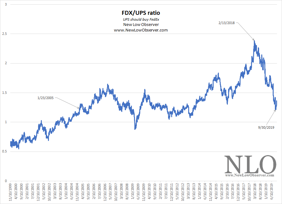
Since 1999, FedEx has made significant gains on UPS. However, the recent decline of FedEx since February 2018 and the recent reversal in September 2019 suggests that FedEx may have bottomed OR that UPS made be headed lower while FedEx treads water or rises.
For UPS, this is the ideal time to make an offer for FedEx as FDX lingers at 2005 levels. UPS being unwilling or unable to seize on FedEx at this time (too steep a price at any level) may be the opening for Amazon. Looking at the relative price of FDX/AMZN since UPS went public has the following skewed scenario.
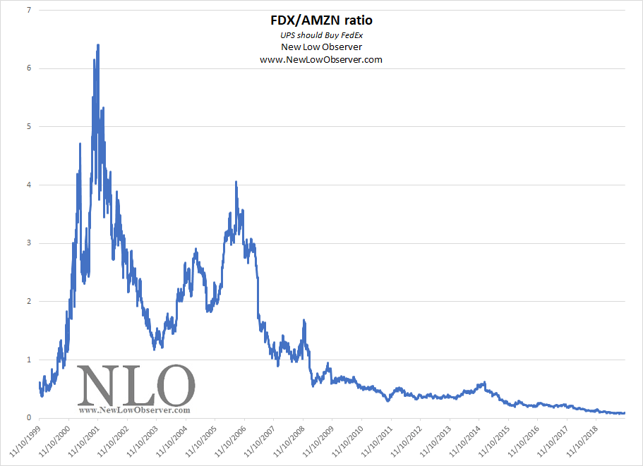
Clearly, AMZN holds all the cards. If FDX and UPS can’t see this reality, they may be forced to merge under less ideal conditions. Regulators would be far more favorable to an acquisition of a “retailer” of a shipping company versus two shippers that are almost equals with significant market share.
Check the top ten air and ground shippers outside of these companies, there is going to be action in this group before long.
Below is a chart of C.H. Robinson Worldwide (CHRW) from 1998 to 2019 reflecting the year-over-year (YoY) percentage change.
Below are the valuation targets for C.H. Robinson Worldwide (CHRW) over the next 10 years. Continue reading
We have never been hopeful when it comes to Bitcoin. We are only concerned with price. So far, price is confirming the declining trend. Continue reading
Below are the valuation targets for Old Second Bancorp (OSBC) over the next 10 years. Continue reading
Below is a chart of Applied Materials (AMAT) from 1981 to 2019 reflecting the year-over-year (YoY) percentage change.