The NLO team executed the following transaction(s): Continue reading
-
Topics
Archives
-
-
Recent Posts
-
-
-
-

The NLO team executed the following transaction(s): Continue reading
We got our hands on the latest investment tome by Gregory Zuckerman titled The Man Who Solved the Market: How Jim Simons Launched the Quant Revolution. The book is good but we can’t help but cut to the data to get a better sense of perspective.
Below is a comparison between Jim Simons and Warren Buffett in the first 12 years of published investment performance. Continue reading
Posted in Jim Simons, Warren Buffett
We’ve started this decade by reviewing the watch list from the beginning of 2019. We are exploring the many different ways to utilize our watch list by collecting and analyzing data from various fundamental measures. Our study has revealed outcomes that may be surprising findings.
| January 4, 2019 (Top 5 Companies) | ||
| Strategy | High | Low |
| Yield | 6.9% | 20.0% |
| P/E | 47.0% | 23.8% |
| Payout Ratio | 26.7% | 9.5% |
| P/B | 41.8% | 24.2% |
| Closest to Low | 21.7% | |
| S&P 500 | 27.8% | |
The gains above are based on top 5 companies by various fundamental metrics from our January 4, 2019 watch list. The best performer was the top five high P/E ratio stocks while the worst performer was the high dividend yield (similar to the Dogs of the Dow strategy).
| High P/E | High Dividend Yield | |||||
| Symbol | P/E | % Change | Symbol | Yield | % Change | |
| SYK | 48.48 | 33% | FUN | 7.30% | 15% | |
| TNC | 42.52 | 51% | MMP | 6.29% | 6% | |
| SAFM | 37.33 | 74% | WRI | 6.26% | 21% | |
| VMI | 34.62 | 34% | HP | 5.71% | -6% | |
| BF-B | 30.36 | 43% | MO | 5.69% | -1% | |
| 38.66 | 47% | 6.25% | 7% | |||
Keep in mind that the time frame for this assessment is one year. One might think that this is a one-time occurrence but our data, as confirmed in the Dogs of the Dow from 1996-2019, shows that companies with high P/E ratios tend to outperform the widely followed Dow Jones Industrial Average and S&P 500 Index.
U.S. Dividend Watch List: January 3, 2020
We are excited to start the new year with new ways to look at the market. The last decade was a great one for the bullish investor. We started the New Low Observer in July 2009 based on the belief that a bull market was due.
In the last decade, the S&P 500 went from 1,133 to 3,230, 185% gain or +12% annually. We have been working hard to explore ways to improve our performance and we will be bringing some of our best ideas forward through the weekly watch list. Continue reading
The following is the breakdown of the Dogs of the TSX 60 (found here) in week one, compared to other fundamental ratios. Continue reading
The following is the breakdown of the Dogs of the Dow (found here) in week one, compared to other fundamental ratios. Continue reading
Below is the Dogs of the TSX 60 for 2020 with the breakdown of the other categories that we track.
Posted in Dogs of the TSX
Below is the Dogs of the Dow for 2020 with the breakdown of the other categories that we track.
Below is a chart of the performance of the Dogs of the TSX 60 from December 31, 2018 to December 31, 2019.
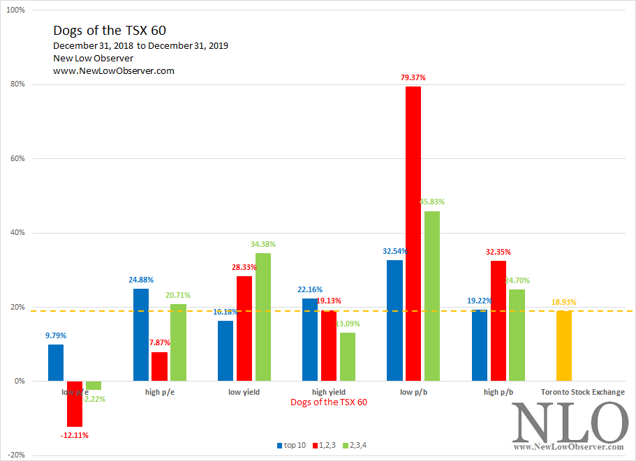
On average, as with the Dogs of the Dow, low yield stocks continues to dominate the high yield (Dogs of the TSX 60). It isn’t supposed to be this way according to the popular literature on this topic.
Our commentary from the January 2019 Dogs of the TSX 60 watch list had the following to say:
“Unlike the Dogs of the Dow, The Dogs of the TSX 60 have the best performers in the ‘high yield’, ‘low p/b’, and ‘low p/e’. Our preference is for stocks within the low yield grouping.”
Our painful adherence to conservatism and safety has seen our pick of low yield stocks doing “alright” compared to the Toronto Stock Exchange. We introduced the 1,2,3 and 2,3,4 as an alternative to the conventional top ten stocks, as we believe better performance within the low yield stocks would come from the top 2nd, 3rd, and 4th stocks.
While we have observed that low p/e, low p/b, and high yield Canadian stocks performed better in the past, only the low p/b stocks crushed it, especially the top 1,2,3 stock in that grouping with a dumbfounding gain of +79.37%.
Below is a chart of the performance of the Dogs of the Dow from December 31, 2018 to December 31, 2019.
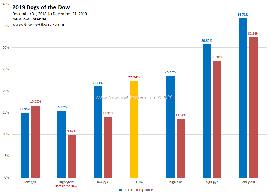
In 2019, the Dogs of the Dow (high yield) failed to exceed the performance of the Dow Jones Industrial Average. In addition, the Dogs of the Dow (high yield) severely underperformed the low yield stocks by a margin of +15%.
Our commentary from the January 2019 Dogs of the Dow watch list had the following to say:
“Our preference is for stocks in the highest p/e or lowest yield stocks.”
While the top 3 stocks in the high p/e category underperformed the Dow Jones Industrial Average with a gain of +13.54%, the low yield group crushed the index with gains of +36.71% and +32.36%.
1996-2019 Long-Term Performance
Below is our long-term performance of the Dogs of the Dow from 1996 to 2019 for both the top ten and top 3 stocks for the respective categories.
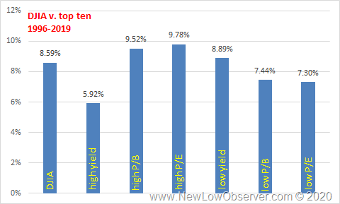
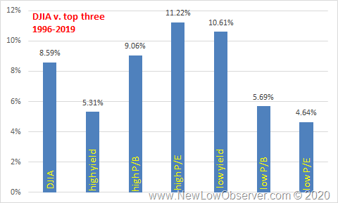
As is the case, the Dogs of the Dow (high yield) underperform the DJIA and the low yield category. High P/E stocks seem to win the day with above average gains on a long term basis. This is counter to the belief that investors should buy low p/e stocks.
see also:
Posted in Dogs of the Dow, Low Yield
Below is the performance of the top 5 stocks by fundamental ratios that we posted from our watch list dated January 4, 2019 to December 27, 2019:
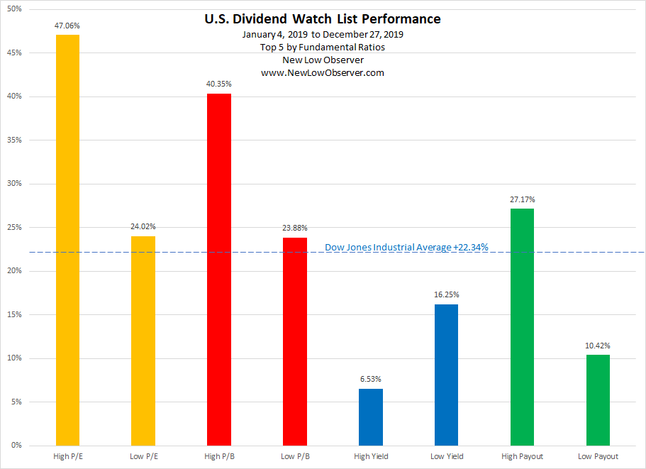
When looking at the data, we prefer to compare the performance of companies on a spectrum of relative values. For this reason, we have compared the High P/E stocks against the Low P/E stocks, High P/B to Low P/B etc.
Long held views on fundamental value investing suggest that investors choose the stocks in the “low” categories over the “high” categories, except in the case of yield. Our attention to the spectrum of data that is available to us points to the fact, so far, that the “high” categories require significant attention as they offer significant potential reward.
The category to beat from our January 4, 2019 watch list was the High P/E group as opposed to the Low P/E group where the gain was +47.06% as compared to +24.02%, respectively.
The second best category in 2019 was the High P/B group with a 2019 gain of +40.35% as contrasted with the Low P/B group which gained +23.88%.
The third group, in terms of performance, was the Low Yield stocks with a gain of +16.25% (failing to beat the index), which stood at nearly 3 times the gains of the High Yield (similar to the Dogs of Dow) stocks with gains of +6.53%.
Last but not least, the High Payout (dividend payout relative to earnings) stocks gained +27.17% as compared to the Low Payout stocks gain of +10.42%.
In the last year, the Dow Jones Industrial Average gained approximately +22.34%.
This is the last watch list for 2019 and what a year it has been to be long equities.
The S&P 500 index increased +30% while the Dow Jones Industrial Average rose +25%.
Our team has been working hard to fine tune our strategies and we look forward to highlighting the results next year. For now, here are companies on our watch list to ending the decade.
| Symbol | Name | Price | % Yr Low | P/E | EPS (ttm) | P/B | Yield | Payout Ratio |
| HRB | H&R Block | 23.39 | 2.63% | 11.5 | 2.03 | -60.0 | 4.4% | 51% |
| BEN | Franklin Resources | 26.25 | 2.66% | 11.2 | 2.35 | 1.3 | 4.1% | 46% |
| SWX | Southwest Gas Holdings, Inc. | 75.24 | 2.69% | 21.0 | 3.59 | 1.7 | 2.9% | 61% |
| TCO | Taubman Centers | 30.45 | 3.15% | 7.8 | 3.91 | 32.7 | 8.9% | 69% |
| CBRL | Cracker Barrel Old Country Store, Inc. | 154.83 | 3.57% | 17.0 | 9.10 | 6.1 | 3.4% | 57% |
| MCY | Mercury General Corp. | 48.58 | 4.05% | 13.0 | 3.73 | 1.5 | 5.2% | 68% |
| ROL | Rollins Inc. | 32.66 | 4.15% | 52.7 | 0.62 | 13.3 | 1.3% | 68% |
| FCBC | First Community Bancshares | 30.99 | 4.31% | 12.8 | 2.42 | 1.4 | 3.2% | 41% |
| ANAT | American National Insurance | 115.89 | 4.40% | 9.4 | 12.34 | 0.5 | 2.8% | 27% |
| CHRW | C.H. Robinson Worldwide | 77.93 | 5.14% | 16.3 | 4.79 | 6.3 | 2.6% | 43% |
| CLX | Clorox | 153.53 | 6.93% | 24.4 | 6.29 | 35.1 | 2.8% | 67% |
| EVR | Evercore Inc. | 75.38 | 8.37% | 9.3 | 8.14 | 3.9 | 3.1% | 29% |
| ATRI | Atrion Corporation | 734.39 | 8.74% | 37.5 | 19.57 | 5.9 | 0.8% | 32% |
| NJR | New Jersey Resources Corp. | 43.87 | 8.80% | 23.2 | 1.89 | 2.5 | 2.8% | 66% |
| NFG | National Fuel Gas | 46.87 | 9.05% | 13.4 | 3.51 | 1.9 | 3.7% | 50% |
| STFC | State Auto Financial Corp. | 30.84 | 9.75% | 44.7 | 0.69 | 1.4 | 1.3% | 58% |
| UGI | UGI Corp. | 44.70 | 10.32% | 31.7 | 1.41 | 2.4 | 2.9% | 92% |
| DUK | Duke Energy Corporation | 90.97 | 10.32% | 18.8 | 4.83 | 1.5 | 4.2% | 78% |
| CNP | CenterPoint Energy, Inc. | 26.91 | 10.97% | 21.4 | 1.26 | 2.0 | 4.3% | 91% |
Companies in green and blue are part of the Dividend Achiever and Dividend Aristocrat, respectively.
Disclaimer On our current list, we excluded companies that have no earnings. Stocks that appear on our watch lists are not recommendations to buy. Instead, they are the starting point for doing your research and determining the best company to buy. Ideally, a stock that is purchased from this list is done after a considerable decline in the price and extensive due diligence. Our view is to embrace the worse case scenario prior to investing. It is important to place these companies on your own watch list so that when the opportunity arises, you can purchase them with a greater margin of safety. It is our expectation that, at the most, only 1/3 of the companies that are part of our list will outperform the market over a one-year period.
Below are the valuation targets for Federal Realty Trust (FRT) for the next 10 years. Continue reading
Below are the valuation targets for Kimberly-Clark (KMB) for the next 10 years. Continue reading
Below is a chart of Amazon.com (AMZN) from 1997 to 2019.
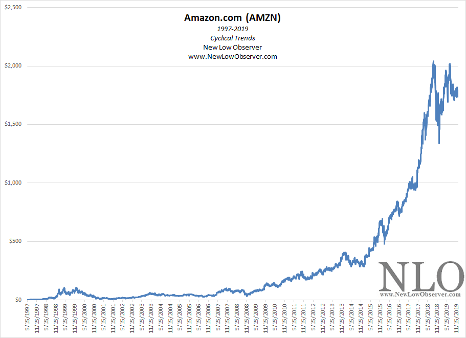
In the charts that follow, we break down the percentage change in each cyclical rise and decline of Amazon.com. These cyclical changes put into perspective the current rise and help to gauge what to expect when the next cyclical decline arrives. Continue reading
Below are the valuation targets for SNC-Lavalin Group (SNC.TO) for the next 10 years. Continue reading
Posted in 10-year Targets, Altimeter, SNC