Members
-
Topics
Archives
-
-
Recent Posts
-
-
-
Investor Education
Market Return After Exceptional Years
Dollar Cost Averaging Tool
Dow Theory: The Formation of a Line
Dividend Capture Strategy Analysis
Golden Cross – How Golden Is It?
Debunked – Death Cross
Work Smart, Not Hard
Charles H. Dow, Father of Value Investing
It's All About the Dividends
Dow Theory: Buying in Scales
How to Avoid Losses
When Dividends are Canceled
Cyclical and Secular Markets
Inflation Proof Myth
What is Fair Value?
Issues with P-E Ratios
Beware of Gold Dividends
Gold Standard Myth
Lagging Gold Stocks?
No Sophisticated Investors
Dollar down, Gold up?
Problems with Market Share
Aim for Annualized Returns
Anatomy of Bear Market Trade
Don’t Use Stop Orders
How to Value Earnings
Low Yields, Big Gains
Set Limits, Gain More
Ex-Dividend Dates -
-
Historical Data
1290-1950: Price Index
1670-2012: Inflation Rate
1790-1947: Wholesale Price Cycle
1795-1973: Real Estate Cycle
1800-1965: U.S. Yields
1834-1928: U.S. Stock Index
1835-2019: Booms and Busts
1846-1895: Gold/Silver Value
1853-2019: Recession/Depression Index
1860-1907: Most Active Stock Average
1870-2033: Real Estate Cycles
1871-2020: Market Dividend Yield
1875-1940: St. Louis Rents
1876-1934: Credit-New Dwellings
1896-1925: Inflation-Stocks
1897-2019: Sentiment Index
1900-1903: Dow Theory
1900-1923: Cigars and Cigarettes
1900-2019: Silver/Dow Ratio
1901-2019: YoY DJIA
1903-1907: Dow Theory
1906-1932: Barron's Averages
1907-1910: Dow Theory
1910-1913: Dow Theory
1910-1936: U.S. Real Estate
1910-2016: Union Pacific Corp.
1914-2012: Fed/GDP Ratio
1919-1934: Barron's Industrial Production
1920-1940: Homestake Mining
1921-1939: US Realty
1922-1930: Discount Rate
1924-2001: Gold/Silver Stocks
1927-1937: Borden Co.
1927-1937: National Dairy Products
1927-1937: Union Carbide
1928-1943: Discount Rate
1929-1937: Monsanto Co.
1937-1969: Intelligent Investor
1939-1965: Utility Stocks v. Interest Rates
1941-1967: Texas Pacific Land
1947-1970: Inventory-Sales Ratio
1948-2019: Profits v. DJIA
1949-1970: Dow 600? SRL
1958-1976: Gold Expert
1963-1977: Farmland Values
1971-2018: Nasdaq v. Gold
1971-1974: REIT Crash
1972-1979: REIT Index Crash
1986-2018: Hang Seng Index Cycles
1986-2019: Crude Oil Cycles
1999-2017: Cell Phone Market Share
2008: Transaction History
2010-2021: Bitcoin Cycles -
Interesting Read
Inside a Moneymaking Machine Like No Other
The Fuzzy, Insane Math That's Creating So Many Billion-Dollar Tech Companies
Berkshire Hathaway Shareholder Letters
Forex Investors May Face $1 Billion Loss as Trade Site Vanishes
Why the oil price is falling
How a $600 Million Hedge Fund Disappeared
Hedge Fund Manager Who Remembers 1998 Rout Says Prepare for Pain
Swiss National Bank Starts Negative
Tice: Crash is Coming...Although
More on Edson Gould (PDF)
Schiller's CAPE ratio is wrong
Double-Digit Inflation in the 1970s (PDF)
401k Crisis
Quick Link Archive
Category Archives: commodities
The Canadian Economy
Posted in Bloomberg Commodity Index, Canada, Charles H. Dow, commodities, Dewey, Dow Theory
Tagged members
Commodity Index: Upside Resistance Targets
Below is the Bloomberg Commodity Index (BCOM) from December 2015 to November 2020.

In the work that follows, we provide an updated view on the upside targets for the index. Continue reading
Posted in BCOM, Bloomberg Commodity Index, commodities, Dow Jones-UBS
Tagged members
Commodity Index Review: January 2019
Below we review the Bloomberg Commodity Index (BCOM) and upside resistance targets. Continue reading
Commodity Index Review: November 2018
We’ve been following the Bloomberg Commodity Index (BCOM) since it was known as the Dow-Jones UBS Commodity Index. In that time, We’ve never seen the persistent action that has been on display since May 2016. Continue reading
Commodity Index Update
Below is the Bloomberg Commodity Index (formerly known as the Dow Jones Commodity Index) with downside targets based on the work of Edson Gould.
Posted in Bloomberg Commodity Index, commodities
Commodity Index Review: Upside Targets
The Bloomberg Commodity Index has finally reached the extreme downside target of 79.26. Initially, we didn’t think that the index would fall to the extreme downside target as indicated in our October 29, 2013 posting. However, after declining below the long-term technical support level, we had to acknowledge what is now obvious.

Commodity Index: Are We There Yet?
On October 29, 2013, we said the following:
“…if we are in a commodity bull market, as we’ve made reference to in our January 1, 2009 article, then there is a good chance that a bounce at the long-term technical support line would mark the end of the cyclical bear move in commodities.”
On October 15, 2014, the Bloomberg Commodity Index (sold to Bloomberg in July 2013 from S&P Dow Jones) declined as low as 116.96. As seen in the chart below, this sits at the exact long-term support level.
Review: Bank of Montreal
Contributor C. Cheng Asks:
“What are your concerns regarding the housing bubble forming in Canada and it’s potentially adverse effects on BMO?”
Our Response:
The timeliness of this comment regarding Bank of Montreal (BMO) is critical. On June 7, 2012 (found here), we posted an Investment Observation on Bank of Montreal which was one of our leading considerations as an investment opportunity. Keep in mind that our interest in BMO came after a 14-month declining trend in the stock’s price.
At that time we said the following of BMO:
“We are reticent to recommend any kind of banking institution due to the many unexpected risks that occur outside of the purview of regulators and accountants. However, Bank of Montreal is a reasonable banking investment if bought at the right price. We believe that the right price begins at $51.80 and below.”
Unfortunately, BMO never fell below $51.80. In fact, the day that were did our write up on BMO it only fell below the $53.57 price on the five subsequent trading days immediately afterwards, with the lowest price being $52.15 on June 11, 2012.
At the moment, BMO’s stock price has retested the previous high set in November 2013.

If there is a concern that Canadian real estate is in a bubble then it would be wise to sell only the principal in BMO while leaving the profits to compound. This would eliminate the guesswork associated with determining if there is a bubble. The remaining funds would be allowed to compound at a 5.50% rate until BMO has sustain a similar decline in price from April 2011 to June 2012.
Review: Dow Jones-UBS Commodity Index
Comments Off on Review: Dow Jones-UBS Commodity Index
Posted in commodities, Dow Jones-UBS
Tagged members
Incorrect Interpretations of Market Peaks
In a MarketWatch article titled “7 Ways to Spot a Market Top” (found here), it is suggested that there are key ways to tell whether or not we are at a top in U.S. stock markets. First, we’re going to selectively choose (cherry pick) the points that we can refute or demonstrate weaknesses. Second, we’re going show how, even at a stock market peak, abandoning new investment opportunities can potentially be a mistake.
Starting with the first of the “7 Ways to Spot a Market Top” is the claim that:
While the U.S. stock market is trading at record highs, three blue-chip Chinese companies -- Petro China (PTR), China Mobile (CHL) and Yanzhou Coal are trading near 52-week lows, points out Brad Lamensdorf, chief investment officer of the Lamensdorf Market Timing Report. All three stocks peaked in January [2013]and have been skidding ever since. Given the key role China plays in the global economy, ‘this looks like a bad sign for US stocks,’ Lamensdorf said.
While it cuts us deep to suggest that a 52-low implies proof that a top in the market is at hand (don’t forget our vested interest on this topic), there are clear weaknesses in this argument. First and foremost, look at the chart for the respective stocks.

For PetroChina (PTR) the stock peaked in April 2011. Since then, the stock has been unable to exceed the prior peak. A technical analyst would have immediately recognized this and would not make the basis of their analysis the 2013 peak because it is lower than the 2011 top.

In the case of China Mobile (CHL), the stock peaked in August 2012.

In the instance of Yanzhou Coal (YZC), the stock peaked in May of 2011. If what Mr. Lamensdorf says is true, U.S. stocks should have shown more signs of weakness before the most recent declines. Based on the information that we’ve provided, the first of 7 ways to spot a market top is very weak at best.
The second of 7 ways to spot a market top reflects on the performance of the Spanish stock market indexes. Unfortunately, there is no PROOF that, based on the movement of the three indexes, that we’ve seen the top in the U.S. stock market. Instead, it only reflects on what has happened in Spain. In addition, the time span that is used is narrow at best. What is a better alternative to indicate a possible top in the market? First and foremost, Dow Theory could have been a better guide for consideration of when and if we were at a market top in advance of the actual peaks. As an example, the Spanish IBEX 35 Index, is shown below from 2006 to the present.

From the peak of the IBEX 35 Index in 2007, the decline was down to the March 2009 low near 6,936.90. The increase of the IBEX 35 Index could have been expected to increase at least half of the prior decline before giving clear indications of a change in direction in the market. According to Dow Theory the best case scenario would be for the market to retrace 50% of the previous decline.
Our own example of a real-time application of Dow Theory projections in advance of a market top is our April 3, 2009 posting titled “Bear Market Rally Targets” (found here), when the Dow was at 8,017.59. At that time, we said that the Dow Jones Industrials Average had an upside target of 10,360.02 based on the Dow Theory 50% principle. Dow Theory clearly outlines how to interpret market direction based on the stock market movement after the retracement of the 50% principle. Therefore, it would have been clear that the decline was in the cards and not helped by the European Financial crisis.
In our considered opinion, calling the top is easy after the fact, however the tools were in place to allow for understanding the potential upside limits beforehand. Additionally, there is no proof that the Spanish markets have topped out, based on such a short time frame (June 2012 to June 2013). In fact, according to the precepts of Dow Theory, the marginal top of January 2013 could not be considered to be “in” until the IBEX 35 declines below the 2012 low.
The third of 7 ways to spot a market top is based on the FTSE Europe relative strength index. The indicator only shows the last year of movement. The problem with this is that we don’t have a “relative” view on which to test the accuracy of this indication. Although not the exact index and without the exact measure of time for which the indicator is at (a considerable weakness to leave out such information because we cannot independently test what should be widely available), we’ve outlined the Vanguard FTSE Europe ETF (VGK) with a relative strength indicator on a 28-period trailing interval.

As can be seen above, the RSI has not necessarily give a clear indication of where the top in the market is when reviewed over a period from 2006 to the present. As an example, in 2012, the two RSI peaks resulted in higher market levels afterwards. Likewise, the RSI low of 2010 resulted in an even lower level for the Vanguard ETF in 2012. Worse still, the early 2008 low in the RSI was much lower than the early 2009 RSI low. However, the 2009 low in price was a staggering –58% lower than the early 2008 price for the Vanguard ETF.
Again, without the source of the RSI provided and the exact index that was used over a substantial period of time to verify the quality of the indicator, it would be difficult to suggest that the information provided was enough to prove that we could use the information to identify a market top, or bottom.
The fourth of the 7 ways to spot a market top refers to the Schiller P/E or CAPE ratio valuation of global equity markets. Again, this view only reflects the current point in time. It leaves out the perspective of other times in history, relative to when the S&P 500 Index was at respective peaks and troughs in history, compared to the same countries. However, we do have a good source to help see how this may not be the top, according to CAPE valuations.

The chart above is the Shiller P/E or CAPE ratio from GuruFocus.com (found here). According to the chart, it would appear that on a historical basis, the U.S. stock market should trade back to the mean P/E level of 16.5 after trading to the historical peak level of 22.9. However, there are two serious problems with this perspective. First, it ignores the fact that at nearly 50% of the times that the S&P has been at the same level in the past, the market continued much higher than the current level in 1929 and 2000. In the case of the year 2000, the market doubled the P/E level that we are currently at. The second problem is that the S&P 500 index didn’t exist before 1957. Therefore, anything before 1957 is based on a theoretical P/E ratio that is not even “real.” In fact, everything prior to 1957 is based on the belief that an imaginary S&P 500 would have replicated the performance of the Dow Jones Industrial Average). We’ve already pointed out the deceptiveness of P/E ratios and how they can be astronomical at market bottoms and miniscule at market tops in our article titled “P-E Ratios: Lessons from Confliction Indications” (found here).
In the fifth of the 7 ways to spot a market top, the article refers to the S&P 500 activity from 1996 to the present. Yes, it is true that the S&P 500 has failed to exceed the prior peaks of 2000 and 2007 by a wide margin. However, choosing the S&P 500 strictly fits the argument. Additionally, it seems to be the point of the author that prior peaks are a indication of a market top. However, if the Dow Jones Industrial Average were applied to the same period of time then it could be argued that you cannot pick a market top based on prior peaks.

In each instance of a peak for the Dow, the index went higher, as opposed to the S&P 500. Furthermore, If we looked at the Nasdaq Composite Index, then we could say, based on the flawed logic of prior peaks being the top in the market, that we’re a long way from the top in the stock market, as seen in the chart below.

The sixth of 7 ways to spot a market top relates to the 50-moving average of the S&P 500 Index. According to the article, Mark Luschini, chief investment strategist at Janney Montgomery Scott says:
“'As a matter of fact, with the S&P 500’s recent pullback to 1,600, it actually suggests an interim bottom,’ says Luschini. The index has bounced around and off of the 50-day moving average of 1,615, ‘so for the time being, that’s pretty good support for the market,’ he adds.”
Suffice to say, this wasn’t actually a way to spot a market top. We’re not sure why this was included.
Finally, the seventh of the 7 ways to spot a market top discusses the price of oil but it doesn’t relate this back to the stock market as the previous 6 points attempted, somewhat. Despite this fact, we have to point out the comment made by the analyst about the price of oil. The article states:
“As crude gets more expensive, OPEC members have an incentive to ramp up production. But in such times, [Tim] Evans doesn’t view the higher prices as bullish.”
Unfortunately, in the chart that is included with Mr. Evans commentary, we can see that the price of oil increased from January 2007 and peaked June 2008 and collapsed to the April 2009 low. Coincidentally, the stock market had a similar movement over the exact period of time. As Charles H. Dow, co-founder of the Wall Street Journal, said:
“For the past 25 years the commodity market and the stock market have moved almost exactly together. The index number representing many commodities rose from 88 in 1878 to 120 in 1881. It dropped back to 90 in 1885, rose to 95 in 1891, dropped back to 73 in 1896, and recovered to 90 in 1900. Furthermore, index numbers kept in Europe and applied to quite different commodities had almost exactly the same movement in the same time. It is not necessary to say to anyone familiar with the course of the stock market that this has been exactly the course of stocks in the same period ( source: Dow, Charles. Review and Outlook. Wall Street Journal.February 21, 1901.)”
With this in mind, it is possible to suggest that because oil is relatively far from the peak, there may still be some upside left. After all, in the period from 2007 to the present, whenever oil rose, so too did the stock market. Why should we expect anything different going forward? Especially when the price for oil hasn’t exceed the 2008 peak.
Our next point is regarding the abandonment of investments if and when you “know” that the stock market has peaked. In our posting titled “Complete 2008 Transaction Summary” (found here), we show every position that we took in 2008, the length of time that we held each position and the gain or loss for each position. It is important to note that although the stock market was in the process of collapsing, we were able to make long only positions based on stocks from our U.S. Dividend Watch List and end the year with gains of +14% as opposed to Dow Industrials and S&P 500 declines of -38% and greater.
Another source for inspiration of investing in stocks at stock market peaks can be derived from the work of Jeremy Siegel’s article titled “Nifty Fifty Revisited” (PDF here). In the article by Siegel, the highest P/E stocks (at a market peak; 1972) for that era were selected to determine their performance over a long-term basis (1972 to 1995). If, as a long-term investor, you’re interested in beating inflation by a wide margin, then avoiding new purchases at the peak in the market, because you think we’re at a peak, isn’t as rational as it would seem. It might make sense if you have a well established system (that is profitable, of course) in place. However, the work of Siegel suggests that for long-term investors, avoiding new purchases at market peak could be a costly trade off.
In our personal experience, a la 2008, we can’t suggest that our performance will be replicated again. However, what we can claim is that, aside from dumb luck, abandoning investment opportunities because the market has peaked or is falling could be just as mistaken as calling market tops, and bottoms, based on spurious notions that are unsubstantiated.
Posted in 50% principle, Charles Dow, Charles H. Dow, commodities, Market cycles, S&P 500
Dow Theory Applied to Silver?
A reader asks:
“How do you relate Dow Theory to the Silver market?”
Our response:
Charles H. Dow was first an economist, then a commodities expert and finally a stock market analyst. Before Charles H. Dow co-founded the Wall Street Journal, he was better known for writing the “Leadville Letters” for the Providence Journal. The “Leadville Letters” reported on Colorado’s silver mining boom in 1879. After co-founding the Wall Street Journal, the lessons learned in the silver mines ofColorado were found to have application on Wall Street.
Charles Dow was keenly aware of the importance and correlation between commodity prices and stock prices. Many of Dow’s articles in the Wall Street Journal were focused on the movement of commodity prices and all costs of production that went into commodity prices from shipping to the finished product.
As an example, Dow made the following observation:
“For the past 25 years the commodity market and the stock market have moved almost exactly together. The index number representing many commodities rose from 88 in 1878 to 120 in 1881. It dropped back to 90 in 1885, rose to 95 in 1891, dropped back to 73 in 1896, and recovered to 90 in 1900. Furthermore, index numbers kept in Europe and applied to quite different commodities had almost exactly the same movement in the same time. It is not necessary to say to anyone familiar with the course of the stock market that this has been exactly the course of stocks in the same period.”
Much of Dow Theory is based on Dow’s observation of the price action of commodities and then later applied to stock prices. The application of Dow Theory to the price of silver, gold or almost any other commodity is bringing Dow’s work back to its roots. In fact, Dow’s observations in commodities and then later applied to stocks is the basis for much of the modern fundamental and technical analysis that is done today, which includes the quest to determine the “value” of a company and the uses of Fibonacci numbers.
Dow Theory is applicable to all prices that are subject to the whims of market forces. Dow Theory also accounts for manipulation and hoarding. Dow Theory attempts to account for what can reasonably be expected of price action in the not too distant future.
Sources:
- Dow, Charles. Review and Outlook. Wall Street Journal.February 21, 1901.
- Bishop, George W. Jr. Who Was the First American Financial Analyst? Financial Analysts Journal, Vol. 20, No. 2 (Mar.-Apr., 1964), p.26-28.
- Bishop, George W. Jr. New England Journalist: Highlights in the Newspaper Career of Charles H. Dow. The Business History Review.Vol. 34, No. 1 (Spring, 1960) p. 77-93.
- More on Dow Theory from NLO
Comments Off on Dow Theory Applied to Silver?
Posted in commodities, Dow Theory, gold, Silver
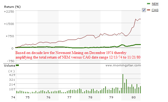
Watch List Double Take
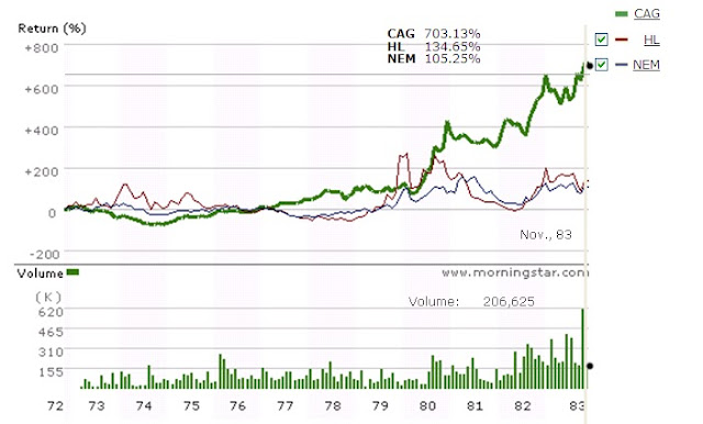 |
| Source: Morningstar.com, date range: 11/20/1972 to 11/19/1983 |
Below is a chart of CAG compared only to Newmont Mining (NEM) at the very lowest price of NEM on December 13, 1974 to the high of NEM at or near the peak of gold stocks. In this case, NEM has the bold green line while CAG has the thin red line. Note that CAG has a total return almost 17 times that of NEM.