Below is Barron’s references to “tech stocks” relative to the July 1st closing price of the Nasdaq Composite Index from 1980 to 2020.

see also: New York Times Recession/Depression Index 1853-2018

Below is Barron’s references to “tech stocks” relative to the July 1st closing price of the Nasdaq Composite Index from 1980 to 2020.
see also: New York Times Recession/Depression Index 1853-2018
Posted in Barron's, Barron's Data
This from Dow Theory Letters on July 5, 1974.
"What’s happening, what’s gone wrong? The answer: there's a giant squeeze in world liquidity, and it is scaring the devil out of investors, large and small, from one end of the globe to the other. Last week two German banks declared bankruptcy, while it was revealed (WSJ, June 26) that an oil-drilling "tax write-off" situation has turned into what may be the biggest swindle in US history. On June 27 trading in Westinghouse was halted at 12 1/8 (“you can be short if it’s Westinghouse”), and an hour later the President of the company announced that the outfit was solvent (all this while WX broke its 1962 low) (page 1)."
Those two German banks were Bankhaus I.D. Herstatt of Cologne and Bass & Herz Bankhaus. This was a situation where the failure of Herstatt led to the failure of Bass & Herz and a host of other substantial losses.
Chase Manhattan Bank was in possession of $156 million in Herstatt deposits. This meant that U.S. creditors (namely Citibank’s British banking unit of Hill, Samuel & Co.) were seeking claims on these funds even though Chase Manhattan had no authority to recognize the claims.
Seattle First National Bank (SeaFirst) was caught in a bind when they performed a $22.5 million transaction at their Swiss subsidiary and the funds were not transferred to the parent company hours before Herstatt was forced into bankruptcy.
In classic scam fashion, the oil-drilling "tax write-off" scheme was named Home-stake Production Company of Tulsa Oklahoma. Using the name “Homestake” tied the swindler with the success and stability of Homestake Mining while not having achieved anything of note.
What made this swindle exceptional is the fact that people like Liza Minelli, Candice Bergen, and Buddy Hackett (as well as Congressmen) were involved in the money losing fraud. The motivation for getting into these “tax write-off” schemes might have been inspired, at the peak, by articles like the following from Barron’s in March 1974.

“Bank shares at 10% yields mean that investor are scared of the banks (page 2).”
It was not long before this comment was published on banks that banks were on a mad dash to lure investors and analysts. In a Barron’s article titled “Beautiful Balloon?” it was indicated that the 1970 amendment to the Bank Holding Company Act of 1956 led banks “…into related (and some not-so-related) financial areas.”

It was those related financial areas that banks had “…been heavily engaged in financing real estate activities, and, despite the debacle among REITs, thus far have escaped essentially unscathed.” It wasn’t long before those banks almost paid the price for their foray into REITs, until the government intervened. This article from Barron’s should have been titled “Beautiful Bubble” as the collapse was in the early stages at this time and by July 5, 1974, there was more pain until December 1974, to the tune of –27.04% in the Dow Jones Industrial Average.

see also: Homestake Mining: The Exception that Proves the Rule
In a SeekingAlpha posting titled “Time to dust off investing strategies from 2009 crisis, UBS says” dated April 12, 2020, it is suggested that:
“A group of deep-value stocks were winners for investors through multiple parts of the cycle during the 2008-09 financial crisis, and a UBS analyst team says it is time to revisit those investing strategies.”
The benefit of an analyst is that they give good guidance beforehand. Assessing the recommendations after the fact is necessary but using such an approach could be argued as having elements of survivor bias or data mining. After all, if the company went out of business it isn’t even being considered for the possible mistakes or bad assessment.
In order to truly learn from the past, it is best to look at published recommendations at the peak in the market and review the performance. This is where we can learn the most that isn’t biased toward favorable outcomes.
Below we rate and review published recommendations by all UBS analysts that give specific recommendations in Barron’s throughout the period from January 2007 to December 2007 (that we could find).
Safeway (SWY): UBS analyst Neil Currie
“A compelling voice of dissent comes from UBS analyst Neil Currie, who pegs Safeway's core earnings at $1.65 a share in 2006 and $1.74 in 2007 once Blackhawk is stripped out. With the Street assuming a "best-case scenario," he assigns a more moderate multiple of 15 times 2007 projected earnings of $1.90, and says Safeway should be worth about 29. Smart shoppers might want to check out another aisle for something fresher (Tan, Kopin. Safeway: Ripe for a Fall?. Barron's. January 1, 2007).”

Safeway, as reflected in the chart, was expected to be value not much more than $29 and that the stock price would likely decline in value from there. UBS analyst Neil Currie was right on the mark as Safeway rose slightly in 2007 and then fell as low as $15 by 2012. A later buyout offer of reached for Safeway as the stock traded as high as $35 in 2015.
DBS Group Holdings (DBSDF): UBS analyst Jaj Singh
“Despite last year's rally, bank valuations remain reasonable at 1.75 times book, or accounting, value. UBS analyst Jaj Singh argues that they should be higher because average valuations over the past eight years tracked a deflationary period, and "a more relevant period is the early 1990s." Then, banks traded at 2.6 times book value; UBS' target ratio today is 1.9. In the banking group, DBS, or Development Bank of Singapore (DBS.Singapore), boasts strong deposits, low funding costs and a 67% loan-to-deposit ratio that leaves much room for expansion. Tan, Kopin. Singapore: the Safest Route to Asia's Riches. Barron's. Feb 12, 2007).”

The crosshair in the chart above, from February 12, 2007, should be all that needs to be said on this topic. At roughly $14.85, the price of DBS declined as much as -64%. Currently, DBS Group sits at nearly -7% below the 2007 recommendation.
Weyerhaeuser (WY): UBS analyst Richard Schneider
“Shareholders are pressuring Weyerhaeuser to change its status as a corporation to a REIT with better tax benefits and where gains are passed on to investors, but it is unclear whether the push will succeed. One hurdle: The company "may have to sell everything but timberland to qualify" for RE IT status, according to UBS analyst Richard Schneider. The analyst, who rates the stock Neutral, says Weyerhaeuser may seek to partially restructure and split off its containerboard business (Malik, Naureen S. Forest Grumps. Barron’s. March 19, 2007.).”

From the March 19, 2007 recommendation to the low of March 6, 2009, WY fell approximately -75.44%. Weyerhaeuser currently sits –29.61% below the 2007 recommendation.
Daimler AG (DDAIF): UBS analyst Max Warburton
“Notes Max Warburton, a UBS analyst in London: ‘Ex-Chrysler, Daimler is already an 8% margin business. Management is committed to unlocking value and the 'new Daimler' is set to be a high-margin, high-cashflow business.’ The stock, Jonas and Warburton argue, is worth over $100 (Palmer, Jay. If You Can Find a Better Stock, Buy It. Barron’s. May 21, 2007.).”

From May 21, 2007 to the low of 2009, Daimler AG declined approximately –76%. Currently, Daimler AG sits –63% below the 2007 recommended level.
CSL (CSL.AX): UBS analyst Andrew Goodsall
“The outlook for CSL wasn't always so bullish. In 2003, its plasma business threatened to unravel when prices crashed due to oversupply; CSL shares plummeted from A$52 to a low of A$11.57. The glut spurred Aventis, now Sanofi-Aventis (SNY), to seek a buyer for its plasma unit. CSL Chief Executive Brian McNamee stepped in, paying almost A$1 billion to acquire the business-twice the size of his own plasma division-and the bet paid off.
“The deal helped improve the dynamics for the whole industry, as U.S. collection centers were consolidated. With several key barriers to entering the market, including a three-to-four-year lead time in setting up new centers, UBS analyst Andrew Goodsall estimates demand for plasma product should be "tight" until at least 2010 (Murdoch, Susan. Australia's First $100 Stock? Barron’s. May 21, 2007.).”

From May 21, 2007 to March 9, 2009, CSL increased +10%. More importantly, CSL increased +997% from May 21, 2007 to April 10, 2020.
Ameriprise Financial (AMP): UBS analyst Andrew Kligerman
“UBS analyst Andrew Kligerman predicted in our story that Ameriprise shares, then 45, would surge once investors realized what a money spinner the company was. He has a Buy rating with a target price of 73, or about 30% above recent levels (Willoughby, Jack. Ameriprise Shares Look Lofty. Barron’s. August 6, 2007.) ”


From August 6, 2007 to the low of November 2008, AMP declined -78%. As of April 9, 2020, AMP is up +109%.
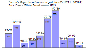
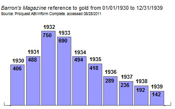
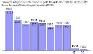
Gold/GLD: UBS analyst John Reade
“Analysts say that buyers are set to return as the urge to avoid risk revives. Add to this an increasing physical demand from consumers, particularly in India, and gold's outlook is all the more bullish and its current price all the more attractive. Says UBS analyst John Reade: "In this environment, there's a meaningful chance that gold will attract the safe-haven bid that has been so far mostly absent during the credit crunch (Hotter, Andrea.Glimmers of Hope for Gold. Barron’s. August 27, 2007)."

At the time this was written, the iShares Gold ETF was trading at $65.98. The ETF went as high as $184.82 and settled at $70 at the lowest point in October 2008, gaining +6.09%. Currently, GLD sits below the 2011 peak but comfortably above the 2007 recommendation level.
British Airways (BA) or (IAG.L): UBS analyst Tim Marshall
“BA (British Airways) however, does have an ace up its sleeve: a new state-of-the-art terminal at Heathrow that opens in March. Known as Terminal 5, the huge facility will be for BA exclusively and offer travelers unusual comfort and speed in everything from security checks to baggage claims. The new terminal will ‘make the airline far more competitive and, in the end, will be a far greater positive for the airline than Open Skies will be a negative,’ maintains Tim Marshall, a UBS analyst in London. If he's right, the stock could actually rebound over the next 12 months (Palmer, Jay. Opening the Skies. Barron’s. December 3, 2007.).”

From December 3, 2007 to the low of October 10, 2008, IAG.L declined -68.02%. IAG.L sits
Thoughts
The winners, and still champions, are Safeway, CSL Limited and gold. The analysts, Neil Currie, Andrew Goodsall and John Reade, made calls that have stood the test of a major bear market and thrived through the subsequent bull market. These are analysts that should be tracked down and followed as their assessment may have been a function of timing, luck, or solid hard work.

Our favorite call is the Safeway assessment by Neil Currie because the price target given was very accurate and even after a buyout offer (years later) the stock did not get priced far above the 2007 valuation.
Those that didn’t do so well were at the mercy of the markets. Andrew Kligerman gets a mention for recommending Ameriprise Financial which crashed and recovered.
Posted in Analyst Estimate, Barron's, Barron's Data
This from September 24, 2019 Barron’s:

Pandemics occur from time to time, so while they are hard to predict they are not unexpected. At around the same time, there was a serious bout of swine flu in China.
For now, based on what has occurred so far, we’ll continue to run on the view that FedEx, and more specifically the Dow Jones Transportation Average, are potential early indicators for the economy.
Barron’s exuberance over their ability to predict where we currently are in the market based on an article from October 2012 may come back to bite them, especially when they put it on the magazine cover. We’ve been sufficiently warned.

Comments Off on Curse of the Magazine Cover
Posted in Barron's
Barron’s attempts at Dow Theory has failed miserably…again. In the September 29, 2012 article by Jacqueline Doherty titled “Broken Dow Theory,” it is suggested that “A lagging transportation sector historically has been considered a bad omen…” and then recites the standard, sub-standard nomenclature “…less shipping means fewer goods are being produced and purchased, which means the economy is slowing and the stock market could be headed for a fall.” Doherty goes on to cite data from Bespoke Investment Group asserting that even though the Transportation index has fallen behind the market in general, it may not mean that the stock market, as represented by the S&P 500, necessarily needs to follow the same script.
Fortunately, Dow Theory is very specific about how to interpret the Dow Jones Industrial and Transportation Averages since the publication of Robert Rhea’s book The Dow Theory. Nowhere in the rules of Dow Theory is there any indication that the vacillations of the S&P 500 are remotely part of the interpretation of the theory. Especially since the S&P 500 came onto the scene over 60 years after the creation of the Dow Industrials.
Despite the fact that there are some Dow Theorists who frequently use the S&P 500 as a substitute for indications of a rising or falling market (this isn’t Dow Theory), there is little evidence that using the additional index is necessary. Alternate indexes are only necessary when and if the Dow Jones Industrial and Transportation Averages no longer exist.
While the prevailing opinion is that the Dow Industrials isn’t a relevant index reflective of the market as a whole, a distinction should be made between a “lagging” index and a “divergent” index. A lagging index is one which is going in the same direction as the other but is not increasing/decreasing at the same rate. A divergence is when one index goes up while the other index is going down. The chart below shows two failures and one divergence between the Industrials and Transports.
![image_thumb[8]](https://i0.wp.com/www.newlowobserver.com/wp-content/uploads/2012/10/image_thumb8.png "image_thumb[8]")
When one index cannot make new highs in accordance with the other index, it should be considered a significant failure and a warning sign. A perfect example is when the Transportation Index made a new high in 2008 and the Industrial Index could not follow through. The subsequent decline in both indexes was staggering.
In situations where there has been a divergence between the Dow Industrials and Transports, it is the Transports that typically leads the divergence to the upside or downside, meaning that the Transports will provide a clue as to the potential market direction in spite of the action of the Dow Industrials. Although historically this has been the case, Barron’s has unwittingly legitimized the view that the spread between the Dow Industrials and Dow Transports is some form of Dow Theory. In no way is this the case. In fact, in the period from 1896 to 1984, the Transports have exceeded the Industrials, on a percentage basis, 15 out of 25 Dow Theory bull and bear market moves.
| Year | DJI beat by | DJT beat by | Year | DJI lost by | DJT lost by | ||||||
| 1896 | 33.50% | 1899 | -13.30% | ||||||||
| 1900 | 51.00% | 1902 | -6.40% | ||||||||
| 1903 | 88.60% | 1906 | -7.30% | ||||||||
| 1907 | 24.50% | 1909 | -5.30% | ||||||||
| 1910 | 10.10% | 1912 | -13.80% | ||||||||
| 1914 | 78.70% | 1916 | -3.10% | ||||||||
| 1917 | 64.80% | 1919 | -26.00% | ||||||||
| 1921 | 18.40% | 1922 | -2.30% | ||||||||
| 1923 | 192.30% | 1929 | -3.80% | ||||||||
| 1932 | 15.60% | 1937 | -21.40% | ||||||||
| 1938 | 20.60% | 1938 | -6.40% | ||||||||
| 1939 | 20.30% | 1939 | -5.30% | ||||||||
| 1942 | 64.40% | 1946 | -16.50% | ||||||||
| 1947 | 39.40% | 1948 | -20.50% | ||||||||
| 1949 | 92.50% | 1953 | -6.50% | ||||||||
| 1953 | 3.80% | 1956 | -27.80% | ||||||||
| 1957 | 819.90% | 1959 | -12.40% | ||||||||
| 1960 | 5.80% | 1961 | -2.90% | ||||||||
| 1962 | 48.80% | 1966 | -7.00% | ||||||||
| 1966 | 19.20% | 1968 | -22.30% | ||||||||
| 1970 | 82.40% | 1972 | -14.50% | ||||||||
| 1974 | 10.00% | 1976 | -13.10% | ||||||||
| 1978 | 86.50% | 1981 | -10.60% | ||||||||
| 1982 | 44.00% | 1983 | -9.70% | ||||||||
| 1984 | 177.80% | 1984 | -31.00% | ||||||||
| DJI | DJT | DJI | DJT | ||||||||
| Total | 520.50% | 1592.40% | Average: | -9.65% | -14.18% |
The table above reflects the percentage by which the respective indexes exceeded the other from either the bull market low or the bear market top. In the timeframe indicated above, the Transports have routinely exceeded the Industrials to the upside by nearly three times. The same is true for Dow Theory bear market moves where the Transports have excessive downside moves as compared to the Dow Jones Industrial average by nearly 50%.
The pattern of excessive gains and losses in the Transports versus the Industrials has remained the case since 1984. As an example, at the peak in 2007, the Dow Industrials declined –54% while the Transports declined –60%. On the rise from the 2009 bottom, the Industrials and Transports registered gains of +110% and +162% based on their respective peaks. Excessive gains and losses, by the Transports above that of the Industrials, demonstrates that the Transports usually act as a leading indicator of market direction.
It should be noted that before the work of Wall Street Journal editor William Peter Hamilton and author Robert Rhea on the topic of Dow Theory, Charles H. Dow (co-founder of the Wall Street Journal) created and analyzed the Rail Index (now Transports) without the existence of the Dow Industrials for 12 years, from 1884 to 1896, for indications of market direction. Those 12 years are the basis of what Dow was able to formulate his observations on the market.
Unfortunately, the Barron’s article goes on to quote a CIO who states that the “…Nasdaq 100 and S&P 500 are better leading indicators than the transports.” Based on the available data, the Nasdaq 100 has not been able to exceed the all-time high set in January 2000. Additionally, the S&P 500 has not managed to exceed the all-time high set in October 2007. In the bull market run since the 2009 low, the Transportation Average has managed to exceed its all-time high unlike the Nasdaq 100 and S&P 500.
Finally, Barron’s quotes data from Bespoke which reviews, “…periods when the S&P 500 exceeded the transport index by 10 percentage points over a 50-day trading period. Going back to 1928, the S&P 500 gained 1% in the subsequent six months, not awful although below the average six-month gain of 3.5%.” Using a “50-day trading period” to arrive a conclusion about the next six months is inadequate in making even a cyclical determination of a bull or bear market based on Dow Theory, let alone a secular indication. Dow Theory is about the primary trend of the market which tends to last from 3-4 1/2 years at a time.
In order to make a “complete” secular and cyclical analysis based on Dow Theory, interpretation should begin at the prior dual Industrial and Transport peaks in 2007/2008, at minimum. Until there is a dual Industrial and Transport new high, cyclical new highs in one index or the other would be a bear market reaction as indicated in our August 9, 2011 note titled “Bear Market Rally Targets.” Our indication that a bear market rally was about to take place was with 2% of the October 3, 2011 low, giving full opportunity to seek out new investment opportunities before the bear market rally to the current peak in the Industrials. The current divergence of the two indexes is confirmation of the fact that we’re still in a bear market rally until the prior 2009-2011/2012 highs are exceeded for a cyclical bull market and all-time highs for a new secular bull market.
Until 1956, Barron’swould include Dow Theory analysis in the Market Laboratory section every week. Since 1956, Dow Theory would show up only in feature articles from experts on the topic. Now, it seems that anyone making mention of either the Dow Industrials or Dow Transports can suffice as knowledgeable on the topic of Dow Theory.
Naturally, there are many critics who adamantly speak out against Dow Theory, which is surprising since Charles H. Dow’s work of creating the Wall Street Journalalong with his theories of the stock market are the foundation of both fundamental and technical analysis in the United States. However, the critics, even without knowing the nuances of Dow Theory, are justified in their claims especially when the “analysis” is so incomplete and inaccurate.
If the goal is to do away with Dow Theory and eliminate the indexes then that is fine. However, if the goal is to actually interpret the theory in some mediocre fashion then it should be done by someone who has actually studied the topic extensively. Barron’s, a place where William Peter Hamilton and many other great Dow Theorists were prominently featured, is doing a disservice by connecting unrelated and disparate themes and suggesting that somehow the theory is “broken.”
Comments Off on Dow Theory: Not Broken, Just Misunderstood
Posted in Barron's, Charles H. Dow, Dow Industrials, Dow Theory, Dow Transports
Tagged members
 |
| Source: Persons, Warren. Barron's. May 15, 1933; pg. 18 |
 |
| source: Person, Warren. Barron's. May 15, 1933. pg. 18. |
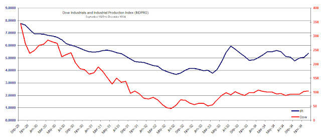
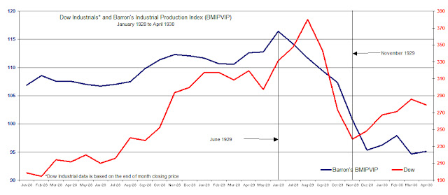
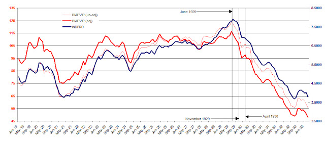
“After April 1930, the post-crash rally ended, and a great bear market began. As the market turned down again, the US economy crumbled. By July 1930, Barron's Index of Industrial Activity had fallen to 85.5. The Great Depression was on.
“And I'm wondering about the comparison with today's action. Recently, we've seen the Dow climbing steadily from its March 2009 low, all the while with the economy neutral to weak. Then we see the Dow hitting a high last month in May with business today sluggish and even weaker than it was in January.
“And I'm wondering, ‘Are we fated to live 1929-1930 all over again?’ Is the stock market rally of March 2009 to May 2011 a repeat of the stock market rally of November 1929 to April 1930? In both instances, business weakened as the market climbed higher.
“But the scary part is that in 1930 when the Dow broke support, the Great Depression began and Barron's Business Index continued to plunge. Let's keep an eye on the March 2011 lows -- Dow......11613.30 and Transports ....4950.17.”
We’re disappointed that Russell’s remarks are uninformed and misleading with the intent of creating fear. First, Russell withholds the data necessary to test whether his assessment is accurate. Next, Russell implies that the Dow Industrials of today may be rising in spite of the Industrial Production Index falling. However, the Fed’s INDPRO has been in perfect alignment with the rise of the Industrial Average since 2007 as shown in the chart below.
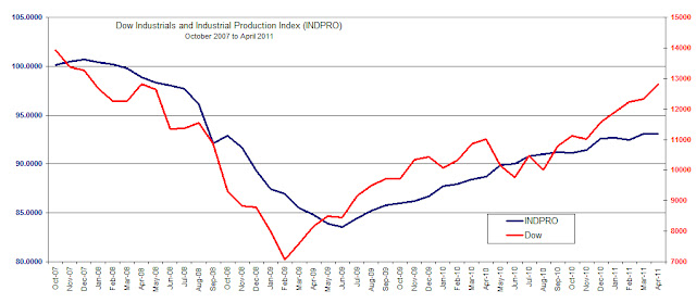
While the true test may come when the Dow Industrials and Industrial Production Index (INDPRO) attempt to exceed the prior high of 2007, there is little indication that Russell’s assessment is correct.
